 React
React iOS
iOS Android
 Flutter
 Angular
 JavaScript
 Unity
Unity Unreal
 Node
Node Python
 Ruby
Ruby PHP
PHP Java
Java .NET
.NET Go
Go REST
RESTlet messageListConfig = MessageListConfig()
let utils = Utils(messageListConfig: messageListConfig)
streamChat = StreamChat(chatClient: chatClient, utils: utils)Message List
What is the Message List?
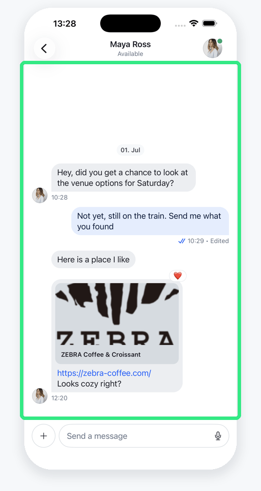
The message list is the place to show a list of the messages of a specific channel.
A message can come in many different forms. If you are looking for the different types of messages and how to customize them the place to look for is the Message Components section. The Message List is really handling the list of the messages that a channel contains.
The default message list implementation in the SDK follows the style of other messaging apps such as Apple's iMessage, Facebook Messenger, WhatsApp, Telegram, and many others. In these kinds of apps, the current sender's messages are displayed on the right side, while the other participants' messages are displayed on the left side. In addition to that, there is an avatar of the user sending a message shown.
The message list has many different customization options, and you can support many different layouts with it. We highly recommend to customize our message list component (by implementing your own message views) over building one from scratch.
Customization options
For general customizations, the best place to start is the MessageListConfig. This is a configuration file that can be used in the Utils class that is handed to the StreamChat object upon initialization. The Message List Configuration chapter is handling everything related to this type of customization.
Reminder: The configuration of the StreamChat object is recommended to be happening in the AppDelegate file. A guide on how to do this can be found here.
It is also possible to replace the screen that is shown when there are no messages yet in the current channel. This can be achieved by overriding the makeEmptyMessagesView function in the ViewFactory. Read more in the Empty Messages View section.
In order to change the background of the Message List the makeMessageListBackground function in the ViewFactory can be overridden. A more detailed explanation together with an example can be found in the Message List Background section.
Another option is to create a custom ViewModifier that is applied to the message list using the makeMessageListModifier function in the ViewFactory. This offers a lot of freedom and more details, together with an example implementation can be found in the Custom modifier for the Message List section.
Message List Configuration
The MessageListConfig is a helper class that allows customization of the MessageList in a unified, straightforward manner. The way this is done is by handing it into the Utils class that is then handed to the StreamChat initializer upon creation.
Here is an example of how to do this:
This code snippet is normally located in the AppDelegate.swift file inside of the didFinishLaunchingWithOptions function. If you are unsure of where to put that, you can follow the Getting Started for a detailed description.
This does not do any customization as it only uses the default parameters from the MessageListConfig. Due to the fact that there are default parameters for every option it is easy to only specify the customization options that are needed in the specific use-case.
Every one of them is discussed in the next chapters, but here is an overview over all the options that are configurable in the MessageListConfig together with their types and default values (click on the parameter name to jump directly to the section where they are explained in more detail):
| Parameter | Type | Default |
|---|---|---|
messageListType | MessageListType | .messaging |
typingIndicatorPlacement | TypingIndicatorPlacement | .automatic |
groupMessages | Bool | true |
messageDisplayOptions | MessageDisplayOptions | MessageDisplayOptions() |
messagePaddings | MessagePaddings | MessagePaddings() |
dateIndicatorPlacement | DateIndicatorPlacement | .messageList |
pageSize | Int | 25 |
messagePopoverEnabled | Bool | true |
doubleTapOverlayEnabled | Bool | false |
becomesFirstResponderOnOpen | Bool | false |
resignsFirstResponderOnScrollDown | Bool | true |
updateChannelsFromMessageList | Bool | false |
maxTimeIntervalBetweenMessagesInGroup | TimeInterval | 60 |
cacheSizeOnChatDismiss | Int | 1024 * 1024 * 100 |
iPadSplitViewEnabled | Bool | true |
scrollingAnchor | UnitPoint | .center |
showNewMessagesSeparator | Bool | true |
highlightMessageWhenJumping | Bool | true |
handleTabBarVisibility | Bool | true |
messageListAlignment | MessageListAlignment | .standard |
uniqueReactionsEnabled | Bool | false |
localLinkDetectionEnabled | Bool | true |
isMessageEditedLabelEnabled | Bool | true |
markdownSupportEnabled | Bool | false |
userBlockingEnabled | Bool | true |
bouncedMessagesAlertActionsEnabled | Bool | true |
skipEditedMessageLabel | (ChatMessage) -> Bool | { _ in false } |
draftMessagesEnabled | Bool | true |
hidesCommandsOverlayOnMessageListTap | Bool | true |
hidesAttachmentsPickersOnMessageListTap | Bool | true |
attachmentPreviewWidth | CGFloat | 256 |
navigationBarDisplayMode | NavigationBarItem.TitleDisplayMode | .inline |
supportedMessageActions | (SupportedMessageActionsOptions) -> [MessageAction] | Default actions |
The next sections will go through these values and discuss the impact they have when altered.
messageListType
The MessageListType enum has four cases:
.messaging.team.livestream.commerce
The goal with that is to have an easy configuration option to support different types of chat interfaces that are tailored towards specific use-cases.
Currently, the only one supported is the .messaging case, which is also the default. The documentation will be updated once the other cases are supported as well.
typingIndicatorPlacement
When another user is typing a message, the SDK can show a typing indicator in different places.
The default is .automatic, which shows the indicator inline in the message list and can fall back to the navigation bar when needed. If you want to force a specific placement, you can use .inline or .navigationBar.
Here is an example of the two explicit placements:
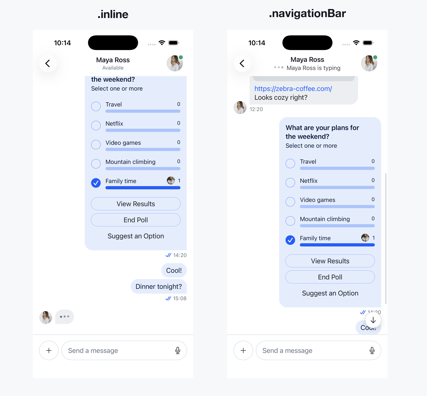
In case you want to set the .navigationBar option here is a snippet of code that achieves that. This goes into the didFinishLaunchingWithOptions function of the AppDelegate.swift file:
let messageListConfig = MessageListConfig(
    typingIndicatorPlacement: .navigationBar
)
let utils = Utils(
    messageListConfig: messageListConfig
)
streamChat = StreamChat(chatClient: chatClient, utils: utils)
groupMessages
The SDK offers the option to group messages of a user together to show them in a more compact way. The groupMessages parameter specifies if this behavior is wanted or not.
The default value is true, an example for both looks can be seen below:
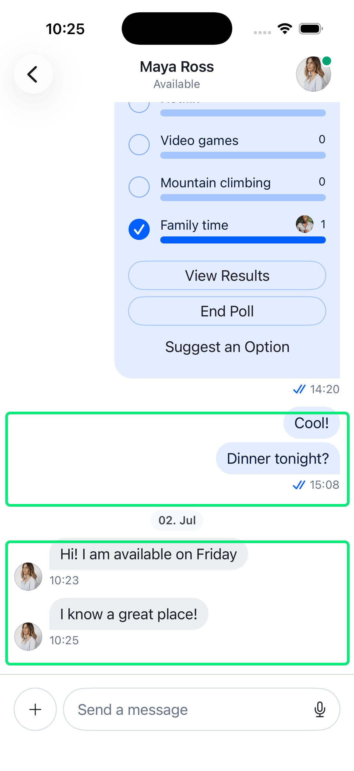
To identify which messages to group together the SDK uses the maxTimeIntervalBetweenMessagesInGroup parameter that is also part of the MessageListConfig. For more details on this parameter the maxTimeIntervalBetweenMessagesInGroup section is provided.
messageDisplayOptions
The messageDisplayOptions parameter allows to customize the overall behavior and appearance of messages in the message list.
For more details on what you can change and customize with the MessageDisplayOptions object, go to the Message Display Options page in the Message Components section.
It has the following parameters:
showIncomingMessageAvatar:BoolshowOutgoingMessageAvatar:BoolshowAvatarsInGroups:BoolshowMessageDate:BoolshowAuthorName:BoolanimateChanges:BooloverlayDateLabelSize:CGFloatlastInGroupHeaderSize:CGFloatnewMessagesSeparatorSize:CGFloatminimumSwipeGestureDistance:CGFloatcurrentUserMessageTransition:AnyTransitionotherUserMessageTransition:AnyTransitionshouldAnimateReactions:BoolreactionsPlacement:ReactionsPlacementreactionsStyle:ReactionsStyleshowOriginalTranslatedButton:BoolmessageLinkDisplayResolver:(ChatMessage) -> [NSAttributedString.Key: Any]spacerWidth:(CGFloat) -> CGFloatreactionsTopPadding:(ChatMessage) -> CGFloatdateSeparator:(ChatMessage, ChatMessage) -> Date?
In order to set the messageDisplayOptions in the MessageListConfig here is an example (with an empty MessageDisplayOptions object):
let messageListConfig = MessageListConfig(
    messageDisplayOptions: MessageDisplayOptions()
)
let utils = Utils(messageListConfig: messageListConfig)
streamChat = StreamChat(chatClient: chatClient, utils: utils)
messagePaddings
The messagePaddings parameter controls the spacing around messages. MessagePaddings has the following parameters:
horizontal— left and right padding for all messages (default16).quotedViewPadding— padding for quoted message views (default16).singleBottom— bottom padding for standalone messages (default8).groupBottom— bottom padding for messages in a group (default4).
An example of how to set the padding to for example a value of 40 can be found here:
let messageListConfig = MessageListConfig(
    messagePaddings: MessagePaddings(horizontal: 40)
)
let utils = Utils(messageListConfig: messageListConfig)
streamChat = StreamChat(chatClient: chatClient, utils: utils)
dateIndicatorPlacement
The date indicator describes an element that displays the date in the message list. It must not be confused with the created_at date of a specific message. The SDK supports three types of date indicators
- floating overlay (
.overlay) - date separators in-between the messages (
.messageList) - show no date indicators (
.none)
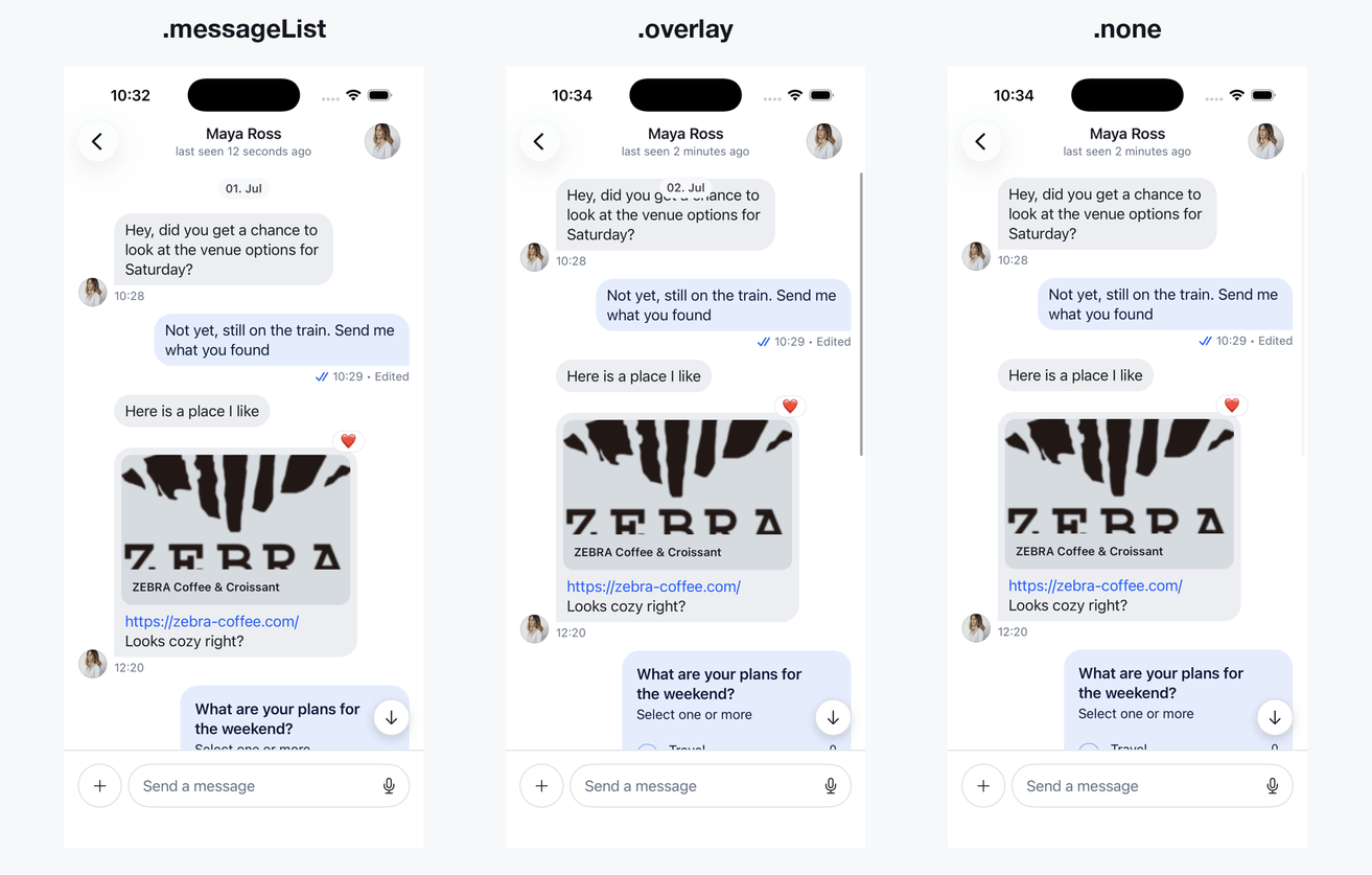
This feature can be configured via the dateIndicatorPlacement in the MessageListConfig. With the floating overlay option (.overlay), the date indicator is shown for a short time whenever a new message appears and during scrolling. On the other hand, in order to always show the date between messages, similarly to Apple Messages and WhatsApp, the .messageList option should be used. Both options can be turned off by using the .none option.
The default option is .messageList. In order to change that for example to the overlay option, this code can be used:
let messageListConfig = MessageListConfig(
    dateIndicatorPlacement: .overlay
)
let utils = Utils(messageListConfig: messageListConfig)
let streamChat = StreamChat(chatClient: chatClient, utils: utils)
pageSize
The pageSize parameter specifies how many messages are loaded by the SDK in a chunk before requesting new messages. The default value of 25 means 25 messages are loaded when entering the channel. When the user scrolls to previous messages and the first 25 are passed, the next chunk of 25 messages is loaded.
This value can be changed to any other Int. It should be considered, however, that there might be performance and networking considerations to take into account when changing up this value.
In order to change this value for example to have a pageSize of 100, this code can be used:
let messageListConfig = MessageListConfig(
    pageSize: 100
)
let utils = Utils(messageListConfig: messageListConfig)
streamChat = StreamChat(chatClient: chatClient, utils: utils)
messagePopoverEnabled
The messagePopoverEnabled parameter allows for an easy configuration option to allow to have things like reactions, threads, and other options available when users long-press a message. These options are available when the value is set to true (the default) and are disabled when set to false.
When set to true the following example shows when a user is long-pressing a gif inside of the message list (works the same with any other type of message):
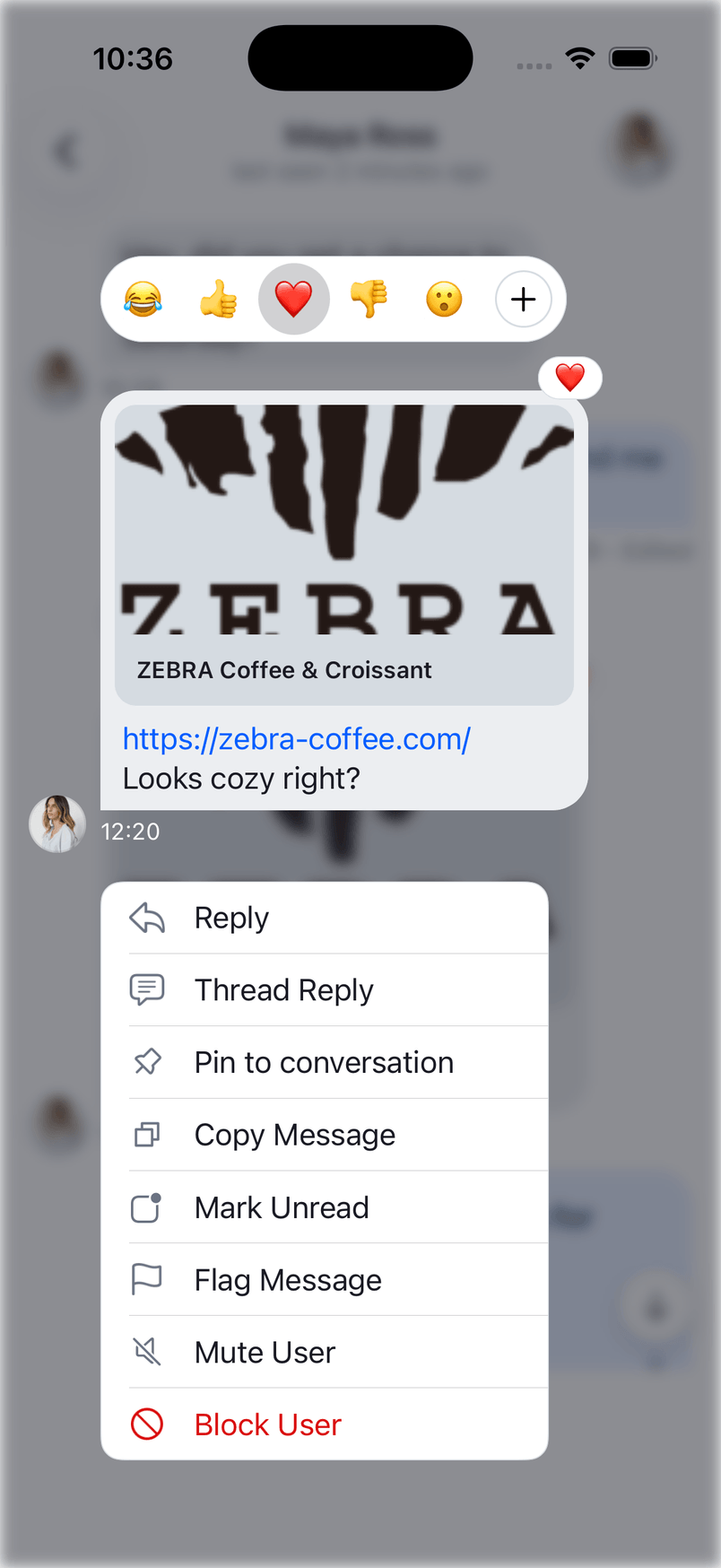
When messagePopoverEnabled is set to false, this menu does not show up. Here is the code to set this configuration:
let messageListConfig = MessageListConfig(
    messagePopoverEnabled: false
)
let utils = Utils(messageListConfig: messageListConfig)
streamChat = StreamChat(chatClient: chatClient, utils: utils)
doubleTapOverlayEnabled
The doubleTapOverlayEnabled parameter is related to the messagePopoverEnabled parameter. If doubleTapOverlayEnabled is set to true, the user can also summon the message overlay menu on a double tap in addition to the regularly enabled long-press gesture.
If unsure what kind of overlay is meant here, feel free to check the section about the messagePopoverEnabled to see an example how it looks.
The default is set to false so that the menu overlay is not showing up on a double tap. To set this to true the following code can be used:
let messageListConfig = MessageListConfig(
    doubleTapOverlayEnabled: true
)
let utils = Utils(messageListConfig: messageListConfig)
streamChat = StreamChat(chatClient: chatClient, utils: utils)
becomesFirstResponderOnOpen
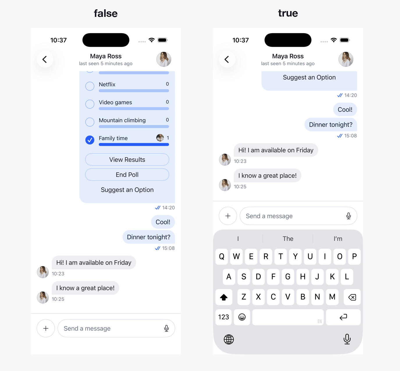
The becomesFirstResponderOnOpen parameter describes if the composer is active once the user is entering the chat channel screen. If set to true the keyboard will open and the user is directly ready to enter a message.
If set to false (the default) the keyboard will not be active and it requires another tap from the user onto the composer. However, the entire list of messages is present, showing more messages initially.
Here, the different options are shown when a user enters a channel:
In order to set this option for example to true, the following code can be used:
let messageListConfig = MessageListConfig(
    becomesFirstResponderOnOpen: true
)
let utils = Utils(messageListConfig: messageListConfig)
streamChat = StreamChat(chatClient: chatClient, utils: utils)
maxTimeIntervalBetweenMessagesInGroup
The messages in the message list are grouped based on the maxTimeIntervalBetweenMessagesInGroup value in the MessageListConfig (if the groupMessages option is set to true). It specifies a TimeInterval which determines how far apart messages can maximally be to be grouped together.
The default value of this property is 60 seconds, which means messages that are 60 seconds (or less) apart, will be grouped together. Messages that are farther apart are not grouped together and appear as standalone messages. An example for that can be seen in the groupMessages section.
To change it up from the default value (60 seconds) a different value (in this case: 20 seconds) can be specified like this:
let messageListConfig = MessageListConfig(
    maxTimeIntervalBetweenMessagesInGroup: 20
)
let utils = Utils(messageListConfig: messageListConfig)
streamChat = StreamChat(chatClient: chatClient, utils: utils)
cacheSizeOnChatDismiss
The cacheSizeOnChatDismiss parameter specifies how large the image cache is after leaving a channel. The default is set to 1024 * 1024 * 100 bytes and it means that when the user is leaving a channel, the image cache that Nuke uses is trimmed down to that size so that it doesn't take up too much memory.
Changing this parameter needs careful consideration of memory allocation limits, so this should only be changed when knowing the exact impacts of it.
In case this is required to be changed however, here is a code example on how to do it (limiting the cache size to half of what it is per default):
let messageListConfig = MessageListConfig(
    cacheSizeOnChatDismiss: 1024 * 1024 * 50
)
let utils = Utils(messageListConfig: messageListConfig)
streamChat = StreamChat(chatClient: chatClient, utils: utils)
showNewMessagesSeparator
The showNewMessagesSeparator controls the visibility of the separator for new messages. By default, this value is true.
If you set it to true, when you open a channel with unread messages, a header will be shown at the top of the oldest unread message, displaying the number of unread messages. The default implementation clears the header when it disappears off the screen.
You can modify this behaviour, as well as the user interface of the separator, by implementing the makeNewMessagesDividerView in the ViewFactory:
func makeNewMessagesDividerView(options: NewMessagesDividerViewOptions) -> some View {
    CustomNewMessagesDivider(
        newMessagesStartId: options.newMessagesStartId,
        count: options.count
    )
}
The NewMessagesDividerViewOptions provides:
newMessagesStartId– a binding to the id of the oldest unread message (where the divider starts). You can attach anonDisappearmodifier and set this value tonilif you want to clear this view when it disappears from the screen.count– the number of unread messages.
Additional MessageListConfig options
The current SDK exposes several additional options you may want to tune:
resignsFirstResponderOnScrollDown: Dismisses the keyboard when you scroll down.updateChannelsFromMessageList: Updates channel list previews from message list updates.iPadSplitViewEnabled: Enables split view behavior on iPad.scrollingAnchor: Controls where the list anchors when it initially loads (default.center).highlightMessageWhenJumping: Highlights the target message when jumping (for example from search).handleTabBarVisibility: Automatically hides/shows the tab bar based on navigation.messageListAlignment: Changes alignment (.standardor.leftAligned).uniqueReactionsEnabled: Enforces one reaction per user.localLinkDetectionEnabled: Enables link detection for message text.isMessageEditedLabelEnabled: Shows an "edited" label for edited messages.markdownSupportEnabled: Enables Markdown rendering for message text.userBlockingEnabled: Enables built-in blocking actions.bouncedMessagesAlertActionsEnabled: Shows bounced message actions as alerts instead of context menus.skipEditedMessageLabel: Custom rule for hiding the edited label per message.draftMessagesEnabled: Enables draft persistence (see Drafts).hidesCommandsOverlayOnMessageListTap: Hides command suggestions when tapping the list.hidesAttachmentsPickersOnMessageListTap: Hides attachment pickers when tapping the list.
Message Item View
If you need bigger customizations of the message view, you can replace the whole message item view and provide your own implementation.
In order to do that, you need to implement the makeMessageItemView method in your custom ViewFactory:
public func makeMessageItemView(
    options: MessageItemViewOptions
) -> some View {
    CustomMessageItemView(
        factory: self,
        channel: options.channel,
        message: options.message,
        width: options.width,
        showsAllInfo: options.showsAllInfo,
        isInThread: options.isInThread,
        isLast: options.isLast,
        scrolledId: options.scrolledId,
        quotedMessage: options.quotedMessage,
        onLongPress: options.onLongPress
    )
}
The MessageItemViewOptions provides:
channel– the channel the message belongs to.message– theChatMessageto display.width– optional available width for the message.showsAllInfo– whether author and date info should be shown.isInThread– whether the message is displayed inside a thread.isLast– whether this is the last message in the list.scrolledId– binding used for scrolling to the message.quotedMessage– binding for a quoted message.onLongPress– callback of type(MessageDisplayInfo) -> Voidinvoked when the message is long-pressed.
It is recommended to implement this method only when you need different organization of the elements of the container - for example, the placement of the author and date indicator, or the read indicators. Under the hood, you should still use the MessageView in order to avoid handling many different cases for the different types of the attachments.
Empty Messages View
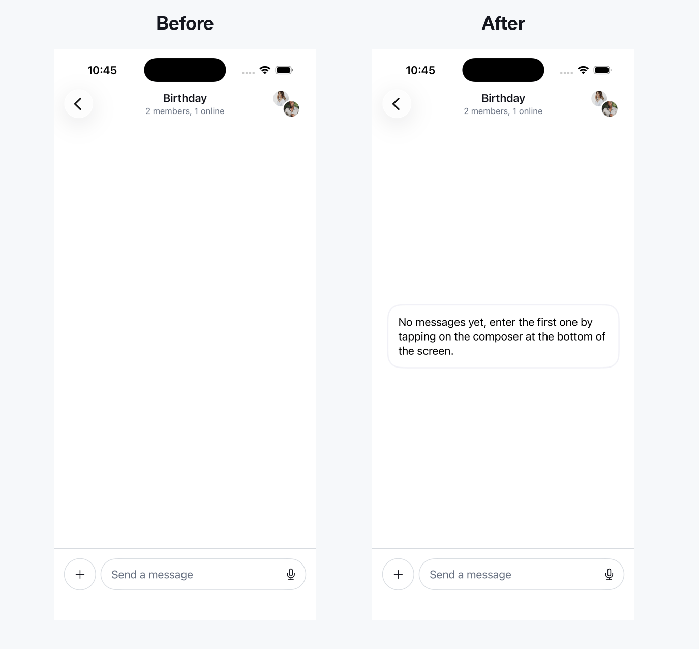
When there are no messages available in the channel, a custom view can be provided. In order to do this, the makeEmptyMessagesView method needs to be implemented in the ViewFactory. In this method, the channel is provided via the options object, allowing for a personalized message for starting a conversation. The default implementation in the SDK just shows the message list background in this slot.
In order to change this up, here is an example usage of an override in the custom ViewFactory:
func makeEmptyMessagesView(options: EmptyMessagesViewOptions) -> some View {
    Text("No messages yet, enter the first one by tapping on the composer at the bottom of the screen.")
        .padding()
        .background(RoundedRectangle(cornerRadius: 20, style: .continuous)
            .stroke(Color(UIColor.secondarySystemBackground), lineWidth: 2)
        )
        .frame(maxWidth: .infinity, maxHeight: .infinity)
        .padding()
}
Here's how that custom implementation looks compared to the default one:
Reminder: the custom ViewFactory needs to be injected into for example the ChatChannelListView. If unsure how to do that, there is a more detailed explanation in the Getting started page.
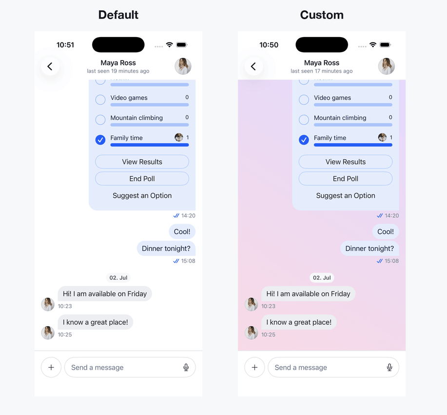
Message List Background
It is possible to change the background of the Message List entirely. This can be done by creating a custom View that allows for complete freedom of handing it whatever object that is desired.
The way to do this is to override the makeMessageListBackground function in the ViewFactory (see Getting started on how to add a custom ViewFactory to your app).
The options object provides isInThread, which specifies whether the message list is part of a message thread. If you need access to the color palette, use @Injected(\.colors).
Here is an example on how to create a gradient background for the background of the Message List (the code goes inside of the custom ViewFactory of the app):
func makeMessageListBackground(options: MessageListBackgroundOptions) -> some View {
    LinearGradient(gradient: Gradient(
        colors: [Color(red: 1.0, green: 0.85, blue: 0.9), Color(red: 0.9, green: 0.85, blue: 1.0)]),
        startPoint: .topLeading,
        endPoint: .bottomTrailing
    )
}
See how this looks compared to the default Message List background:
Custom modifier for the Message List
It is possible to customize the message list further by creating a custom view modifier for it using the makeMessageListModifier function in the Styles protocol. This gives complete freedom over the type of implementation and customization that will be applied to the message list.
The first step in order to implement this is to create a custom ViewModifier. In this example this adds a vertical padding to the View:
struct VerticalPaddingViewModifier: ViewModifier {
    public func body(content: Content) -> some View {
        content
            .padding(.vertical, 8)
    }
}
Next, create a custom Styles implementation and provide the makeMessageListModifier method.
Conform to Styles directly. Most methods have default implementations, but three are required: makeComposerInputViewModifier, makeComposerButtonViewModifier, and makeSuggestionsContainerModifier. Use the public RegularInputViewModifier, RegularButtonViewModifier, and SuggestionsRegularContainerModifier types to keep the default appearance:
final class CustomStyles: Styles {
    var composerPlacement: ComposerPlacement = .docked

    func makeMessageListModifier(options: MessageListModifierOptions) -> some ViewModifier {
        VerticalPaddingViewModifier()
    }

    func makeComposerInputViewModifier(options: ComposerInputModifierOptions) -> some ViewModifier {
        RegularInputViewModifier()
    }

    func makeComposerButtonViewModifier(options: ComposerButtonModifierOptions) -> some ViewModifier {
        RegularButtonViewModifier()
    }

    func makeSuggestionsContainerModifier(options: SuggestionsContainerModifierOptions) -> some ViewModifier {
        SuggestionsRegularContainerModifier()
    }
}
Then assign it to your custom ViewFactory:
class CustomViewFactory: ViewFactory {
    @Injected(\.chatClient) public var chatClient
    public var styles: CustomStyles = CustomStyles()
    // ...
}
Having this kind of freedom allows for more complex modifiers as well.
On this page:
- What is the Message List?
- Customization options
- Message List Configuration
- messageListType
- typingIndicatorPlacement
- groupMessages
- messageDisplayOptions
- messagePaddings
- dateIndicatorPlacement
- pageSize
- messagePopoverEnabled
- doubleTapOverlayEnabled
- becomesFirstResponderOnOpen
- maxTimeIntervalBetweenMessagesInGroup
- cacheSizeOnChatDismiss
- showNewMessagesSeparator
- Additional MessageListConfig options
- Message Item View
- Empty Messages View
- Message List Background
- Custom modifier for the Message List