 React
React iOS
iOS Android
 Flutter
 Angular
 JavaScript
 Unity
Unity Unreal
 Node
Node Python
 Ruby
Ruby PHP
PHP Java
Java .NET
.NET Go
Go REST
RESTclass CustomStyles: Styles {
var composerPlacement: ComposerPlacement = .floating
func makeComposerInputViewModifier(options: ComposerInputModifierOptions) -> some ViewModifier {
RegularInputViewModifier()
}
func makeComposerButtonViewModifier(options: ComposerButtonModifierOptions) -> some ViewModifier {
RegularButtonViewModifier()
}
func makeSuggestionsContainerModifier(options: SuggestionsContainerModifierOptions) -> some ViewModifier {
SuggestionsRegularContainerModifier()
}
}
class CustomFactory: ViewFactory {
@Injected(\.chatClient) public var chatClient
public var styles: CustomStyles = CustomStyles()
// ...
}Overview
The message composer is the component that allows you to send messages consisting of text, images, video, files and links. The composer is customizable - you can provide your own views for several slots. The default component consists of several parts:
- Leading composer view — displayed on the left side of the composer. The default implementation shows a plus button, that on tap displays attachment picker.
- Composer input view — the text input area where the user types their message. The default component supports text, images, files, and videos.
- Trailing composer view — displayed on the right side of the composer. Used for sending the message.
- Attachment picker view — the panel that expands when the user opens the attachment picker. The default implementation supports images and videos from the photo library, files, and camera input. You can inject additional custom pickers into this component.
If you use the photo library or camera pickers, make sure your app declares the required permissions in Info.plist (for example NSPhotoLibraryUsageDescription and NSCameraUsageDescription).
Image and video attachments get width, height and (for video) duration set at selection time on AddedAsset; these are passed into the attachment payload for custom CDN uploads. See Media metadata (dimensions and duration) in the custom CDN guide.
Composer Placement
The composer supports two placement modes that control how it is positioned relative to the message list:
- Docked — the composer is part of the vertical layout, sitting directly below the message list. The message list ends where the composer begins.
- Floating — the composer overlays the message list from the bottom, floating on top of the content. The message list is inset so the last messages are not obscured by the composer.
| Docked | Floating |
|---|---|
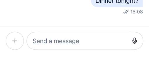 | 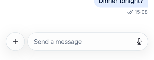 |
The placement is controlled by the composerPlacement property on the Styles protocol. The two built-in style classes have different defaults:
RegularStyles— defaults to.dockedLiquidGlassStyles— defaults to.floating
Changing the Placement
To change the composer placement, implement the Styles protocol and set composerPlacement to the desired value. Several methods have default implementations, so the minimum you need to provide is composerPlacement, makeComposerInputViewModifier, makeComposerButtonViewModifier, and makeSuggestionsContainerModifier. Assign your custom styles to your ViewFactory:
The built-in modifier types used above (RegularInputViewModifier, RegularButtonViewModifier, SuggestionsRegularContainerModifier) are the same ones used by RegularStyles, so this gives you the standard appearance with a floating composer. Swap them for the LiquidGlass variants if you want the glass look.
Composer Configuration
Low-level composer behavior is controlled by ComposerConfig, which is passed into the Utils object upon StreamChat initialization.
let composerConfig = ComposerConfig()
let utils = Utils(composerConfig: composerConfig)
let streamChat = StreamChat(chatClient: chatClient, utils: utils)
All parameters have sensible defaults, so you only need to specify the ones you want to change. Here is the full list:
| Parameter | Type | Default | Description |
|---|---|---|---|
isVoiceRecordingEnabled | Bool | true | Enables the voice recording button in the trailing composer view. |
isVoiceRecordingAutoSendEnabled | Bool | false | Automatically sends the voice recording when the record button is released. |
inputViewMinHeight | CGFloat | 40 | The minimum height of the text input area. |
inputViewMaxHeight | CGFloat | 120 | The maximum height the text input area can grow to before scrolling. |
inputViewCornerRadius | CGFloat | 20 | The corner radius of the text input area. |
inputFont | UIFont | .preferredFont(forTextStyle: .body) | The font used in the text input area. |
gallerySupportedTypes | GallerySupportedTypes | .imagesAndVideo | Controls which media types are available in the attachment picker. |
maxGalleryAssetsCount | Int? | nil | The maximum number of media assets a user can attach at once. nil means no limit. |
adjustMessageOnSend | (String) -> String | Identity | A closure to transform message text just before it is sent. |
adjustMessageOnRead | (String) -> String | Identity | A closure to transform message text when it is read back from the server. |
GallerySupportedTypes
The GallerySupportedTypes enum controls what media types appear in the photo library picker:
.imagesAndVideo— shows both images and videos (default)..images— shows only images..videos— shows only videos.
Examples
Enabling voice recording:
let composerConfig = ComposerConfig(isVoiceRecordingEnabled: true)
let utils = Utils(composerConfig: composerConfig)
let streamChat = StreamChat(chatClient: chatClient, utils: utils)
Restricting the attachment picker to images only:
let composerConfig = ComposerConfig(gallerySupportedTypes: .images)
let utils = Utils(composerConfig: composerConfig)
let streamChat = StreamChat(chatClient: chatClient, utils: utils)
Limiting the number of attachments per message:
let composerConfig = ComposerConfig(maxGalleryAssetsCount: 5)
let utils = Utils(composerConfig: composerConfig)
let streamChat = StreamChat(chatClient: chatClient, utils: utils)
Trimming whitespace from messages before sending:
let composerConfig = ComposerConfig(
    adjustMessageOnSend: { $0.trimmingCharacters(in: .whitespacesAndNewlines) }
)
let utils = Utils(composerConfig: composerConfig)
let streamChat = StreamChat(chatClient: chatClient, utils: utils)
Applying a Custom Modifier
The composer's background, padding, and other styling properties are controlled by the Styles protocol rather than ViewFactory. Implement makeComposerViewModifier in your custom Styles conformance to change the composer appearance:
class CustomStyles: Styles {
    var composerPlacement: ComposerPlacement = .docked

    func makeComposerViewModifier(options: ComposerViewModifierOptions) -> some ViewModifier {
        MyComposerBackgroundModifier()
    }

    func makeComposerInputViewModifier(options: ComposerInputModifierOptions) -> some ViewModifier {
        RegularInputViewModifier()
    }

    func makeComposerButtonViewModifier(options: ComposerButtonModifierOptions) -> some ViewModifier {
        RegularButtonViewModifier()
    }

    func makeSuggestionsContainerModifier(options: SuggestionsContainerModifierOptions) -> some ViewModifier {
        SuggestionsRegularContainerModifier()
    }
}

struct MyComposerBackgroundModifier: ViewModifier {
    public func body(content: Content) -> some View {
        content
            .background(Color.red)
    }
}
Assign your custom styles to the factory:
class CustomFactory: ViewFactory {
    @Injected(\.chatClient) public var chatClient
    public var styles = CustomStyles()
    // ...
}
Customizing the Trailing Composer View
If you want to change the button for sending messages (or add additional content alongside it), implement the makeTrailingComposerView method in the ViewFactory. Here's an example usage:
public func makeTrailingComposerView(
    options: TrailingComposerViewOptions
) -> some View {
    CustomSendMessageButton(
        enabled: options.enabled,
        onTap: options.onTap
    )
}
The TrailingComposerViewOptions provides:
enabled– whether there's content (text / attachment) for the message to be sent.cooldownDuration– if the channel is in cooldown mode, use this property to show a timer with the duration (in seconds) until the user can send messages again.onTap– the action to be executed when the user taps the send button. You should attach this action to your custom button, in order for the message to be sent.
Some messaging apps hide the send button when there's no text or attachments provided by the user. To support such a case, you can use the enabled property to hide or show the button.
Customizing the Leading Composer View
You can also swap the leading composer view with your own implementation. This might be useful if you want to change the behaviour of the attachment picker (provide a different one), or even just hide the component.
In order to do this, implement the makeLeadingComposerView method, which receives a LeadingComposerViewOptions with a binding of the PickerTypeState. Having the PickerTypeState allows you to control the visibility of the attachment picker view. The PickerTypeState has two states – expanded and collapsed. If the state is collapsed, the composer is in the minimal mode (only the text input and leading and trailing areas are shown). If the state is expanded, it has an associated value of type AttachmentPickerType, which defines the type of picker currently displayed. The possible states are none (nothing is selected), media (media picker is selected), instantCommands (instant commands picker is shown), and custom (for your own custom pickers).
Apart from the PickerTypeState, the options also include the ChannelConfig. This configuration allows you to control the display of some elements from the channel response from the backend, such as enabling/disabling of attachments, max message length, typing indicators, etc. More details about the available settings in the channel configuration can be found here.
The isCommandActive flag indicates whether a command (like giphy) is currently active in the composer.
Here's an example on how to provide a custom leading composer view:
public func makeLeadingComposerView(
    options: LeadingComposerViewOptions
) -> some View {
    LeadingComposerView(
        factory: self,
        pickerTypeState: options.state,
        channelConfig: options.channelConfig,
        isCommandActive: options.isCommandActive
    )
}
The default LeadingComposerView comes with the built-in attachment button logic. While you can reuse it directly as shown above, you can also replace it with your own control that toggles options.state and reacts to options.isCommandActive.
To learn more, check our Custom Attachments guide.
Customizing the Composer Input View
The input text view can also be replaced with your own implementation. To do this, provide your own implementation of the makeComposerInputView:
public func makeComposerInputView(
    options: ComposerInputViewOptions
) -> some View {
    CustomComposerInputView(
        factory: self,
        channelController: options.channelController,
        text: options.text,
        selectedRangeLocation: options.selectedRangeLocation,
        command: options.command,
        quotedMessage: options.quotedMessage,
        editedMessage: options.editedMessage,
        maxMessageLength: options.maxMessageLength,
        cooldownDuration: options.cooldownDuration,
        onCustomAttachmentTap: options.onCustomAttachmentTap,
        removeAttachmentWithId: options.removeAttachmentWithId,
        sendMessage: options.sendMessage
    )
}
The ComposerInputViewOptions provides the following properties:
channelController– the channel controller for the current channel.text– binding of the text that's entered in the input view.selectedRangeLocation– binding of the cursor location.command– binding for the currently active composer command (for examplegiphy).recordingState– binding for the current voice recording state.composerAssets– the currently selected media assets (images, videos).addedCustomAttachments– a list of the added custom attachments.addedVoiceRecordings– a list of the added voice recordings.quotedMessage– binding for a quoted message.editedMessage– binding for a message being edited.maxMessageLength– optional maximum allowed length of a message.cooldownDuration– if the channel is in slow-mode, the cooldown duration in seconds.hasContent– whether the composer currently has any content.canSendMessage– whether the current user can send a message.onCustomAttachmentTap– called when a custom attachment is tapped.removeAttachmentWithId– called when an attachment should be removed from the selected attachments.sendMessage– called when the user sends the message.onImagePasted– called when an image is pasted into the input.startRecording– called to start a voice recording.stopRecording– called to stop a voice recording.
Next Steps
Learn how to configure mentions, slash commands, and other composer commands in the Commands guide.
Our SDK also supports custom attachments. If you want to learn more, check the Custom Attachments guide.
Additionally, learn how to create your own composer by building Apple Messages' iOS 17 Composer here.
On this page: