 React
React iOS
iOS Android
 Flutter
 Angular
 JavaScript
 Unity
Unity Unreal
 Node
Node Python
 Ruby
Ruby PHP
PHP Java
Java .NET
.NET Go
Go REST
RESTlet displayOptions = MessageDisplayOptions(reactionsPlacement: .bottom)
let utils = Utils(
messageListConfig: MessageListConfig(messageDisplayOptions: displayOptions)
)
let streamChat = StreamChat(chatClient: chatClient, utils: utils)Reactions reordering
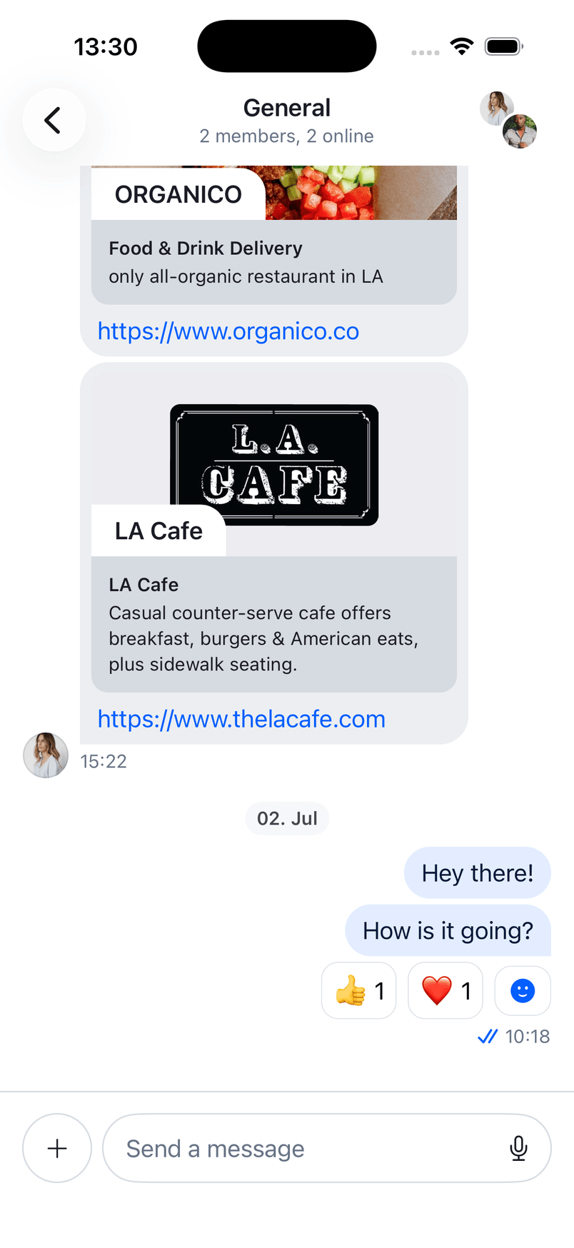
In the StreamChat product, by default, the reactions are shown above a message, similarly to the Apple Messages app.
However, some apps place them at the bottom, such as Slack and WhatsApp. Luckily, the SDK provides a configuration to move the reactions below the message, like the mentioned apps.
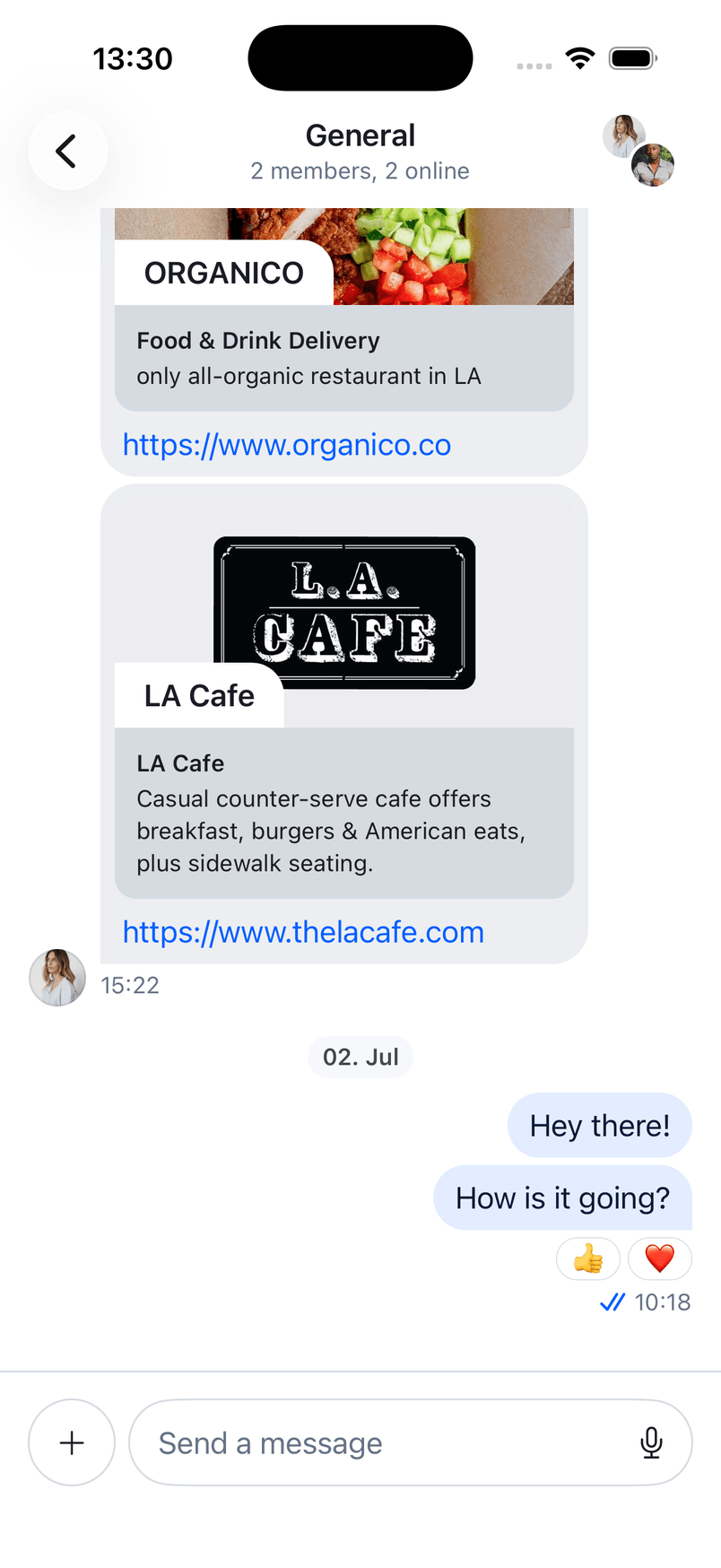
Reactions Placement
Configuring the SDK to use the bottom placement of reactions can be done with the following code.
Additionally, you can swap the reactions view with your own implementation. To do this, implement the makeBottomReactionsView in the ViewFactory.
public func makeBottomReactionsView(
    options: ReactionsBottomViewOptions
) -> some View {
    CustomBottomReactionsView(
        message: options.message,
        showsAllInfo: options.showsAllInfo,
        onTap: options.onTap,
        onLongPress: options.onLongPress
    )
}
The ReactionsBottomViewOptions provides:
message– the message whose reactions to display.showsAllInfo– whether all message info (author, date, etc.) is shown for this row.onTap– callback when the reactions view is tapped (to add/change a reaction).onLongPress– callback when the reactions view is long-pressed (to show the reactions detail).
Custom Reactions View
For example, some apps show the reactions only in one row. If the number of reactions is larger and it doesn't fit in the row, there's a more button that shows all reactions.
Let's create a new file called CustomBottomReactionsView, and add the following initial contents.
import StreamChat
import StreamChatSwiftUI
import SwiftUI

struct CustomBottomReactionsView: View {

    @Injected(\.chatClient) var chatClient
    @Injected(\.utils) var utils
    @Injected(\.colors) var colors
    @Injected(\.images) var images

    var showsAllInfo: Bool
    var reactionsPerRow: Int
    var onTap: () -> ()
    var onLongPress: () -> ()

    @StateObject var viewModel: ReactionsOverlayViewModel

    private let cornerRadius: CGFloat = 12
    private let reactionSize: CGFloat = 20

    init(
        message: ChatMessage,
        showsAllInfo: Bool,
        reactionsPerRow: Int = 4,
        onTap: @escaping () -> (),
        onLongPress: @escaping () -> ()
    ) {
        self.showsAllInfo = showsAllInfo
        self.onTap = onTap
        self.reactionsPerRow = reactionsPerRow
        self.onLongPress = onLongPress
        _viewModel = StateObject(wrappedValue: ReactionsOverlayViewModel(message: message))
    }
}
With the @Injected properties, we provide access to the fonts, colors, images and the chat client. Then, we also add the values passed from the factory method, as well as we create a ReactionsOverlayViewModel that handles the business logic for adding and removing reactions.
Next, let's implement the body of the SwiftUI view.
var body: some View {
    if reactions.count > 2 {
        HStack {
            let firstThree = Array(reactions[0..<2])
            let moreButtonCount = reactions.count - firstThree.count
            content(for: firstThree, moreButtonCount: moreButtonCount)
        }
    } else {
        HStack {
            content(for: reactions)
        }
    }
}

private var message: ChatMessage {
    viewModel.message
}

private var reactions: [MessageReactionType] {
    message.reactionScores.keys.filter { reactionType in
        (message.reactionScores[reactionType] ?? 0) > 0
    }
    .sorted(by: utils.sortReactions)
}
In the code above, we check if the number of reactions exceeds the allowed number (2 in this case). If yes, we compute the difference, and we pass it to our content method that creates the view. Otherwise, we just call the content method, wrapped in HStack.
Next, let's see the content implementation.
private func content(
    for reactions: [MessageReactionType],
    moreButtonCount: Int? = nil
) -> some View {
    Group {
        if let moreButtonCount {
            Button(action: {
                onLongPress()
            }, label: {
                Text("+\(moreButtonCount)")
                    .bold()
            })
            .padding(.all, 8)
            .padding(.horizontal, 2)
            .modifier(
                BubbleModifier(
                    corners: .allCorners,
                    backgroundColors: [Color(colors.backgroundCoreElevation1)],
                    cornerRadius: cornerRadius
                )
            )
        }

        ForEach(reactions) { reaction in
            if let emoji = icon(for: reaction) {
                HStack(spacing: 4) {
                    Text(emoji)
                        .font(.system(size: reactionSize))
                    Text("\(count(for: reaction))")
                }
                .padding(.all, 8)
                .background(Color(colors.backgroundCoreElevation1))
                .modifier(
                    BubbleModifier(
                        corners: .allCorners,
                        backgroundColors: [Color(colors.backgroundCoreElevation1)],
                        cornerRadius: cornerRadius
                    )
                )
                .onTapGesture {
                    viewModel.reactionTapped(reaction)
                }
                .onLongPressGesture {
                    onLongPress()
                }
            }
        }

        Button(
            action: onTap,
            label: {
                Image(systemName: "face.smiling.inverse")
                    .padding(.all, 8)
                    .padding(.horizontal, 2)
                    .modifier(
                        BubbleModifier(
                            corners: .allCorners,
                            backgroundColors: [Color(colors.backgroundCoreElevation1)],
                            cornerRadius: cornerRadius
                        )
                    )
            }
        )
    }
}
In the code above, we optionally add the "more" button, depending on whether the number of allowed reactions is exceeded.
Then, we iterate through the reactions, and we display them as emoji text using the BubbleModifier.
Finally, we add the button for adding additional reactions.
Additionally, we have few more computed variables that are used in the code above, that you should add in the CustomBottomReactionsView.
private var userReactionIDs: Set<MessageReactionType> {
    Set(message.currentUserReactions.map(\.type))
}

private func count(for reaction: MessageReactionType) -> Int {
    message.reactionScores[reaction] ?? 0
}

func icon(for reaction: MessageReactionType) -> String? {
    images.availableEmojis
        .first { $0["key"] == reaction.rawValue }?["value"]
}

func color(for reaction: MessageReactionType, userReactionIDs: Set<MessageReactionType>) -> Color? {
    let containsUserReaction = userReactionIDs.contains(reaction)
    return containsUserReaction ? Color(colors.backgroundUtilitySelected) : nil
}
These are used for determining the icon, color and count of a specific reaction.
With that, you can now run the app and see the updated bottom reactions view.
Custom Message Item View
If you need further customizations, you can also implement the makeMessageItemView method and provide a different layout for the whole message item. The makeMessageItemView replaces the complete message row (including reactions, author info, etc.):
public func makeMessageItemView(
    options: MessageItemViewOptions
) -> some View {
    CustomMessageItemView(
        factory: self,
        channel: options.channel,
        message: options.message,
        width: options.width,
        showsAllInfo: options.showsAllInfo,
        isInThread: options.isInThread,
        isLast: options.isLast,
        scrolledId: options.scrolledId,
        quotedMessage: options.quotedMessage,
        onLongPress: options.onLongPress
    )
}
The MessageItemViewOptions provides:
channel– the channel the message belongs to.message– theChatMessageto display.width– optional available width for the message.fixedContentWidth– optional fixed content width that can preserve an existing message layout.showsAllInfo– whether author and date info should be shown.shownAsPreview– whether the message is rendered as a preview (for example, in overlays).isInThread– whether the message is displayed inside a thread.isLast– whether this is the last message in the list.scrolledId– binding used for scrolling to the message.quotedMessage– binding for a quoted message.onLongPress– callback when the message is long-pressed.viewModel– optional view model for the message.
Summary
In this section, we have shown you how to configure the SDK to use bottom reactions.
Additionally, we have seen how you can implement your custom view for bottom reactions, as well as how to build your own message item view from scratch.
As a next step, you can explore other parts of our cookbook, where we build many interesting customizations. Furthermore, for a complete social experience, we recommend looking into our Video SDK.