 React
React iOS
iOS Android
 Flutter
 Angular
 JavaScript
 Unity
Unity Unreal
 Node
Node Python
 Ruby
Ruby PHP
PHP Java
Java .NET
.NET Go
Go REST
RESTimport StreamChat
import StreamChatSwiftUI
import SwiftUI
struct AppleMessageComposerView<Factory: ViewFactory>: View, KeyboardReadable {}Custom Composer
The message composer is an important part of a good messaging experience. It provides users different ways to communicate, whether that's text, media or custom attachments.
In this section, we will re-create Apple's composer, introduced in iOS 17, and integrate it with the StreamChat SDK.
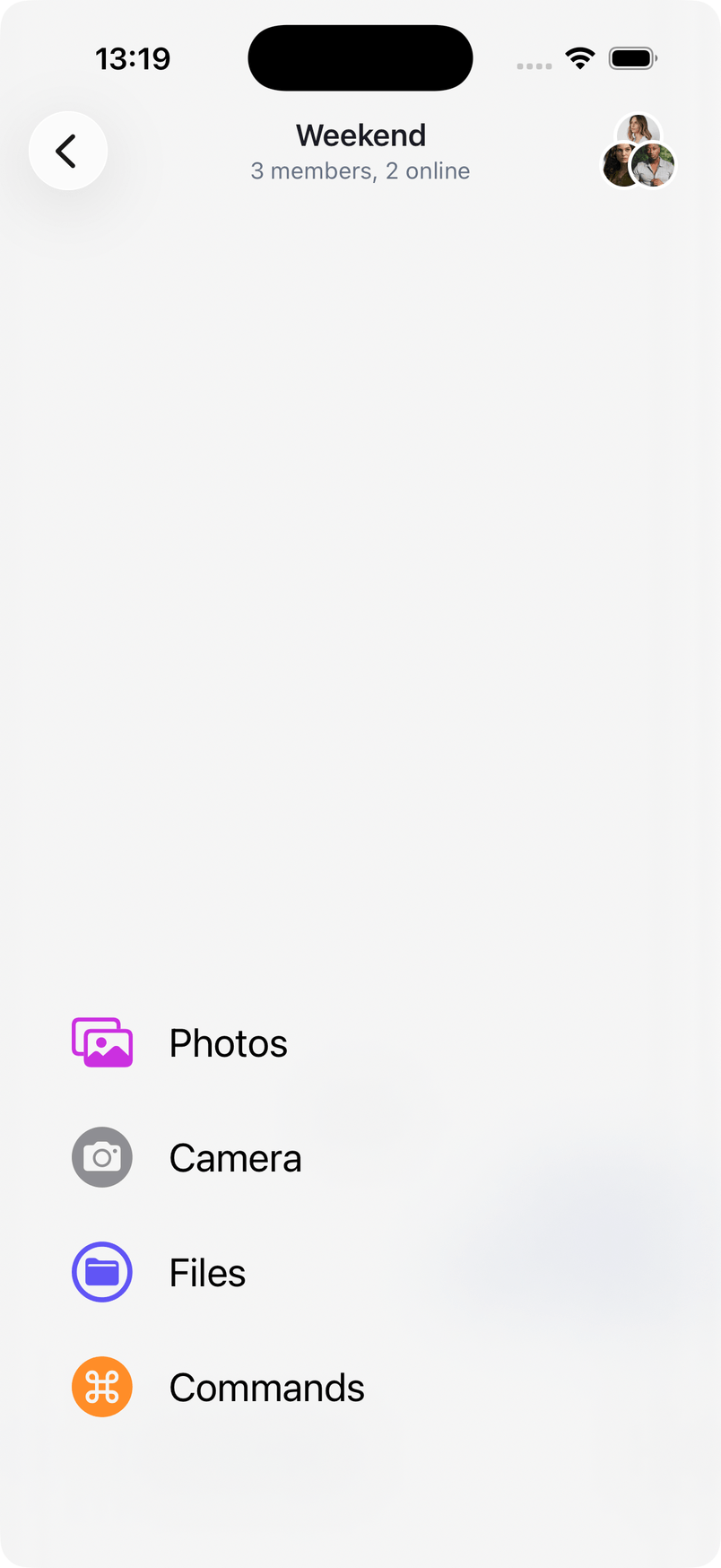
At first look, the composer is pretty standard - just a plus button and a text input field. However, when you press the plus icon, a nice animated popup with the different attachment options appears.
Let's see how we can build this, while reusing some of our standard UI components.
Custom Composer View
To get started, create a new file called AppleMessageComposerView, and add the following initial code.
The AppleMessageComposerView is a SwiftUI view that's generic over a ViewFactory protocol, for providing customizations of the lower-level building blocks. It also implements our KeyboardReadable protocol, which provides useful keyboard handling out of the box.
Next, let's define few properties that we are going to use in our implementation.
@Injected(\.colors) private var colors

    // Initial popup size, before the keyboard is shown.
    @State private var popupSize: CGFloat = 350
    @State private var composerHeight: CGFloat = 0
    @State private var keyboardShown = false
    @State private var editedMessageWillShow = false

    private var factory: Factory
    private var channelConfig: ChannelConfig?
    @Binding var quotedMessage: ChatMessage?
    @Binding var editedMessage: ChatMessage?

    @State private var state: AnimationState = .initial
    @State private var listScale: CGFloat = 0

    @StateObject var viewModel: MessageComposerViewModel
The @Injected property provides access to StreamChat's SDK colors.
The @State properties track the view state, such as the size of the composer popup and whether it's expanded or not. The quotedMessage and editedMessage bindings allow the composer to handle quoted and edited messages. We also create a MessageComposerViewModel view model that handles the entered text, validation, presentation logic, as well as the sending of a message.
Let's add the init method next.
public init(
    viewFactory: Factory,
    viewModel: MessageComposerViewModel? = nil,
    channelController: ChatChannelController,
    messageController: ChatMessageController? = nil,
    quotedMessage: Binding<ChatMessage?>,
    editedMessage: Binding<ChatMessage?>,
    willSendMessage: @escaping () -> Void
) {
    factory = viewFactory
    channelConfig = channelController.channel?.config
    let vm = viewModel ?? ViewModelsFactory.makeMessageComposerViewModel(
        with: channelController,
        messageController: messageController,
        quotedMessage: quotedMessage,
        editedMessage: editedMessage,
        willSendMessage: willSendMessage
    )
    _viewModel = StateObject(wrappedValue: vm)
    _quotedMessage = quotedMessage
    _editedMessage = editedMessage
}
Now, we can implement the body of the SwiftUI view. The composer's visible part consists of a horizontal stack with a plus button and a text input field. When a certain attachment picker is selected, the composer expands and moves up, providing users with the possibility to pick the attachment they need.
This means that we need to use a vertical stack as a container, where we would hide the picker in a compacted state and move it up with an animation when needed.
Therefore, the key components of the composer are the plus button, the input view, and the bottom attachment picker. Here's how this looks like in code.
var body: some View {
    VStack(spacing: 0) {
        HStack {
            plusButton

            factory.makeComposerInputView(
                options: ComposerInputViewOptions(
                    channelController: viewModel.channelController,
                    text: $viewModel.text,
                    selectedRangeLocation: $viewModel.selectedRangeLocation,
                    command: $viewModel.composerCommand,
                    recordingState: $viewModel.recordingState,
                    recordingGestureLocation: $viewModel.recordingGestureLocation,
                    composerAssets: viewModel.composerAssets,
                    addedCustomAttachments: viewModel.addedCustomAttachments,
                    addedVoiceRecordings: viewModel.addedVoiceRecordings,
                    quotedMessage: $quotedMessage,
                    editedMessage: $editedMessage,
                    maxMessageLength: channelConfig?.maxMessageLength,
                    cooldownDuration: viewModel.cooldownDuration,
                    hasContent: viewModel.hasContent,
                    canSendMessage: viewModel.canSendMessage,
                    audioRecordingInfo: viewModel.audioRecordingInfo,
                    pendingAudioRecordingURL: viewModel.pendingAudioRecording?.url,
                    onCustomAttachmentTap: viewModel.customAttachmentTapped(_:),
                    removeAttachmentWithId: viewModel.removeAttachment(with:),
                    sendMessage: { viewModel.sendMessage() },
                    onImagePasted: viewModel.imagePasted,
                    startRecording: viewModel.startRecording,
                    stopRecording: viewModel.stopRecording,
                    confirmRecording: viewModel.confirmRecording,
                    discardRecording: viewModel.discardRecording,
                    previewRecording: viewModel.previewRecording,
                    showRecordingTip: viewModel.showRecordingTip,
                    sendInChannelShown: viewModel.sendInChannelShown,
                    showReplyInChannel: $viewModel.showReplyInChannel
                )
            )
        }
        .padding(.all, 8)

        factory.makeAttachmentPickerView(
            options: AttachmentPickerViewOptions(
                attachmentPickerState: $viewModel.pickerState,
                filePickerShown: $viewModel.filePickerShown,
                cameraPickerShown: $viewModel.cameraPickerShown,
                onFilesPicked: viewModel.addFileURLs,
                onPickerStateChange: viewModel.change(pickerState:),
                photoLibraryAssets: viewModel.imageAssets,
                onAssetTap: viewModel.imageTapped(_:),
                onCustomAttachmentTap: viewModel.customAttachmentTapped(_:),
                isAssetSelected: viewModel.isImageSelected(with:),
                addedCustomAttachments: viewModel.addedCustomAttachments,
                cameraImageAdded: viewModel.cameraImageAdded(_:),
                askForAssetsAccessPermissions: viewModel.askForPhotosPermission,
                isDisplayed: viewModel.overlayShown,
                height: viewModel.overlayShown ? popupSize : 0,
                popupHeight: popupSize,
                selectedAssetIds: viewModel.composerAssets.compactMap {
                    if case .addedAsset(let asset) = $0 { return asset.id }
                    return nil
                },
                channelController: viewModel.channelController,
                messageController: viewModel.messageController,
                canSendPoll: viewModel.canSendPoll,
                instantCommands: viewModel.instantCommands,
                onCommandSelected: { command in
                    viewModel.pickerTypeState = .expanded(.none)
                    viewModel.composerCommand = command
                    viewModel.handleCommand(
                        for: $viewModel.text,
                        selectedRangeLocation: $viewModel.selectedRangeLocation,
                        command: $viewModel.composerCommand,
                        extraData: ["instantCommand": command]
                    )
                    becomeFirstResponder()
                }
            )
        )
        .offset(y: viewModel.overlayShown ? 0 : popupSize)
        .opacity(viewModel.overlayShown ? 1 : 0)
        .animation(.easeInOut(duration: 0.25))
    }
    .background(
        GeometryReader { proxy in
            let height = proxy.frame(in: .local).height
            Color.clear.preference(key: HeightPreferenceKey.self, value: height)
        }
    )
    .onPreferenceChange(HeightPreferenceKey.self) { value in
        Task { @MainActor in
            if let value, value != composerHeight {
                composerHeight = value
            }
        }
    }
    .onReceive(keyboardWillChangePublisher) { visible in
        if visible && !keyboardShown {
            if viewModel.composerCommand == nil && !editedMessageWillShow {
                withAnimation(.easeInOut(duration: 0.02)) {
                    viewModel.pickerTypeState = .expanded(.none)
                }
            }
        }
        keyboardShown = visible
        editedMessageWillShow = false
    }
    .onReceive(keyboardHeight) { height in
        if height > 0 && height != popupSize {
            popupSize = height - bottomSafeArea
        }
    }
    .modifier(factory.styles.makeComposerViewModifier(options: ComposerViewModifierOptions()))
    .background(
        Group {
            if viewModel.showSuggestionsOverlay {
                factory.makeSuggestionsContainerView(
                    options: SuggestionsContainerViewOptions(
                        suggestions: viewModel.suggestions,
                        handleCommand: { commandInfo in
                            viewModel.handleCommand(
                                for: $viewModel.text,
                                selectedRangeLocation: $viewModel.selectedRangeLocation,
                                command: $viewModel.composerCommand,
                                extraData: commandInfo
                            )
                        }
                    )
                )
            }
        }
        .offset(y: -composerHeight),
        alignment: .bottom
    )
    .onChange(of: editedMessage) { _ in
        viewModel.fillEditedMessage(editedMessage)
        if editedMessage != nil {
            becomeFirstResponder()
            editedMessageWillShow = true
        }
    }
    .accessibilityElement(children: .contain)
    .overlay(
        ComposerActionsView(viewModel: viewModel, state: $state, listScale: $listScale)
            .offset(y: -(UIScreen.main.bounds.height - composerHeight) / 2 + 80)
            .allowsHitTesting(state == .expanded)
    )
}
There are a few things worth noting in this implementation:
- Instead of instantiating
ComposerInputViewdirectly, we usefactory.makeComposerInputView(options:). This ensures that the factory's styling (input background, borders, etc.) is applied correctly, and that the built-in send and voice recording buttons inside the input view work as expected. - The attachment picker is shown and hidden using
.offsetand.opacitymodifiers rather than just a height change. Without these, the picker's content would bleed into the layout even when collapsed. - The suggestions overlay is placed in a
.backgroundmodifier (offset upward by the composer height), matching the default composer behavior. viewModel.fillEditedMessage(_:)is called wheneditedMessagechanges, which correctly populates the text field and cursor position for editing.
What's interesting for us is the last overlay modifier, which allows us to show the animated composer actions view.
Next, let's see how we can build this view.
Composer Actions View
First, create a new struct called ComposerAction, with the following properties.
struct ComposerAction: Equatable, Identifiable {
    static func == (lhs: ComposerAction, rhs: ComposerAction) -> Bool {
        lhs.id == rhs.id
    }

    var imageName: String
    var text: String
    var color: Color
    var action: () -> Void
    var id: String {
        "\(imageName)-\(text)"
    }
}
This struct will provide information about the items shown in the list of actions.
Next, we can create the ComposerActionsView. The composer actions view consists of a blurred background, and a list of different composer actions. Additionally, it contains the bouncy animation, which animates the scaling of the list, as well as its offset.
struct ComposerActionsView: View {

    @ObservedObject var viewModel: MessageComposerViewModel

    @State var composerActions: [ComposerAction] = []

    @Binding var state: AnimationState
    @Binding var listScale: CGFloat

    var body: some View {
        ZStack(alignment: .bottomLeading) {
            Color.white.opacity(state == .initial ? 0.2 : 0.5)

            BlurredBackground()
                .opacity(state == .initial ? 0.0 : 1.0)

            VStack(alignment: .leading, spacing: 30) {
                ForEach(composerActions) { composerAction in
                    Button {
                        withAnimation {
                            state = .initial
                            composerAction.action()
                        }
                    } label: {
                        ComposerActionView(composerAction: composerAction)
                    }
                }
            }
            .padding(.leading, 40)
            .padding(.bottom, 84)
            .scaleEffect(
                CGSize(
                    width: state == .initial ? 0 : 1,
                    height: state == .initial ? 0 : 1
                )
            )
            .offset(
                x: state == .initial ? -75 : 0,
                y: state == .initial ? 90 : 0
            )
        }
        .onAppear {
            setupComposerActions()
        }
        .edgesIgnoringSafeArea(.all)
        .onTapGesture {
            withAnimation(.interpolatingSpring(stiffness: 170, damping: 25)) {
                switch state {
                case .initial:
                    listScale = 1
                    state = .expanded
                case .expanded:
                    listScale = 0
                    state = .initial
                }
            }
        }
    }
}
In the onAppear modifier, we are calling a method setupComposerActions, which creates the items that will be presented. Let's see this method next.
private func setupComposerActions() {
    let imageAction: () -> Void = {
        viewModel.pickerTypeState = .expanded(.media)
        viewModel.pickerState = .photos
    }
    let commandsAction: () -> Void = {
        viewModel.pickerTypeState = .expanded(.instantCommands)
    }
    let filesAction: () -> Void = {
        viewModel.pickerTypeState = .expanded(.media)
        viewModel.pickerState = .files
    }
    let cameraAction: () -> Void = {
        viewModel.pickerTypeState = .expanded(.media)
        viewModel.pickerState = .camera
    }

    composerActions = [
        ComposerAction(
            imageName: "photo.on.rectangle",
            text: "Photos",
            color: .purple,
            action: imageAction
        ),
        ComposerAction(
            imageName: "camera.circle.fill",
            text: "Camera",
            color: .gray,
            action: cameraAction
        ),
        ComposerAction(
            imageName: "folder.circle",
            text: "Files",
            color: .indigo,
            action: filesAction
        ),
        ComposerAction(
            imageName: "command.circle.fill",
            text: "Commands",
            color: .orange,
            action: commandsAction
        )
    ]
}
The actions provided here, manipulate the state of the picker state and the picker type, based on the user's selection.
Next, let's see the implementation of a ComposerActionView, that presents a composerAction.
struct ComposerActionView: View {

    private let imageSize: CGFloat = 34

    var composerAction: ComposerAction

    var body: some View {
        HStack(spacing: 20) {
            Image(systemName: composerAction.imageName)
                .resizable()
                .scaledToFit()
                .foregroundColor(composerAction.color)
                .frame(width: imageSize, height: imageSize)

            Text(composerAction.text)
                .foregroundColor(.primary)
                .font(.title2)
        }
    }
}
Additionally, we need to add few utility types, that will help us achieve our desired UI, such as the blurred background.
struct BlurredBackground: View {
    var body: some View {
        Color.clear
            .frame(
                width: UIScreen.main.bounds.width,
                height: UIScreen.main.bounds.height
            )
            .background(
                .ultraThinMaterial,
                in: RoundedRectangle(cornerRadius: 16.0)
            )
    }
}

struct HeightPreferenceKey: PreferenceKey {
    static var defaultValue: CGFloat? { nil }

    static func reduce(value: inout CGFloat?, nextValue: () -> CGFloat?) {
        value = value ?? nextValue()
    }
}

enum AnimationState {
    case initial, expanded
}
Integrating the Composer
Our final step is providing the newly created composer view to the SwiftUI SDK. For this, create a new file called CustomViewFactory and implement the makeMessageComposerViewType from the ViewFactory protocol.
import StreamChat
import StreamChatSwiftUI
import SwiftUI

class CustomViewFactory: ViewFactory {

    @Injected(\.chatClient) public var chatClient

    public var styles = RegularStyles()

    private init() {}

    public static let shared = CustomViewFactory()

    func makeMessageComposerViewType(
        options: MessageComposerViewTypeOptions
    ) -> some View {
        AppleMessageComposerView(
            viewFactory: self,
            channelController: options.channelController,
            messageController: options.messageController,
            quotedMessage: options.quotedMessage,
            editedMessage: options.editedMessage,
            willSendMessage: options.willSendMessage
        )
    }
}
The MessageComposerViewTypeOptions provides:
channelController– the channel controller for the current channel.messageController– optional, the message controller for threaded replies.quotedMessage– binding for a quoted message.editedMessage– binding for a message being edited.willSendMessage– callback invoked just before a message is sent.
All five parameters should be forwarded to AppleMessageComposerView so that quoted and edited message flows work correctly.
Depending on which components you use, you should provide this view factory instead of the default one. For example, if you are using a ChatChannelListView, you can pass it in the creation process.
var body: some Scene {
WindowGroup {
ChatChannelListView(viewFactory: CustomViewFactory.shared)
}
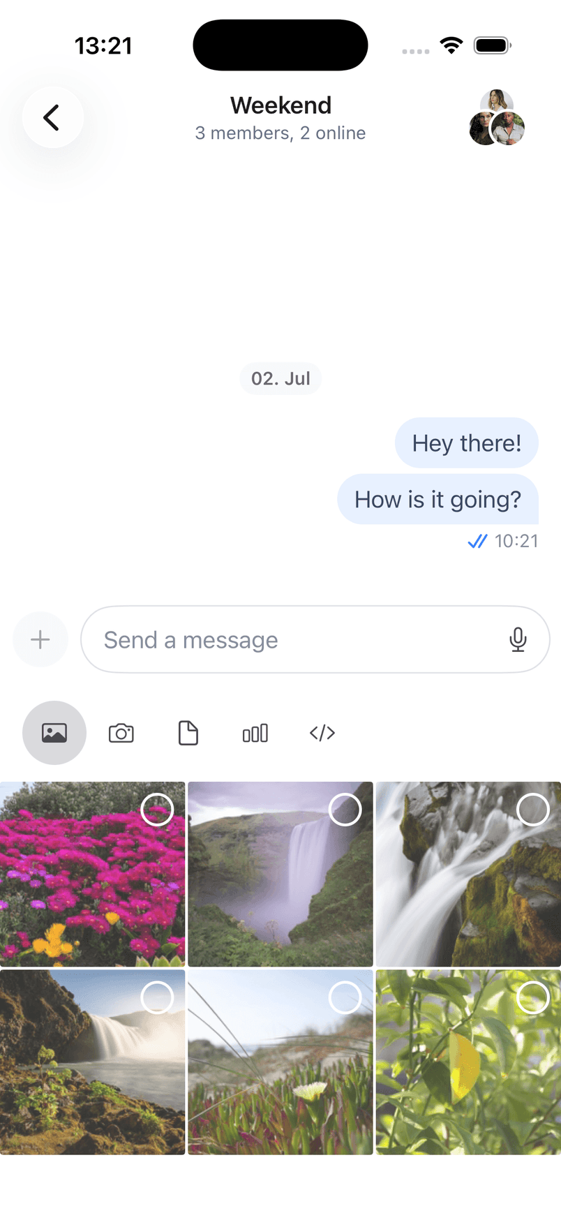
}If you run your app now, you should see the updated composer, as shown on the screenshot.
Summary
In this cookbook, you learnt how to implement your own version of the message composer view, using Apple's composer view as an inspiration. We have also shown you how to integrate it with our SwiftUI SDK.
As a next step, you can explore other parts of our cookbook, where we build many interesting customizations. Furthermore, for a complete social experience, we recommend looking into our Video SDK.