 React
React iOS
iOS Android
 Flutter
 Angular
 JavaScript
 Unity
Unity Unreal
 Node
Node Python
 Ruby
Ruby PHP
PHP Java
Java .NET
.NET Go
Go REST
RESTAppearance.default.images.openAttachments = UIImage(systemName: "plus")Custom Attachments
The ComposerVC can be customized in order to change the built-in attachments or can be extended to support your own custom attachments. By default the composer handles images, videos, giphys and files, but you can also create your own custom attachments. Some examples of common custom attachments are: location sharing, contact details, workouts and voice memos. You can read more about how attachments work in the Working with Attachments guide.
All the provided attachments are customizable in the composer in terms of style changes, layout changes or how they are presented. For example, you can change the clip button styling responsible for opening the attachments picker, you can replace the built-in attachments picker with your own, or even change all the flow and render the attachments picker in a subview instead of being presented in a view controller.
The composer also makes it really easy to be extended and support your own custom attachments. In this guide we will show you how you can customize the composer in order to support a custom contact attachment.
How to customize the attachments button
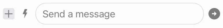
Change the button icon
By default the attachments button icon is a clip. You can easily change this by setting your own icon in the Appearance configuration:
| Before | After |
|---|---|
 |  |
You can find more information on how the appearance configuration works here.
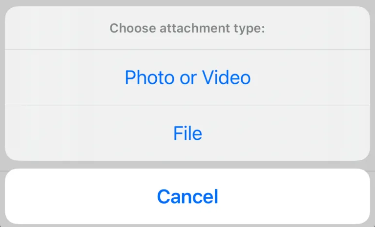
Change the button styling
You can further customize the styling of the button by subclassing the ComposerVC and override the setUpAppearance() lifecycle method. Here is an example of adding a background color and a corner radius to the attachment button:
class CustomComposerVC: ComposerVC {

    override func setUpAppearance() {
        super.setUpAppearance()

        // The subviews of composer belong to the `composerView`
        composerView.attachmentButton.backgroundColor = UIColor.systemGray5
    }

    override func layoutSubviews() {
        super.layoutSubviews()
        composerView.attachmentButton.layer.cornerRadius = 4
    }
}
Then, set the custom component in the Components configuration:
Components.default.messageComposerVC = CustomComposerVC.self| Before | After |
|---|---|
|  |
You can find more information on how the components configuration works here.
How to customize the action sheet of attachments picker
When tapping on the attachments button an action sheet appears for the user to select which attachments picker he wants to open. It is possible to customize the actions of the action sheet by subclassing ComposerVC and overriding the var attachmentsPickerActions: [UIAlertAction] property. For example, let’s add a custom camera action to support adding photos from the native iOS Camera.
Steps:
- We subclass the
ComposerVC. - We create the
cameraPicker. - We override the
attachmentsPickerActions: [UIAlertAction]and extend it with our new camera action. - When the action is triggered we need present the
cameraPicker.
class CustomComposerVC: ComposerVC {

    // Here we create the camera picker lazily so we only create a picker instance once
    lazy var cameraPicker: UIImagePickerController = {
        let picker = UIImagePickerController()
        picker.sourceType = .camera
        // ComposerVC already confirms to `UIImagePickerControllerDelegate`
        // and will handle the result from the picker automatically
        picker.delegate = self
        return picker
    }()

    override var attachmentsPickerActions: [UIAlertAction] {
        let showCameraPickerAction = UIAlertAction(
            title: "Camera",
            style: .default,
            handler: { [weak self] _ in
                self?.showCameraPicker()
            }
        )
        // Here we return the super actions to get
        // the default actions and add our new one
        return super.attachmentsPickerActions + [showCameraPickerAction]
    }

    func showCameraPicker() {
        self.present(cameraPicker, animated: true)
    }
}

// Don't forget to set your custom component
Components.default.messageComposerVC = CustomComposerVC.self| Before | After |
|---|---|
 | 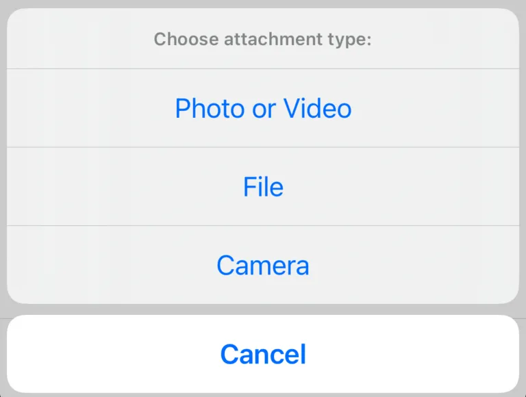 |
With the new action added, now if the user selects the Camera action it will present the native iOS Camera so the user can directly add a photo to the attachments.
How to support a custom attachment
In order for the composer to support your own custom attachments we will go through the full process of creating a custom Contact attachment and adding the necessary changes for the composer to support it. The process consists of the following steps:
- Extend
AttachmentTypeto include the new contact custom type. - Create a new
ContactAttachmentPayloadstruct to define the contact data. - Subclass
ComposerVCand overridevar attachmentsPickerActions: [UIAlertAction]to add a new contact action. - Handling the contact action to append the contact attachment to the composer’s content.
- Implement the contact attachment preview view for the composer to render it.
Adding the contact attachment type
The different attachment types are represented by the AttachmentType and you can add new types by extending it and adding a new static property like this:
extension AttachmentType {
    static let contact = Self(rawValue: "contact")
}
Adding the contact attachment payload
To add custom data to your custom attachment you need to create a ContactAttachmentPayload which implements the AttachmentPayload protocol. This protocol has only one requirement, which is the static let type: AttachmentType property.
struct ContactAttachmentPayload: AttachmentPayload {
    static let type: AttachmentType = .contact

    let name: String
    let phoneNumber: String
}
The AttachmentPayload already conforms to Codable so you only need to add the your custom properties and the data will automatically be added to the message payload.
Adding a new contact action
Now that you have your custom attachment data created, you need to add a new contact action that will open a CNContactPickerViewController so that the user can select contacts from the device.
class CustomComposerVC: ComposerVC {
    // Adding the new contacts picker action
    override var attachmentsPickerActions: [UIAlertAction] {
        let contactsAction = UIAlertAction(
            title: "Contacts",
            style: .default,
            handler: { [weak self] _ in
                self?.showContactPicker()
            }
        )
        return super.attachmentsPickerActions + [contactsAction]
    }

    // Helper to show the contact picker
    func showContactPicker() {
        let contactPicker = CNContactPickerViewController()
        contactPicker.delegate = self
        present(contactPicker, animated: true)
    }
}

// Don't forget to set your custom component
Components.default.messageComposerVC = CustomComposerVC.self
The approach here is quite familiar, we need to subclass the ComposerVC, override the attachmentsPickerActions: [UIAlertAction] property to include our new contact action and in the action handler, present the CNContactPickerViewController. Finally, the composer needs to know about the contacts selected, so we need to set the composer as the delegate of the CNContactPickerViewController, which we will implement in the next step.
Appending the contact attachment to the composer’s Content
Now that the user can select contacts, we need to notify the composer of those contacts. For that we implement the CNContactPickerDelegate.
extension CustomComposerVC: CNContactPickerDelegate {

    func contactPicker(_ picker: CNContactPickerViewController, didSelect contacts: [CNContact]) {
        let contactAttachments = contacts
            .map { contact in
                ContactAttachmentPayload(
                    name: "\(contact.givenName) \(contact.familyName)",
                    phoneNumber: contact.phoneNumbers.first?.value.stringValue ?? ""
                )
            }
            .map(AnyAttachmentPayload.init)

        content.attachments.append(contentsOf: contactAttachments)
    }
}
As you can see we get the contacts as CNContact so we need to transform this data for the composer to understand it. First we map it to ContactAttachmentPayload and then to AnyAttachmentPayload since the composer’s content attachments is of type Content.attachments: [AnyAttachmentPayload] in order to support multiple AttachmentPayload’s.
Implementing the contact attachment preview view
The contact attachments can now be appended to content but the composer doesn’t know yet how to render them. So the next step is to create the view for the contact attachment.
class ContactAttachmentView: _View, AppearanceProvider {
    var content: ContactAttachmentPayload? {
        didSet { updateContentIfNeeded() }
    }

    let contactNameLabel = UILabel()
    let contactPhoneNumberLabel = UILabel()
    let contactStackView = UIStackView()

    override func setUpAppearance() {
        super.setUpAppearance()

        backgroundColor = UIColor.systemGray6
        layer.masksToBounds = true
        layer.borderWidth = 1
        layer.borderColor = appearance.colorPalette.border.cgColor

        contactNameLabel.textColor = appearance.colorPalette.subtitleText
        contactNameLabel.font = appearance.fonts.subheadlineBold

        contactPhoneNumberLabel.textColor = appearance.colorPalette.text
        contactPhoneNumberLabel.font = appearance.fonts.bodyBold

        contactStackView.axis = .vertical
    }

    override func layoutSubviews() {
        super.layoutSubviews()
        layer.cornerRadius = 15
    }

    override func setUpLayout() {
        super.setUpLayout()

        addSubview(contactStackView)
        contactStackView.addArrangedSubview(contactNameLabel)
        contactStackView.addArrangedSubview(contactPhoneNumberLabel)
        contactStackView.translatesAutoresizingMaskIntoConstraints = false

        NSLayoutConstraint.activate([
            heightAnchor.constraint(equalToConstant: 56),
            contactStackView.leadingAnchor.constraint(equalTo: layoutMarginsGuide.leadingAnchor),
            contactStackView.trailingAnchor.constraint(equalTo: layoutMarginsGuide.trailingAnchor),
            contactStackView.topAnchor.constraint(equalTo: layoutMarginsGuide.topAnchor),
            contactStackView.bottomAnchor.constraint(equalTo: layoutMarginsGuide.bottomAnchor)
        ])
    }

    override func updateContent() {
        super.updateContent()

        contactNameLabel.text = content?.name
        contactPhoneNumberLabel.text = content?.phoneNumber
    }
}
The ContactAttachmentView must subclass from _View and implement the required lifecycle functions as described in the Custom Components page. The contact attachment view is a pretty simple one with just a vertical stack displaying the name of the contact at the top, and the number at the bottom. But in order for the composer to use this new attachment view we still need to let the composer know that the ContactAttachmentPayload is rendered by ContactAttachmentView. To do that we need to make ContactAttachmentPayload conform to AttachmentPreviewProvider protocol:
extension ContactAttachmentPayload: AttachmentPreviewProvider {
    static let preferredAxis: NSLayoutConstraint.Axis = .vertical

    func previewView(components: Components) -> UIView {
        let preview = ContactAttachmentView()
        preview.content = self
        return preview
    }
}
Both the function and the static property implementations are required to conform to AttachmentPreviewProvider. The preferredAxis is how the custom attachments should be displayed together, in a horizontal stack, or vertical stack. Finally, we need to return the previewView() for the contact attachment payload, so we return ContactAttachmentView and set the content of the view to self, which is of course the ContactAttachmentPayload.
Result:
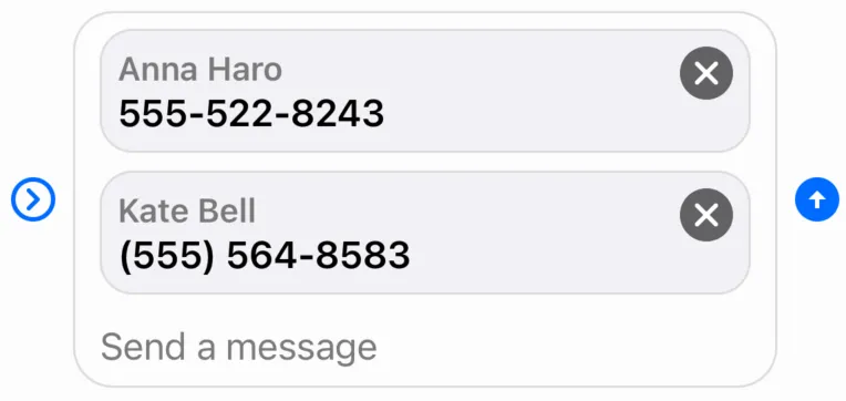
The close button is automatically added by the AttachmentPreviewContainer component that can also be customized.
Advanced customization of the attachments picker
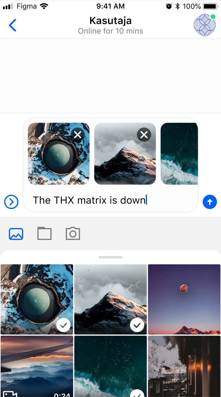
You can totally customize the flow of how the attachments picker is presented. Not only you can replace any default picker with your custom one, but you can also bypass the action sheet and present the attachments picker directly in a different view.
Replace the default media picker
To replace the default UIImagePickerController with your own custom UIViewController you just need to override the var mediaPickerVC: UIViewController property and replace with your own, and make sure your custom view controller sends events to the composer. When the composer receives the selected attachments from your custom media picker, you need to update the attachments of the composer’s content which is represented by the ComposerVC.Content.
class CustomComposerVC: ComposerVC {
  override var mediaPickerVC: UIViewController {
        let customMediaPicker = MyCustomMediaPickerController()
        customMediaPicker.delegate = self
        return customMediaPicker
    }
}

extension CustomComposerVC: MyCustomMediaPickerControllerDelegate {
    func picker(_ picker: MyCustomMediaPickerController, didSelectImages imageURLs: [URL]) {
      imageURLs.forEach { imageURL in
        let attachment = try! AnyAttachmentPayload(localFileURL: imageURL, attachmentType: .image)
        content.attachments.append(attachment)
      }

      picker.dismiss(animated: true, completion: nil)
    }
}

// Don't forget to set your custom component
Components.default.messageComposerVC = CustomComposerVC.self
With this in place, you will be able to use your custom media picker controller when tapping on the media picker action.
Note
Creating MyCustomMediaPickerController and MyCustomMediaPickerControllerDelegate is out of scope of this guide. These components are just an example on how you can provide your own custom media picker controller.
Show the media picker in a different view
In case you want to bypass the action sheet when tapping the attachments button, you can, by overriding the showAttachmentsPicker(sender: UIButton) and do an implementation from scratch on how you want to present the attachments picker. For example, let’s see how you could show the attachments picker as a view replacing the keyboard by using the inputView of the composer’s textField:
class CustomComposerVC: ComposerVC {

    override func showAttachmentsPicker(sender: UIButton) {
        // If the custom input view is currently showing
        // hide it when tapping the attachments button.
        if composerView.inputMessageView.textView.inputView != nil {
            hideCustomInputView()
            return
        }

        // Otherwise, show the custom input view.
        showCustomInputView()
    }

    // Helper to show the custom media picker view as an inputView
    func showCustomInputView() {
        let view = MyCustomMediaPickerView()

        UIView.animate(withDuration: 0.2) {
            self.composerView.inputMessageView.textView.inputView = view
            self.composerView.inputMessageView.textView.reloadInputViews()
        }
    }

    // Helper to hide the custom media picker view and show the Keyboard again
    func hideCustomInputView() {
        UIView.animate(withDuration: 0.2) {
            self.composerView.inputMessageView.textView.inputView = nil
            self.composerView.inputMessageView.textView.reloadInputViews()
        }
    }
}

// Don't forget to set your custom component
Components.default.messageComposerVC = CustomComposerVC.self
Note
Creating MyCustomMediaPickerView is out of scope of this guide. This is just an example on how you can provide your own custom flow and present the attachments picker in a different view.
With this kind of customization you can show your custom attachments picker view below the composer like this example design:
On this page: