 React
React iOS
iOS Android
 Flutter
 Angular
 JavaScript
 Unity
Unity Unreal
 Node
Node Python
 Ruby
Ruby PHP
PHP Java
Java .NET
.NET Go
Go REST
RESTlet reactionFireSmall: UIImage = UIImage(named: "fireSmall")!
let reactionFireBig: UIImage = UIImage(named: "fireBig")!
let reactionWaveSmall: UIImage = UIImage(named: "waveSmall")!
let reactionWaveBig: UIImage = UIImage(named: "waveBig")!
let customReactions: [MessageReactionType: ChatMessageReactionAppearanceType] = [
"fire": ChatMessageReactionAppearance(
smallIcon: reactionFireSmall,
largeIcon: reactionFireBig
),
"wave": ChatMessageReactionAppearance(
smallIcon: reactionWaveSmall,
largeIcon: reactionWaveBig
)
]
Appearance.default.images.defaultReactions = customReactionsMessage Reactions
The Stream Chat API provides built-in support for adding reactions to messages. The UI SDK provides components for displaying and adding reactions to a message.
Basic Usage
Message reactions come out of the box with Stream Chat. The SDK will respect your channel configuration, if you disable reactions for a channel or channel type from the dashboard, the SDK will not render the UI for reactions.
Custom Reactions and Images
All the available reactions are extendible or totally replaceable with custom ones. You can change the list of supported message reactions via the Appearance object. Here is an example of how you can use your own set of reactions:
Custom Reactions Sorting
By default, the reactions are sorted alphabetically. You can change the order of the reactions by providing a custom reactionsSorting function in the Components configuration.
Here is an example of how you can sort the reactions by their score:
Components.default.reactionsSorting = { $0.score < $1.score }You can also provide a custom static order based on the MessageReactionType:
extension MessageReactionType {
    var position: Int {
        switch rawValue {
        case "love": return 0
        case "haha": return 1
        case "like": return 2
        case "sad": return 3
        case "wow": return 4
        default: return 5
        }
    }
}

Components.default.reactionsSorting = { $0.type.position < $1.type.position }
You can also use additional reaction information for sorting, available in the ChatMessageReactionData provided in the sorting closure:
count- The number of reactions.score- The score value of the reaction. By default it is the same value ascount.firstReactionAt- The date of the first reaction from this type of reaction.lastReactionAt- The date of the last reaction from this type of reaction.
For example, you can sort by the date of the first reaction, with the following code:
static func byFirstReactionAt(_ lhs: ChatMessageReactionData, _ rhs: ChatMessageReactionData) -> Bool {
    guard let lhsFirstReactionAt = lhs.firstReactionAt, let rhsFirstReactionAt = rhs.firstReactionAt else {
        return false
    }

    return lhsFirstReactionAt < rhsFirstReactionAt
}
Querying reactions
You can query reactions by their type or the author id, to provide an experience similar to Slack (for example, show all users who reacted with "like").
To do this, you need to create a ChatReactionListController:
let reactionListController = client.reactionListController(
    query: .init(
        messageId: message.id,
        filter: .equal(.reactionType, to: reactionType)
    )
)
The reactions are available via the property reactionListController.reactions. You can listen to updates by implementing the delegate method controller(_ controller:, didChangeReactions:)
func controller(_ controller: ChatReactionListController, didChangeReactions changes: [ListChange<ChatMessageReaction>]) {
    reactions = controller.reactions
}
In order to load more reactions while paginating, you should call the method loadMoreReactions:
reactionListController.loadMoreReactions { [weak self] _ in
    // handle reactions.
}
Message Reactions
By default, the message reactions are displayed inline as a bubble view on top of the messages.
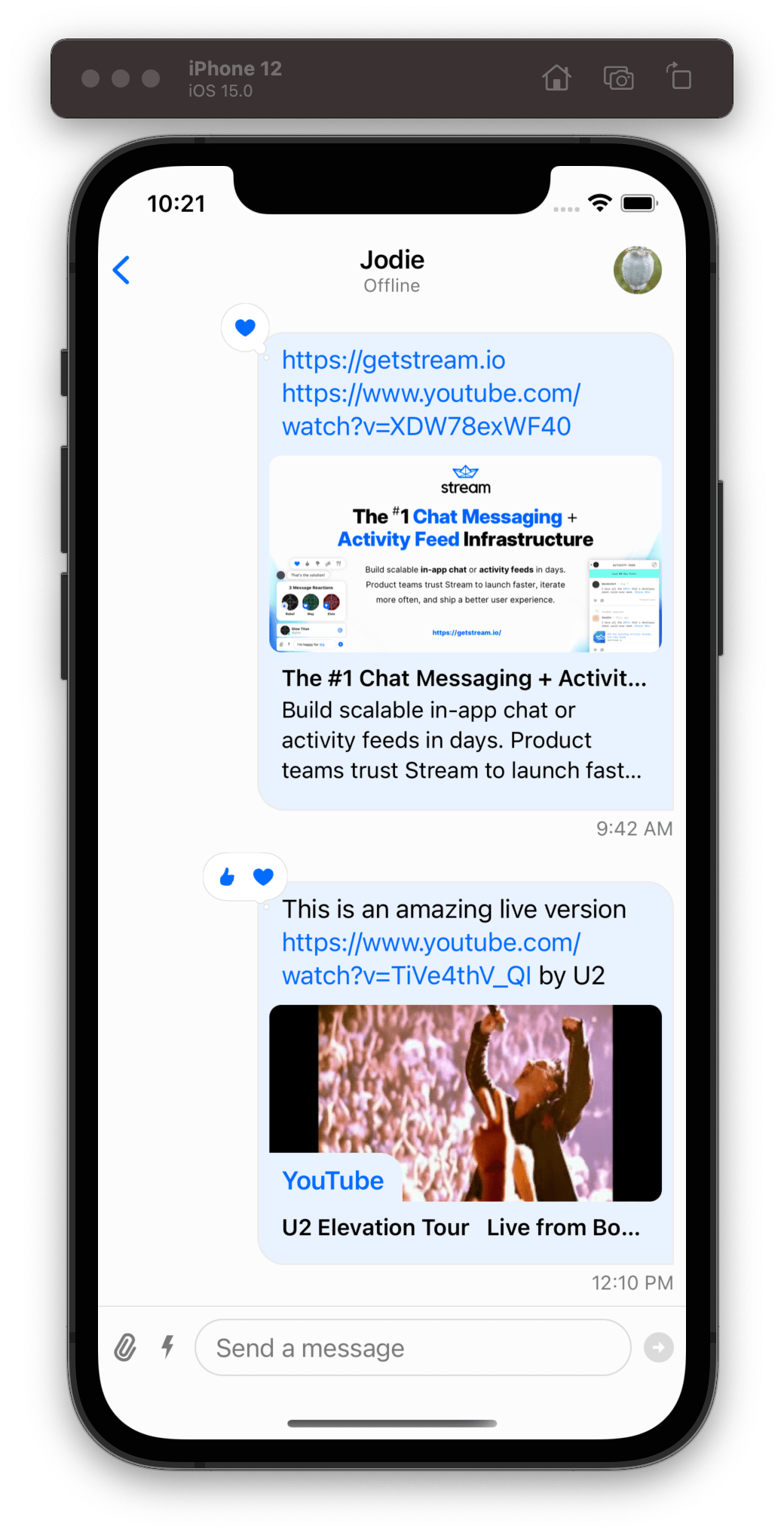
The message reaction view is composed of a container bubble view that holds a stack of reaction item views. Here is the hierarchy of the message reaction view:

ChatReactionsBubbleView
The reactions bubble view is a container that is responsible not only to hold the stack of the reactions but also for the bubble styling.
By subclassing the ChatReactionsBubbleView, you can customize the styling of the bubble view. In this example, we change the bubble fill color to black:
class CustomChatReactionsBubbleView: ChatReactionsBubbleView {
    override var fillColor: UIColor? {
        UIColor.black
    }
}

Components.default.messageReactionsBubbleView = CustomChatReactionsBubbleView.self
ChatMessageReactionsView
This component is responsible for rendering the list of reactions. By default, the reactions are rendered in a horizontal stack.
In this example we customize the ChatMessageReactionsView so that the reactions are rendered in a vertical stack instead:
class CustomChatMessageReactionsView: ChatMessageReactionsView {

    override func setUpLayout() {
        super.setUpLayout()

        stackView.axis = .vertical
    }
}

Components.default.messageReactionsView = CustomChatMessageReactionsView.self
ChatMessageReactionItemView
This component is responsible to display a single reaction. By default, if the reaction is from the logged-in user, the reaction image color is blue, if not, the color is gray. Let's do a simple customization and set the color to white instead of blue when the reaction is from the logged-in user:
class CustomChatMessageReactionItemView: ChatMessageReactionItemView {

    override var reactionImageTint: UIColor? {
        guard let content = content else { return nil }
        let isChosenByCurrentUser = content.reaction.isChosenByCurrentUser
        return isChosenByCurrentUser ? .white : .gray
    }
}

Components.default.messageReactionItemView = CustomChatMessageReactionItemView.self
If we do all the customizations described above to the message reactions view, this will be the end result:
| Default Message Reactions | Custom Message Reactions |
|---|---|
| 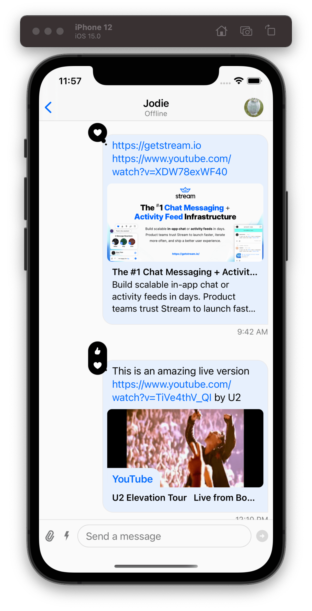 |
Reactions Picker
In order to add a new reaction to a message you need to long-press a message or tap the message reactions bubble view, and the SDK will show a popup view with a reactions picker at the top. The reactions picker which is represented by the ChatMessageReactionsPickerVC is basically a bigger message reaction view that accepts user input allowing the user to select a reaction.
When the user long-presses the message, the popup view will display the reactions picker at the top, the message content at the centre, and the message actions at the bottom. On the other hand, if the user taps the reactions bubble view, instead of having the message actions at the bottom, it will show a view with all the reactions that belong to the message.
| Long-pressing a message | Tapping reaction bubble view |
|---|---|
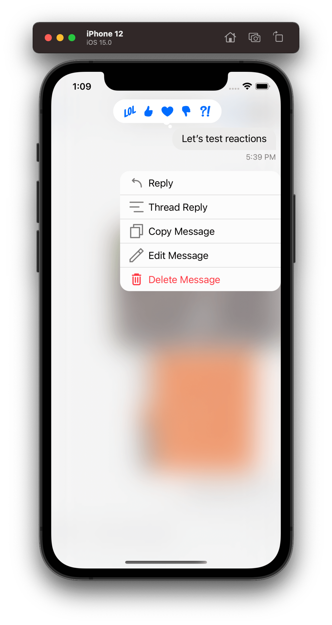 | 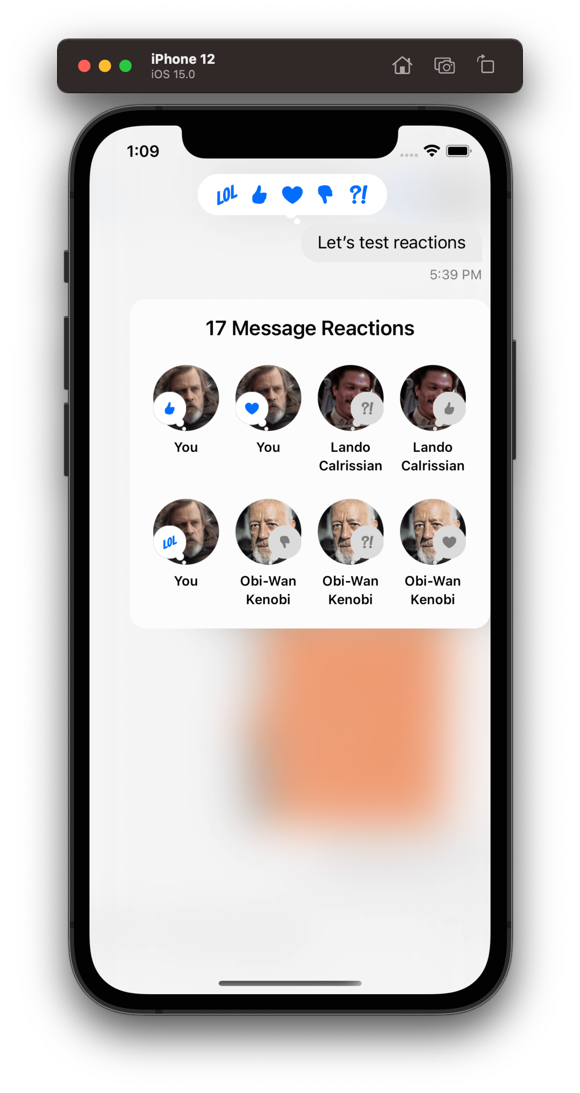 |
The reaction picker view has a similar structure to the message reaction view. Here is the hierarchy of the reaction picker view:

ChatReactionPickerBubbleView
Much like the message reaction view, the picker view also has a container bubble view that is responsible to hold the stack of reactions and the styling of the bubble. By default the UI SDK uses the DefaultChatReactionPickerBubbleView which is a subclass of the base ChatReactionPickerBubbleView. If you want to do more advanced customization you can subclass directly the ChatReactionPickerBubbleView, but for the most common customizations, subclassing DefaultChatReactionPickerBubbleView should be fine.
Let's show an example of customizing the DefaultChatReactionPickerBubbleView component:
class CustomChatReactionPickerBubbleView: DefaultChatReactionPickerBubbleView {

    override open var contentBackgroundColor: UIColor {
        .black
    }

    override open var contentBorderColor: UIColor {
        .black
    }

    override open var tailBackImage: UIImage? {
        super.tailBackImage?.withTintColor(.black)
    }

    override open var tailFrontImage: UIImage? {
        super.tailFrontImage?.withTintColor(.black)
    }

    override open func layoutSubviews() {
        super.layoutSubviews()

        contentViewBackground.layer.cornerRadius = 20
    }
}

Components.default.reactionPickerBubbleView = CustomChatReactionPickerBubbleView.self
In the example above we changed the color of the bubble to black. For this, we had not only to change the background to black but also the border color and the tail images. We also changed the corner radius of the bubble since in the next step we will make the bubble vertical instead of horizontal.
ChatReactionPickerReactionsView
This component is responsible to render the list of reactions. By default, the reactions are rendered in a horizontal stack, exactly like the message reaction view.
Let's do the same change we did with the message reaction view, and change the stack to be vertical aligned:
class CustomChatReactionPickerReactionsView: ChatReactionPickerReactionsView {

    override func setUpLayout() {
        super.setUpLayout()

        stackView.axis = .vertical
    }
}

Components.default.reactionPickerReactionsView = ChatReactionPickerReactionsView.self
ChatMessageReactionItemView
The component responsible to display a single reaction is actually the same as the one used by the message reaction view. Let's reuse the same customization we did the message reaction view and apply it to the reaction picker too:
class CustomChatMessageReactionItemView: ChatMessageReactionItemView {

    override var reactionImageTint: UIColor? {
        guard let content = content else { return nil }
        let isChosenByCurrentUser = content.reaction.isChosenByCurrentUser
        return isChosenByCurrentUser ? .white : .gray
    }
}

Components.default.reactionPickerReactionItemView = CustomChatMessageReactionItemView.self
Here is the result for all the customizations done to the reaction picker view:
| Default Picker | Custom Picker |
|---|---|
| 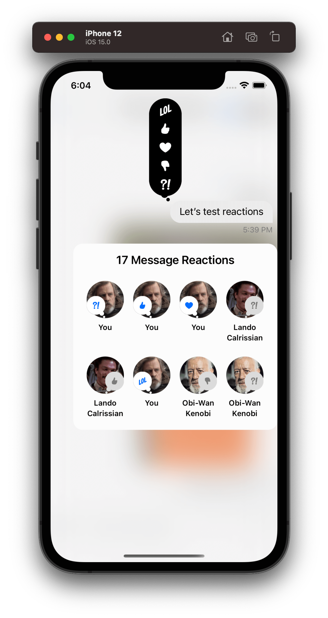 |
Reaction Authors
The ChatMessageReactionAuthorsVC is responsible to displays all the reactions of the message and its author. It is the view that is presented at the bottom when the user taps the reactions bubble view.
ChatMessageReactionAuthorsVC
By default the ChatMessageReactionAuthorsVC render the reactions in a collection view and each cell is represented by the ChatMessageReactionAuthorViewCell component.
Let's change the background color of the reaction authors view and change the cell size by subclassing the ChatMessageReactionAuthorsVC component:
class CustomChatMessageReactionAuthorsVC: ChatMessageReactionAuthorsVC {

    override var reactionAuthorCellSize: CGSize {
        CGSize(width: 64, height: 70)
    }

    override func setUpAppearance() {
        super.setUpAppearance()

        topLabel.textColor = UIColor.white
        view.backgroundColor = .black
    }
}

Components.default.reactionAuthorsVC = CustomChatMessageReactionAuthorsVC.self
ChatMessageReactionAuthorViewCell
In order to customize each cell of the reaction authors view, we need to subclass the ChatMessageReactionAuthorViewCell component.
class CustomChatMessageReactionAuthorViewCell: ChatMessageReactionAuthorViewCell {

    override func setUpLayout() {
        super.setUpLayout()

        containerStack.removeArrangedSubview(authorNameLabel)
    }
}

Components.default.reactionAuthorCell = CustomChatMessageReactionAuthorViewCell.self
If we apply these customizations above on the reaction authors view component, we will see the following result:
| Default Reaction Authors | Custom Reaction Authors |
|---|---|
| 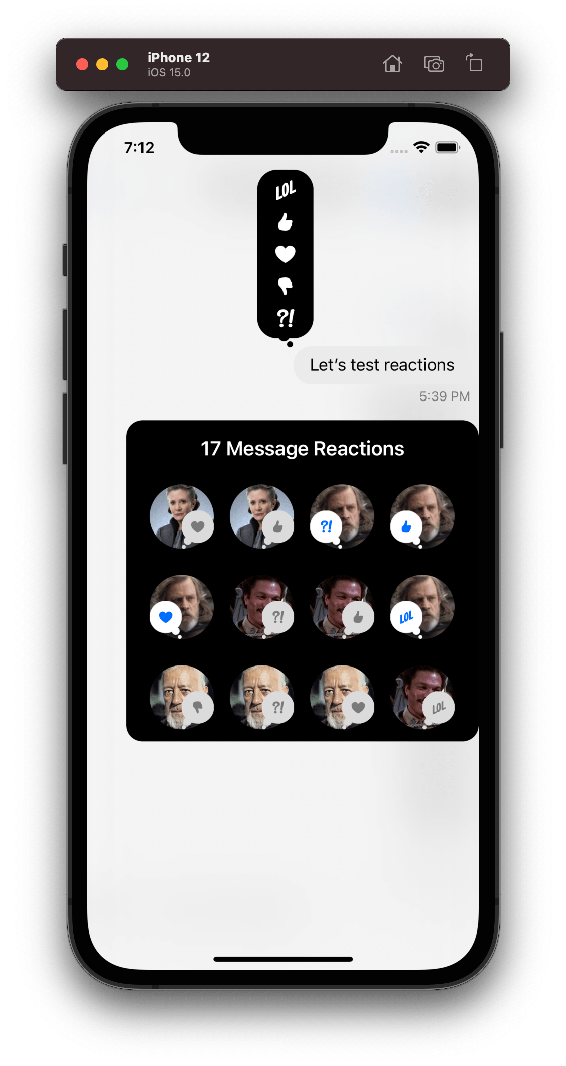 |
On this page: