

This article demonstrates how to perform basic customizations such as swapping colors, fonts, and icons with assets, color, and typographic styles from your style guide. You can create a free chat trial account to follow along with the tutorial.
Resources
You can find and download the completed Xcode project on GitHub. This tutorial is for a UIKit (Storyboard) app. You can read the SwiftUI version or the advanced SwiftUI theming tutorial. You can also refer to the video SwiftUI tutorial Theming and Customizing Your Stream Chat SwiftUI App on YouTube.
Basic Theming Overview

The Stream Chat iOS SDK allows basic customization through the Appearance object. It is an object that contains the visual settings of the messaging application. Using the Appearance object, you can change the inherent colors, symbols (icons), and font styles the SDK offers. To do advanced customization, the SDK provides the possibility to use views injection. Making complex customizations like adding a custom attachment and swapping views go beyond the scope of this tutorial.
You can modify the icons and font styles the SDK presents in the chat app through the Appearance object directly as follows:
1Appearance.default.images.sendArrow = UIImage(systemName: "paperplane.circle.fill")!
1Appearance.default.fonts.body = UIFont(name: "Freehand-Regular", size: 24)!
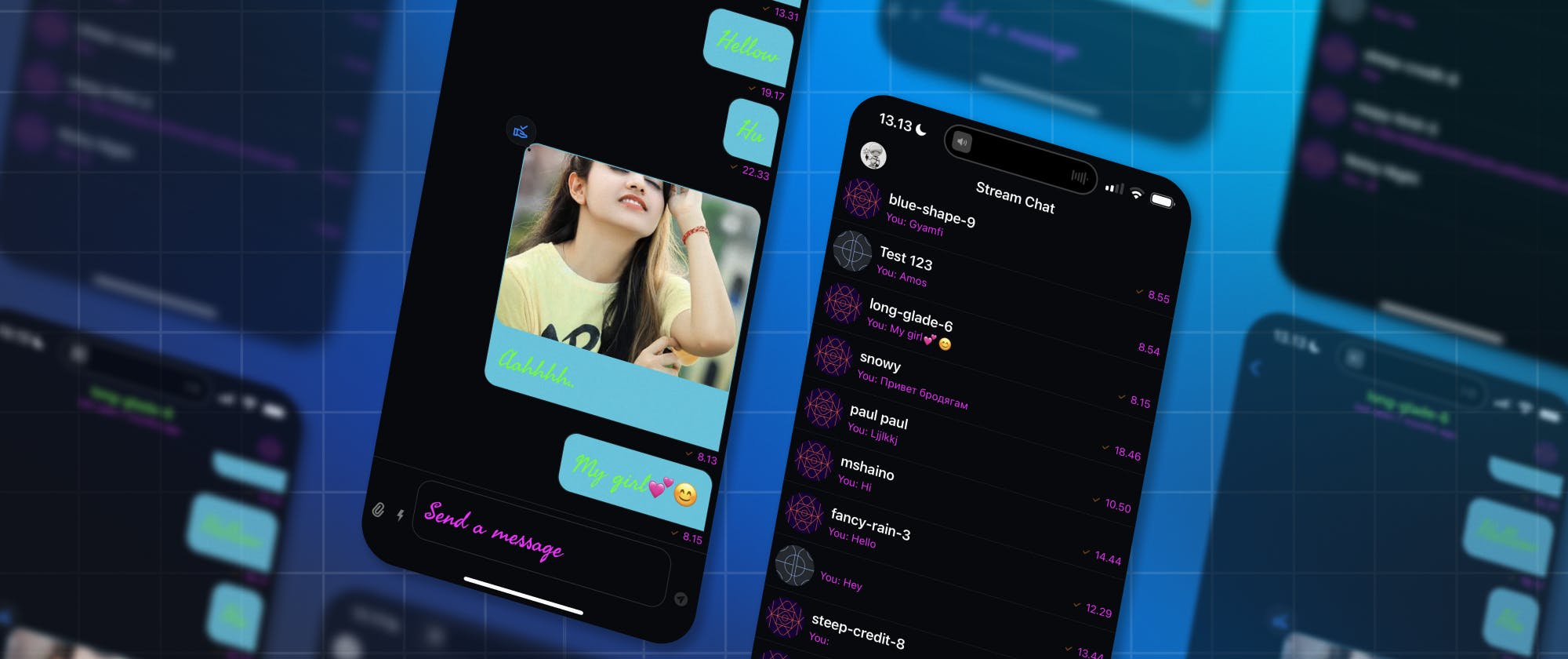
The code snippets above override the send button in the compose area and the body font, as demonstrated in the image below.

The Appearance class has another object called ColorPalette() that gives access to the set of colors the SDK supports. You can use the Appearance and color palette objects to alter the background of the channel list and the conversations area with the code snippet below.
1Appearance.default.colorPalette.background = .systemGray6.
Start With a Blank iOS/Storyboard Project
Create a new iOS project in Xcode. Select Storyboard as the Interface, Swift as the Language, and name the project. This sample app is called ChatTailor.swift, but you can use any name you prefer and save the project somewhere on your computer.
Fetch the Stream iOS SDK From GitHub and Set It Up
After creating a blank iOS/Storyboard project you should fetch the iOS SDK from GitHub and configure it. This tutorial doesn't cover the configuration of the SDK to work with the Xcode project. To learn more about how to get the SDK up and running with the Storyboard project, check the article Building An iOS Chat App With Swift.
Changing the Tint Color Without Using the Appearance Object
The SDK allows you to replace the system-defined colors for navigation cues/icons and button items without using the Appearance object. The color used for defining these items is called tint color.
When you modify the tint color, it will affect the following interface elements:
- Icons
- Back navigation icon
- Instant Commands icon
- Applied reaction icons
- The blinking cursor for the compose area
- The floating scroll-to-bottom icon at the bottom-right of the conversations area.
- Text
- Thread Reply
- Context menus
- Links in sent messages
- Buttons
- Right arrow button for displaying instant commands and attachment icons
You can override the system-defined tint color using the scene method in the Swift file SceneDelegate.swift. The scene method has a parameter called _ scene. You should use a guard statement to check whether the _ scene parameter passed is of the type UIWindowScene. Otherwise, it should go ahead without doing anything. Then, use a ForEach loop to set the tint color you prefer.
12345// MARK:Override the system-defined tint color
        guard let scene = scene as? UIWindowScene else { return }
        scene.windows.forEach { brandColor in
            brandColor.tintColor = .systemPink
        }
The sample code below shows the complete implementation of how to override the tint color in SceneDelegate.swift
12345678910111213141516171819202122232425262728293031323334353637383940414243444546474849505152//  SceneDelegate.swift
//  ChatTailor

import UIKit
import StreamChat
import StreamChatUI

class SceneDelegate: UIResponder, UIWindowSceneDelegate {

    var window: UIWindow?

    func scene(
        _ scene: UIScene,
        willConnectTo session: UISceneSession,
        options connectionOptions: UIScene.ConnectionOptions
    ) {
        let config = ChatClientConfig(apiKey: .init("dz5f4d5kzrue"))

        // MARK:Override the system-defined tint color
        guard let scene = scene as? UIWindowScene else { return }
        scene.windows.forEach { brandColor in
            brandColor.tintColor = .systemPink
        }

        /// user id and token for the user
        let userId = "tutorial-droid"
        let token: Token =
        "eyJhbGciOiJIUzI1NiIsInR5cCI6IkpXVCJ9.eyJ1c2VyX2lkIjoidHV0b3JpYWwtZHJvaWQifQ.NhEr0hP9W9nwqV7ZkdShxvi02C5PR7SJE7Cs4y7kyqg"

        /// Step 1: create an instance of ChatClient and share it using the
            singleton
        ChatClient.shared = ChatClient(config: config)

        /// Step 2: connect to chat
        ChatClient.shared.connectUser(
            userInfo: UserInfo(
                id: userId,
                name: "Tutorial Droid",
                imageURL: URL(string: "https://bit.ly/2TIt8NR")
            ),
            token: token
        )

        /// Step 3: create the ChannelList view controller
        let channelList = DemoChannelList()
        let query = ChannelListQuery(filter: .containMembers(userIds: [userId]))
        channelList.controller = ChatClient.shared.channelListController(query: query)

        /// Step 4: similar to embedding with a navigation controller using Storyboard
        window?.rootViewController = UINavigationController(rootViewController: channelList)
    }
}
The image below demonstrates the before and after versions of the interface elements affected by changing the tint color.

Modifying Default Colors With Your Brand's Colors
Using the Appearance and ColorPalette() objects, you can tweak the colors of elements in the chat app. In this section, you will customize the color values of the following views.
- Background color
- Message bubbles
- Attachments
- Text Color
- Navigation title
- Channel list items summary
- Incoming and outgoing messages
- Context menu
- Timestamps
- Date
- Giphy logo text
- Placeholder text for the compose area
- Instant Commands label
- Previous online status (last seen)
- Read indicator (double checkmark)
- Sent indicator (single checkmark)
- System-wide messages (information about deleted messages)
You can begin by adding a new file, CustomizeChannelVC.swift containing a view controller class. This custom channel view controller must conform to the SDK's chat channel view controller, ChatChannelVC.
123456789//  CustomizeChannelVC.swift
//  ChatTailor

import StreamChat
import StreamChatUI
import UIKit

// This class must conform to the iOS SDK's chat channel view controller
class CustomizeChannelVC: ChatChannelVC {}
Next, open SceneDelegate.swift and add the function applyChatCustomizations() { } below the StreamChat and StreamChatUI imports. The closure of this method should contain all the basic customizations. Additionally, you should set the default channel view controller for the app to the custom view controller class in the closure of the apply chat customizations method.
123456789import UIKit
import StreamChat
import StreamChatUI

// Perform all basic customizations in this function
func applyChatCustomizations() {
  // Setting the default channel view controller to the custom view controller class
 Components.default.channelVC = CustomizeChannelVC.self
 }
Customizing Background Colors
In the closure of the apply chat customizations function, add:
Appearance.default.colorPalette.background6 = .systemTealto modify the outgoing chat bubbles background color to system teal.Appearance.default.colorPalette.background1 = .systemTealto change the background color of outgoing chat bubbles to system teal.Appearance.default.colorPalette.background8 = .systemCyanto change the backgrounds of incoming message bubbles and the scroll-to-bottom icon to system cyan.Appearance.default.colorPalette.background = .systemCyanto set the background colors of the channel list, conversations area, and context menus to a cyan color.

Refer to the image below to see the before and after background colors.
Customize Text Color and the Color of UI Elements
Below the customizations of the background in the closure of the apply chat customizations function, add:
Appearance.default.colorPalette.text = .greento modify the text color of the navigation title, outgoing chat bubbles, incoming chat bubbles, context menus, compose area, Giphy, and reveal button for swipe-to-delete action to green.Appearance.default.colorPalette.staticColorText = .systemCyanto change the text color for the Giphy logo text, and date (when a message was sent).Appearance.default.colorPalette.subtitleText = .magentato override the text colors of the channel list message summary, timestamps, placeholder for the compose area, Instant Commands label, Giphy label, and previous online status (last seen).Appearance.default.colorPalette.textLowEmphasis = .orangeto swap the color of the sent indicator (single checkmark) for the channel list, system-wide messages (deleted message), and conversations area.Appearance.default.colorPalette.accentPrimary = .linkto set the text color of the read indicator to a link (blue) color.
You can see all the changes in this section in the before and after screenshots above.
How To Customize Fonts
The iOS SDK supports all of Apple's Dynamic Type Sizes listed in the table below.
| Style | Weight | Size (points) | Leading (points) |
|---|---|---|---|
| Large Title | Regular | 34 | 41 |
| Title 1 | Regular | 28 | 34 |
| Title 2 | Regular | 22 | 28 |
| Title 3 | Regular | 20 | 25 |
| Headline | Semibold | 17 | 22 |
| Body | Regular | 17 | 22 |
| Callout | Regular | 16 | 21 |
| Subhead | Regular | 15 | 20 |
| Footnote | Regular | 13 | 18 |
| Caption 1 | Regular | 12 | 16 |
| Caption 2 | Regular | 11 | 13 |
These built-in text styles provide great legibility and scale seamlessly on different devices. You should use the Appearance object to modify these standard text styles. For example, to change the body font size and type, add Appearance.default.fonts.body = UIFont(name: "Helvetica Neue", size: 32)! below the text color customizations in the apply chat customizations function. The code snippet sets the font of the body text to Helvetica Neue with a size of 32 points using the UIFont class. The ! symbol at the end of the statement is used to force-unwrap the optional value returned by the UIFont(name: , size: ) initializer. Increasing the body font size affects the text on the text field and message bubbles.

Add a Custom Font
The SDK allows you to use a custom font instead of the default text styles. This example uses a custom Google Font called Freehand. Find the custom font you like and drag it to the app bundle. Select the following option in the image below in the window that pops up and click Finish.

Register the Custom Font in info.plist
To Implement the custom font in the application, you should register it in the app's info.plist file.
- Click the app's folder in the Project Navigator. The folder for this sample project is ChatTailor.
- Select the info tab and click the + icon below the keys to add a new key.
- Choose Fonts provided by application
- Set the Item 0's Type as String and enter the font name. This project has the font name Freehand-Regular.ttf.

In SceneDelegate.swift, add Appearance.default.fonts.body = UIFont(name: "Freehand-Regular", size: 24)! in the closure of applyChatCustomizations(), similar to the previous customizations. The code snippet above will display the Freehand custom font as shown in the screenshot below.

Swapping the SDK-Provided Icons With SF Symbols and Google Material Symbols
The SDK provides several symbols and images you can replace with the icons you prefer. Find the names of symbols you want to swap through the Appearance and Images objects. Then, add a period (.) at the end of the code snippet Appearance.default.images. to display a list of symbols to replace in the app. It shows in the image below.

This section demonstrates how to replace the following icons with SF Symbols and Google Material Symbols.
- Send icon on the right side of the compose area (text field)
- Small and large reactions icons
You can follow the steps in this section to swap other icons in the SDK. As demonstrated previously, do all the image/icon overrides in the closure of theapplyChatCustomizations()method in SceneDelegate.swift. Below the previous colors and fonts customization statements, Add: Appearance.default.images.sendArrow = UIImage(systemName: "paperplane.circle.fill")!to replace the send icon in the text field.

Appearance.default.images.reactionLoveBig = UIImage(systemName: "bolt.heart.fill")!to replace the large heart icon in the reactions menu.Appearance.default.images.reactionLoveSmall = UIImage(systemName: "bolt.heart.fill")!to change the small overlayed heart icon appearing after tapping the large heart icon in the reactions menu. The code snippet replaces the default heart icon with a bolt heart icon from the SF Symbols library.
Apart from using SF Symbols to replace the SDK-provided icons, you can swap them with Google Material icons. The example below shows how to change the Wut reaction icon to an approval delegation icon from the Google Material icons library.
Appearance.default.images.reactionWutBig = (UIImage(named:"approval_delegation"))!
Appearance.default.images.reactionWutSmall = (UIImage(named:"approval_delegation"))!
The code snippets above replace the large and small versions of the Wut icon.

Putting All the Basic Customizations Together
The sample code below shows how to do all the basic customizations, changing colors, fonts, and icons in SceneDelegate.swift using the function applyChatCustomizations(). You can download the finished project on GitHub.
123456789101112131415161718192021222324252627282930313233343536373839404142434445464748495051525354555657585960616263646566676869707172737475767778798081828384858687888990919293949596979899100101102103104105106107108//  SceneDelegate.swift
//  ChatTailor

import UIKit
import StreamChat
import StreamChatUI

// Perform all basic customizations in this function
func applyChatCustomizations() {

    // MARK: Customize Background Color

    // Change the outgoing chat message bubble to a teal color
    Appearance.default.colorPalette.background6 = .systemTeal

    // Change the background of attachments for outgoing chat message bubbles. Outgoing chat bubbles with attachments
    Appearance.default.colorPalette.background1 = .systemTeal

    // Change the background color of the incoming chat message bubble and jump-to-botom or scroll-to-bottom button
    Appearance.default.colorPalette.background8 = .systemCyan
    // Change the background of: Channel list, compose area, conversations area, context menu
    Appearance.default.colorPalette.background = .systemGray6

    // MARK: Customize Text Color and the Color of UI Elements

    // Change the text for navigation title, outgoing chat bubble, incoming chat bubble, context menu, compose area, Giphy, reveal button for swipe-to-delete action
    Appearance.default.colorPalette.text = .green

    // Change the text color for the Giphy logo text, date. When a message was sent
    Appearance.default.colorPalette.staticColorText = .systemCyan

    // Change the text color of the channel list message summary, timestamps, placeholder for the compose area, Instant Commands label, Giphy label, and previous online status (last seen)
    Appearance.default.colorPalette.subtitleText = .magenta

    // Change the text color of the sent indicator (single checkmark) for the channel list, system-wide messages (deleted message) and conversations area
    Appearance.default.colorPalette.textLowEmphasis = .orange

    // Change the text color of the read indicator
    Appearance.default.colorPalette.accentPrimary = .link

    // MARK: Customizing Fonts

    // Modify the body font: Compose area text, incoming and outgoing messages, context menu
    //Appearance.default.fonts.body = UIFont(name: "Helvetica Neue", size: 32)!
    Appearance.default.fonts.body = UIFont(name: "Freehand-Regular", size: 24)!

    // MARK: Customizing the SDK-provided SF Symbols

    // Swap the send icon
    Appearance.default.images.sendArrow = UIImage(systemName: "paperplane.circle.fill")!

    // Swap reaction icons with SF Symbols
    Appearance.default.images.reactionLoveBig = UIImage(systemName: "bolt.heart.fill")!
    Appearance.default.images.reactionLoveSmall = UIImage(systemName: "bolt.heart.fill")!

    // Replace reaction icons with Google Material Symbols
    Appearance.default.images.reactionWutBig = (UIImage(named:"approval_delegation"))!
    Appearance.default.images.reactionWutSmall = (UIImage(named:"approval_delegation"))!

    Components.default.channelVC = CustomizeChannelVC.self
}

class SceneDelegate: UIResponder, UIWindowSceneDelegate {

    var window: UIWindow?

    func scene(
        _ scene: UIScene,
        willConnectTo session: UISceneSession,
        options connectionOptions: UIScene.ConnectionOptions
    ) {
        let config = ChatClientConfig(apiKey: .init("dz5f4d5kzrue"))

        // MARK:Override the system-defined tint color
        guard let scene = scene as? UIWindowScene else { return }
        scene.windows.forEach { brandColor in
            brandColor.tintColor = .systemPink
        }

        /// user id and token for the user
        let userId = "tutorial-droid"
        let token: Token =
        "eyJhbGciOiJIUzI1NiIsInR5cCI6IkpXVCJ9.eyJ1c2VyX2lkIjoidHV0b3JpYWwtZHJvaWQifQ.NhEr0hP9W9nwqV7ZkdShxvi02C5PR7SJE7Cs4y7kyqg"

        /// Step 1: create an instance of ChatClient and share it using the singleton
        //ChatClient.shared = ChatClient(config: config)
        applyChatCustomizations()
        ChatClient.shared = ChatClient(config: config)

        /// Step 2: connect to chat
        ChatClient.shared.connectUser(
            userInfo: UserInfo(
                id: userId,
                name: "Tutorial Droid",
                imageURL: URL(string: "https://bit.ly/2TIt8NR")
            ),
            token: token
        )

        /// Step 3: create the ChannelList view controller
        let channelList = DemoChannelList()
        let query = ChannelListQuery(filter: .containMembers(userIds: [userId]))
        channelList.controller = ChatClient.shared.channelListController(query: query)

        /// Step 4: similar to embedding with a navigation controller using Storyboard
        window?.rootViewController = UINavigationController(rootViewController: channelList)
    }
}
Conclusion
To wrap up, customizing your Stream Chat iOS app is an excellent way to give your messaging app a unique look and feel. The guide in this tutorial gave you a starting point, including a wealth of information on overriding the SDK-provided colors, fonts, and icons with your design assets and brand styles. With the insights provided in this tutorial, you should be well on your way to creating a truly personalized and distinct Stream Chat iOS app experience.
What Do I Do Next?
After reading this article, here are your next steps:
If you plan to do complex customization, check out the theming section of the documentation and the related advanced SwiftUI theming tutorial.
Download the finished project from GitHub and review all the procedures used for the modifications.
If you do not have a Stream account yet, consider signing up for a free trial.