

Stream's SwiftUI SDK gives developers a modern way to build beautiful iOS chat messaging apps with stateful components.
This tutorial guides you to perform significant customizations for the channel list of Stream Chat SwiftUI apps using views injection.
You will discover how to swap Stream's UI components with your bespoke layout and composition. In particular, you will customize the channel list by cloning the look and feel of popular messaging apps and implementing them into the channel list screen.
For example, the navigation bar will look like that of the WhatsApp iOS app. The top bar will mimic that of Facebook Messenger. You will add a tab bar and compose button clones of WhatsApp and Twitter Chat to the footer section of the screen. In addition, the footer will have a non-sticky button that will disappear on a scroll like LinkedIn chat.
Keep reading to unlock nearly all the customization options of the channel list!
Getting Started
This tutorial requires a blank SwiftUI project with the integration of the Stream SDK. However, it will not cover how to set up the SDK. If you are new to Stream and need help setting up the project, check out the quick start guide tutorial. You can watch the video version of this tutorial from the Stream Developers YouTube Channel.
To begin, create a SwiftUI app with the name ChannelListTheming using Xcode and add the SwiftUI SDK using Swift Package Manager. You can download the completed sample code for this tutorial from GitHub and explore it when you get stuck.
Understanding Views Injection and Components Swapping
The SDK allows you to swap its standard components with any view that conforms to the SwiftUI views protocol. Aside from the ability to substitute views in the SDK, you can remove some of the provided if you do not need them.
The SDK has a protocol called view factory. The view factory defines swappable views of the channel list and allows you to remove and provide your version of its components.
Slottable Channel List Components
Some of the components that have slots for custom-built SwiftUI views are the navigation view, top view, list items, and sticky and non-sticky footers. Although this article does not cover how to change the channel list items, the procedure you will use for replacing the other components can be applied to modify the channel list items. If you need help customizing the channel list items, you can check out this YouTube video and its documentation. The image below shows some of the components that you will substitute.

The Project Structure and Setup
After setting up the project and using the file AppDelegate.swift to connect to the SDK, you are ready to perform the channel list theming. The SwiftUI app structure of the completed project is similar to the image below.

The View Factory
To customize the channel list components, you should create a custom view you want to use for the replacement and implement its function in the view factory. The view factory allows the swapping of the components. Add a new Swift file and name it CustomUIFactory.swift. When you run the app, it displays the channel list using ChatChannelListView() in the main app file ChannelListThemingApp.swift.
1234567891011121314// ChannelListThemingApp.swift
import SwiftUI
import StreamChat
import StreamChatSwiftUI

@main
struct SwiftUIChatDemoApp: App {
    @UIApplicationDelegateAdaptor(AppDelegate.self) var appDelegate
    var body: some Scene {
        WindowGroup {
            ChatChannelListView()
        }
    }
}
Replace it with ChatChannelListView(viewFactory: CustomUIFactory.shared) to use the custom view factory instead.
Open the file CustomUIFactory.swift and change its content to the code below. The only requirement of the view factory is to create an instance of the Stream chatClient using injection. Then, define all the functions for the components that need to be customized.
12345678910111213141516171819202122232425262728293031323334353637383940414243444546474849505152535455565758// CustomUIFactory.swift

import SwiftUI
import StreamChat
import StreamChatSwiftUI

class CustomUIFactory: ViewFactory {

    @Injected(\.chatClient) public var chatClient

    private init() {}

    public static let shared = CustomUIFactory()

    // 1. Customize the no channels view
    func makeNoChannelsView() -> some View {
        NoChannelsYet()
    }

    // 2. Change the channel list background color
    func makeChannelListBackground(colors: ColorPalette) -> some View {
        BackgroundView()
    }

    // 3. Customize the list divider
    func makeChannelListDividerItem() -> some View {
        //EmptyView()
        CustomListRowSeparator()
    }

    // 4. Add a custom-made channel list header
    func makeChannelListHeaderViewModifier(title: String) -> some ChannelListHeaderViewModifier {
        CustomChannelModifier(title: title)
    }

    // 5. Remove the search bar and add a custom top view
    func makeChannelListTopView(
        searchText: Binding<String>
    ) -> some View {
        //EmptyView()
        UserOnlineView()
    }

    // 6. Add a vertical padding to the top of the channel list
    func makeChannelListModifier() -> some ViewModifier {
        VerticalPaddingViewModifier()
    }

    // 7. Add floating buttons using the footer component
    public func makeChannelListFooterView() -> some View {
        UnreadButtonView()
    }

    // 8. Make a tab bar using the sticky footer component
    func makeChannelListStickyFooterView() -> some View {
        WhatsAppTabView()
    }
}
How To Customize the No Channels View
When there are no channels to be displayed, the SDK presents the image of the screen below.

You can replace the screen above with a standard SwiftUI view. Add a new file NoChannelsYet.swift, and replace its content with this code.
12345678910111213141516171819202122//  NoChannelsYet.swift
//  ChannellListTheming

import SwiftUI

struct NoChannelsYet: View {
    var body: some View {
        VStack {
            Image("emptyChannels")
                .resizable()
                .aspectRatio(contentMode: .fit)

            Text("Sorry, No channels yet!!!")
        }
    }
}

struct NoChannelsYet_Previews: PreviewProvider {
    static var previews: some View {
        NoChannelsYet()
    }
}
It contains an SVG image with text below it. Next, you should call this file in the makeNoChannelsView() function from the view factory.
1234// 1. Customize the no channels view
    func makeNoChannelsView() -> some View {
        NoChannelsYet()
    }
The screen will then become:

Change the Channel List Background Color
You can replace the background of the channel list with a solid color or gradient. Add a new file BackgroundView.swift in the project navigator and create a gradient view using the code below.
123456789101112131415161718192021//  BackgroundView.swift
//  ChannellListTheming

import SwiftUI

struct BackgroundView: View {
    let orangeGreen = LinearGradient(colors: [.orange, .green],
                                  startPoint: .topLeading,
                                  endPoint: .bottomTrailing)
    var body: some View {
        orangeGreen
            .opacity(0.25)
            .edgesIgnoringSafeArea(.all)
    }
}

struct BackgroundView_Previews: PreviewProvider {
    static var previews: some View {
        BackgroundView()
    }
}
It draws a gradient that transitions from orange to green on the screen.

In CustomUIFactory.swift, you should implement the makeChannelListBackground to see the custom background.
1234// 2. Change the channel list background color
    func makeChannelListBackground(colors: ColorPalette) -> some View {
        BackgroundView()
    }
Customize the List Divider
The separators presented above the list rows can be removed or customized. To substitute them with a custom divider, create a file CustomListRowSeparator.swift and add the code below.
1234567891011121314151617181920212223//  CustomListRowSeparator.swift
//  ChannellListTheming

import SwiftUI

struct CustomListRowSeparator: View {
    let deviceWidth = UIScreen.main.bounds.width
    let orangeGreen = LinearGradient(colors: [.orange, .green],
                                  startPoint: .leading,
                                  endPoint: .trailing)
    var body: some View {
        Rectangle()
            .fill(orangeGreen)
            .frame(width: deviceWidth, height: 1)
            .blendMode(.screen)
    }
}

struct CustomListRowSeparator_Previews: PreviewProvider {
    static var previews: some View {
        CustomListRowSeparator()
    }
}
It draws a rectangle with an orange gradient at the leading edge and a green gradient at the trailing edge.

To implement it in the custom view factory, you should use makeChannelListDividerItem(). In some situations, you may not need the list row separator. So, to hide it, you can pass EmptyView() to the closure of makeChannelListDividerItem(). It has a comment in the code below.
12345// 3. Customize the list divider
    func makeChannelListDividerItem() -> some View {
        //EmptyView()
        CustomListRowSeparator()
    }
Add a Custom-Made Channel List Header
To populate the channel list navigation with your own, you should use a view that conforms to the standard SwiftUI toolbar content protocol. Create two new Swift files CustomChannelHeader.swift and ChannelListHeaderModifier.swift. CustomChanneltHeader.swift should contain the SwiftUI views you want to use for the swapping. You should open the file and replace its content using the code below.
123456789101112131415161718192021222324252627282930313233343536373839404142434445464748// CustomChannelHeader.swift

import SwiftUI
import StreamChatSwiftUI

public struct CustomChannelHeader: ToolbarContent {

    @Injected(\.fonts) var fonts
    @Injected(\.images) var images

    public var title: String
    public var onTapLeading: () -> ()

    @State private var callType = "All"
    var calls = ["All", "Missed"]

    public var body: some ToolbarContent {
        ToolbarItem(placement: .principal) {
            /*Text(title)
             .font(fonts.bodyBold)*/
            Picker("What is your favorite color?", selection: $callType) {
                ForEach(calls, id: \.self) {
                    Text($0)
                }
            }
            .pickerStyle(.segmented)

        }

        ToolbarItem(placement: .navigationBarTrailing) {
            NavigationLink {
                Text("This is injected view")
            } label: {
                /*Image(uiImage: images.messageActionEdit)
                 .resizable()*/
                Image(systemName: "phone.badge.plus")
            }
        }
        ToolbarItem(placement: .navigationBarLeading) {
            Button {
                onTapLeading()
            } label: {
                //Image(systemName: "phone.badge.plus")
                Text("Edit")
            }
        }
    }
}
The code creates three header items. It has a button at the leading, segmented control, and a button at the trailing that resembles the header under the calls tab in the WhatsApp app.

ChannelListHeaderModifier.swift is the view modifier that applies to CustomChannelHeader.swift. Substitute its content with this code:
1234567891011121314151617181920212223// ChannelListHeaderModifier.swift

import SwiftUI
import StreamChatSwiftUI

struct CustomChannelModifier: ChannelListHeaderViewModifier {

    var title: String

    @State var profileShown = false

    func body(content: Content) -> some View {
        content.toolbar {
            CustomChannelHeader(title: title) {
                profileShown = true
            }
        }
        .sheet(isPresented: $profileShown) {
            Text("Profile View")
        }
    }

}
It presents a sheet when you tap the edit button. Use the code below to implement ChannelListHeaderModifier.swift in CustomUIFactory.swift to see the custom header.
1234// 4. Add a custom-made channel list header
    func makeChannelListHeaderViewModifier(title: String) -> some ChannelListHeaderViewModifier {
        CustomChannelModifier(title: title)
    }
Remove the Search Bar and Add a Custom Top View
The SDK allows you to remove the components you do not want to show using EmptyView() for a particular function implementation in the view factory. Above the channel list items is a top view that houses the search bar. In this section, you will substitute the search functionality with a SwiftUI composition similar to the "users online" section in Facebook Messenger.
Begin by adding UserOnlineView.swift in the navigator. Copy and paste the following code into it:
123456789101112131415161718192021222324252627282930313233343536373839404142434445464748495051525354555657585960616263646566676869707172737475767778798081828384858687888990919293949596979899100101102103104105106107108109110111112113114115116117118119120121122123124125126127128129130131132133134135136137138139140141142143144145146147148149150151152153154155156157158159160161162163164165166167168169//  UserOnlineView.swift
//  ChannellListTheming

import SwiftUI

struct UserOnlineView: View {
    var body: some View {
        ScrollView(.horizontal, showsIndicators: false) {
            HStack {
                VStack {
                    ZStack(alignment: .bottomTrailing) {
                        Image(systemName: "video.badge.plus")
                            .font(.system(size: 40))
                            .symbolRenderingMode(.multicolor)
                            .padding(EdgeInsets(top: 0, leading: 12, bottom: 0, trailing: 0))

                        Image("")
                            .resizable()
                            .frame(width: 12, height: 12)
                    }
                    Text("Add")
                        .font(.caption2)
                        .foregroundColor(.secondary)
                }

                VStack {
                    ZStack(alignment: .bottomTrailing) {
                        Image("stefan")
                            .resizable()
                            .frame(width: 40, height: 40)
                            .clipShape(Circle())
                        Image("status")
                            .resizable()
                            .frame(width: 12, height: 12)
                    }
                    Text("Stefan")
                        .font(.caption2)
                        .foregroundColor(.secondary)
                }

                VStack {
                    ZStack(alignment: .bottomTrailing) {
                        Image("alice")
                            .resizable()
                            .frame(width: 40, height: 40)
                            .clipShape(Circle())
                        Image("status")
                            .resizable()
                            .frame(width: 12, height: 12)
                    }
                    Text("Alice")
                        .font(.caption2)
                        .foregroundColor(.secondary)
                }

                VStack {
                    ZStack(alignment: .bottomTrailing) {
                        Image("luke")
                            .resizable()
                            .frame(width: 40, height: 40)
                            .clipShape(Circle())
                        Image("status")
                            .resizable()
                            .frame(width: 12, height: 12)
                    }
                    Text("Luke")
                        .font(.caption2)
                        .foregroundColor(.secondary)
                }

                VStack {
                    ZStack(alignment: .bottomTrailing) {
                        Image("fra")
                            .resizable()
                            .frame(width: 40, height: 40)
                            .clipShape(Circle())
                        Image("status")
                            .resizable()
                            .frame(width: 12, height: 12)
                    }
                    Text("Fra")
                        .font(.caption2)
                        .foregroundColor(.secondary)
                }

                VStack {
                    ZStack(alignment: .bottomTrailing) {
                        Image("george")
                            .resizable()
                            .frame(width: 40, height: 40)
                            .clipShape(Circle())
                        Image("status")
                            .resizable()
                            .frame(width: 12, height: 12)
                    }
                    Text("George")
                        .font(.caption2)
                        .foregroundColor(.secondary)
                }

                VStack {
                    ZStack(alignment: .bottomTrailing) {
                        Image("gordon")
                            .resizable()
                            .frame(width: 40, height: 40)
                            .clipShape(Circle())
                        Image("status")
                            .resizable()
                            .frame(width: 12, height: 12)
                    }
                    Text("Gordon")
                        .font(.caption2)
                        .foregroundColor(.secondary)
                }

                VStack {
                    ZStack(alignment: .bottomTrailing) {
                        Image("nash")
                            .resizable()
                            .frame(width: 40, height: 40)
                            .clipShape(Circle())
                        Image("status")
                            .resizable()
                            .frame(width: 12, height: 12)
                    }
                    Text("Nash")
                        .font(.caption2)
                        .foregroundColor(.secondary)
                }

                VStack {
                    ZStack(alignment: .bottomTrailing) {
                        Image("zoey")
                            .resizable()
                            .frame(width: 40, height: 40)
                            .clipShape(Circle())
                        Image("status")
                            .resizable()
                            .frame(width: 12, height: 12)
                    }
                    Text("Zoey")
                        .font(.caption2)
                        .foregroundColor(.secondary)
                }

                VStack {
                    ZStack(alignment: .bottomTrailing) {
                        Image("thierry")
                            .resizable()
                            .frame(width: 40, height: 40)
                            .clipShape(Circle())
                        Image("status")
                            .resizable()
                            .frame(width: 12, height: 12)
                    }
                    Text("Thierry")
                        .font(.caption2)
                        .foregroundColor(.secondary)
                }
            }
        }
    }
}

struct UserOnlineView_Previews: PreviewProvider {
    static var previews: some View {
        UserOnlineView()
    }
}
It creates a horizontal scroll view of users currently online.

Next, you should specify in CustomUIFactory.swift that you want to swap the SDK's top view with the content of UserOnlineView.swift using the code below:
1234567// 5. Remove the search bar and add a custom top view
    func makeChannelListTopView(
        searchText: Binding<String>
    ) -> some View {
        //EmptyView()
        UserOnlineView()
    }
Add Vertical Padding to the Top of the Channel List Items
The vertical space between the top view you added previously and the channel list items is small. Luckily, the SDK allows you to add a specified amount of padding to widen the space using VerticalPaddingViewModifier. Create a new SwiftUI file VerticalPaddingView.swift and add the code below.
123456789101112131415// VerticalPaddingView.swift

import SwiftUI
import StreamChatSwiftUI

// Add a padding on top of the channel list
struct VerticalPaddingViewModifier: ViewModifier {

    public func body(content: Content) -> some View {
        content
            .listStyle(.insetGrouped)
            .padding(.vertical, 8)
    }

}
The vertical padding view modifier is a struct that conforms to the ViewModifier. The sample code above adds eight points vertical gap between the top view and the channel list items.

Next, you should register VerticalPaddingView.swift in CustomUIFactory.swift by placing it inside the vertical padding slot using makeChannelListModifier().
1234// 6. Add a vertical padding to the top of the channel list
    func makeChannelListModifier() -> some ViewModifier {
        VerticalPaddingViewModifier()
    }
Add a Non-Sticky Button to the Footer Component
Below the channel list items, there are two footer components. These are the sticky and non-sticky footers. The non-sticky footer appears above the sticky one. Adding content to the non-sticky section will display at the bottom of the list of items. After the list items finish loading, the non-sticky content will disappear when you reach the bottom part of the list where there are no more items.
To add content to this section, create a new file UnreadButtonView.swift, and use this code to substitute content:
12345678910111213141516171819202122//  UnreadButtonView.swift
//  ChannellListTheming

import SwiftUI

struct UnreadButtonView: View {
    var body: some View {
        Button {
            print("Jump to unread messages button tapped")
        } label: {
            Image(systemName: "arrow.up")
            Text("Jump to unread")
        }
        .buttonStyle(.borderedProminent)
    }
}

struct UnreadButtonView_Previews: PreviewProvider {
    static var previews: some View {
        UnreadButtonView()
    }
}
The above code creates a button that you can tap to jump onto the top part of the screen.

Now, you can implement the button in CustomUIFactory.swift using makeChannelListFooterView().
1234// 7. Add a non-sticky button to the footer component
    public func makeChannelListFooterView() -> some View {
        UnreadButtonView()
    }
Add a Tab Bar and Floating Button to the Sticky Footer Component
The sticky footer component of the SDK appears beneath the non-sticky footer. It makes its contents stick to the bottom of the channel list screen, even when you scroll the list. In this section, you will create a tab bar and a compose button above it.
To add the compose button above the tab bar, create a new file TwitterComposeButtonView.swift, and use the code below as an alternative for its content.
12345678910111213141516171819202122232425262728//  TwitterComposeButtonView.swift
//  ChannellListTheming

import SwiftUI

struct TwitterComposeButtonView: View {

    let orangeGreen = LinearGradient(colors: [.orange, .green],
                                  startPoint: .topLeading,
                                  endPoint: .bottomTrailing)

    var body: some View {
        HStack {
            Spacer()

            Image(systemName: "plus.message.fill")
                .font(.largeTitle)
                .symbolRenderingMode(.hierarchical)
                .foregroundStyle(orangeGreen)
        }
    }
}

struct TwitterComposeButtonView_Previews: PreviewProvider {
    static var previews: some View {
        TwitterComposeButtonView()
    }
}
It draws a "plus message" icon on the screen.

The tab bar items should link to a page. So, add a new SwiftUI file EmptyPageView.swift with an empty text string.
12345678910111213141516//  EmptyPageView.swift
//  ChannellListTheming

import SwiftUI

struct EmptyPageView: View {
    var body: some View {
        Text("")
    }
}

struct EmptyPageView_Previews: PreviewProvider {
    static var previews: some View {
        EmptyPageView()
    }
}
Next, add another file WhatsAppTabView.swift, and use the code below for its content instead.
1234567891011121314151617181920212223242526272829303132333435363738394041424344454647484950//  WhatsAppTabView.swift
//  ChannellListTheming

import SwiftUI

struct WhatsAppTabView: View {
    let deviceWidth = UIScreen.main.bounds.width
    let orangeGreen = LinearGradient(colors: [.orange, .green],
                                  startPoint: .topLeading,
                                  endPoint: .bottomTrailing)

    var body: some View {
        VStack {
           TwitterComposeButtonView()

            TabView {
                Rectangle()
                    .tabItem {
                        Label("Status", systemImage: "circle.dashed.inset.filled")
                    }

                EmptyPageView()
                    .tabItem {
                        Label("Calls", systemImage: "phone.fill")
                    }
                EmptyPageView()
                    .tabItem {
                        Label("Camera", systemImage: "camera")
                    }
                EmptyPageView()
                    .tabItem {
                        Label("Chats", systemImage: "message")
                    }
                    .badge(12)

                EmptyPageView()
                    .tabItem {
                        Label("Settings", systemImage: "gear")
                    }
            }
            .frame(width: deviceWidth, height: 48)
        }
    }
}

struct WhatsAppTabView_Previews: PreviewProvider {
    static var previews: some View {
        WhatsAppTabView()
    }
}
The content of WhatsAppTabView.swift creates a tab bar with five tab items and the compose button on the top-right above it.

Finally, place WhatsAppTabView.swift into the SDK's sticky footer slot using makeChannelListStickyFooterView() in CustomUIFactory.swift.
1234// 8. Add a tab bar and floating button to the sticky footer component
    func makeChannelListStickyFooterView() -> some View {
        WhatsAppTabView()
    }
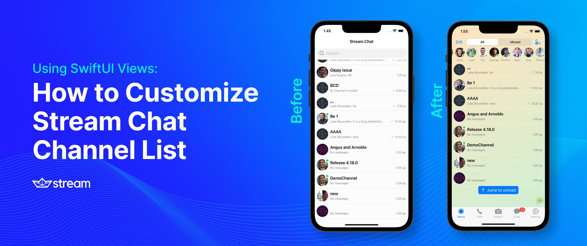
Putting All Together
When you follow all the sections described above in customizing the channel list screen with custom-made SwiftUI views, your finished project should look like the screen below.
You can get the finished project from GitHub to learn more.

What Do I Do Next?
You can learn more about customizing the Stream chat SwiftUI SDK by reading the theming section of the documentation. You can read the blog post Build a SwiftUI Chat Messaging App or watch Theming and Customizing Your Stream Chat SwiftUI App. The companion video for this article is available on the The Stream Developers YouTube channel.
Related links