 React
React iOS
iOS Android
 Flutter
 Angular
 JavaScript
 Unity
Unity Unreal
 Node
Node Python
 Ruby
Ruby PHP
PHP Java
Java .NET
.NET Go
Go REST
RESTclass SceneDelegate: UIResponder, UIWindowSceneDelegate {
func scene(_ scene: UIScene, willConnectTo session: UISceneSession, options connectionOptions: UIScene.ConnectionOptions) {
guard let scene = scene as? UIWindowScene else { return }
scene.windows.forEach {
$0.tintColor = .systemPink
}
}
}Theming
You can customize the look and feel of all UI components provided by StreamChatUI. The SDK allows you to change the appearance of components such as colors and fonts via the Appearance configuration. Changes to appearance should be done as early as possible in your application lifecycle, the SceneDelegate and AppDelegate are usually the right places to do this. The SDK comes with a singleton object Appearance.default that you can use directly to make changes.
Brand Color
If you only need to retint interactive elements you don't have to touch Stream's Appearance configuration — just change the tint color of the UIWindow. UI elements respect UIView.tintColor as the main (brand) color, and the current tintColor depends on the tint color of the view hierarchy the UI element is presented on.
For example, by changing the tint color of the UIWindow of the app, you can easily modify the brand color of the whole chat UI:
| Before | After |
|---|---|
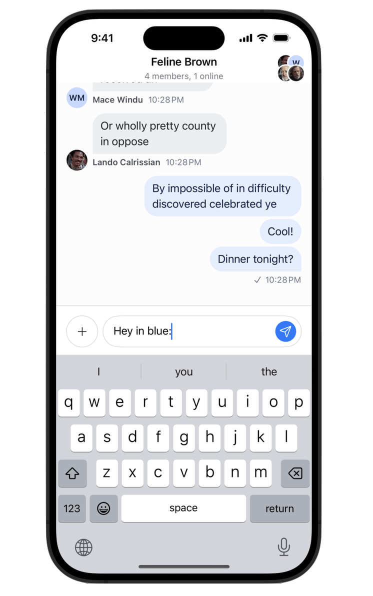 | 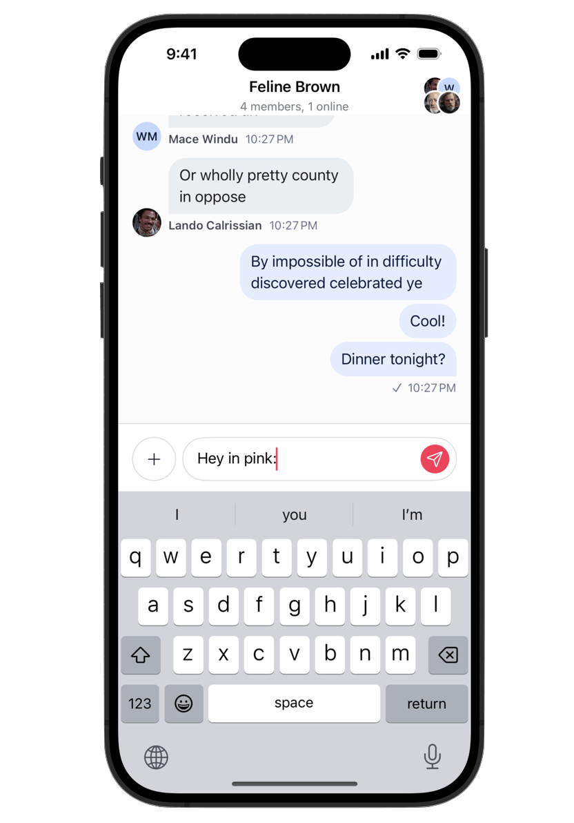 |
For systematic theming across the whole SDK, override the brand and chrome ramps on Appearance.default.colorPalette instead — see Brand Ramp and Chrome Ramp below.
Colors and Fonts
The colors and fonts are part of the Appearance configuration type. Since all components have access to this configuration, all components will be impacted by the changes on this configuration.
For example, let's change the color of the messages sent by the current user and the body font. We can do this by simply modifying the values from Appearance.default as early as possible in your application life-cycle:
class SceneDelegate: UIResponder, UIWindowSceneDelegate {
    func scene(_ scene: UIScene, willConnectTo session: UISceneSession, options connectionOptions: UIScene.ConnectionOptions) {
        ...
        Appearance.default.fonts.body = .italicSystemFont(ofSize: 20)
        Appearance.default.colorPalette.chatBackgroundOutgoing = .yellow
        ...
    }
}
You can find the full reference of both Fonts and ColorPalette respectively.
| Before | After |
|---|---|
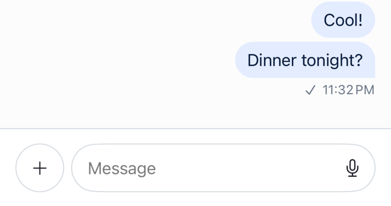 | 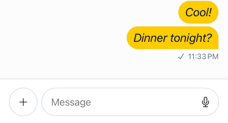 |
You can see the font and the background color of the message has changed. Also note, that the font in the composer text view is also changed, since it uses the same semantic font as the body of the message.
The example above changes a single semantic token. For changes that should propagate to every component derived from your brand or neutral palette, override the brand or chrome ramp instead — see Brand Ramp / Chrome Ramp below.
Color Tokens
Important: Start by adjusting the
brandandchromeramps — most semantic tokens derive from them, so a small number of overrides reskins the whole SDK. Reach for individual semantic tokens only when a specific surface needs to deviate from what the ramps produce.
Brand Ramp
The brand accent color ramp. Most accent and on-brand surfaces derive from these stops.
| Token | Description |
|---|---|
brand50 | Lightest tint of the brand color ramp. |
brand100 | Very light tint of the brand color ramp. Used for outgoing message bubble backgrounds. |
brand150 | Light tint of the brand color ramp. Used for outgoing attachment backgrounds. |
brand200 | Pale step of the brand color ramp. Used for primary button borders. |
brand300 | Muted step of the brand color ramp. Used for borders inside outgoing message content. |
brand400 | Mid tone of the brand color ramp. Anchors the ramp across light and dark mode. |
brand500 | Primary brand color. Override this and the surrounding steps to apply your brand across the SDK. |
brand600 | Slightly dark shade of the brand color ramp. |
brand700 | Dark shade of the brand color ramp. |
brand800 | Very dark shade of the brand color ramp. |
brand900 | Darkest shade of the brand color ramp. Used for text on tinted brand surfaces. |
Chrome Ramp
The neutral gray ramp. Most surface, text, and border tokens derive from these stops.
| Token | Description |
|---|---|
chrome0 | Base chrome surface. White in light mode, black in dark mode. |
chrome50 | Subtle tint of the chrome (neutral) ramp. |
chrome100 | Light tint of the chrome (neutral) ramp. |
chrome150 | Lifted tint of the chrome (neutral) ramp. |
chrome200 | Pale step of the chrome (neutral) ramp. |
chrome300 | Mid-light step of the chrome (neutral) ramp. |
chrome400 | Mid step of the chrome (neutral) ramp. |
chrome500 | Mid-dark step of the chrome (neutral) ramp. |
chrome600 | Dark step of the chrome (neutral) ramp. |
chrome700 | Very dark step of the chrome (neutral) ramp. |
chrome800 | Darker step of the chrome (neutral) ramp. |
chrome900 | Darkest step of the chrome (neutral) ramp. |
chrome1000 | Extreme chrome value. Black in light mode, white in dark mode. |
Accent
| Token | Description |
|---|---|
accentPrimary | The main brand color (derived from the brand ramp). Used for interactive elements, buttons, links, and primary actions. Override the brand ramp to cascade across every derived token; override accentPrimary directly only when you want this token to differ from the ramp. |
accentSuccess | Indicates a positive or completed state. Used for confirmations and success feedback. |
accentError | Indicates a failure or destructive state. Used for failed messages, validation errors, and deletions. |
accentNeutral | A mid-tone gray for de-emphasized UI elements. |
Background — Elevation
The elevation scale establishes a vertical hierarchy. Higher numbers sit visually closer to the user. In dark mode, values step progressively lighter as depth increases. In light mode, all levels are white.
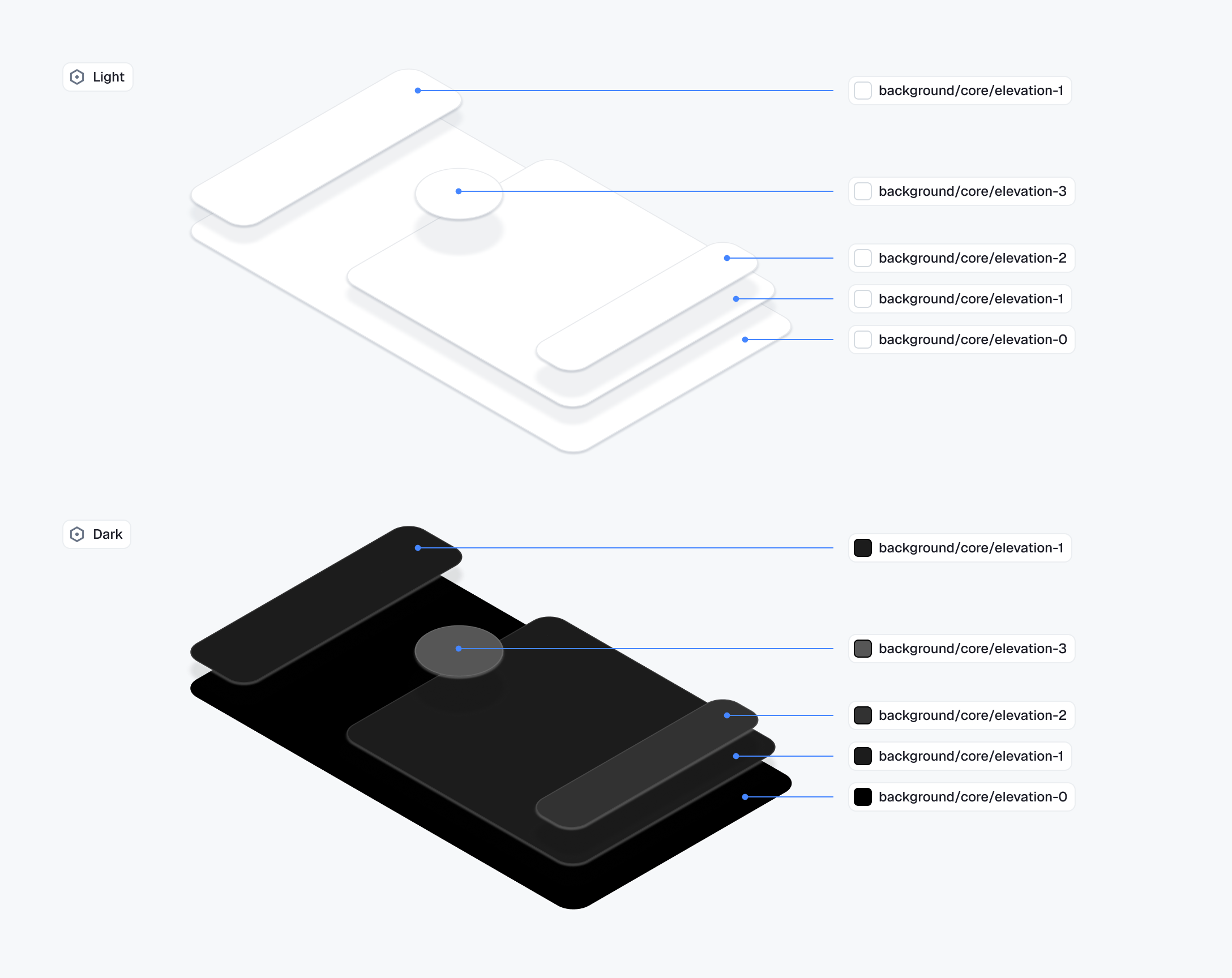
| Token | Description |
|---|---|
backgroundCoreElevation0 | The base layer. Always white, used as the reference point for the elevation scale. Steps above this gain depth in dark mode through progressively lighter backgrounds. |
backgroundCoreElevation1 | Slightly raised surfaces. Used for content containers that sit directly on the base layer, such as the message list and channel list. |
backgroundCoreElevation2 | Floating and modal surfaces. Used for popovers, dropdowns, dialogs, and any element that interrupts the content flow. |
backgroundCoreElevation3 | Used for badge counts that float above other UI elements. |
Background — Surface
| Token | Description |
|---|---|
backgroundCoreApp | The outermost application background. Sits behind all surfaces and is generally not overridden directly. |
backgroundCoreSurfaceDefault | Background for sectioned content areas. Used for grouped containers and distinct content regions. |
backgroundCoreSurfaceSubtle | A slightly receded background. Used for secondary containers or to create soft visual separation. |
backgroundCoreSurfaceCard | Background for contained, card-style elements. Matches the surface in light mode but lifts slightly in dark mode to maintain visual separation. |
backgroundCoreSurfaceStrong | A more prominent background. Used for elements that need to stand out from the main surface. |
backgroundCoreInverse | The opposite of the primary surface. Used for tooltips, snackbars, and high-contrast floating elements. |
backgroundCoreOnAccent | Background for elements placed on an accent-colored surface. Ensures legibility against brand colors. |
backgroundCoreHighlight | A tint for drawing attention to content. Used for highlights and pinned messages. |
backgroundCoreOverlayLight | A light semi-transparent layer. Used to lighten surfaces and for hover states on dark backgrounds. |
backgroundCoreOverlayDark | A dark semi-transparent layer. Used for image overlays. |
backgroundCoreScrim | A heavy semi-transparent layer. Used behind sheets, drawers, and modals to separate them from content. |
Background — Utility
| Token | Description |
|---|---|
backgroundUtilityPressed | A slightly stronger overlay applied during an active press or tap. Provides tactile feedback on interactive elements. |
backgroundUtilitySelected | Indicates an active or selected state. Used for selected messages, active list items, and toggled controls. |
backgroundUtilityDisabled | Background for non-interactive elements. Flattens the element visually to signal unavailability. |
Text
| Token | Description |
|---|---|
textPrimary | Main body text. Used for message content, titles, and any text that carries primary meaning. |
textSecondary | Supporting metadata text. Used for timestamps, subtitles, and secondary labels. |
textTertiary | De-emphasized text. Used for hints, placeholders, and lowest-priority supporting information. |
textOnInverse | Text on inverse-colored surfaces. Flips between light and dark to maintain legibility when the background inverts. |
textOnAccent | Text on accent-colored surfaces. Stays white in both light and dark mode since the accent background does not invert. |
textDisabled | Text for non-interactive or unavailable states. Communicates that an element cannot be interacted with. |
textLink | Hyperlinks and inline actions. Uses the brand color to signal interactivity within text content. |
Border
| Token | Description |
|---|---|
borderCoreDefault | Standard border for surfaces and containers. Used for input fields, cards, and dividers on neutral backgrounds. |
borderCoreSubtle | A lighter border for minimal separation. Used where a full-strength border would feel too heavy. |
borderCoreStrong | An emphatic border for elements that need clear definition. Used for focused containers and prominent dividers. |
borderCoreInverse | Border on inverse-colored surfaces. Stays legible when the background flips between light and dark mode. |
borderCoreOnInverse | Border on inverse-colored surfaces used as a separator element. |
borderCoreOnAccent | Border on accent-colored surfaces. Stays white in both light and dark mode since the accent background does not invert. |
borderCoreOpacitySubtle | A very light transparent border. Used as a frame treatment on images and media attachments. |
borderCoreOpacityStrong | A stronger transparent border for elements on colored or dark backgrounds. Used for waveform bars and similar treatments. |
borderUtilityDisabled | Border for non-interactive elements. Matches the disabled surface to visually flatten the element. |
borderUtilityDisabledOnSurface | Border for disabled elements on elevated surfaces. Stays visually distinct from the surface without drawing attention. |
Avatar
| Token | Description |
|---|---|
avatarBackgroundDefault | Default avatar background color. |
avatarPaletteBackground1 | First palette option for avatar backgrounds. |
avatarPaletteText1 | Text color paired with the first avatar palette background. |
avatarTextDefault | Default text color for avatar initials. |
Badge
| Token | Description |
|---|---|
badgeBackgroundDefault | Background for the default badge variant. |
badgeBackgroundError | Background for error badges indicating failures or critical counts. |
badgeBackgroundInverse | Background for badges on light surfaces requiring high contrast. |
badgeBackgroundNeutral | Background for neutral, informational badges. |
badgeBackgroundOverlay | Background for badges overlaid on media or images. |
badgeBackgroundPrimary | Background for primary-styled badges. |
badgeBorder | Border color for badges. |
badgeText | Text color for badges on default backgrounds. |
badgeTextOnAccent | Text color for badges on accent-colored backgrounds. |
badgeTextOnInverse | Text color for badges on inverse backgrounds. |
Button
| Token | Description |
|---|---|
buttonPrimaryBackground | Background for primary action buttons. |
buttonPrimaryBackgroundLiquidGlass | Background for primary buttons with Liquid Glass material. |
buttonPrimaryBorder | Border for primary action buttons. |
buttonPrimaryText | Text color for outlined primary buttons. |
buttonPrimaryTextOnAccent | Text color for filled primary buttons. |
buttonSecondaryBackground | Background for secondary action buttons. |
buttonSecondaryBackgroundLiquidGlass | Background for secondary buttons with Liquid Glass material. |
buttonSecondaryBorder | Border for secondary action buttons. |
buttonSecondaryText | Text color for secondary buttons. |
buttonSecondaryTextOnAccent | Text color for filled secondary buttons. |
buttonDestructiveBackground | Background for destructive action buttons. |
buttonDestructiveBackgroundLiquidGlass | Background for destructive buttons with Liquid Glass material. |
buttonDestructiveBorder | Border for destructive action buttons. |
buttonDestructiveText | Text color for outlined destructive buttons. |
buttonDestructiveTextOnAccent | Text color for filled destructive buttons. |
Chat
| Token | Description |
|---|---|
chatBackgroundIncoming | Bubble background for incoming messages. |
chatBackgroundOutgoing | Bubble background for outgoing messages. |
chatBackgroundAttachmentIncoming | Background for attachment previews in incoming messages. |
chatBackgroundAttachmentOutgoing | Background for attachment previews in outgoing messages. |
chatBorderIncoming | Border for incoming message bubbles. |
chatBorderOutgoing | Border for outgoing message bubbles. |
chatBorderOnChatIncoming | Border for elements inside incoming message bubbles. |
chatBorderOnChatOutgoing | Border for elements inside outgoing message bubbles. |
chatTextIncoming | Text color for incoming messages. |
chatTextOutgoing | Text color for outgoing messages. |
chatTextLink | Link text color within chat messages. |
chatTextSystem | Text color for system messages. |
chatTextTimestamp | Text color for message timestamps. |
chatTextTypingIndicator | Text color for the typing indicator. |
chatTextUsername | Text color for usernames in chat. |
chatReplyIndicatorIncoming | Reply thread indicator color for incoming messages. |
chatReplyIndicatorOutgoing | Reply thread indicator color for outgoing messages. |
chatPollProgressFillIncoming | Poll progress bar fill color in incoming messages. |
chatPollProgressFillOutgoing | Poll progress bar fill color in outgoing messages. |
chatPollProgressTrackIncoming | Poll progress bar track color in incoming messages. |
chatPollProgressTrackOutgoing | Poll progress bar track color in outgoing messages. |
Control
| Token | Description |
|---|---|
controlCheckboxBorder | Border for checkbox controls. |
controlChipText | Text color for chip controls. |
controlPlaybackThumbBackgroundActive | Background for the active playback scrubber thumb. |
controlPlaybackThumbBackgroundDefault | Background for the default playback scrubber thumb. |
controlPlaybackThumbBorderActive | Border for the active playback scrubber thumb. |
controlPlaybackThumbBorderDefault | Border for the default playback scrubber thumb. |
controlPlayButtonBackground | Background for the play button overlay. |
controlPlayButtonIcon | Icon color for the play button overlay. |
controlProgressBarFill | Fill color for progress bars. |
controlProgressBarTrack | Track color for progress bars. |
controlRadioCheckBackgroundSelected | Background for selected radio buttons and checkmarks. |
controlRadioCheckBorder | Border for radio buttons and checkmarks. |
controlRadioCheckIcon | Icon color for the check indicator in radio buttons and checkmarks. |
controlRemoveControlBackground | Background for the remove/delete control. |
controlRemoveControlBorder | Border for the remove/delete control. |
controlRemoveControlIcon | Icon color for the remove/delete control. |
Input
| Token | Description |
|---|---|
inputSendIconDisabled | Send button icon color when the input is empty or disabled. |
inputTextDefault | Default text color for input fields. |
inputTextIcon | Icon color within input fields. |
inputTextPlaceholder | Placeholder text color for input fields. |
Presence
| Token | Description |
|---|---|
presenceBackgroundOffline | Background for the offline presence indicator. |
presenceBackgroundOnline | Background for the online presence indicator. |
presenceBorder | Border for presence indicator dots. |
Reaction
| Token | Description |
|---|---|
reactionBackground | Background for reaction pills. |
reactionBorder | Border for reaction pills. |
reactionText | Text color for reaction counts. |
Utilities
| Token | Description |
|---|---|
highlightedColorForColor | Returns a highlighted variant of the given color. Used for tap/press states in UIKit views. Type: @Sendable (UIColor) -> UIColor. |
Image Assets
The image assets and icons used by buttons also use the Appearance configuration type. For example, let's modify the icon used for the "Send" button:
Appearance.default.images.sendArrow = UIImage(systemName: "arrowshape.turn.up.right")!| Before | After |
|---|---|
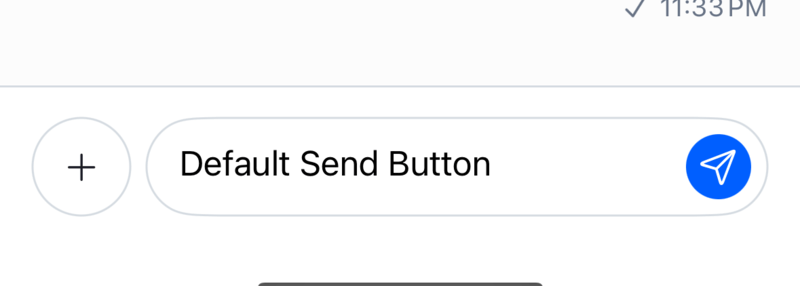 | 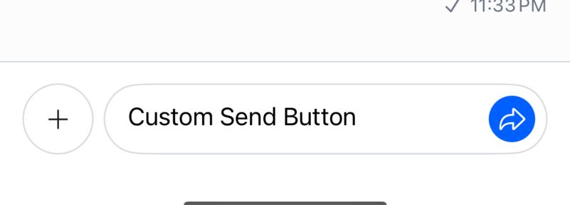 |
If the same image is used in multiple places, changing the image in the Appearance object will update it in all places.
You can find the full reference of the Images object here.
Data Formatting
Besides customizing the UI appearance, you can also customize the data formatting of the components. For example, you can change how the channel name is displayed or how the timestamp of messages are formatted.
Below is an example of how to change the channel name and message timestamp formatting.
final class CustomChannelNameFormatter: ChannelNameFormatter {
    func format(
        channel: ChatChannel,
        forCurrentUserId currentUserId: UserId?
    ) -> String? {
        return channel.name ?? channel.lastActiveMembers.map { $0.name ?? $0.id }.joined(separator: ", ")
    }
}

final class CustomMessageTimestampFormatter: MessageTimestampFormatter {
    var dateFormatter: DateFormatter = {
        let formatter = DateFormatter()
        formatter.dateStyle = .short
        formatter.timeStyle = .short
        return formatter
    }()

    func format(_ date: Date) -> String {
        dateFormatter.string(from: date)
    }
}

Appearance.default.formatters.channelName = CustomChannelNameFormatter()
Appearance.default.formatters.messageTimestamp = CustomMessageTimestampFormatter()
You can find the full reference of the Formatters object here.
For more examples, you can read the Data Formatting page.