 React
React iOS
iOS Android
 Flutter
 Angular
 JavaScript
 Unity
Unity Unreal
 Node
Node Python
 Ruby
Ruby PHP
PHP Java
Java .NET
.NET Go
Go REST
RESTlet pollsConfig = PollsConfig(
multipleAnswers: PollsEntryConfig(configurable: true, defaultValue: true),
anonymousPoll: .default,
suggestAnOption: .notConfigurable,
addComments: .default,
maxVotesPerPerson: .default
)
Components.default.pollsConfig = pollsConfigPolls
Stream Chat's UIKit SDK includes the capability to create polls within your chat application. Polls are an effective tool for enhancing user interaction and engagement, providing a dynamic way to gather opinions and feedback.
Polls on UIKit are available since version 4.64.0.
Polls are disabled by default. In order to enable this feature, you need to go to the Stream dashboard for your app, and enable the "Polls" flag for your channel type.
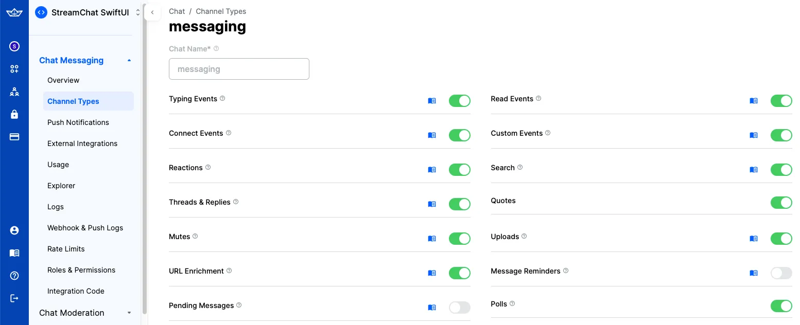
When enabling Polls, an additional "Create Poll" action will be shown in the attachment picker of the default composer component.
Poll configuration
You can configure the default poll features by changing the Components.default.pollsConfig. This will determine which features the user can enable when creating the poll. Below is the poll creation view with all features supported:
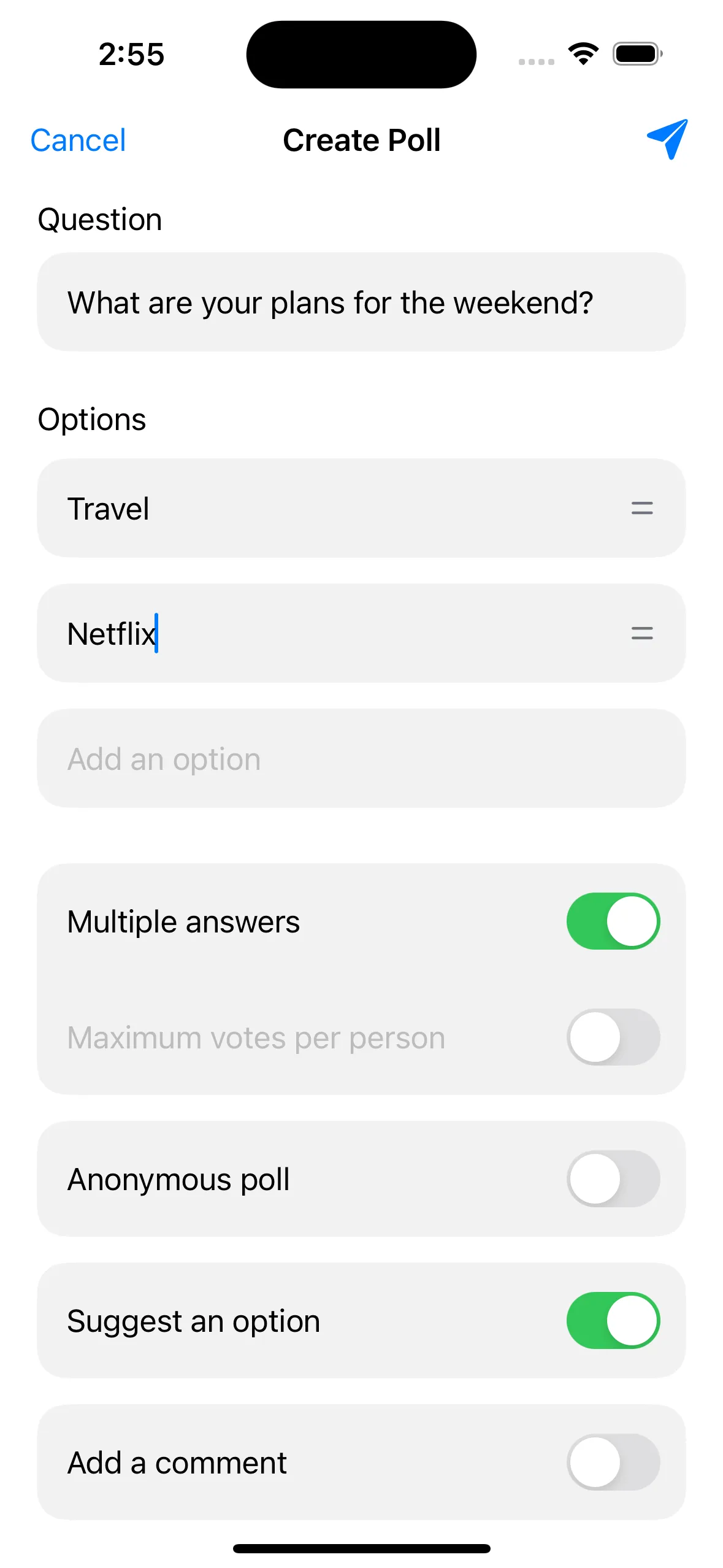
You can setup which of these options will be supported. In order to do that, you need to provide your own PollsConfig.
For example, let's create a new configuration that removes the suggestions feature and enables multiples votes by default.
Poll creation view
The PollCreationVC is the view controller responsible for creating polls. By default, it is shown when the user taps the "Create Poll" action in the composer's attachment picker. You can completely provide your own implementation by overriding the ComposerVC.showPollCreation() function or you can customize the default component by overriding the Components.default.pollCreationVC property. This view is composed by the following sub components:
Components.default.pollCreationNameCell- The cell responsible for the poll title.Components.default.pollCreationOptionCell- The cell responsible for the poll options.Components.default.pollCreationFeatureCell- The cell responsible for the enabling/disabling of the poll features.Components.default.pollCreationMultipleVotesFeatureCell- The cell responsible for the multiple votes feature which has more information than the other features.Components.default.pollCreationSectionHeaderView- The header view for the sections in the poll creation view.
To show an example on how you can customize the PollCreationVC, let's create a new feature cell that will allow the user to set a poll's expiration date.
The first thing we need to do is to create the new feature, for this we will need to extend the PollFeatureType and create a new feature that conforms to the PollFeature protocol:
extension PollFeatureType {
    public static var expiration = Self(rawValue: "expiration")
}

public struct ExpirationPollFeature: PollFeature {
    public let name: String = "Expiration"
    public var isEnabled: Bool
    public var expirationDate: Date?
}
After that, we need to customize the poll creation view to show this new feature. We will create a new cell that will allow the user to set the expiration date:
class PollExpirationFeatureCell: PollCreationFeatureCell {
    lazy var featureNameLabel = UILabel()

    lazy var datePicker = UIDatePicker()

    var onValueChanged: ((Date?) -> Void)?

    override func setUp() {
        super.setUp()

        datePicker.datePickerMode = .date
        datePicker.addTarget(self, action: #selector(datePickerValueChanged), for: .valueChanged)
    }

    override func setUpLayout() {
        // We will use the existing container that renders the rounded container.
        container.views {
            featureNameLabel
            datePicker
        }
        .height(PollCreationVC.pollCreationInputViewHeight)
        .padding(leading: 12, trailing: 12)
        .embed(in: self, insets: .init(top: 6, leading: 12, bottom: 6, trailing: 12))
    }

    @objc func datePickerValueChanged() {
        onValueChanged?(datePicker.date)
    }
}
Finally, we need to create a new PollCreationVC that will include the new feature cell and that it updates the extra data to include the expiration date:
class CustomPollCreationVC: PollCreationVC {

    var pollExpirationFeature = ExpirationPollFeature(isEnabled: false) {
        didSet {
            // Update the extra data to include the custom feature.
            // The extra data will be automatically send by the `createPoll` function.
            if let expDate = pollExpirationFeature.expirationDate?.timeIntervalSince1970 {
                extraData["expiration"] = .number(expDate)
            }
        }
    }

    override func setUp() {
        super.setUp()

        // Register the custom cell
        collectionView.register(PollExpirationFeatureCell.self, forCellWithReuseIdentifier: "PollExpirationFeatureCell")
        // Adds the new feature to the poll features
        pollFeatures.append(.expiration)
    }

    override func collectionView(_ collectionView: UICollectionView, cellForItemAt indexPath: IndexPath) -> UICollectionViewCell {
        /// We need to override the `collectionView(_:cellForItemAt:)` method to provide the custom cell for the expiration feature.
        let section = sections[indexPath.section]
        switch section {
        case .features:
            let feature = pollFeatures[indexPath.item]
            switch feature {
            case .expiration:
                let expCell = collectionView.dequeueReusableCell(
                    withReuseIdentifier: "PollExpirationFeatureCell",
                    for: indexPath
                ) as! PollExpirationFeatureCell
                    expCell.featureNameLabel.text = pollExpirationFeature.name
                    expCell.onValueChanged = { [weak self] date in
                        self?.pollExpirationFeature.isEnabled = date != nil
                        self?.pollExpirationFeature.expirationDate = date
                    }
                return expCell
            default:
                break
            }
        default:
            break
        }
        /// If the feature is not the expiration, we use the default implementation.
        let cell = super.collectionView(collectionView, cellForItemAt: indexPath)
        return cell
    }
}

Components.default.pollCreationVC = CustomPollCreationVC.self
The above customization will add the new expiration feature to the poll creation as seen in the image below:
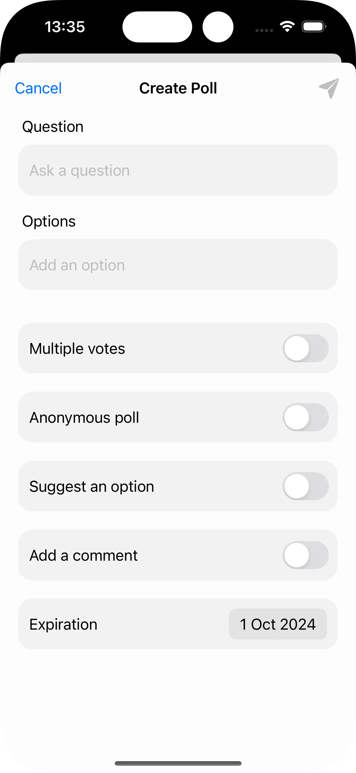
The handling of the expiration date on the server is out of the scope of this guide. You will need to implement the server-side logic to handle the expiration date and automatically close the poll.
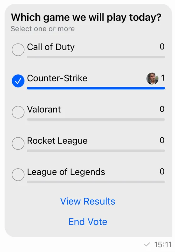
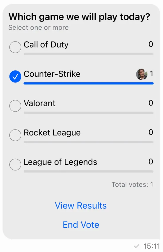
Poll attachment view
When a message contains a poll in the ChatMessage.poll property, the poll will be rendered by the PollAttachmentView.
Poll attachments have the same behaviour as other types of messages - you can send reactions, reply, delete them or pin them.
The default poll attachment view has the following UI:
You can customize the poll attachment view by providing your own implementation of the PollAttachmentView class and replace it in the Components.default.pollAttachmentView property. This view is composed by a header view, the list of options, and a footer view. The header view displays the poll title and the rule to submit votes, while the footer view displays a list of buttons to interact with the poll. If you want to change the layout or add new views to the poll, this is the place to do it.
As an example, let's add a label that shows the total number of votes in the poll:
class CustomPollAttachmentView: PollAttachmentView {
    lazy var totalVotesLabel = UILabel()

    override func setUpAppearance() {
        super.setUpAppearance()

        totalVotesLabel.font = appearance.fonts.caption1
        totalVotesLabel.textColor = appearance.colorPalette.textLowEmphasis
    }

    override func setUpLayout() {
        directionalLayoutMargins = .init(top: 12, leading: 10, bottom: 10, trailing: 12)

        VContainer(spacing: 14) {
            headerView
            optionListView
            HContainer {
                Spacer()
                totalVotesLabel
            }
            footerView
        }
        .embedToMargins(in: self)
    }

    override func updateContent() {
        super.updateContent()

        totalVotesLabel.text = "Total votes: \(content?.poll.voteCount ?? 0)"
    }
}
This will add a new label below the options like you can see in the image below:
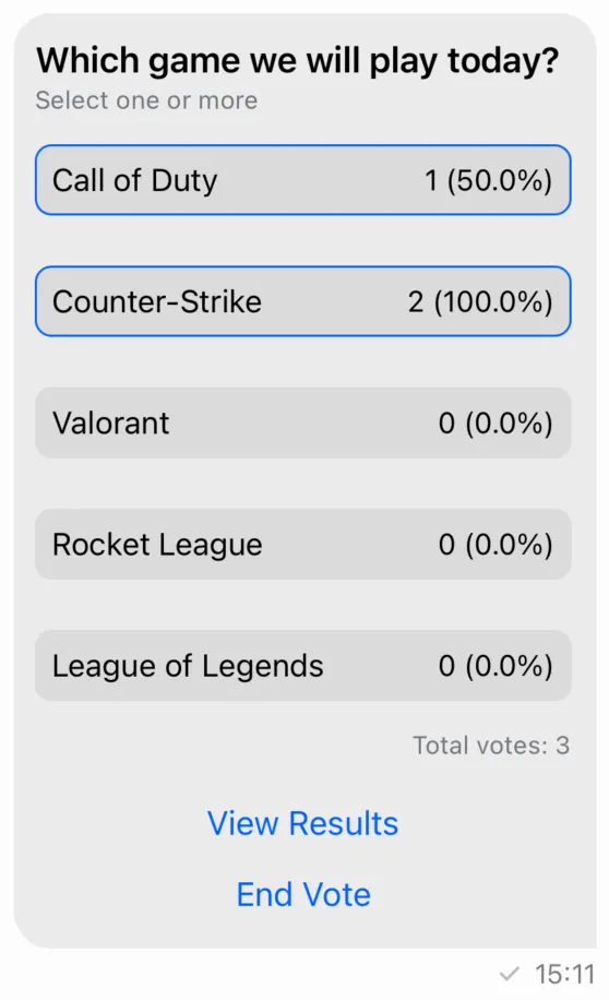
If you want to customize the poll options, you should override the Components.default.pollAttachmentOptionListView or the Components.default.pollAttachmentOptionListItemView. Below is an example of a custom option list item view that changes how the votes are displayed:
class CustomPollAttachmentOptionListItemView: PollAttachmentOptionListItemView {

    lazy var roundedContainer = HContainer(spacing: 4, alignment: .center)

    override func setUpAppearance() {
        super.setUpAppearance()

        roundedContainer.backgroundColor = appearance.colorPalette.background2
        roundedContainer.layer.cornerRadius = 8
        roundedContainer.layer.borderColor = appearance.colorPalette.accentPrimary.cgColor
    }

    override open func setUpLayout() {
        roundedContainer.views {
            optionNameLabel
            Spacer()
            votesCountLabel
        }
        .padding(8)
        .embed(in: self)
    }

    override func updateContent() {
        super.updateContent()

        guard let content = self.content else { return }
        roundedContainer.layer.borderWidth = content.isVotedByCurrentUser ? 1 : 0
        votesCountLabel.text = "\(content.voteCount) (\(content.voteRatio * 100)%)"
    }
}

Components.default.pollAttachmentOptionListItemView = CustomPollAttachmentOptionListItemView.self
This component uses the new View Container Builder to create the view hierarchy. You can find more information on how it works here.
We reused only the optionNameLabel and votesCountLabel from the default implementation and added a new roundedContainer. The interactions and logic pretty much remain the same. The result of this customization can be seen in the image below:
Besides these components, the SDK also provides components to show the results of the polls, comments, the full list of options in case it is a big poll and more. Here are some of the available components:
Components.default.pollResultsVC- The view controller that shows the results of the poll.Components.default.pollResultsVoteListVC- The view controller that shows the list of all the votes received for an option.Components.default.pollCommentListVC- The view controller that shows the comments of the poll.Components.default.pollAllOptionsListVC- The view controller that shows the full list of options in case it is a big poll.
Poll state
The Poll model contains the data needed to present a poll:
allowAnswers: Bool- Indicates whether the poll allows answers.allowUserSuggestedOptions: Bool- Indicates whether the poll allows user-suggested options.answersCount: Int- The count of answers received for the poll.createdAt: Date- The date and time when the poll was created.pollDescription: String?- A brief description of the poll. This property is optional and may benil.enforceUniqueVote: Bool- Indicates whether the poll enforces unique votes.id: String- The unique identifier of the poll.name: String- The name of the poll.updatedAt: Date?- The date and time when the poll was last updated. This property is optional and may benil.voteCount: Int- The count of votes received for the poll.extraData: [String: RawJSON]- A dictionary containing custom fields associated with the poll.voteCountsByOption: [String: Int]?- A dictionary mapping option IDs to the count of votes each option has received. This property is optional and may benil.isClosed: Bool- Indicates whether the poll is closed.maxVotesAllowed: Int?- The maximum number of votes allowed per user. This property is optional and may benil.votingVisibility: VotingVisibility?- Represents the visibility of the voting process. This property is optional and may benil.createdBy: ChatUser?- The user who created the poll. This property is optional and may benil.latestAnswers: [PollVote]- A list of the latest answers received for the poll.options: [PollOption]- An array of options available in the poll.latestVotesByOption: [PollOption]- A list of the latest votes received for each option in the poll.
In order to create a poll in your custom UI components, you need to use the ChatChannelController method createPoll:
chatController.createPoll(
    name: question.trimmed,
    allowAnswers: allowComments,
    allowUserSuggestedOptions: suggestAnOption,
    enforceUniqueVote: !multipleAnswers,
    maxVotesAllowed: maxVotesAllowed,
    votingVisibility: anonymousPoll ? .anonymous : .public,
    options: pollOptions
) { [weak self] result in
    switch result {
    case let .success(messageId):
        log.debug("Created poll in message with id \(messageId)")
        completion()
    case let .failure(error):
        log.error("Error creating a poll: \(error.localizedDescription)")
        self?.errorShown = true
    }
}
To perform operations on a poll (for example, adding and removing votes), you need a PollController.
Poll controllers can be created with the ChatClient, by specifying the message id and the poll id:
let pollController = chatClient.pollController(
    messageId: message.id,
    pollId: poll.id
)
PollController
In order to cast a vote for an option in a poll, you can use the castPollVote method:
pollController.castPollVote(
    answerText: nil,
    optionId: option.id
) { [weak self] error in
    if let error {
        // handle error
    }
}
You can also use this method to add a comment to a poll, without voting for an option.
pollController.castPollVote(
    answerText: "comment",
    optionId: nil
) { [weak self] error in
    if let error {
        // handle error
    }
}
To remove a vote, you can use the removePollVote method:
pollController.removePollVote(
    voteId: vote.id
) { [weak self] error in
    if let error {
        // handle error
    }
}
In order to suggest a new option to a poll, you can use the suggestPollOption method:
pollController.suggestPollOption(text: "option") { [weak self] error in
    if let error {
        // handle error
    }
}
To close voting for a poll, you should use the closePoll method:
pollController.closePoll { [weak self] error in
    if let error {
        // handle error
    }
}
To get the current user's votes, you can simply call pollController.ownVotes.
PollControllerDelegate
You can implement the PollControllerDelegate's methods to listen for poll and votes updates:
/// Called when there is an update to a poll.
///
/// - Parameters:
///   - pollController: The instance of `PollController` that is providing the update.
///   - poll: An `EntityChange<Poll>` object representing the changes to the poll.
///   This includes information about what kind of change occurred (e.g., insert, update, delete) and the updated poll entity.
func pollController(
    _ pollController: PollController,
    didUpdatePoll poll: EntityChange<Poll>
)

/// Called when there is an update to the current user's votes.
///
/// - Parameters:
///   - pollController: The instance of `PollController` that is providing the update.
///   - votes: An array of `ListChange<PollVote>` objects representing the changes to the user's votes.
func pollController(
    _ pollController: PollController,
    didUpdateCurrentUserVotes votes: [ListChange<PollVote>]
)
PollVoteListController
In order to paginate through votes (and answers), you should create a PollVoteListController, through the ChatClient instance.
For example, if you want to paginate through all the votes for a given option, you can use the following code:
let query = PollVoteListQuery(
    pollId: poll.id,
    optionId: option.id
)
let controller = chatClient.pollVoteListController(query: query)
To paginate through all the comments (answers) in a poll, you can use the following query:
let query = PollVoteListQuery(
    pollId: poll.id,
    filter: .equal(.isAnswer, to: true)
)
let commentsController = chatClient.pollVoteListController(query: query)
PollVoteListControllerDelegate
To listen to updates of the PollVoteListController you should implement the PollVoteListControllerDelegate method:
/// The controller changed the list of observed votes.
///
/// - Parameters:
///   - controller: The controller emitting the change callback.
///   - changes: The change to the list of votes.
func controller(
    _ controller: PollVoteListController,
    didChangeVotes changes: [ListChange<PollVote>]
)