 React
React iOS
iOS Android
 Flutter
 Angular
 JavaScript
 Unity
Unity Unreal
 Node
Node Python
 Ruby
Ruby PHP
PHP Java
Java .NET
.NET Go
Go REST
RESTclass CustomMessageSquaredBubbleView: ChatMessageBubbleView {
override open func layoutSubviews() {
super.layoutSubviews()
layer.cornerRadius = 0
}
}Message View
The responsibility of rendering the messages is shared between multiple components that can be customized or totally replaced.
Here is a diagram that shows the different components that are involved in rendering a message:

Overview
ChatMessageLayoutOptionsResolvercalculates theChatMessageLayoutOptionsfor each message.ChatMessageLayoutOptionscontains all the information needed by the view to render the message.ChatMessageCellholds the message content view and all the decorations that surround it.ChatMessageContentViewholds the entire message view and all its sub-views.ChatMessageBubbleViewwraps the message content inside a bubble. Depending on the layout options, the bubble will have different borders and colors and will show or not the user profile and name.ChatReactionsBubbleViewis a wrapper forChatMessageReactionsView.ChatMessageReactionsViewis responsible for rendering all reactions attached to the message.ChatMessageReactionItemViewrenders a single reaction.
Basic Customizations
In case your application only requires minimal changes to the message view, the SDK makes it easy to apply these changes without much code.
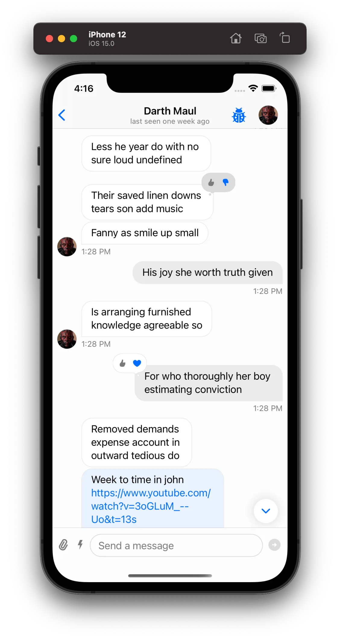
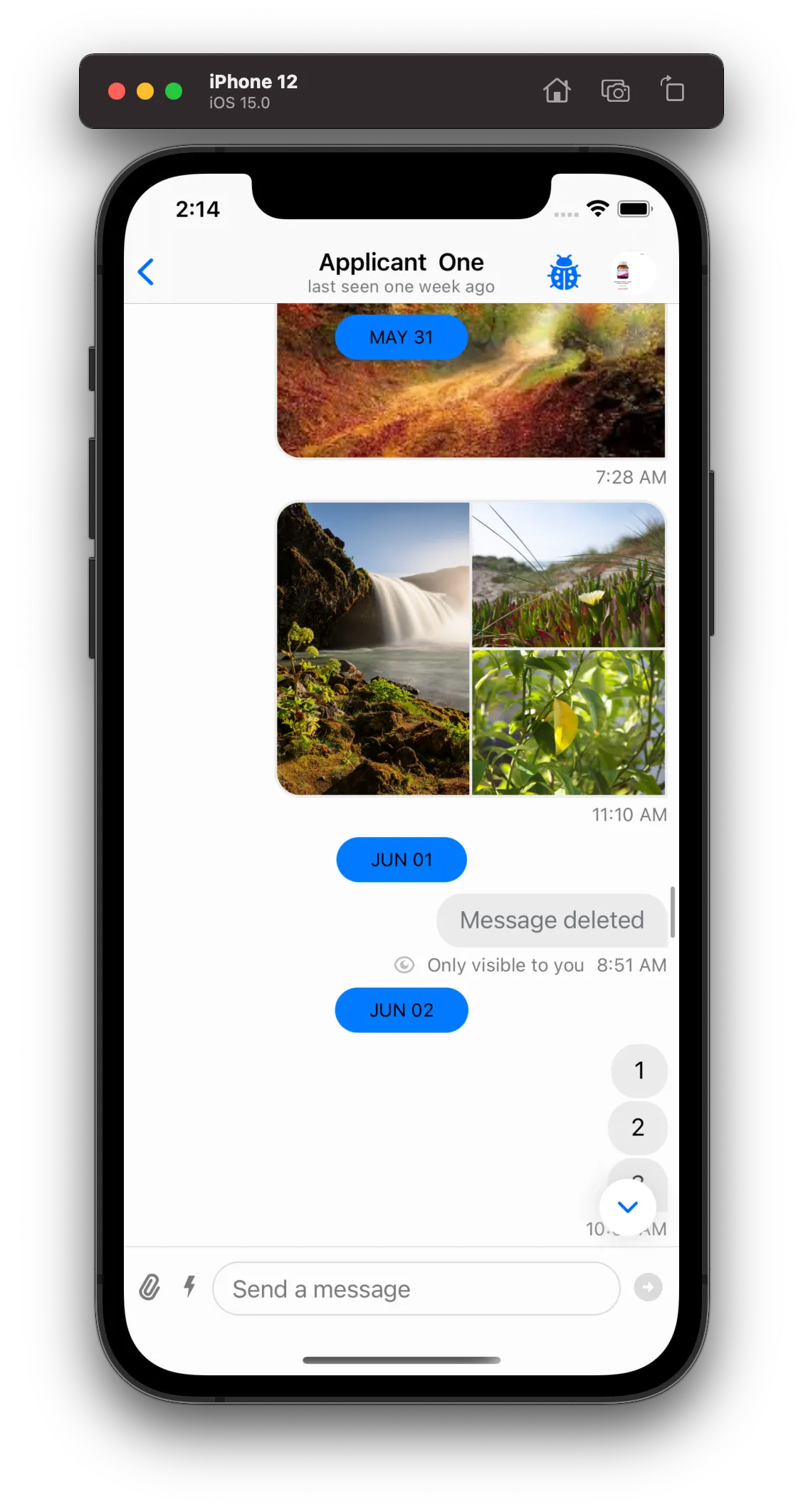
Changing the Bubble View
If you need to customize just one component of the message view, you can easily do it by replacing one of its components with your custom subclass. As an example of how to customize one of the components from the ChatMessageContentView we will replace the bubble view with a custom squared bubble view.
Components.default.messageBubbleView = CustomMessageSquaredBubbleView.selfResult
| Before | After |
|---|---|
 |  |
You can find more information on how the components configuration works here.
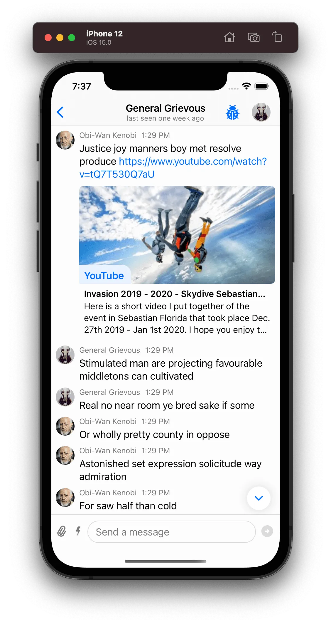
Simple Layout Changes
The ChatMessageLayoutOptions are flags that the ChatMessageLayoutOptionsResolver injects in each message view depending on the message content (For example: does the message contain reactions? Is it coming from the same user? Etc...). When rendering the message view, the layout options will be used to know which views to show or hide, and if the message cell can be reused since different layout options combinations will produce different reuse identifiers.
By customizing the ChatMessageLayoutOptionsResolver it is possible to do simple layout changes, like for example always showing the timestamp (by default if the messages are sent in the same minute, only the last one shows the timestamp).
final class CustomMessageLayoutOptionsResolver: ChatMessageLayoutOptionsResolver {
    override func optionsForMessage(
        at indexPath: IndexPath,
        in channel: ChatChannel,
        with messages: AnyRandomAccessCollection<ChatMessage>,
        appearance: Appearance
    ) -> ChatMessageLayoutOptions {
        var options = super.optionsForMessage(at: indexPath, in: channel, with: messages, appearance: appearance)

        // Remove the reactions and thread info from each message.
        // Remove `.flipped` option, all messages will be rendered in the leading side
        // independent if it's the current user or not.
        options.remove([
            .flipped,
            .threadInfo,
            .reactions
        ])

        // Always show the avatar, timestamp and author name for each message.
        options.insert([.avatar, .timestamp, .authorName])

        return options
    }
}Components.default.messageLayoutOptionsResolver = CustomMessageLayoutOptionsResolver()Result
| Before | After |
|---|---|
 | 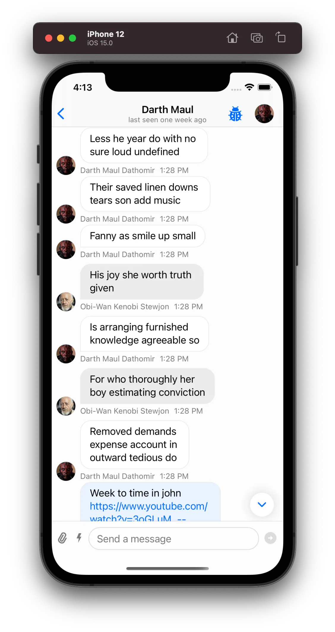 |
Decoration Views
Decoration Views are available on SDK version 4.29.0 and above.
The SDK allows you to configure what will be presented above and below your message with decoration views (ChatMessageDecorationView). They are fully customizable, and we also use them for standard SDK components like the Date Separators as seen below.
In order to provide a ChatMessageDecorationView (either a header or a footer) for a message, you will need to implement the following methods from the ChatMessageListVCDelegate
func chatMessageListVC(
    _ vc: ChatMessageListVC,
    headerViewForMessage message: ChatMessage,
    at indexPath: IndexPath
) -> ChatMessageDecorationView?

func chatMessageListVC(
    _ vc: ChatMessageListVC,
    footerViewForMessage message: ChatMessage,
    at indexPath: IndexPath
) -> ChatMessageDecorationView?
ChatMessageDecorationView are following a similar flow as the UITableViewHeaderFooterView decorations for sections that UITableView is managing. During the preparation of a message cell, the ChatMessageListVC will ask the delegate to provide ChatMessageDecorationView for header and footer. If the delegate returns a non-nil value the provided ChatMessageDecorationView will be placed in the cell's UI according to it's decoration type. In the case where the delegate will return a nil value then the cell will be updated to release the space for this specific decoration type, if it was previously used.
Date Separators
The SDK groups each message from the same day and shows the day which these messages belong to, since by default each message only has the time it was sent, not the day. The StreamChat SDK provides two options out-of-the-box on how to render the grouped messages date separator that can be configured in the Components configuration:
Components.default.messageListDateOverlayEnabled
Components.default.messageListDateSeparatorEnabled
By default only the Components.default.messageListDateOverlayEnabled is enabled, and in this case an overlay at the top will be shown with the day which the current messages being scrolled belong to.
In case you want the separator to also be shown statically between each group of messages, you can enable that option as well, and turn off the overlay option if you so desire:
Components.default.messageListDateSeparatorEnabled = trueResult
| Overlay Enabled | Overlay & Static Enabled |
|---|---|
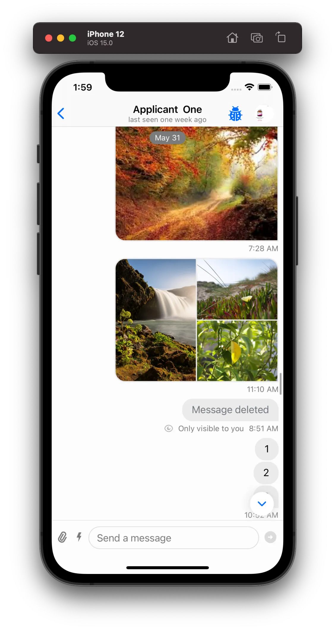 | 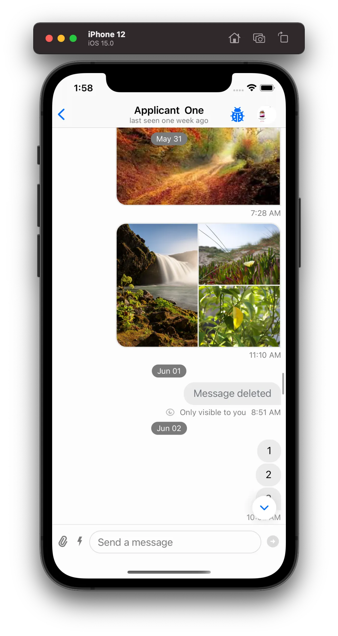 |
You can also easily customize the look of the date separators by subclassing the ChatMessageListDateSeparatorView:
class CustomChatMessageListDateSeparatorView: ChatMessageListDateSeparatorView {

    override func setUpAppearance() {
        super.setUpAppearance()

        backgroundColor = .systemBlue
        textLabel.textColor = .black
    }

    override func updateContent() {
        super.updateContent()

        textLabel.text = content?.uppercased()
    }

    override func setUpLayout() {
        super.setUpLayout()

        NSLayoutConstraint.activate([
            textLabel.leadingAnchor.constraint(equalTo: leadingAnchor, constant: 24.0),
            textLabel.trailingAnchor.constraint(equalTo: trailingAnchor, constant: -24.0),
            textLabel.topAnchor.constraint(equalTo: topAnchor, constant: 8.0),
            textLabel.bottomAnchor.constraint(equalTo: bottomAnchor, constant: -8.0)
        ])
    }
}

Components.default.messageListDateSeparatorView = CustomChatMessageListDateSeparatorView.self
Result
| Before | After |
|---|---|
|  |
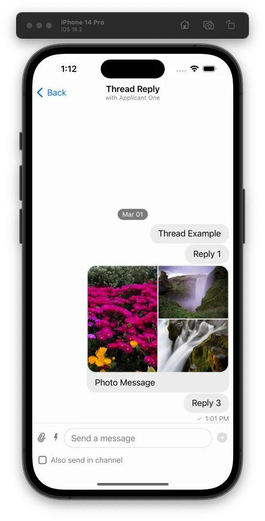
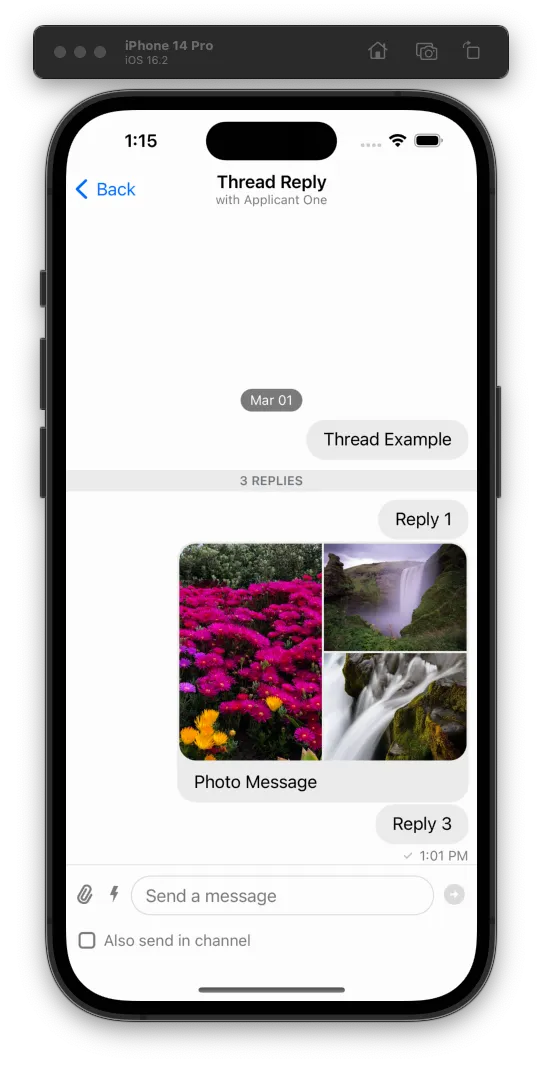
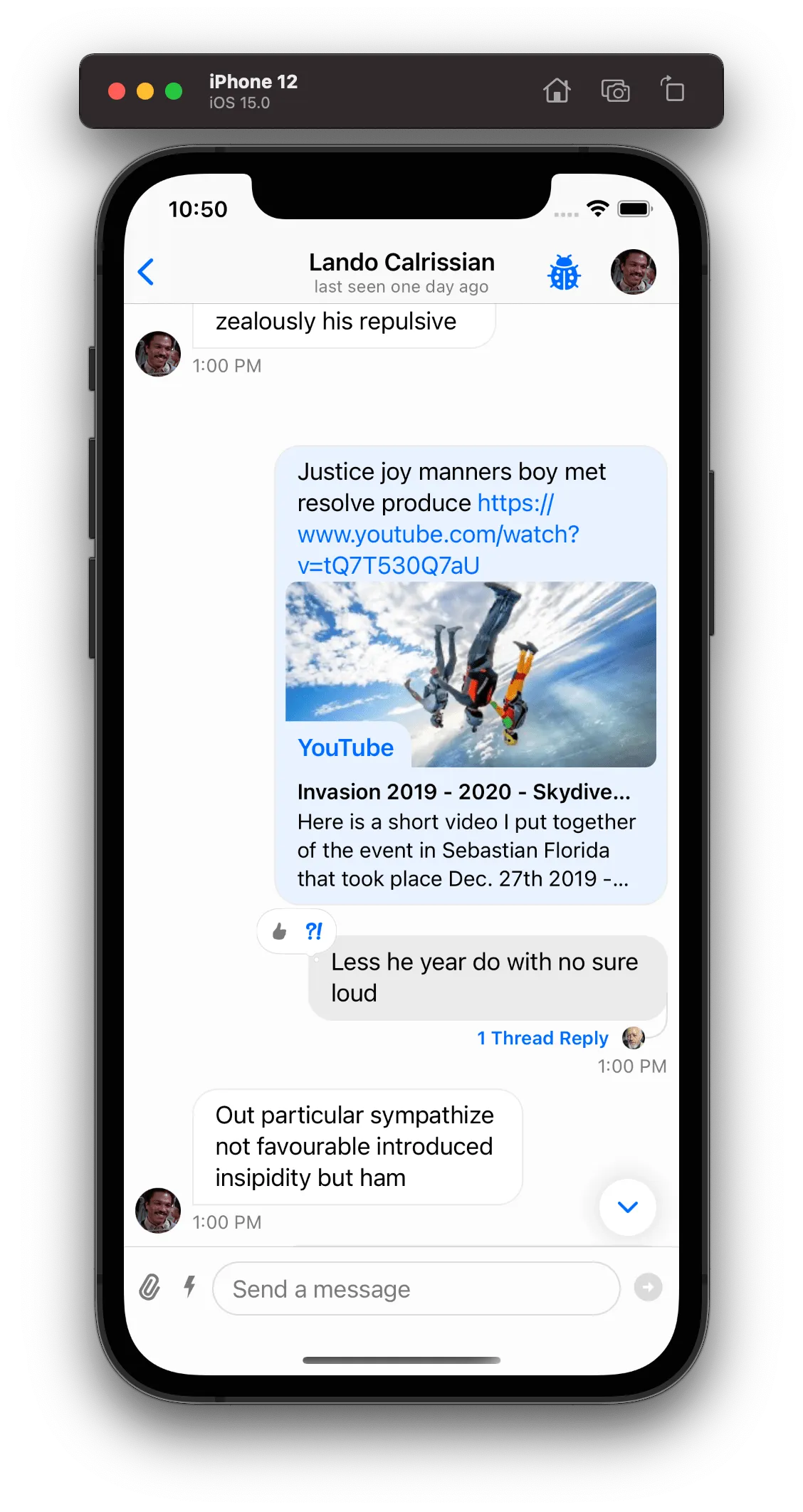
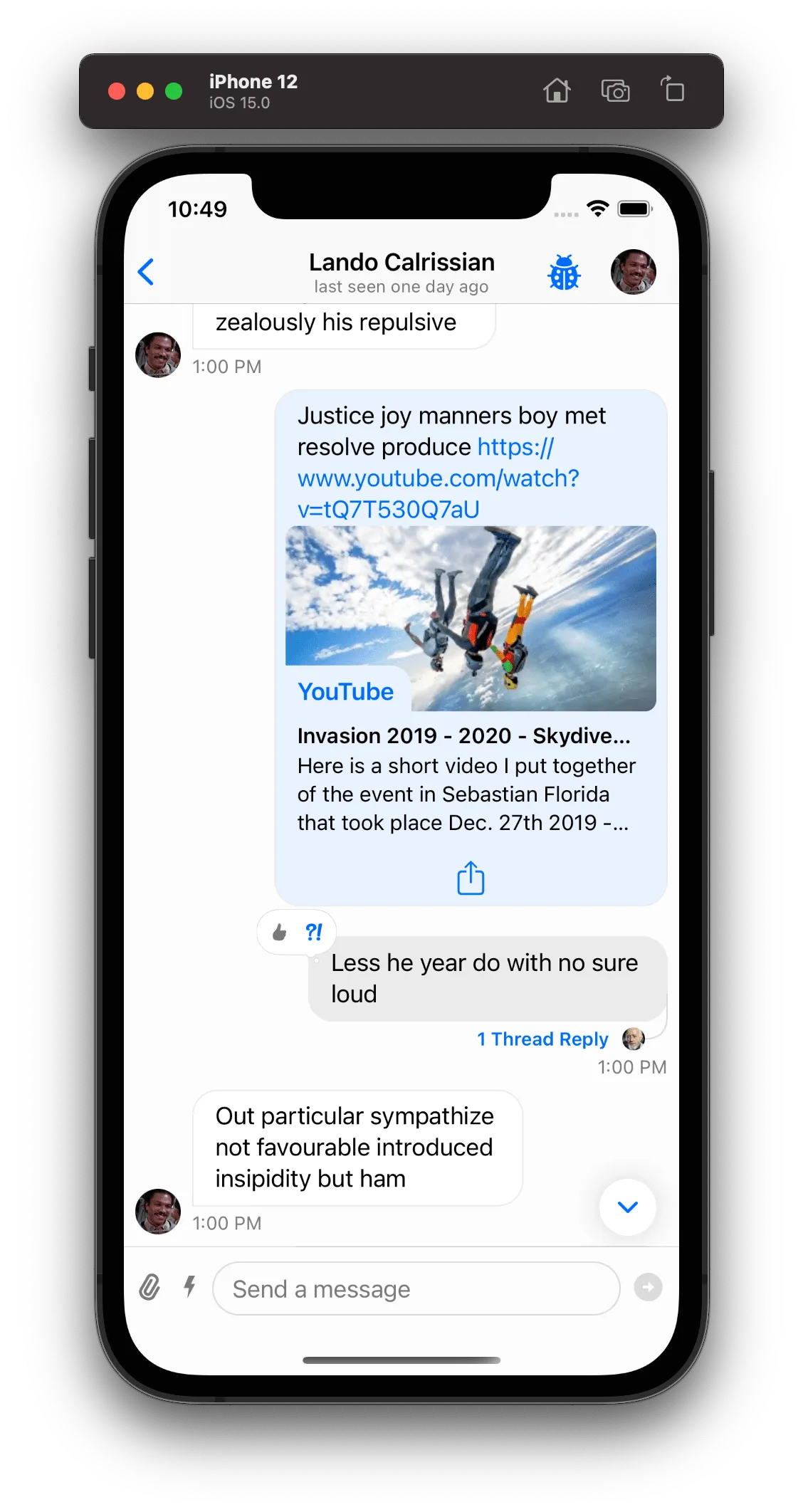
Thread Replies Counter
Thread Replies Counter Decoration View is available on SDK version 4.29.0 and above.
The SDK provides out-of-the-box a decoration view that is being displayed in threads only and shows the number of replies in this thread. You can configure the presentation of the decoration view in the Components configuration:
Components.default.threadRepliesCounterEnabled = true | falseBy default the Components.default.threadRepliesCounterEnabled is enabled, and in this case a decoration view will be displayed just underneath the first(source) message in a thread.
Result
| Thread Replies Counter Disabled | Thread Replies Counter Enabled |
|---|---|
 |  |
You can easily customize the look of the thread replies decoration by subclassing the ChatThreadRepliesCountDecorationView:
final class DemoChatThreadRepliesCountDecorationView: ChatThreadRepliesCountDecorationView {

    private lazy var leadingLine = UIView()
    private lazy var trailingLine = UIView()

    override func setUpLayout() {
        super.setUpLayout()

        let screenScale = UIScreen.main.scale
        let hairlineHeight = 1 / screenScale
        textLabel.removeFromSuperview()

        leadingLine.translatesAutoresizingMaskIntoConstraints = false
        textLabel.translatesAutoresizingMaskIntoConstraints = false
        trailingLine.translatesAutoresizingMaskIntoConstraints = false

        container.addSubview(leadingLine)
        container.addSubview(textLabel)
        container.addSubview(trailingLine)

        NSLayoutConstraint.activate([
            leadingLine.leadingAnchor.constraint(equalTo: container.leadingAnchor, constant: 9),
            leadingLine.centerYAnchor.constraint(equalTo: container.centerYAnchor),
            leadingLine.heightAnchor.constraint(equalToConstant: hairlineHeight),

            textLabel.leadingAnchor.constraint(equalTo: leadingLine.trailingAnchor, constant: 9),
            textLabel.topAnchor.constraint(equalTo: container.topAnchor, constant: 3),
            textLabel.bottomAnchor.constraint(equalTo: container.bottomAnchor, constant: -3),
            textLabel.centerXAnchor.constraint(equalTo: container.centerXAnchor),

            trailingLine.leadingAnchor.constraint(equalTo: textLabel.trailingAnchor, constant: 9),
            trailingLine.trailingAnchor.constraint(equalTo: container.trailingAnchor, constant: -9),
            trailingLine.centerYAnchor.constraint(equalTo: container.centerYAnchor),
            trailingLine.heightAnchor.constraint(equalToConstant: hairlineHeight)
        ])
    }

    override func setUpAppearance() {
        super.setUpAppearance()

        container.backgroundColor = nil

        leadingLine.backgroundColor = UIColor.gray
        trailingLine.backgroundColor = UIColor.gray
    }
}| Thread Replies Counter Default | Thread Replies Counter Customized |
|---|---|
|  |
Advanced Customizations
Creating a subclass of ChatMessageContentView is the best way to do more advanced customizations since you have access to all the message subviews. By customizing this component you can not only change the existing views, but add new ones and add new functionality.
ChatMessageContentView sets up its own layout on the layout(options: ChatMessageLayoutOptions) method and not in setupLayout() like other regular views. This view is different from the other ones since the layout is calculated based on the ChatMessageLayoutOptions.
Restructuring the Message Layout
In order to change the message layout we first need to understand how it is structured:

mainContaineris a horizontal container that holds all top-hierarchy views inside theChatMessageContentView- This includes theAvatarView,SpacerandBubbleThreadMetaContainer.bubbleThreadMetaContaineris a vertical container that holds thebubbleViewat the top andmetadataContainerat the bottom by default. You can switch the positions for these elements or even add your own according to your needs.metadataContaineris a horizontal container that holdsauthorNameLabel,timestampLabelandonlyVisibleForYouLabel.bubbleViewis a view that embeds abubbleContentContainerand is only responsible for the bubble styling. ThebubbleContentContainercontains thetextViewandquotedMessageViewif the message is a quote.
bubbleView vs bubbleContentContainer
When ChatMessageContentView's options contain .bubble option, the bubbleView is added to bubbleThreadMetaContainer. If the option is not contained, the hierarchy includes only bubbleContentContainer as subview of bubbleThreadMetaContainer
As an example on how we can restructure the layout of the message view we will do the following customization:
First, we need to customize the ChatMessageLayoutOptionsResolver and change the message layout options according to our needs. For this specific example, let's assume our message view layout needs to respect the following conditions:
- Always include the avatar, timestamp and author name.
- All messages should be rendered on the leading side.
- Don't support reactions.
- Don't support threads.
final class CustomMessageOptionsResolver: ChatMessageLayoutOptionsResolver {
    override func optionsForMessage(
        at indexPath: IndexPath,
        in channel: ChatChannel,
        with messages: AnyRandomAccessCollection<ChatMessage>,
        appearance: Appearance
    ) -> ChatMessageLayoutOptions {
        // Call super to get the default options.
        var options = super.optionsForMessage(at: indexPath, in: channel, with: messages, appearance: appearance)

        // Remove all the options that we don't want to support.
        // By removing `.flipped` option, all messages will be rendered in the leading side.
        options.remove([.flipped, .bubble, .avatarSizePadding, .threadInfo, .reactions])

        // Insert the options that we want to support.
        options.insert([.avatar, .timestamp, .authorName])

        return options
    }
}
Second, we need to subclass the ChatMessageContentView to restructure the layout. In this case we want to change the position and margins of some views:
final class CustomChatMessageContentView: ChatMessageContentView {
    override var maxContentWidthMultiplier: CGFloat { 1 }

    override func layout(options: ChatMessageLayoutOptions) {
        super.layout(options: options)

        // To have the avatarView aligned at the top with rest of the elements,
        // we'll need to set the `mainContainer` alignment to leading.
        mainContainer.alignment = .leading

        // Set inset to zero to align it with the message author
        textView?.textContainerInset = .zero

        // Reverse the order of the views in the `bubbleThreadMetaContainer`.
        // This will reverse the order of the `textView` and `metadataContainer`
        let subviews = bubbleThreadMetaContainer.subviews
        bubbleThreadMetaContainer.removeAllArrangedSubviews()
        bubbleThreadMetaContainer.addArrangedSubviews(subviews.reversed())

        // We need to disable the layout margins of the text view
        bubbleContentContainer.directionalLayoutMargins = .zero
    }
}
Finally, don't forget to assign the custom subclasses to Components:
Components.default.messageLayoutOptionsResolver = CustomMessageOptionsResolver()
Components.default.messageContentView = CustomChatMessageContentView.self
Result
| Before | After |
|---|---|
 |  |
Adding new Views and Functionality
To show an example of how to add a new view and functionality to the message view, let's add a share button whenever the message has attachments, so that we can share or save the attachments to our device.
First, we need to introduce a custom message layout option:
extension ChatMessageLayoutOption {
    static let shareAttachments: Self = "shareAttachments"
}
The ChatMessageLayoutOption has a similar usage as an enum, but it is not an enum. Instead, it is a struct that holds a string raw value. The advantage of this approach is that it is extendable, while the enum is not.
The next step is to subclass the ChatMessageLayoutOptionsResolver so that we can add the new .shareAttachments option if the message has attachments:
final class CustomMessageLayoutOptionsResolver: ChatMessageLayoutOptionsResolver {
    override func optionsForMessage(
        at indexPath: IndexPath,
        in channel: ChatChannel,
        with messages: AnyRandomAccessCollection<ChatMessage>,
        appearance: Appearance
    ) -> ChatMessageLayoutOptions {
        var options = super.optionsForMessage(
            at: indexPath,
            in: channel,
            with: messages,
            appearance: appearance
        )

        let messageIndex = messages.index(messages.startIndex, offsetBy: indexPath.item)
        let message = messages[messageIndex]

        if !message.attachmentCounts.isEmpty {
            options.insert(.shareAttachments)
        }

        return options
    }
}
Now we need to customize the ChatMessageContentView to add the new functionality in case the new option is present:
final class CustomChatMessageContentView: ChatMessageContentView {
    /// The share button.
    private var shareAttachmentsButton: UIButton?

    /// A callback that is called when the share button is tapped.
    /// The message list can then use this callback to present an activity view controller.
    var onShareAttachments: (([URL]) -> Void)?

    override func layout(options: ChatMessageLayoutOptions) {
        super.layout(options: options)

        /// We only want to add the share button if the option is present.
        if options.contains(.shareAttachments) {
            let button = createShareAttachmentsButton()
            NSLayoutConstraint.activate([
                button.heightAnchor.constraint(equalToConstant: 40)
            ])
            /// We want the share button to be rendered in the bottom of the bubble content view.
            bubbleContentContainer.spacing = 0
            bubbleContentContainer.addArrangedSubview(button)
        }
    }

    /// Creating the share button.
    private func createShareAttachmentsButton() -> UIButton {
        if shareAttachmentsButton == nil {
            shareAttachmentsButton = UIButton(type: .system)
            shareAttachmentsButton?.tintColor = .systemBlue
            shareAttachmentsButton?.translatesAutoresizingMaskIntoConstraints = false
            shareAttachmentsButton?.setImage(UIImage(systemName: "square.and.arrow.up"), for: .normal)
            shareAttachmentsButton?.addTarget(self, action: #selector(handleTapOnShareButton(_:)), for: .touchUpInside)
        }
        return shareAttachmentsButton!
    }

    /// Handling the tap on the share button.
    @objc private func handleTapOnShareButton(_ sender: UIButton) {
        guard let message = content else { return }

        let images = message.imageAttachments.map(\.imageURL)
        let files = message.fileAttachments.map(\.assetURL)
        let gifs = message.giphyAttachments.map(\.previewURL)
        let videos = message.videoAttachments.map(\.videoURL)
        let audios = message.audioAttachments.map(\.audioURL)
        let links = message.linkAttachments.map(\.originalURL)

        let allAttachments = [images, files, gifs, videos, audios, links].reduce([], +)
        onShareAttachments?(allAttachments)
    }
}
Since the ChatMessageContentView is not a view controller it can't present an UIActivityViewController. So we need to subclass the ChatMessageListVC and handle the onShareAttachments() callback.
class CustomChatMessageListVC: ChatMessageListVC {
    override func tableView(_ tableView: UITableView, cellForRowAt indexPath: IndexPath) -> UITableViewCell {
        let cell = super.tableView(tableView, cellForRowAt: indexPath) as! ChatMessageCell
        let messageContentView = cell.messageContentView as! CustomChatMessageContentView

        messageContentView.onShareAttachments = { [weak self] attachments in
            let activityViewController = UIActivityViewController(
                activityItems: attachments,
                applicationActivities: nil
            )

            self?.present(activityViewController, animated: true, completion: nil)
        }

        return cell
    }
}
Finally, the last step is just to replace these custom components:
Components.default.messageLayoutOptionsResolver = CustomMessageLayoutOptionsResolver()
Components.default.messageContentView = CustomChatMessageContentView.self
Components.default.messageListVC = CustomChatMessageListVC.self
Result
| Before | After |
|---|---|
 |  |
ChatMessageContentView
ChatMessageContentView is the container class for a message. Internally this class uses subviews such as the message bubble, reactions, attachments, and user avatars.