 React
React iOS
iOS Android
 Flutter
 Angular
 JavaScript
 Unity
Unity Unreal
 Node
Node Python
 Ruby
Ruby PHP
PHP Java
Java .NET
.NET Go
Go REST
RESTstruct ChatApp: App {
var body: some Scene {
WindowGroup {
TabView {
ChatChannelListView()
.tabItem { Label("Chat", systemImage: "message") }
ChatThreadListView()
.tabItem { Label("Threads", systemImage: "text.bubble") }
}
}
}
}Thread List
The ChatThreadListView is the UI component that displays the list of threads that the current user is participating in.
The Thread List component is available on the SwiftUI SDK since version 4.65.0.
Basic Usage
You can show this component in your app by creating a ChatThreadListView instance, here is a simple example of an app with two tabs, one for the channel list and another for the thread list:
The ChatThreadListView has the following parameters:
viewFactory: The view factory used for creating views used by the thread list.viewModel: The view model used for managing the thread list presentation logic. A default view model is provided if not specified.threadListController: The thread list controller managing the list of threads. Provide a customThreadListQueryto customize the list.title: A custom title used as the navigation bar title.embedInNavigationView: Whether to embed the view in the SDK's navigation container (NavigationStackon iOS 16+,NavigationViewon earlier versions). The default istrue.
Thread List Query
The ThreadListQuery is responsible to configure the list of threads that will be displayed in the ChatThreadListController. These are the available parameters:
watch: A boolean indicating whether to watch for changes in the thread list or not.filter: An optional filter for the threads returned.sort: Sorting for the thread list. By default it sorts by unread state, last message date, and parent message id.limit: The amount of threads fetched per page. The default is 20.replyLimit: The amount of replies fetched per thread. The default is 3.participantLimit: The amount of participants fetched per thread. The default is 10.next: The pagination token from the previous response to fetch the next page.
All the parameters are customizable and you can change them according to your needs. The default values are a good compromise between performance and user experience.
If you are using the ChatThreadListView component, you don't need to worry about the next parameter, since pagination is handled for you. If not, you can use the next parameter from the previous response to fetch the next page of threads.
UI Customization
You can customize the Thread List component by providing a custom ViewFactory. The view factory is responsible for creating the views used by the thread list. Below there is all the views and modifiers related to the thread list that can be customized:
makeThreadDestination()- Creates the destination view for the thread detail view. By default it shows the thread view.makeThreadListItem(thread:threadDestination:selectedThread:)- Creates the view for each thread in the list.makeNoThreadsView()- Creates the view displayed when the thread list is empty.makeThreadsListErrorBannerView(onRefreshAction:)- Creates the view displayed when an error occurs while loading the thread list.makeThreadListLoadingView()- Creates the view displayed while loading the thread list.makeThreadListContainerViewModifier(viewModel:)- Creates the view modifier applied to the thread list container view. It can be used to provide additional state or behavior to the thread list.makeThreadListHeaderViewModifier(title:)- Responsible for the navigation header of the thread list. It can be used to customize the navigation bar title, buttons, and other properties.makeThreadListHeaderView(viewModel:)- Creates the header view for the thread list. By default it shows a loading spinner if it is refetching the threads or shows a banner notifying that there are new threads to be fetched.makeThreadListFooterView(viewModel:)- Creates the footer view for the thread list. By default shows a loading spinner when loading more threads.makeThreadListBackground()- Creates the background view for the thread list.makeThreadListItemBackground(thread:isSelected:)- Creates the background view for each thread in the list.makeThreadListDividerItem()- Creates the divider view between threads in the list.
Thread List Navigation Header
The navigation header of the thread list can be configured through the makeThreadListHeaderViewModifier() view factory method. Here is sample example on how to change the header to a large title navigation style:
class AppFactory: ViewFactory {

    public static let shared = AppFactory()

    func makeThreadListHeaderViewModifier(title: String) -> some ViewModifier {
        ThreadListLargeTitleViewModifier(
            title: title
        )
    }
}

struct ThreadListLargeTitleViewModifier: ViewModifier {
    let title: String

    func body(content: Content) -> some View {
        content
            .navigationBarTitleDisplayMode(.large)
            .navigationTitle(title)
    }
}
As you can see, the customization is quite similar to the Channel List header modifier. If you need a more advanced customization, you can take a look at the ChannelListHeaderViewModifier customization.
Thread List Header View
By default, the Thread List header view shows a loading spinner when re-fetching the threads or a banner when there are new threads to be fetched. You can customize this view by providing a custom implementation of makeThreadListHeaderView().
As an example customization, lets keep the same loading spinner but change the header when there are new threads to be fetched:
struct CustomChatThreadListHeaderView: View {
    @Injected(\.colors) private var colors
    @Injected(\.images) private var images

    @ObservedObject private var viewModel: ChatThreadListViewModel

    init(
        viewModel: ChatThreadListViewModel
    ) {
        self.viewModel = viewModel
    }

    var body: some View {
        Group {
            if viewModel.isReloading {
                loadingView
            } else if viewModel.hasNewThreads {
                newThreadsBannerView
            } else {
                EmptyView()
            }
        }
    }

    var loadingView: some View {
        VStack {
            Spacer()
            ProgressView()
            Spacer()
        }
        .frame(height: 40)
    }

    var newThreadsBannerView: some View {
        HStack(alignment: .center) {
            Spacer()
            Text("\(viewModel.newThreadsCount) new threads")
                .foregroundColor(Color(colors.staticColorText))
            Spacer()
        }
        .padding(.all, 12)
        .background(colors.tintColor)
        .onTapGesture {
            viewModel.loadThreads()
        }
    }
}
Then, don't forget to provide the custom view in the view factory:
func makeThreadListHeaderView(viewModel: ChatThreadListViewModel) -> some View {
    CustomChatThreadListHeaderView(viewModel: viewModel)
}
Result:
| Before | After |
|---|---|
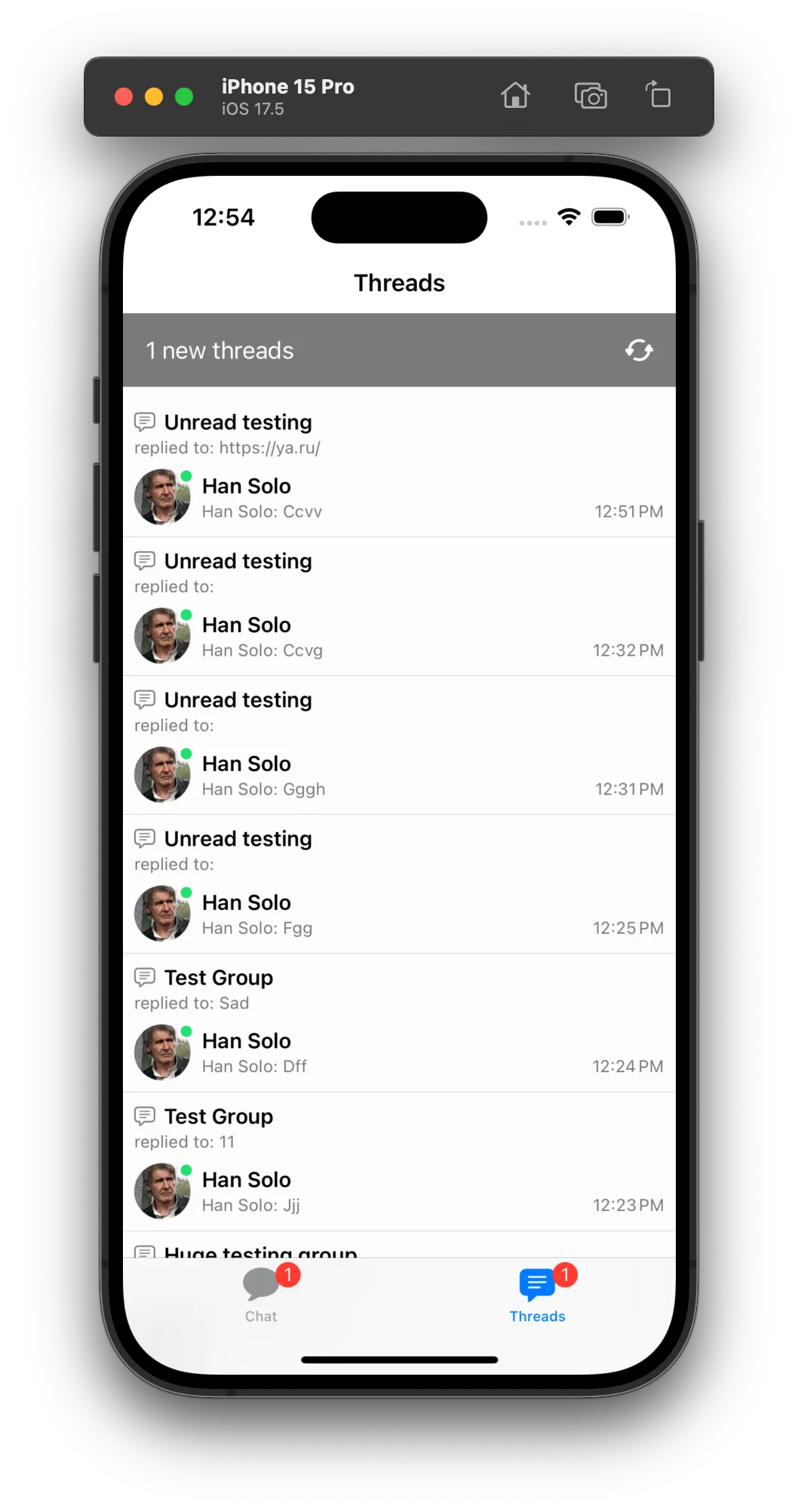 | 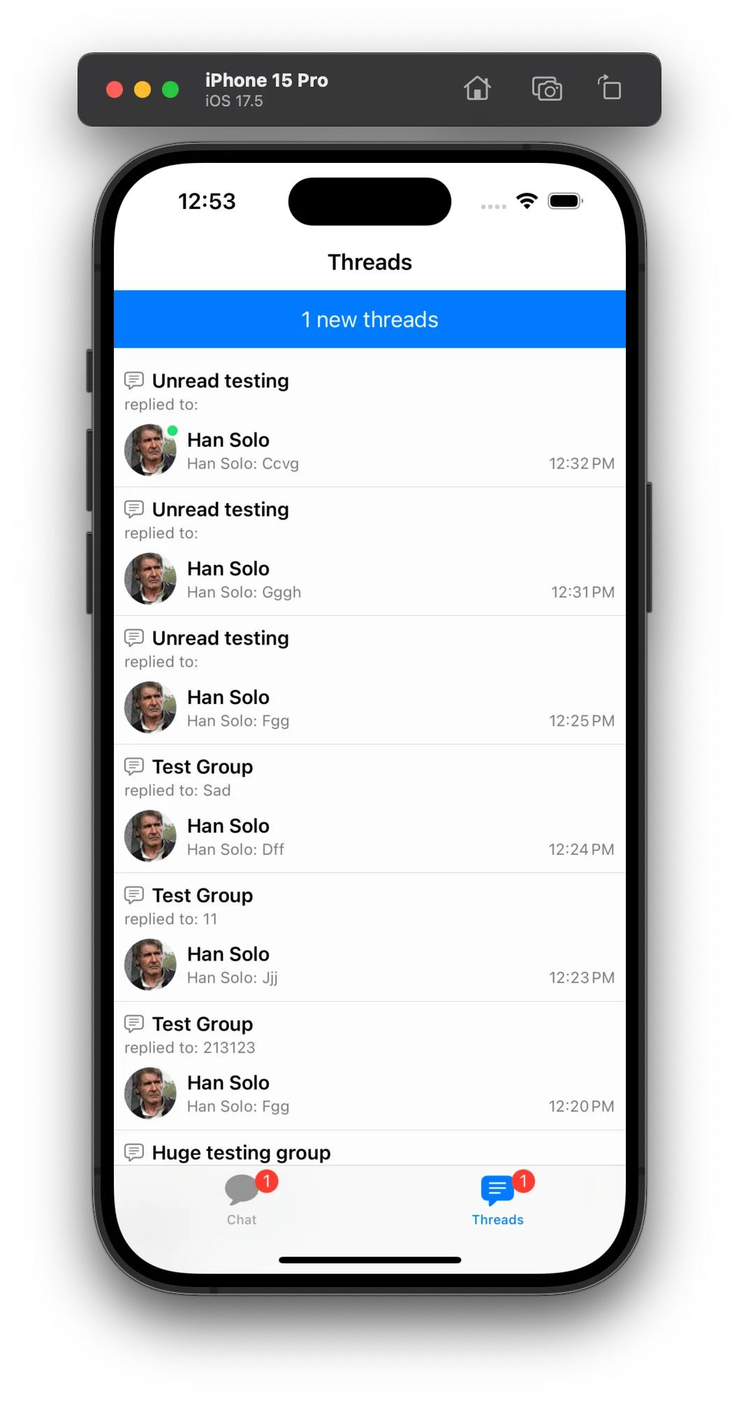 |
Advanced Customization
Let's imagine that you do not want the new threads banner to appear in the thread list header view, but instead you want to show a floating banner on the top of the thread list. You can do this by first, changing the makeThreadListHeaderView() method to return only the loading view when it is reloading, and then provide a custom makeThreadListContainerViewModifier() to add the floating banner on top of the thread list.
First, we change the thread list header view to only show the loading spinner:
struct CustomChatThreadListHeaderView: View {
    @ObservedObject private var viewModel: ChatThreadListViewModel

    init(
        viewModel: ChatThreadListViewModel
    ) {
        self.viewModel = viewModel
    }

    var body: some View {
        Group {
            if viewModel.isReloading {
                loadingView
            } else {
                EmptyView()
            }
        }
    }

    var loadingView: some View {
        VStack {
            Spacer()
            ProgressView()
            Spacer()
        }
        .frame(height: 40)
    }
}
Then, we provide a custom view modifier to add the floating banner on top of the thread list:
struct CustomChatThreadListContainerModifier: ViewModifier {
    @Injected(\.colors) private var colors
    @Injected(\.images) private var images

    @ObservedObject private var viewModel: ChatThreadListViewModel

    init(
        viewModel: ChatThreadListViewModel
    ) {
        self.viewModel = viewModel
    }

    func body(content: Content) -> some View {
        if viewModel.hasNewThreads && !viewModel.isReloading {
            ZStack(alignment: .top) {
                content
                newThreadsBannerView
            }
        } else {
            content
        }
    }

    var newThreadsBannerView: some View {
        VStack(alignment: .center) {
            HStack(alignment: .center) {
                Text("\(viewModel.newThreadsCount) new threads")
                    .font(.footnote.bold())
                    .foregroundColor(Color(colors.staticColorText))
                Image(uiImage: images.restart)
                    .customizable()
                    .frame(width: 20, height: 20)
                    .foregroundColor(Color(colors.staticColorText))
            }
            .frame(width: 140, height: 25)
            .padding(.all, 8)
            .background(colors.tintColor)
            .clipShape(.capsule)
            .shadow(radius: 4)
            .onTapGesture {
                viewModel.loadThreads()
            }
        }
        .padding(.top, 20)
    }
}
Make sure you set the custom view modifier in the view factory:
func makeThreadListContainerViewModifier(viewModel: ChatThreadListViewModel) -> some ViewModifier {
    CustomChatThreadListContainerModifier(viewModel: viewModel)
}
Result:
| Before | After |
|---|---|
| 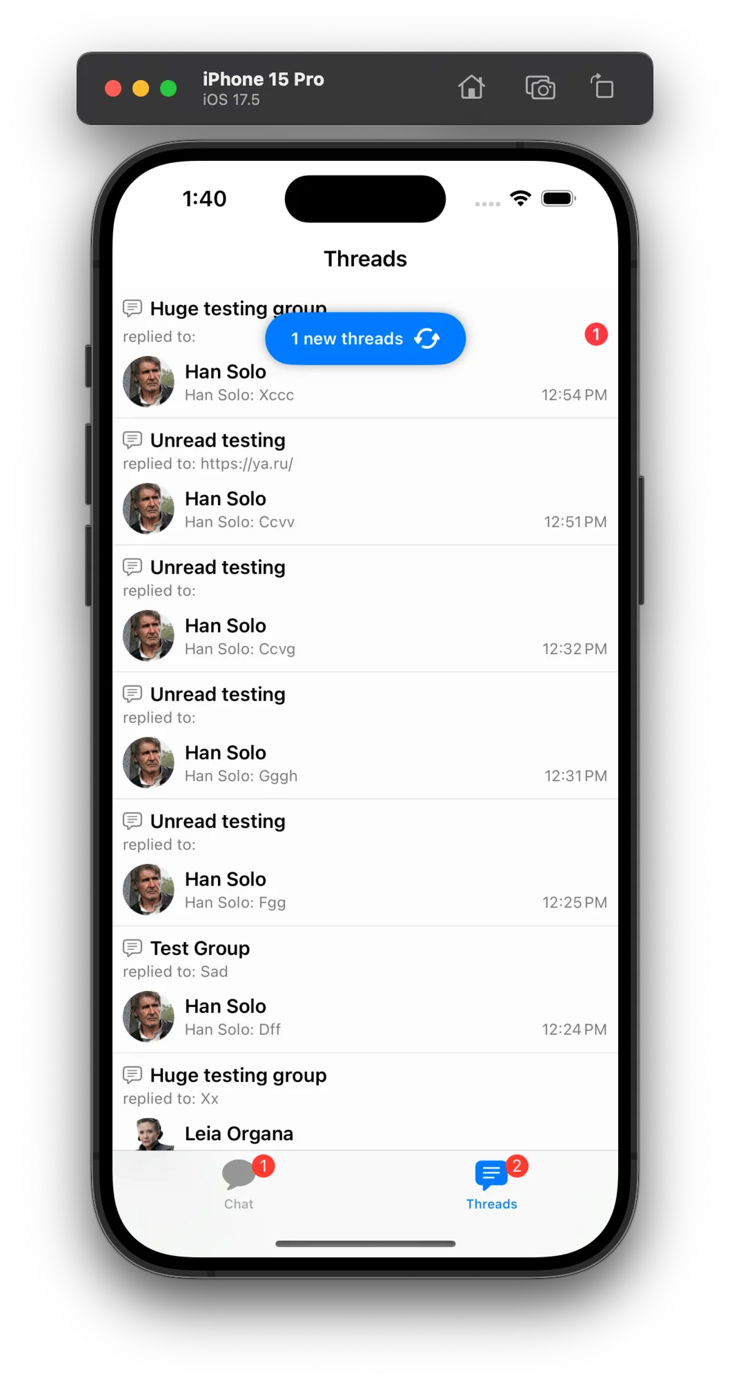 |
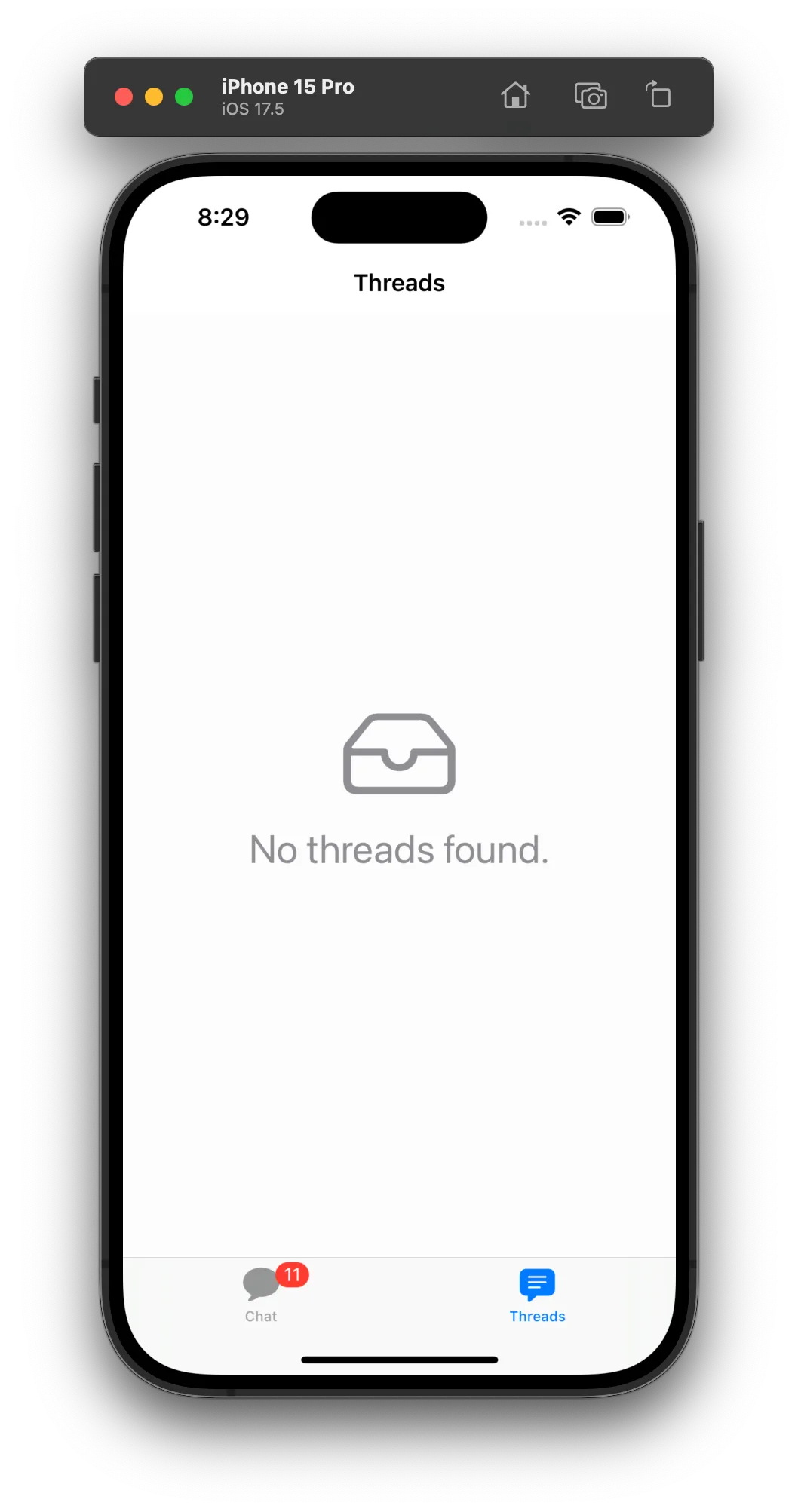
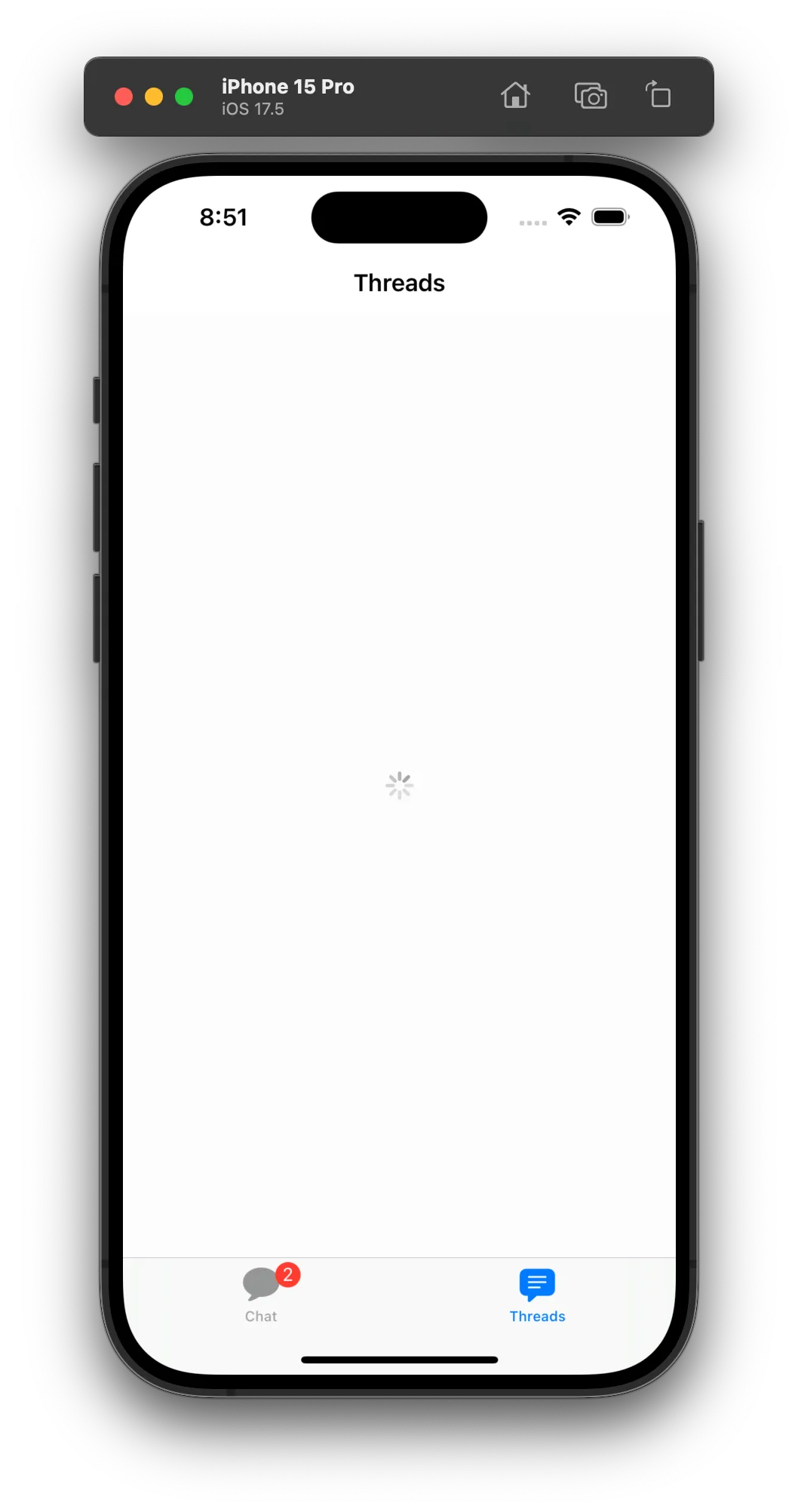
Thread List States
The Thread List component comes with three states: loading, empty, and error. The state logic is handled automatically by this component. You can override the appearance of these states by providing a custom ViewFactory and customizing the views related to these states:
makeNoThreadsView()- The empty state view.makeThreadsListErrorBannerView()- The error banner state view.makeThreadListLoadingView()- The loading state view.
| Empty | Error | Loading |
|---|---|---|
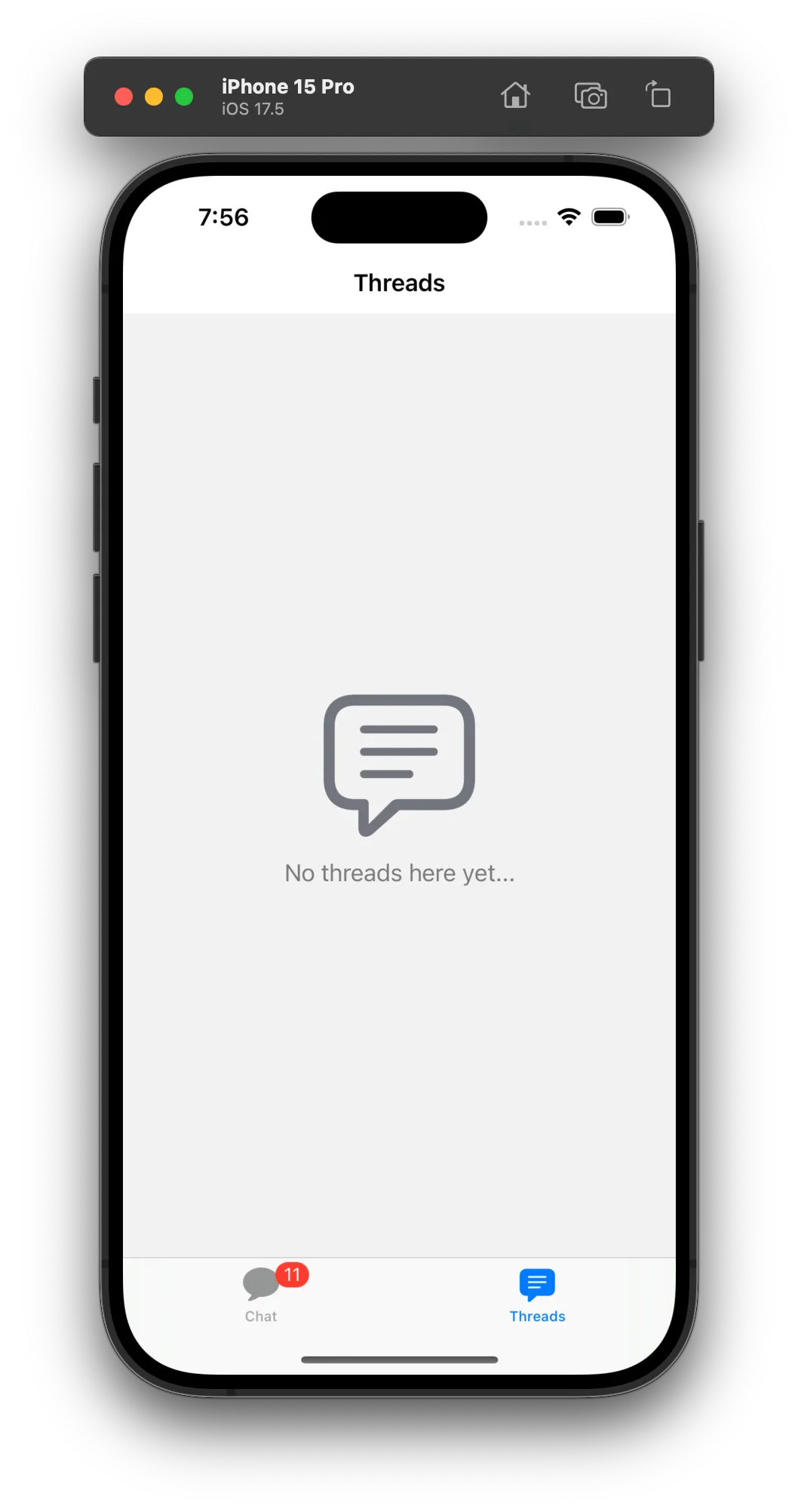 | 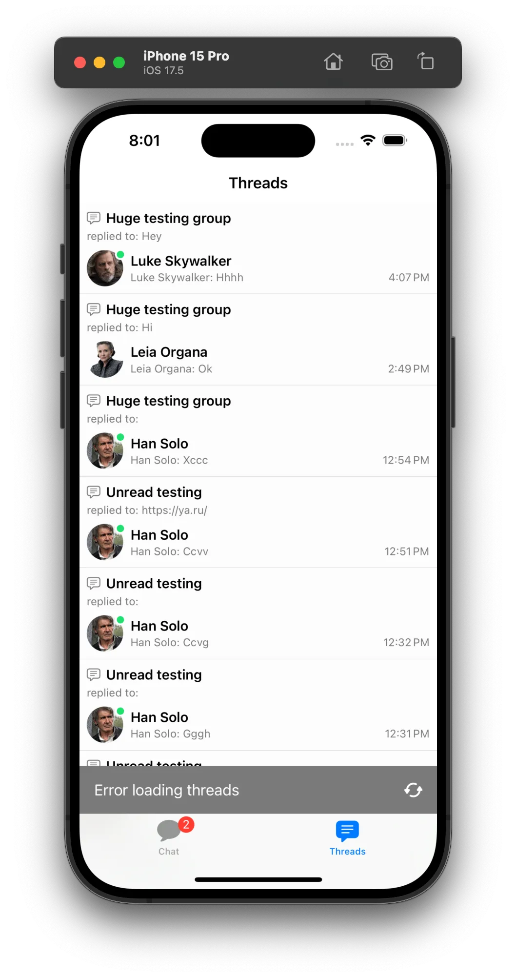 | 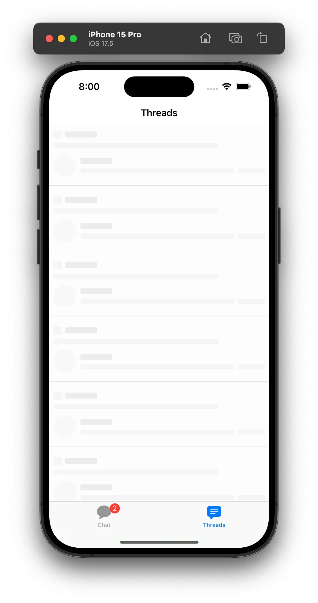 |
The loading view uses a redacted effect to simulate the loading state based on our thread list item layout. You can customize the loading view by providing your own redacted effect or just a simple progress view like the example below:
struct CustomThreadListLoadingView: View {
    var body: some View {
        VStack {
            Spacer()
            ProgressView()
            Spacer()
        }.frame(maxWidth: .infinity)
    }
}

// view factory replacement
func makeThreadListLoadingView() -> some View {
    CustomThreadListLoadingView()
}
Below is an example of a custom empty view:
struct CustomNoThreadsView: View {
var body: some View {
VStack {
Spacer()
Image(systemName: "tray")
.resizable()
.scaledToFit()
.frame(width: 80, height: 80)
.foregroundColor(.gray)
Text("No threads found.")
.font(.title)
.foregroundColor(.gray)
Spacer()
}
.frame(maxWidth: .infinity)
}
}
// view factory replacement
func makeNoThreadsView() -> some View {
CustomNoThreadsView()
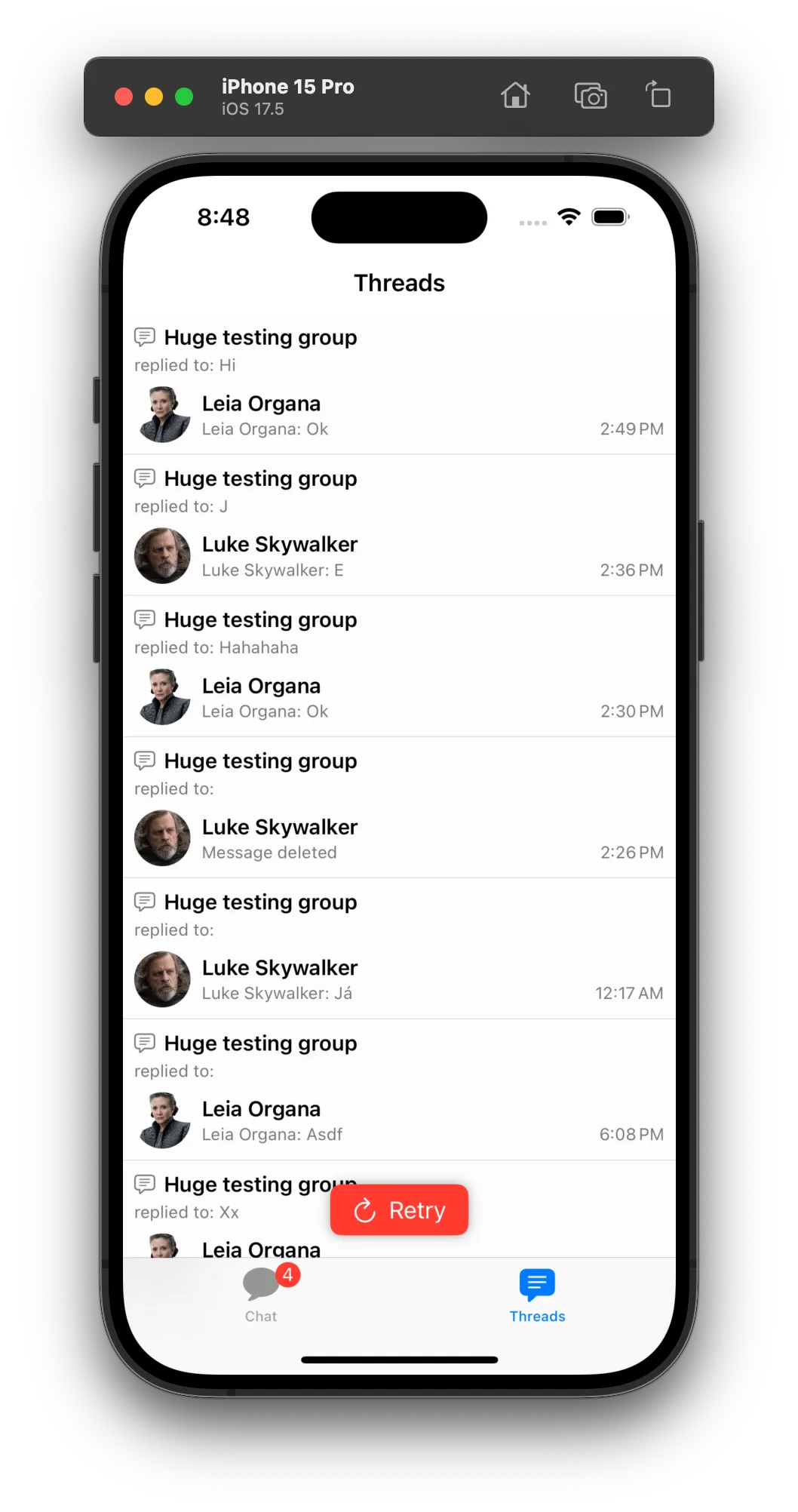
}For the loading view, let's change the default banner to be a floating red banner:
struct CustomThreadListErrorBannerView: View {
    var onRefreshAction: () -> Void

    var body: some View {
        HStack {
            Spacer()
            Button(action: onRefreshAction) {
                HStack {
                    Image(systemName: "arrow.clockwise")
                    Text("Retry")
                }
                .padding(.horizontal, 16)
                .padding(.vertical, 8)
                .background(Color.red)
                .foregroundColor(.white)
                .cornerRadius(8)
                .shadow(radius: 4)
            }
            Spacer()
        }
        .padding(.bottom, 16)
    }
}

// view factory replacement
func makeThreadsListErrorBannerView(onRefreshAction: @escaping () -> Void) -> some View {
    CustomThreadListErrorBannerView(onRefreshAction: onRefreshAction)
}
With the customizations above, the thread list states will look like this:
| Empty | Error | Loading |
|---|---|---|
 |  |  |
Advanced Customization
You can have more control on how you display the different states of the thread list by making use of the thread list container view modifier. For example, instead of showing a floating error button, you can show a full screen error view. Here is an example on how it is possible to completely take control of the thread list states:
struct CustomChatThreadListContainerModifier: ViewModifier {
    @ObservedObject private var viewModel: ChatThreadListViewModel

    init(viewModel: ChatThreadListViewModel) {
        self.viewModel = viewModel
    }

    func body(content: Content) -> some View {
        if viewModel.isLoading {
            CustomThreadListLoadingView()
        } else if viewModel.failedToLoadThreads {
            CustomErrorView()
        } else if viewModel.isEmpty {
            CustomNoThreadsView()
        } else {
            content
        }
    }
}
Then, you would need to change the view factory to return empty views for the existing state views, and add the custom container modifier:
func makeNoThreadsView() -> some View {
    EmptyView()
}

func makeThreadListLoadingView() -> some View {
    EmptyView()
}

func makeThreadsListErrorBannerView(onRefreshAction: @escaping () -> Void) -> some View {
    EmptyView()
}

func makeThreadListContainerViewModifier(viewModel: ChatThreadListViewModel) -> some ViewModifier {
    CustomChatThreadListContainerModifier(viewModel: viewModel)
}
Thread List Item
The thread list item view is responsible for displaying each thread in the list. You can customize the thread list item view by providing a custom implementation of makeThreadListItem(thread:threadDestination:selectedThread:).
By default, the navigation is automatically handled for you, as long as you wrap your custom channel list item inside our ChatThreadListNavigatableItem container view. Here is how you provide your custom thread list item in the view factory:
func makeThreadListItem(
    thread: ChatThread,
    threadDestination: @escaping (ChatThread) -> ChatChannelView<DemoAppFactory>,
    selectedThread: Binding<ThreadSelectionInfo?>
) -> some View{
    ChatThreadListNavigatableItem(
        thread: thread,
        threadListItem: CustomChatThreadListItem(thread: thread),
        threadDestination: threadDestination,
        selectedThread: selectedThread,
        handleTabBarVisibility: true
    )
}
If you want to handle the navigation yourself, you can provider a custom wrapper view that handles the navigation.
Below, you can see an example of a custom thread list item view that makes the layout more compact and similar to Slack:
struct CustomChatThreadListItem: View {
    let thread: ChatThread
    let viewModel: ChatThreadListItemViewModel

    init(thread: ChatThread) {
        self.thread = thread
        self.viewModel = ChatThreadListItemViewModel(thread: thread)
    }

    var body: some View {
        VStack(alignment: .leading, spacing: 2) {
            HStack {
                HStack(spacing: 2) {
                    Text("#")
                        .font(.title3.bold())
                    Text(threadTitle)
                        .lineLimit(1)
                        .font(.headline)
                        .foregroundColor(.primary)
                }
                Spacer()
                if viewModel.unreadRepliesCount > 0 {
                    UnreadIndicatorView(unreadCount: viewModel.unreadRepliesCount)
                }
            }
            HStack(alignment: .center, spacing: 4) {
                MessageAvatarView(
                    avatarURL: viewModel.latestReplyAuthorImageURL,
                    size: .init(width: 20, height: 20)
                )
                Text(viewModel.latestReplyMessageText)
                    .font(.subheadline)
                    .foregroundColor(.secondary)
                Spacer()
                Text(viewModel.latestReplyTimestampText)
                    .font(.subheadline)
                    .foregroundColor(.secondary)
            }
        }
        .padding(.all, 8)
    }

    var threadTitle: String {
        let title = thread.title ?? thread.parentMessage.text
        if title.isEmpty {
            if let lastAttachment = thread.parentMessage.allAttachments.last?.type.rawValue.capitalized {
                return lastAttachment
            }
            return thread.parentMessage.poll?.name ?? title
        }
        return title
    }
}
As you can see above, you can use our ChatThreadListItemViewModel to reuse some of the default presentation logic. You can also access the ChatThread directly or even create your own view model. Just like every other custom view, you can use our reusable components like the MessageAvatarView and UnreadIndicatorView to help you build your custom layout.
Result:
| Before | After |
|---|---|
 |  |
Thread Events
By default the UI components handle automatically the thread events, like new replies and thread updates. But, in case your app needs additional logic, these are the available thread events:
ThreadMessageNewEvent: Triggered when a new reply is added to a thread.ThreadUpdatedEvent: Triggered when a thread is updated, like the thread title or custom data.