

Creating a viable platform based on user-generated content (UGC) is an inherently difficult task in a competitive market, but adding live eCommerce to the feature list can feel particularly daunting.
Luckily, you can learn a lot about designing great UX from your competition, especially TikTok Live Shopping.
With its origins in China, a country that has consistently been at the forefront of eCommerce in general and live commerce in particular for years, the TikTok app's UX is carefully designed to drive sales while keeping users engaged with the livestream.
In this guide, we'll go over how a TikTok Live Shopping session flows, why its livestream shopping UX works so well, what product managers can learn from it, and some challenges to consider as you try to implement this feature.
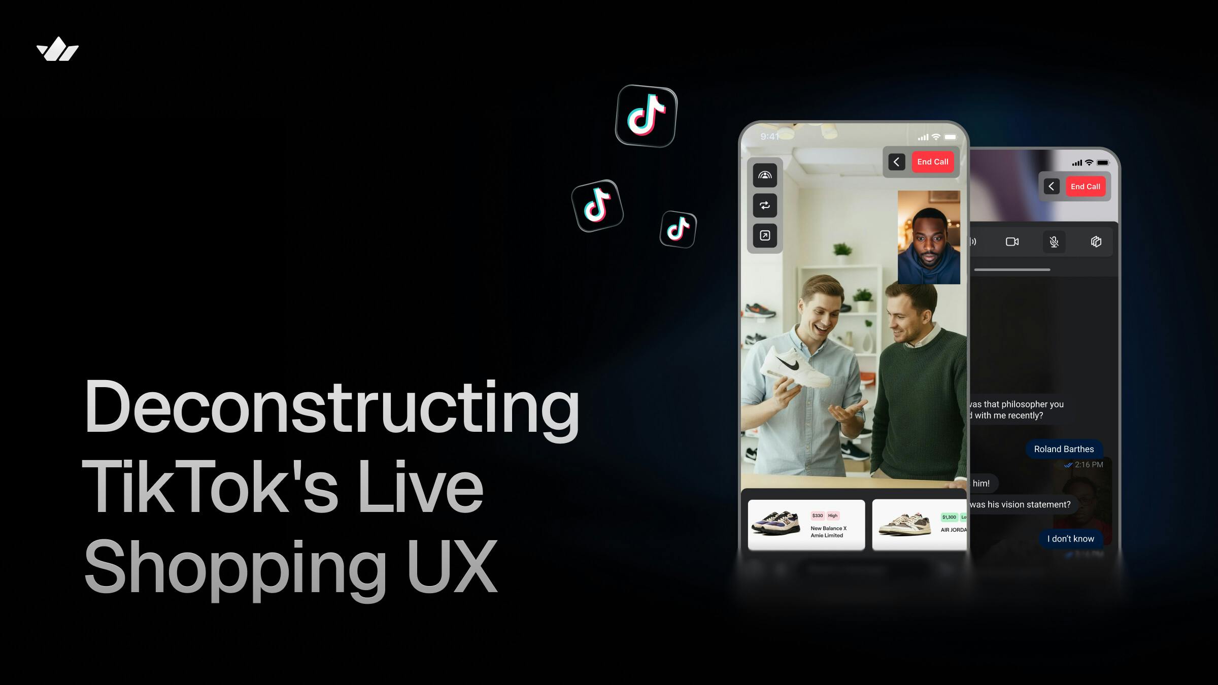
Features of a TikTok Live Shopping Session
Before we dive into the UX details, let's take a quick look at what a TikTok Live Shopping session is typically like.
Discovery
TikTok provides a few avenues for discovery.
In most cases, a user will stumble across a shopping livestream from their main For You Page feed or the Live feed, just like any other piece of user generated content.

Users can also specifically search for live shopping broadcasts if they have a particular channel, product, or category in mind already.
Since these streams appear naturally in most cases, there are many visual indicators that tell a user they're watching a shopping stream instead of a standard live session.

Apart from the host who may be showing off a featured item, there's a product card at the bottom, as well as elements on the top and bottom that display the channel name with a follow button, viewer count, and more.
Engagement
Just like other livestreaming formats, there's a direct connection between creator and audience. This atmosphere creates natural, real-time engagement via the live chat room and viewer-initiated actions, like virtual gifts to the host that trigger in-stream animations.
Users can also explore discounts, product carousels, and whole product pages without being taken off the livestream.
Purchase
Customers stay in the stream as they complete purchases, as well.

Tapping the product card opens a built-in listing page with the ability to add to cart or buy now. A second tap on either button brings up the checkout overlay.
During checkout, first-time buyers have to enter their card details, while returning customers benefit from features like quick-fill and saved card details.
Once a payment completes, the app displays a confirmation that the order was successful with relevant details and buttons to view the order or return to the stream. If the user doesn't tap any buttons, they are brought back to the stream automatically.
Why TikTok's Design Works: UX Principles in Action
Now that we have an idea of the flow of a Live Shopping session, let's look at why this format is such a success.
Social Proof Drives Confidence
eCommerce in general needs social proof in the form of reviews and demos; otherwise, customers are trusting strangers on the internet with their money. TikTok Live Shopping provides this with:
-
Shop and individual product reviews
-
Verified badges
-
Viewer count
-
Floating hearts, likes, "Someone Just Bought" notifications, and virtual gift displays
Potential shoppers are much more likely to make a purchase if they know and like the host. If they're unfamiliar with them, they can still see that others trust them.
Real-Time Feedback Reduces Uncertainty
Since the hosts are either running their own shop and/or receiving commissions for their sales, they're motivated to keep the audience watching their broadcast. Part of this involves giving demonstrations and answering viewer questions in the moment to inspire confidence in their products.
For example, if a customer is unsure about how a clothing item would look on their body, they can ask the creator to try it on. This removes the guesswork about many aspects, like size and quality.

TikTok even provides an "Ask to show" button that users can press to request the host showcase a specific product.
Viewers can also get real-time feedback from other participants by asking them questions in the chat. If the consensus is that the item is high quality, it eases purchasing anxiety.
Urgency Converts Browsers Into Buyers
Limited stock indicators, discount timers, and stream-only pricing create a sense of urgency. Viewers often feel like they have to act fast before they lose access to a good deal or a desired item entirely.
The fear of missing out is such a powerful force that users seek tips on Reddit for the best ways to buy trendy items before they sell out, like the plush toy Labubu.
Frictionless Checkout Keeps Users in the Moment
From selecting the desired item to checkout, navigating a purchase is smooth and continuous. Product cards load near-instantly, and there are no redirects to external payment gateways.
Even when browsing product pages, viewers hear the stream being played out in the background. The constant chatter often continues the momentum and may inspire add-on purchases.
Best Practices for Product Managers
PMs building live commerce experiences can learn a lot from TikTok's UX.
Design for Trust Through Transparency
Live shopping sessions feel transparent on TikTok, which builds user trust. The social proof discussed previously is displayed directly in the stream UI. This reduces the need for deep navigation and the likelihood that a buyer will have second thoughts before adding to cart.
Your app doesn't need to copy TikTok exactly, but you should build for this level of visibility.
Beyond what their streams include, you could add in quality metrics like return stats or repurchase rates. Specialized platforms have even more options, such as a cosmetics live shopping app's UI noting what hair types or skin tones an item suits best.
Clarity Beats Complexity
It's best to keep on-screen information digestible. The TikTok livestream shopping UX has clear, single-purpose UI elements.

Though the colorful icons and timers can be a bit overwhelming, they still serve the purpose of being information-dense without being overly complex. This clarity reduces the time between interest and understanding for the consumer, making it less likely that they'll wander off-stream before completing an order.
Your UI should include details like matching labeling and adequate spacing with a clean visual hierarchy to reduce interface clutter and cognitive load. This will keep your users anchored to the product display.
Instant Feedback Keeps Momentum
User engagement thrives on immediate response. Even little things can make the UX feel lively, like explosive emoji animations popping up when a viewer sends the host a gift.
To create stronger feedback loops, your app should feel reactive to nearly every user action in the livestream and in the shop, including:
-
UI elements: While still respecting clarity, everything from chat emojis to successful transaction animations should hold attention.
-
App performance: Entering streams, changing screens, and the entire ordering process must feel instantaneous to the buyer.
-
Support services: Self-service portals or chatbots can handle returns, defect reports, and similar issues, so human agents can resolve more serious complaints faster.
All of these design choices will keep buyers in the app and lead to better product outcomes.
Design for Continuous Engagement
Customers who buy products through TikTok Live Shopping end up back in the stream, driving continuous engagement.
Reentering the livestream after a product purchase makes viewers more likely to:
-
Buy another product
-
Shout out their purchase to get recognized by the host
-
Inspire others to do the same in chat
Think of ways your product can build a loop of positivity and hype that sustains itself. For instance, you can display the usernames of recent or top buyers to the host to encourage in-stream acknowledgements.
Build a Strong Core Product Loop
Your app can have all the polish of TikTok, but it has no chance of competing against it without building an equally strong core experience for both creators and viewers.
Hosts are the sales engine in live shopping. Beyond entertaining viewers to keep them in the stream, they act as product experts who push potential buyers through the pipeline by answering questions and showcasing items.
You must incentivize them with:
-
Monetary compensation, like commissions or a share of ad revenue
-
In-app support via analytics dashboards and algorithm boosts to support popular channels
Viewers, too, should be given a reason to purchase on your platform. This can take the form of app-wide discounts, cheaper or free shipping for large purchases, or lower pricing for recurring orders.
Challenges Behind the Experience
Though the live shopping format has been largely successful for TikTok, there are certain challenges that come with it.
Scalability at Massive Viewer Counts
Live shopping sessions can attract many concurrent viewers, which puts intense demands on the social media platform and the commerce system.
The stream must deliver high-quality video and audio while also keeping features like real-time chat and updated product information responsive. This becomes more challenging during flash sales, where traffic and purchases suddenly spike.
Maintaining performance under these conditions is no small task for both user satisfaction and revenue protection. Even minor amounts of latency can lead to lower conversion rates when noticeable, which is why teams must build with scalability in mind from the start.
Keeping Every Component in Sync
Consistently reflecting changes in the UI is a large part of what shapes the "live" feeling in live shopping. When the UI becomes slow or completely unresponsive, users lose confidence in your platform and will likely churn.
High amounts of visual indicators on a screen at once during a session increase the risk of them falling out of sync with each other. The small inconsistencies this causes can lead to consumers having second thoughts or feeling ripped off, such as discrepancies between a discount timer and the actual prices on a product page.
Additionally, inaccurately displaying stock changes in the stream or product card can lead to customers placing an order on a sold-out product. This leads to refund complications and higher demands on customer service.
Moderating Live Interaction
With how fast comment streams move, there must be moderation systems in place that can filter out misleading or harmful UGC instantly.
The quality of moderation depends heavily on automated detection systems backed by real-time enforcement and human review for edge cases. Reliability is critical in this situation, as delays can quickly expose users and content creators to risk.
The perceived safety of the experience directly affects user trust, app retention, and willingness to purchase.
Preserving Trust and Security Throughout the Live Shop Event
Issues like secure payment systems, buyer protection, and seller verification are crucial in keeping your live-shopping marketplace from fizzling out.
Given the sheer number of users who can create shops and participate in these streams, it's essential to verify the credibility and legitimacy of their business practices. Similarly, buyer behavior must also be moderated to prevent issues like scalping or return scams.
In the case that consumers face fraud while purchasing products, there must be smooth refund workflows in place that prevent damage to your app's reputation.
Prevention is more effective than remediation, which is why companies must vigilantly maintain compliance with standards like PCI DSS to keep payment and user data safe.
Key Takeaways
TikTok Live Shopping demonstrates how livestream shopping UX can build both trust and momentum in high-intent commerce environments.
By combining live interaction, social proof, and frictionless checkout, the platform minimizes hesitation and keeps users emotionally and cognitively invested in the commerce flow.
For product managers, one of the most important lessons is that every delay, extra step, or moment of confusion weakens engagement and conversion rates. Success in live commerce depends on tight coordination between design, real-time data systems, and infrastructure at scale.
When these elements work in harmony, the result is an experience that feels fast, reliable, and persuasive, turning passive viewers into active buyers.