 React
React iOS
iOS Android
 Flutter
 JavaScript
 Unity
Unity ESP32
ESP32 Platform
 Vision Agents
struct JoinCallView: View {

    @State var callId = ""
    @ObservedObject var viewModel: CallViewModel

    var body: some View {
        VStack {
            TextField("Insert call id", text: $callId)
            Button {
                resignFirstResponder()
                viewModel.startCall(callType: .default, callId: callId, members: [])
            } label: {
                Text("Join call")
            }
            Spacer()
        }
        .padding()
    }

}Video Layout
Introduction
There are many different variations for building the user interface of a video calling app. The StreamVideo iOS SDK provides many different ways and flexibility to build your custom UI. Depending on your use-case, you can either reuse our lower-level UI components, or build completely custom ones, while making use of our video client and state handling.
The sample app
In this tutorial, we will build a video calling app without using our UI SDKs. The goal would be to show you how to use our StreamVideo client and the CallViewModel, as well as how to build your custom UI components.
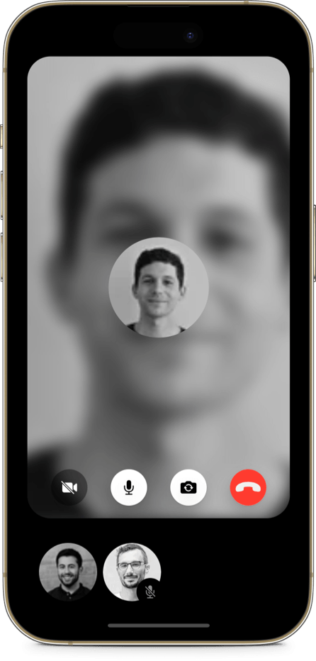
Here's a screenshot of what we are going to build:
Prerequisites
This tutorial focuses solely on building a custom UI without going through the setup of our StreamVideo client, or authenticating users. Make sure to check our sample project and perform the required setup.
Starting a call
In order to start a call, you will need to know the call's id. Let's add a simple UI that will allow the users to enter the call id:
Note the viewModel.startCall method, which is called on a tap of the "Join call" button. This starts a call with the provided call id. Adding participants is optional - if the call type is default, anyone can join the call.
Listening to the calling state
Next, let's use this view in a container view, called HomeView, that will also present our calling screen.
struct HomeView<Factory: ViewFactory>: View {

    @ObservedObject var appState: AppState

    var viewFactory: Factory
    @StateObject var viewModel = CallViewModel()

    var body: some View {
        ZStack {
            JoinCallView(viewModel: viewModel)

            if viewModel.callingState == .joining {
                ProgressView()
            } else if viewModel.callingState == .inCall {
                CallView(viewFactory: viewFactory, viewModel: viewModel)
            }
        }
    }
}
In this view, we are creating the CallViewModel, that allows us to start a call, but also listen to the callingState. We can use this @Published variable to update our UI accordingly.
When the call is in the .joining state, we can show a ProgressView. Whenever it changes to the .inCall state (which means the user has joined the call), we can show our custom CallView.
Building a custom CallView
Next, let's build our custom CallView, which would have a different UI than the default UI SDK implementation. Our goal here would be to show a large video of the current speaker, while the other users' avatars are presented at the bottom, in a horizontally scrollable list.
First, let's see how we can access the participants.
var participants: [CallParticipant] {
    viewModel.callParticipants
        .map(\.value)
        .sorted(by: defaultComparators)
}
The call participants are exposed via the CallViewModel's callParticipants dictionary. You can sort them or group them based on their different properties, such as whether they are speaking, they have audio / video or any other different criteria. The callParticipants dictionary is a @Published variable, and it will trigger updates in your views, whenever its state changes.
There are default sort comparators, that you can use to sort the participants. The default comparators prioritize the pinned user, then the dominant speaker etc:
public let defaultComparators: [StreamSortComparator<CallParticipant>] = [
    pinned,
    screensharing,
    dominantSpeaker,
    ifInvisible(isSpeaking),
    ifInvisible(publishingVideo),
    ifInvisible(publishingAudio),
    ifInvisible(userId)
]
You can provide your own ordering by calling the sorted(using: comparators) method on the CallParticipants.
Additionally, you can access the same properties for the local user, via the CallViewModel's localParticipant variable.
Next, let's see the implementation of the CallView's body:
var body: some View {
    VStack {
        ZStack {
            GeometryReader { reader in
                if let dominantSpeaker = participants.first {
                    VideoCallParticipantView(
                        participant: dominantSpeaker,
                        availableFrame: reader.frame(in: .global),
                        contentMode: .scaleAspectFit,
                        customData: customData,
                        call: call
                    )
                }

                VStack {
                    Spacer()
                    CustomCallControlsView(viewModel: viewModel)
                }
            }
        }
        .frame(maxWidth: .infinity, maxHeight: .infinity)
        .cornerRadius(32)
        .padding(.bottom)
        .padding(.horizontal)

        ScrollView(.horizontal) {
            HStack {
                ForEach(participants.dropFirst()) { participant in
                    BottomParticipantView(participant: participant)
                }
            }
        }
        .padding(.all, 32)
        .frame(height: 100)
        .frame(maxWidth: .infinity)
    }
    .background(Color.black)
}
Our main container would be a VStack, that consists of two parts - the dominant speaker view and the scrollable participant list.
Additionally, the dominant speaker view also shows the call controls for the current user, which means we can use a ZStack.
Dominant speaker view
The dominant speaker is presented using the SDKs VideoCallParticipantView, which handles showing both the video feed of the user, or their profile image if the video is disabled. If you want a different behaviour or UI here, you can also use the lower-level component VideoRendererView, that shows the video feed of the participant, and add your additional custom UI elements.
Custom call controls view
Next, let's see the CustomCallControlsView:
struct CustomCallControlsView: View {

    @ObservedObject var viewModel: CallViewModel

    var body: some View {
        HStack(spacing: 32) {
            VideoIconView(viewModel: viewModel)
            MicrophoneIconView(viewModel: viewModel)
            ToggleCameraIconView(viewModel: viewModel)
            HangUpIconView(viewModel: viewModel)
        }
        .frame(maxWidth: .infinity)
        .frame(height: 85)
    }
}
In this example, we are building a custom call controls view, using buttons from the SDK, for muting video/audio, toggling camera and hanging up. You can easily add your own UI elements in the HStack above. You can use the CallViewModel for the standard call-related actions, or use the Call object directly for custom events and reactions (as described here), and for permissions related actions (as described here).
Horizontally scrollable list
Finally, let's see the horizontally scrollable list at the bottom again:
ScrollView(.horizontal) {
    HStack {
        ForEach(participants.dropFirst()) { participant in
            BottomParticipantView(participant: participant)
        }
    }
}
Here, we drop the first element (that's displayed in the dominant speaker view) from the participants array. This components displays a custom view of type BottomParticipantView:
struct BottomParticipantView: View {

    var participant: CallParticipant

    var body: some View {
        UserAvatar(imageURL: participant.profileImageURL, size: 80)
            .overlay(
                !participant.hasAudio ?
                    BottomRightView {
                        MuteIndicatorView()
                    }
                : nil
            )
    }

}
This is a simple view that makes use of our UserAvatar view for displaying the user's profile image. It also shows an overlay for the mute indicator, which in this case is a custom UI element:
struct MuteIndicatorView: View {

    var body: some View {
        Image(systemName: "mic.slash.fill")
            .resizable()
            .aspectRatio(contentMode: .fit)
            .frame(width: 14)
            .padding(.all, 12)
            .foregroundColor(.gray)
            .background(Color.black)
            .clipShape(Circle())
            .offset(x: 4, y: 8)
    }
}
Conclusion
That's everything that needs to be done to have the UI shown in the screenshot above. Since everything we build was with custom components, you can further change and re-arrange it to fit your use-case.