
Stream now provides a Jetpack Compose Chat SDK. Check out the Compose Chat Messaging Tutorial and give it a try today!
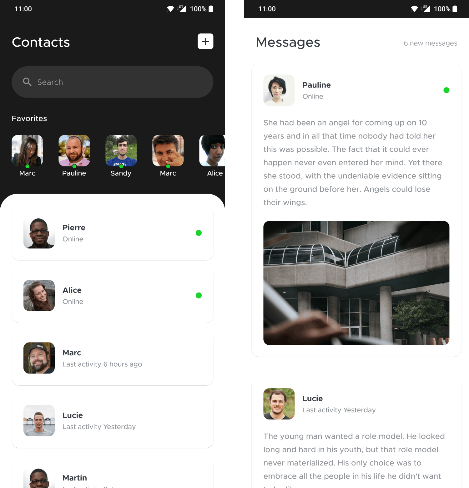
We've recently published a Jetpack Compose design sample on Twitter, recreating the Contacts & Messages design by Mickael Guillaume on Dribbble.
The source code for this sample is available on GitHub. In this article, we'll review some of the solutions within the sample to learn more about Jetpack Compose!
Simple color management
Starting simple, we'll take a look at the color management of the sample. Since it doesn't support dark mode, and doesn't need a large palette, it doesn't make use of the color systems provided by MaterialTheme. Instead, it groups all colors used in a simple object:
1234567891011object AppColors {
    val bgLight = Color.White
    val bgDark = Color(0xFF1A1A1A)
    val bgMedium = Color(0xFF323232)

    val textLight = Color.White
    val textDark = Color(0xFF393E46)
    val textMedium = Color(0xFF929599)

    val onlineIndicator = Color(0xFF19D42B)
}
These are really straightforward to use, for example, here's the implementation of the small green circles that are used as online indicators:
123456Box(
    Modifier
        .size(12.dp)
        .clip(CircleShape)
        .background(AppColors.onlineIndicator)
)
Custom fonts
To attempt to match the font in the sample, we used the free Metropolis font. Adding a custom font in a Compose app is simple: add the resources, create a font family, and then apply it in the theme.
Add the resources to the res/font folder.
Here, we've added five different variants of the Metropolis font. Be careful to use names that the Android resource system can handle (avoid spaces and capital letters).

Create a FontFamily and configure it in the theme.
These resources can be wrapped in Font objects, specifying the weight and style that each font file corresponds to. Then, they can all be added to a FontFamily like so:
1234567private val Metropolis = FontFamily(
    Font(R.font.metropolis_light, FontWeight.Light),
    Font(R.font.metropolis_regular, FontWeight.Normal),
    Font(R.font.metropolis_regular_italic, FontWeight.Normal, FontStyle.Italic),
    Font(R.font.metropolis_medium, FontWeight.Medium),
    Font(R.font.metropolis_bold, FontWeight.Bold)
)
This font family is part of the Typography options in the theme:
1234567private val Typography = Typography(
    body1 = TextStyle(
        fontFamily = Metropolis, // Using our own custom font family here
        fontWeight = FontWeight.Normal,
        fontSize = 16.sp
    )
)
Which will be contained by the app theme, like so:
123456789@Composable
fun CleanChatTheme(
    content: @Composable () -> Unit
) {
    MaterialTheme(
        typography = Typography,
        content = content,
    )
}
Set font weights as needed.
Having CleanChatTheme applied at the root of the Compose tree, the font family will automatically be applied to Text elements in the app.
To get a specific variant of the font, such as bold, specify the weight when creating a Text:
12345Text(
    user.name,
    fontWeight = FontWeight.Bold,
    color = AppColors.textDark,
)
The @ReadOnlyComposable annotation
Sometimes you need access to the composable environment in a function, but won't emit any UI inside it. In these cases, @ReadOnlyComposable can be used to tell the compiler about this to perform certain optimizations.
Take the following function: it transforms a User into a String that describes their last active status (currently online or seen X time ago). To do this, it uses the stringResource composable function.
1234567891011@Composable
@ReadOnlyComposable
private fun lastActiveStatus(user: User): String {
    return when {
        user.isOnline -> stringResource(R.string.user_online)
        else -> stringResource(
            R.string.user_last_activity,
            DateUtils.getRelativeTimeSpanString(user.lastOnline.time)
        )
    }
}
As you'd expect, composables marked with @ReadOnlyComposable can only call other composables that are also marked with @ReadOnlyComposable. For example, trying to create a Text inside this function would result in an error.
Of course, this means that the stringResource function being used above is also marked as a @ReadOnlyComposable.
The @Preview annotation
@Preview is a core part of Jetpack Compose tooling, and it can be used to preview small composable snippets, such as:
12345@Preview
@Composable
fun UserRowPreview() {
    UserRow(user = randomUser())
}
Notably, the annotation comes with a large array of parameters that you can use to customize the previews.
For example, the previews don't show a background by default, so whatever your IDE's theme is will serve as the background, which often makes for a bad experience if the composable you're previewing doesn't create its own background.
Adding the showBackground = true parameter to the annotation means the difference between these two looks:

There are many options available on this annotation to set the size and locale, show the system UI, create groups of previews, and so on. For a deeper exploration of the available options, check out this article by Joe Birch.
List spacing
Getting spacing around lists right has been a difficult task with the old View system. Should you add padding or margins? How will content get cut off, where and how will the overscroll animation be displayed?
Another frequent task is adding space between the list elements, for this you'd implement your own RecyclerView.ItemDecoration class, where you'd then write pixel values into an outRect based on various parameters.
Compose makes this all a lot easier. There are two main parameters you can use to configure spacing on a LazyList: contentPadding and verticalArrangement.
As opposed to regular padding (using Modifier.padding) which would add padding outside the composable and cut off the contents of the list, content padding is added inside the composable, meaning that content will be able to scroll into this padded area.
Here's the same LazyRow with regular padding and content padding, when scrolled to the left:

1234567LazyRow(
    contentPadding = PaddingValues(horizontal = 24.dp, vertical = 0.dp),
) {
    items(users) { user ->
        FavoriteUser(user)
    }
}
The PaddingValues objects has various different constructor functions: you can specify the same padding on all sides, horizontal and vertical padding separately, or individual values for all sides!
The verticalArrangement and horizontalArrangement parameters (on LazyColumn and LazyRow, respectively) can be used to easily add spacing between the elements of the list, by using Arrangement.spacedBy:
12345678LazyRow(
    contentPadding = PaddingValues(horizontal = 24.dp, vertical = 0.dp),
    horizontalArrangement = Arrangement.spacedBy(16.dp),
) {
    items(users) { user ->
        FavoriteUser(user)
    }
}
This makes the following change to the list:

Local Composable functions
Kotlin offers local functions to create short, simple functions that will only be used within another function (and shouldn't even be exposed to others within the same file, like private functions would be).
This works with @Composable functions as well - credit goes to Gabor Varadi for this idea. Here's an example of creating a very small, simple composable to be used inside another:
12345678910111213141516171819@Composable
fun UserRow(user: User) {
    @Composable
    fun OnlineIndicator() {
        Box(
            Modifier
                .size(12.dp)
                .clip(CircleShape)
                .background(AppColors.onlineIndicator)
        )
    }

    Row {
        ...
        if (user.isOnline) {
            OnlineIndicator()
        }
    }
}
Conclusion
That's a wrap for now! Hope you discovered some useful new features of Jetpack Compose along the way. Remember, you can find the full source code of the sample on GitHub, if you wanna play around with the code yourself.
Curious about Compose? Check out our previous article where you can learn how to build a real, functional Android Chat app with Jetpack Compose.
To add a real messaging feature to your app, check out Stream's Chat SDK for Android. It's easy to get started with the in-app messaging tutorial, and you can find more details on the GitHub page of the Android SDK.