Jetpack Compose is a newly introduced declarative UI framework compared to other declarative UIs, and there hasn't been much research on specific design patterns for UI component composition. However, the React ecosystem has a strong history of creating and combining UI components. The UI design patterns used in React can also be adapted in Compose to meet the framework's needs. (Of course, understanding the reasoning behind applying a pattern is far more important than simply implementing the pattern itself.).
The two primary patterns we will be exploring are:
- Slot pattern: This uses slots to group components together in a flexible way, making it easy to organize and rearrange UI elements.
- Compound Component pattern: This shares the state of a parent component with its children to reduce coupling between components and is useful for separating UI and business logic.
In this article, we will review these patterns in the context of real-world requirements and explore the best practices for implementing them. The key objective is to improve the reusability of UI components and provide recommendations for designing UI components in Jetpack Compose.
Terminology
The term “composition” in this article does not refer to one of the Compose phases, but rather to combining objects in object-oriented programming to create complex functionality. Compositing objects to design structures can enhance flexibility and reusability, unlike reusing through inheritance.
Note: If you're unfamiliar with this concept, you can consider reading Effective Kotlin Item 36: Prefer Composition Over Inheritance for a deeper understanding.
Also, the term "component" refers to a UI component in Jetpack Compose, specifically defined as a single unit of a Composable function.
Duplication Case Study: SNS Profile Card
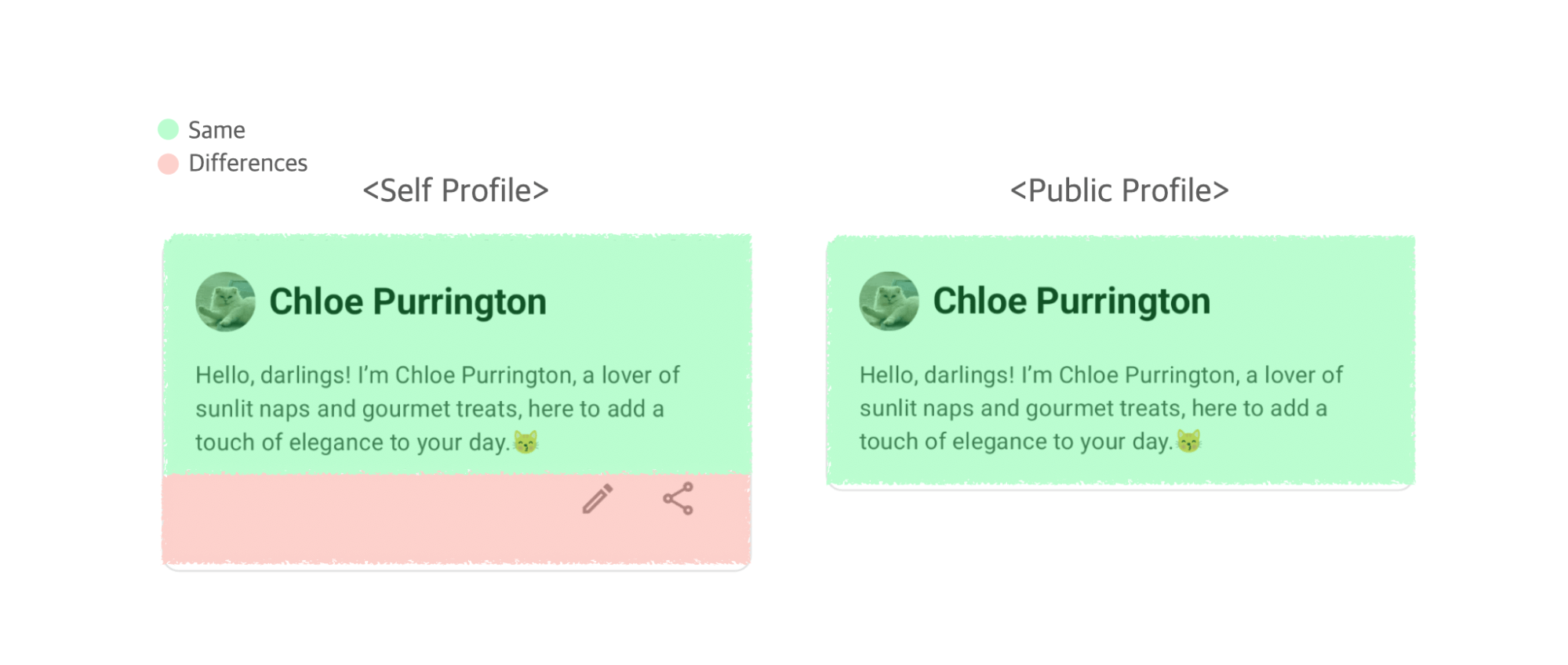
Let's cut to the chase. Assume that you are a developer working on an SNS profile card. However, the self profile UI has some different requirements than public profile UI. The self profile needs to be editable and shareable, unlike the public profile, so should add edit and share buttons at the bottom.


You wonder how to effectively eliminate and handle UI duplication in this scenario. Of course, it’s possible to make the two UIs as completely separate components, but you decide it's more efficient to reuse common elements as much as possible. Reusing shared UI layouts, logic, design styles, and other common parts can make your code more concise and maintainable.
“Don’t repeat yourself” (DRY), Every piece of knowledge must have a single, unambiguous, authoritative representation within a system. — The Pragmatic Programmer.
The easiest solution is to use conditional statements. You can adjust the visibility of a UI element based on a condition without the need to separate components.
12345678910111213141516@Composable
fun UserProfile(
    user: User,
    isSelf: Boolean,
) {
    Column(...) {
        Row(...) {
            ProfileImage(...)
            Name(...)
        }
        Bio(...)
        if (isSelf) {
            Toolbox(...)
        }
    }
}
Random Conditions Cause Complex Components
Organizing the UI with conditional statements may seem simple and practical at first, but as the user's UI changes grow, the component becomes more complex and hard to maintain. This is because adding one conditional statement means that as the component grows, there is the potential for many more conditional statements.
For example, the conditional statements inside the UserProfile component become more complex with each additional condition, such as only showing certain UI elements to premium users, or only exposing them if they have an email address. As the component relies more on conditional statements, it becomes harder to maintain and less readable. This is called "If-else hell", causing strong coupling between components.
123456789101112@Composable
fun UserProfile(...) {
    Column(...) {
        ...
        // “If-else hell” causes strong coupling
        if (isSelf) { ... }
        if (isPremiumMember) { ... }
        if (shouldShowEmail) { ... }
        else {...}
        ...
    }
}
This is a pitfall of the DRY principle. In the DRY principle, duplication is judged not by how the code looks, but by whether the reason for modifying the code is the same. If two code pieces are modified for the same reason, they are duplicates; if modified for different reasons, they are not.
Adding conditional statements within components means that components with different reasons for modification are bundled together, and this logic is not good for reuse. It goes against the principles of object-oriented design, specifically the Single Responsibility Principle. This is because the UserProfile component not only displays profile information but also handles UI logic based on different conditions, which adds too many responsibilities to a single component.
To ensure scalability and maintenance, try to avoid using too many conditional statements that make components too dependent on each other. Instead, focus on creating a flexible user interface structure with clear component roles and responsibilities.
Composition Ideas 1 - Slot Pattern
The Slot pattern is one way to loosen the tight connection between components and allow for more flexible UI component composition. It is a design pattern that enables specific areas of a component to be easily customized from the outside. Composable lambdas (in the form of @Composable () -> Unit) can be used as function parameters in compose, allowing a parent component to define the UI structure without depending on the specific implementation of the child component.
Here is an example of a UserProfile component using the Slot pattern.
123456789101112@Composable
fun UserProfile(
    user: User,
    // Receive the UI itself as a parameter via composable lambda (Slot)
    bottomContent: @Composable () -> Unit,
) {
    Column(...) {
        ...
        // The UserProfile component does not know any incoming UI components
        bottomContent(...)
    }
}
The UserProfile component encapsulates common UI elements to avoid duplication, and differentiates between self profile and public profile through the bottomContent Slot. Now the UserProfile component can compose the UI without knowing the content of the Slot.
And self profile and public profile components could use encapsulation to separate UI implementation from profile-specific logic.
123456789101112131415@Composable
fun SelfProfile(
    user: User
) {
    UserProfile(user) {
        Toolbox(...)
    }
}

@Composable
fun PublicProfile(
    user: User
) {
    UserProfile(user)
}
Now if there are slight changes in the self profile UI requirements, like rearranging buttons or adding a new element at the bottom, we only need to update the components sent to Slot, rather than the entire shared components(Decoupling components for better flexibility).
Slot Pattern Use Cases - Compose Material Design Components
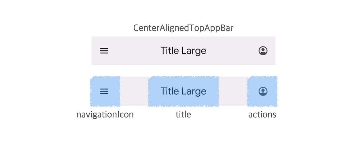
Most Compose Material Design Components use the Slot pattern. The TopAppBar has a title and action for the current screen, and is set up with a Slot using a parameter @Composable () -> Unit for flexible component composition.
123456@Composable
fun CenterAlignedTopAppBar(
    title: @Composable () -> Unit,
    navigationIcon: @Composable () -> Unit = {},
    actions: @Composable RowScope.() -> Unit = {},
    ...

Suppose the title parameter of the TopAppBar component is designed to accept a String type instead of the Slot. Now we can only display text in the title area and cannot add other UI elements such as an Icon or Image. If we want to include other UI elements, we would have to make a new UI component, which can restrict its flexibility and make it hard to meet different UI requirements.
This is why the Slot pattern is useful for adjusting the content of a particular area without changing the layout structure of the component. However, the Slot pattern may not be a perfect solution for all UI compositions.
Slot Pattern Limitation
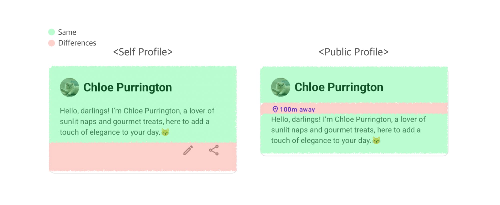
Let’s look at the self profile and public profile example given. Now there is a new UI requirement in public profile to display the distance from the current user.


(A junior developer in the multiverse: If I had known this would happen, I wouldn't have removed the duplicates. 😫)
Unlike the previous example, we have multiple UI differences. Using the Slot pattern would require including a slot for every distinction. If additional UI requirements are added for the profile image area or the name area, extra slots would need to be included in the UserProfile component.
1234567@Composable
fun UserProfile(
    user: User,
    centerContent: @Composable () -> Unit,
    bottomContent: @Composable () -> Unit,
    // and so on…
) { ... }
If you keep adding Slots as your UI changes, you may find that your component's API becomes rather complex. The semantics of the content being passed through the Slot can become ambiguous, leading to a potential misunderstanding of the original purpose. The Slot pattern has its limitations when implementing complex UI logic that requires child components to access the state of the parent component or when child components need flexible composition.
Composition Ideas 2 - Compound Component Pattern
The Compound Component pattern, known as one of the UI design patterns in React, involves breaking down a single component into multiple pieces and then combining them externally. The parent controls the state passed to child components for rendering UI. This separates child components from managing state, allowing them to focus on displaying the user interface. In React, this is typically implemented via the Context API, but in Compose, it can be implemented using Lambda Receivers.
Note: If you're new to this concept, refer to the Kotlin Documentation - Function Literals with Receiver for a detailed explanation.
First, let’s define a scope interface to manage the component's state. This interface defines the state and functions that child components can access.
1234@Stable
interface UserProfileScope {
    val user: User
}
Now, specify the receiver as UserProfileScope in the composable lambda of the UserProfile component.
123456789101112131415161718@Composable
fun UserProfile(
    user: User,
    // Specify the UserProfileScope receiver
    content: @Composable UserProfileScope.() -> Unit,
) {
    val scope = remember { DefaultUserProfileScope(user) }

    Column(...) {
        Row(...) {
            ProfileImage(...)
            Name(...)
        }
        // The UserProfile component does not know any incoming UI components,
        // And the user state can be rendered by the child components
        scope.content()
    }
}
The child components are now able to access the user state using the UserProfileScope, without the need to directly reference the parent component.
1234@Composable
fun UserProfileScope.Bio(...) {
    Text(text = user.bio, ...)
}
Components declared within this scope are restricted for use only within that specific scope. Composable lambdas that do not specify UserProfileScope as a listener cannot receive scoped components.
1234567891011121314@Composable
fun OtherComponent(
    content: @Composable () -> Unit,
) {
    content()
}

@Composable
fun OtherComponentPreview() {
    // Compile error: UserProfileScope is not specified for the composable parameter
    OtherComponent {
        Bio(...)
    }
}
Now both components (SelfProfile, PublicProfile) have been made more flexible for UI changes.
12345678910111213141516171819@Composable
fun SelfProfile(
    user: User
) {
    UserProfile(user) {
        Bio(...)
        Toolbox(...)
    }
}

@Composable
fun PublicProfile(
    user: User
) {
    UserProfile(user) {
        Location(...)
        Bio(...)
    }
}
As new UI changes are required, you can create child components and mix and match them as needed. While child components share the state of the parent component, they can be implemented independently and not directly depend on the parent component.
Although the Compound Component pattern is powerful, it may not be suitable for all situations. Managing scope can become difficult as business logic complexity increases, especially when applying this pattern to UIs that are tightly coupled to business logic. For example, if the UI remains the same but the classes referenced by the UI change, the scope interface needs to be modified, which can cause changes to all the child components involved.
Also, in the current implementation, even if the parent's state changes, the children cannot detect the changes. If a component frequently changes state, consider tracking these changes by wrapping them in State, as shown below.
1234@Stable
interface UserProfileScope {
    val user: State<User>
}
When creating a scope interface that can change state, make sure to avoid causing a recomposition from an unstable state.
Compound Component Pattern Use Cases
While the SNS profile card example above was aimed to offer a basic understanding of the concept, let's now examine some situations where this pattern can be applied more effectively.
Design Systems
The Compound Component pattern is ideal when combining multiple child components with a parent component to create a UI, especially for design systems or reusable components. This is because you can encapsulate not only simple state changes, but also the interaction and event-handling logic between components, providing a consistent API that is easy to use externally.
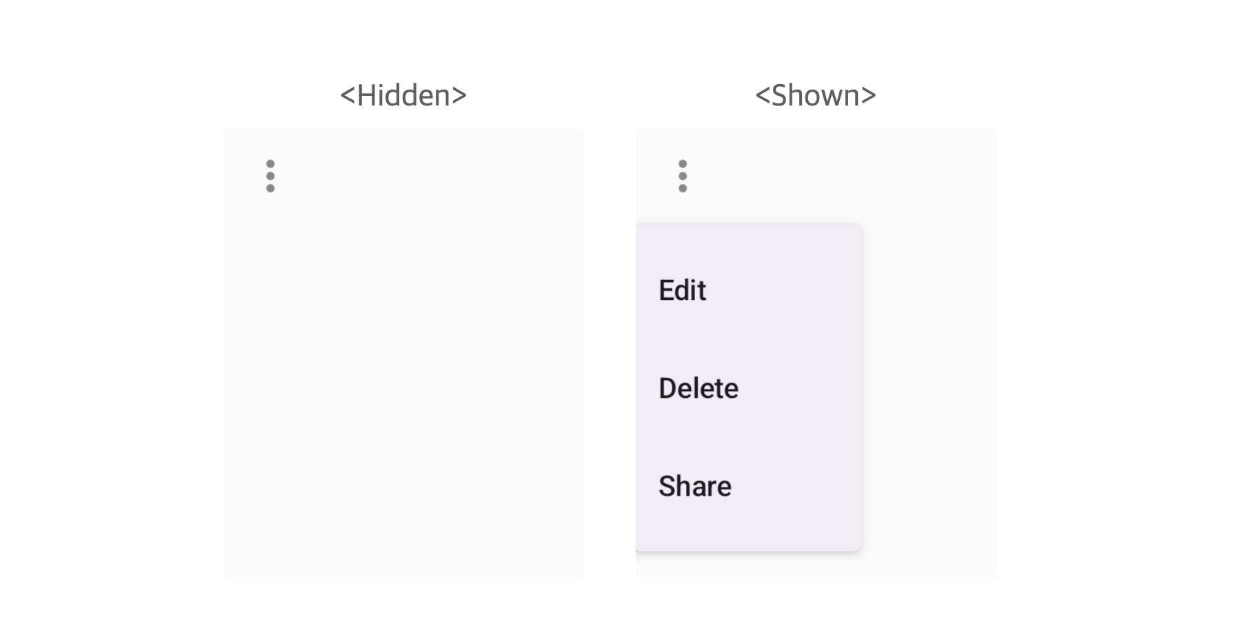
For example, suppose you need to implement a Flyout Menu component like the one below.

Flyout menus are temporary UI elements triggered by events such as button clicks, and must consider visibility, position, animation, and interaction with internal items. You can use the Compound Component pattern to effectively handle this complexity.
1234567891011121314151617181920212223242526272829303132333435363738@Stable
fun interface FlyoutScope {
    fun toggleFlyout()
}

@Composable
fun Flyout(
    content: @Composable FlyoutScope.() -> Unit,
) {
    var isOpen by remember { mutableStateOf(false) }

    val scope = remember {
        FlyoutScope { isOpen = !isOpen }
    }

    IconButton(onClick = { scope.toggleFlyout() }) {
        Icon(
            imageVector = Icons.Outlined.MoreVert,
            contentDescription = null,
            tint = Color.Gray,
            modifier = Modifier,
        )
    }
    DropdownMenu(
        expanded = isOpen,
        onDismissRequest = { scope.toggleFlyout() },
    ) {
        scope.content()
    }
}

@Composable
fun FlyoutScope.MenuItem(text: String, onClick: () -> Unit) {
    DropdownMenuItem(
        onClick = { onClick(); toggleFlyout() },
        text = { Text(text) }
    )
}
Now you can easily organize your menu items using Flyout components. Developers can implement the desired feature without needing to know the Flyout component's internal details.
12345Flyout {
    MenuItem("Edit", onClick = { /* ... */ })
    MenuItem("Delete", onClick = { /* ... */ })
    MenuItem("Share", onClick = { /* ... */ })
}
Lazy Components
Compose provides some built-in components for layout scoping, such as LazyColumn and LazyRow. They use LazyListScope to effectively handle and arrange list items.
Let's look at the declarations for LazyListScope and LazyColumn.
123456789101112/**
 * Receiver scope which is used by [LazyColumn] and [LazyRow].
 */
@LazyScopeMarker
@JvmDefaultWithCompatibility
interface LazyListScope {
    fun item(...)

    fun items(...)

    fun stickyHeader(...)
}
1234567891011/**
 * The vertically scrolling list that only composes and lays out the currently visible items.
 * The [content] block defines a DSL which allows you to emit items of different types. For
 * example you can use [LazyListScope.item] to add a single item and [LazyListScope.items] to add
 * a list of items.
*/
@Composable
fun LazyColumn(
    ...
    content: LazyListScope.() -> Unit
) {
LazyListScope provides APIs for composing list items, such as item, items, and stickyHeader. Developers using lazy components can focus on the UI logic without having to know the detailed state management logic of the list.
1234567891011121314@Composable
fun UserProfiles(users: List<User>) {
    LazyColumn {
        stickyHeader {
            HeaderTitle()
        }
        items(users) { user ->
            PublicProfile(user = user)
        }
        item {
            Footer()
        }
    }
}
Implementing the list without LazyListScope would require the developer to handle the state management and item display logic on their own, which would make the code somewhat more complex. The developers who designed the actual Compose UI might not call this structure the Compound Component pattern, but I think the idea is similar.
Composition Ideas Wrap-up
The three ways of designing user interfaces we've looked at (using conditional statements, the Slot pattern, and the Compound Component pattern) vary in how closely connected the components are and how they manage state. Multiple conditional statements in one component can lead to tightly connected components and complicate state management. The Slot pattern makes UI composition more flexible because the parent component does not need to know the detailed implementation or state of the content that goes into the slot, but it has limitations when creating complex UIs. The Compound Component pattern, on the other hand, allows for more flexibility in UI combinations and implicitly passes state through scope.

The Slot pattern and the Compound Component pattern are not mutually exclusive but rather complementary to each other.. The Slot pattern allows you to reuse components, while the Compound Component pattern helps you create more advanced UIs. It's also important to properly separate and combine stateful and stateless components. Stateless components handle UI composition, while stateful components encapsulate state and simplify complex APIs. The Compound Component pattern makes it easier to efficiently manage and use stateful components.
Ultimately, it is important to design your UI components with minimal coupling between them in order to easily reuse and maintain the components.
Real World Best Practices - Stream Video SDK
The Stream Video SDK is an example of best practices in the real world that showcases UI composition concepts. Stream Video offers an in-app video, voice calling, and livestream solution as an open-source project, allowing developers to access the source code on GitHub.
Let’s look at one of the video call features:

As you can see, the bottom action bar in the video room has options for muting, toggling video, and ending calls, all of which can be customized. This is implemented via the ControlActions component.
Some people might like the camera button on the left, some might want a microphone button in the center, and others may think they should be removed. In order to meet the needs of various SDK customers, ControlActions must provide a slot.
12345678910111213141516171819202122/**
 * …
 * @param actions A list of composable call actions that will be arranged in the layout.
 */
@Composable
public fun ControlActions(
    call: Call,
    modifier: Modifier = Modifier,
    onCallAction: (CallAction) -> Unit = { DefaultOnCallActionHandler.onCallAction(call, it) },
    actions: List<(@Composable () -> Unit)> = buildDefaultCallControlActions(
        call = call,
        onCallAction,
    ),
) {
    Box(... ) {
        LazyRow(...) {
            items(actions) { action ->
                action.invoke()
            }
        }
    }
}
These parameters allow developers to customize the UI by adding their own functions, such as changing the layout of control buttons, without having to make any changes to the ControlActions. The actions parameter works similarly to a slot, taking a list of Composable lambdas to be rendered based on various customer needs. The onCallAction lambda helps to manage the action states (such as toggled microphone status) on its own, allowing for more flexible customization.
1234567891011121314151617181920public sealed interface CallAction

/**
 * Action to toggle if the speakerphone is on or off.
 */
public data class ToggleSpeakerphone(
    val isEnabled: Boolean,
) : CallAction

/**
 * Action to toggle if the microphone is on or off.
 */
public data class ToggleMicrophone(
    val isEnabled: Boolean,
) : CallAction

/**
 * Action to flip the active camera.
 */
public data object FlipCamera : CallAction
The UI composition patterns implemented here make it easy to manage shared state and individual control actions by using composable functions, separating them from UI rendering. Most importantly, it provides more flexibility in UI design, which is crucial to SDK developers in order to meet the various needs of many developers. The Stream Video SDK shows how open-source software in enabling developers to deepen their understanding of diverse programmatic concepts, including design patterns and software architecture, making it a valuable resource for the developer community.
Retrospective: Are conditional statements really a bad idea?
In the DRY principle, duplication is judged not by how the code looks, but by whether the reason for modifying the code is the same. If two code pieces are modified for the same reason, they are duplicates; if modified for different reasons, they are not.
As we’ve discussed earlier, excessive use of conditionals can create what is often referred to as "if-else hell". However, conditional statements themselves are not inherently bad; their value depends on how and where they are used.
123456789101112@Composable
fun UserProfile(
    user: User,
    isSelf: Boolean,
) {
    Column(...) {
        ...
        if (isSelf) {
            Toolbox(...)
        }
    }
}
Some developers may be wondering, what's wrong with this block of code? This could be easy to understand, since it's the most straightforward way to meet UI requirements. It is important not to completely avoid using conditional statements, but to be careful of the extra complexity that may come from using them too often.
If your conditional statements become too numerous or complex, you should consider refactoring your code and reducing complexity by applying the component composition pattern. When dealing with UI behavior logic, especially when handling animation states, it might be better to use straightforward conditional statements instead of implementing complicated patterns.
Retrospective: Is Duplication Always a Bad Thing?
In practice, it's common to encounter differing perspectives, such as the following scenario:
Junior Developer: "Let’s just reuse it and figure it out later! XD"
Senior Developer: "They might seem similar, but they’re actually different. :("
For example, self profile and public profile UI may be similar today, but it's possible that they could evolve into something completely different in the future as business requirements change. Being too strict about following DRY principles in UI development can make the code more complicated and less flexible. In this situation, it might be better in the long term to make each profile UI its own component, with some shared parts, rather than just following DRY principles from the start to avoid duplicating parts with difficult logic.
If each UI component has a different role or state management logic, it may be best to implement them as separate components, even if they have similar placement and style. Considering the roles and responsibilities of each part, as well as the possibility of change, should help you decide whether to remove any duplicates. This is much more important than simply focusing on reducing the lines of code.
Conclusion
Simple is the Best.
While we've explored different ideas for composing components, the Slot pattern and Compound Component pattern aren't the right solution for every situation; sometimes a simple conditional statement or allowing for duplication is a better choice. Make sure you understand the pros and cons of each pattern, consider the roles and responsibilities of your components and the changes you expect to make, and choose the right pattern for your situation.
Personally, I prefer a hands-on approach over theoretical discussions. Instead of saying, "We should try this pattern", I prefer to demonstrate, "This is how it works when we implement it."
In other words, let's use patterns only when they are the most appropriate solution for the problem at hand 🙂

