

Here at Stream, we're helping thousands of companies build and scale their activity feed, chat, and video technology. In this guide, we share best practices to make designing an activity or notification feed with world-class UX easier for you.
Remember this: feeds are fun! They're really one of the best UI patterns for sharing and promoting content between users. We'll break down the activity feed UI pattern from several perspectives. You'll see just how many different and diverse ways there are to design an activity feed.
Why Activity Feeds?
Modern websites and apps are simply products that aim to solve problems or delight our users. Their focus can be entertainment, communication, collaboration, or getting things done.
Feeds are perfect for handling and presenting dynamic and constantly changing information. Fundamentally, feeds are lists of items that can be ordered or columnized by just about any parameter. Often, this is by time, popularity, frequency, age, or relevance. That's why feeds have proven useful for varying use cases like messages posted to a social network, upcoming flight departure times at an airport, or less frequent announcements or notifications about what's new.
Another great reason to add an activity feed in your app is to personalize the user experience. You want to highlight a selection of your content to the given user. This pattern is flexible enough to handle following the user's friends or following specific topics that are of interest.

Etoro allows you to follow investments and other users.

SoundCloud allows you to follow playlists and artists.

Under Armour allows you to follow your friends and their fitness activities.
Etoro, SoundCloud, and Under Armour use feeds to help users discover content across their platforms. This is particularly useful if your user doesn't know exactly what they are looking for or if they are looking for something new.
The web has been transitioning from "static sites" (where content is pushed from the owner to the reader) to digital experiences that foster community interaction and contribution. Activity feeds are the entry point if you're looking to have a "lite" community aspect in your user experience. Activity feeds can provide offline and online conversation points between a team (think Reddit or people discussing a Facebook post).
Feeds are a simple way to help your app establish habits, growth, and virality.
Feeds Form Habits
Apps have found that feeds provide the best way to create strong habits that hook users. Sites like Reddit, Facebook, and Twitter have thrived because they create user habits with their activity feeds. The primary habit is to check their feed for new content. Visiting a site and seeing new content you're interested in is rewarding.
If the app you're designing has members, you can leverage Stream to include an activity feed on your dashboard. This provides organic interaction between members that helps encourage and grow the social community and form important habits. Activity feeds accommodate the spectrum of user behavior, which is essentially browsing, searching, and contributing.
Activity feeds can be the go-to solution for a running timeline of members' recent activity. They are efficient, heuristic design solutions that are cross-platform adaptable. If you want to form even stronger social habits, consider integrating other real-time communication solutions, like Stream's Chat or Video API.
Feed Features and Behaviors
Delighting new and regular users by helping them transition through the empty/zero state is essential for activation and retention.
Filling Feeds
In our 13 tips for highly engaging news feeds, we cover everything from user experience to scalability. This guide covers everything a designer needs to design detailed and comprehensive activity feeds. In this section, we'll cover how to quickly build user engagement into your feed.
Following Suggestions
Whether your app allows you to follow friends, topics, stocks, artists, or any other concept, you'll want to ensure users quickly start customizing their feed. A feed without friends is no feed at all. Regardless of the scale of your feed, you can improve its long-term user experience by making it easy for your users to find new and old friends or colleagues. Let's look at a few ways to make it simple for users to connect with their friends.
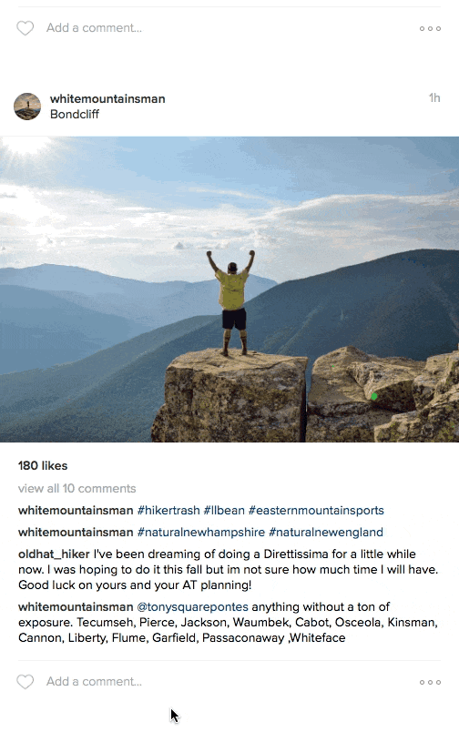
A great example of finding friends can be seen in the implementation of Instagram. Being a mobile-first app, it is limited in screen size, which pushed it to discover a unique and powerful UI pattern.
Instagram: Finding Friends
Let's say you're following a user whose posts consist largely of their adventures in hiking the White Mountains of New Hampshire. If you tap into their profile, you will see a large "Following" button with a smaller carat button next to it. That control gives you a horizontal list of similar accounts. This is brilliant because it allows you to quickly discover accounts that are similar, which will ultimately fill your feed with more content you want to see.
Suggestion Sidebar
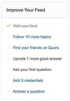
Both Quora, Twitter, Product Hunt, and Tumblr offer this kind of call to action. All three place it in the same spot (right column). Based on the commonality of the placement, let's assume it is the best place for this functionality.
In terms of creating the best user experience, I would suggest combining Tumblr's interactions with Quora's "check to complete" sidebar. Combining a list to complete with a preview in a hover really helps you "dive in." It also helps you feel like there is much more to explore in your feeds.
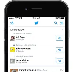
Personalization and Push Notifications
When Twitter started personalizing follow-suggestions, it went the dogfooding route. It created an experimental account, @MagicRecs. When that account was followed, personalized follow-suggestions were delivered to the user. It was a huge success for both users and Twitter.
@MagicRecs was being actively monitored by Twitter Engineers, which allowed them to tweak it in a live and natural way. With their mobile apps, Twitter re-engaged users with push notifications to see MagicRecs follow suggestions.
Suggest Via Email and Social Apps
Don't neglect your email and social contacts! Allowing your users to connect to their email and social accounts is a great way to connect them with friends. If you're going to include facebook, here is a great mobile resource to share and connect apps.
Tip: Make sure to include external apps you've authorized in the "settings" part of your app.
Encourage Conversations
Conversations in feeds extend beyond comments on one entry. Hashtags and @mentions make it easy for users to converse across an entire app. For example, if I create a post about Pearl Street in Boulder, CO, I can mention @getstream (including them in the post) and add a hashtag of #pearlstreet, which would include that post in the larger "conversation" of "#pearlstreet." These two patterns are great ways to draw attention to specific content, as they easily pull additional people into your activities, here's how:
You usually don't need to be following someone to "@" them.
@mentions are great to give someone public acknowledgment or to promote them to your followers
You should think of the rule around distinction. Does your app handle @mention's differently if you start your sentence with an "@" vs @mentioning within your sentence? You may want to exclude conversations that start with @mentions from search results.
Allow someone to report abuse. @mentions can be easily abused to attack other users.
Since @mentions and #hashtags are standard feed protocol, we included them in our free Activity Feeds UI Kit. Download it for free to learn more about common feed elements.
Sharing
Have you ever laughed at something and immediately shared it with a friend?
Sharing can be done within an app or a timeline. Snapchat made sharing extremely fun within the app and accounted for a huge portion of its growth. Instagram followed suit by allowing you to send a post to an individual or a group of people. This helps content go viral. It also provides more engagement data that can be used to further personalize your experience through machine learning.
When sharing to external apps, ensure your designs have smooth and easy ways to quickly share to external apps like email, social networks, and embedding. As a designer, you want to make this action as easy as possible while boosting the user's energy and motivation.
Sharing feels good. It is a direct way to delight your users and attract new ones. The sharing user experience has the potential to drive engagement, delight users, and retain them at key moments. Websites like Giphy have thrived by making it easy for people to share gifs they enjoy.
Personalizing Feeds
Instagram and Quora do a great job of collecting relevant content based on user engagement. Personalization aims to help users discover more content that they enjoy engaging with.
In the case of Instagram, their machine learning is incredibly fast. If part of your New Year's resolution is to get fit, you may start following users who post about fitness. Since this will be a new dynamic, you must manually search for a few users or tags. Once you engage through clicks or impressions, you'll begin to notice new content in the "discover" part of the app. That content will reflect your new interests.
Personalization drives users to follow more people. The more people you follow, the more content is in your feed. When your feed is full of engaging content, you stick around longer. Not only is it great for stickiness, but in the case of Quora, you can compile a digest email of personalized suggestions to get people to return to your feed.
News Feed Types
When you're thinking about your activity stream design, it's good to know that there are roughly three different types of feeds: flat feeds, aggregated feeds, and notification feeds.
Flat feeds contain a simple list of activities. Common examples include your basic feed on Instagram or Twitter.
Aggregated feeds are different from flat feeds because they combine activities. When you see entries like this: "Joe, Sam, Beth, and three others liked your post," you are looking at aggregation in action. Another example is Facebook's birthday notifications: "72 people congratulated Josh for his birthday."
Notification feeds add the concept of "seen" or "read" to the activities.
Many apps have both a notification feed and a flat feed.
Popular Examples of Activity Feeds
A feed provides an easy way to share, discover, and engage, it's why it is so popular. It is a diverse utility for information.
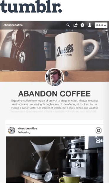
Tumblr
The designers at Tumblr worked really hard to make it easy for end users to customize their feed. If you log into your Tumblr account, you'll see a feed of the Tumblr accounts you follow. Clicking that feed gives you a nice slide-out that allows you (as the user) to focus on the account's content.
However, if you click on the user, you'll be directed away from your dashboard. That's when a user's custom theme comes into play. It's nice because you get a better feeling for the personality of the account you're following. However, I'm not sure this is 100% in line with their design philosophy. According to their designer, Peter Vidani, "The principles are one, to be aware of everything you ask the user to be aware of on the screen. Second, we keep the product (Tumblr) small and focused. We look to see if there are redundancies that can be taken out."
If you're looking to design an activity feed that functions similarly to Tumblr, following their two principles is a good practice. A designer needs to be aware of what is potentially on a screen (in this case, an activity) and how it will be presented within a feed.
Including activity feeds in your product is a great way to keep your users connected to what's going on across your user experience (more on this in a bit).
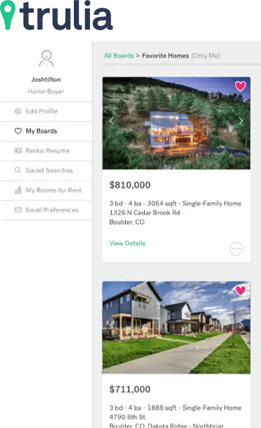
Trulia
The designers at Trulia leveraged the metaphor of "saving" and "liking" (essentially the same thing), which would create "boards" (lists). In the world of e-commerce, the same thing happens with a "wishlist."
Trulia has a beautiful user experience that makes it fun to browse and collect homes that you like. An activity feed makes sense as a core part of that experience. Why?
Well, let's say Rob and Jane will buy a new house. They are working with their realtor, Henry, to move from Denver to Boulder. The main actors in this scenario are Rob, Jane, and Henry. Allowing these people to collaborate and share on the Trulia platform is an ideal use case for a simple activity feed implementation.
Trulia's activity feed is very basic but creates a big win for user engagement and conversion. Go ahead, try favoriteing something without an account. That small bit of UI probably accounts for many of Trulia's new signups. It's a great hook.
News Feed Design Best Practices
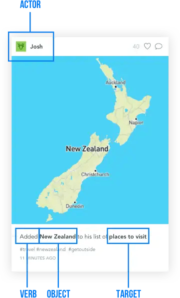
To start defining some best practices, let us look at how the activity stream spec defines an activity:
In its simplest form, an activity consists of an actor, a verb, an object, and a target. It tells the story of a person performing an action on or with an object: "Geraldine posted a photo to her album" or "John shared a video." In most cases, these components will be explicit, but they may also be implied.
You'll notice that our example of "Josh (actor) added(verb) New Zealand (object) to his list of places to visit (target)" follows the spec. Feeds can be more complex and have many custom fields.
Follow these best practices to design a clean and readable feed:
- Feeds should be simple. Always look to remove redundancies in each element. Be careful with names, avatars, and other metadata.
- Feed typography. It's helpful to always be mindful of the character count, line heights, and font sizes. Readability is paramount in feeds.
- Feed abbreviations are your ally in feeds. Make sure you use the correct one (for example, minute should be "min", not "m").
- Zero states. Don't ignore designing empty/zero states. The developers will have to code for them, so you need to design for them.
- Controls. Don't overload each entry with a bunch of UI controls on the post (like, save, follow, retweet, etc). Keep engagement controls focused.
- Testing. Be aggressive in finding out what is most tangible and concrete to most of your users. Research can help you cull your design in the right direction.
What to Avoid When Designing Activity Feeds
If you look at timeline patterns, you'll likely notice how clean and simple the designs are. This is intentional, as you want users of your app to be able to quickly scan content and obtain the correct context. You want to avoid clutter in feeds. Each feed entry may have a lot of custom data associated with it. This is where friction can occur between a designer and the rest of a product team. You'll need to be creative to make sure you avoid clutter in your activity feed.
Avoid making big changes to your feed. When Instagram switched from a chronological feed to an algorithm-based feed, it upset many of its users. You should avoid a chronological feed if you know from the outset that you'll want to algorithmically display the feed order (based on machine learning). You can do both with Stream Feeds. It doesn't have to be a matter of avoiding either format. It needs to be about what is mutually beneficial for the business and users.
Additionally, avoid having a blank feed. First, you can make sure that the user completes a "who to follow" screen before seeing the feed. A very simple solution is to show older posts for people you follow. Design "users to follow" as part of your onboarding and then populate the feed with some of their recent entries.
Another thing to watch out for is spammers creating a lot of content and flooding your users' feeds. Stream's analytics detect these common feed issues.
Activity Feed Design UI Kits and Patterns
iOS Pinterest UI
If your app uses a Pinterest-style feed, this Sketch kit is perfect. Download here.
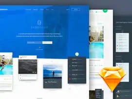
Comprehensive UI Kit for Feeds
A versatile Feed UI Kit for Sketch. If you want to add specific feed patterns to your app, this is the kit you need. Download here.
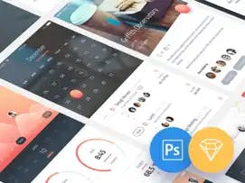
Pheonix UI Kit
This free kit has a lot of great stuff packed in it! Adrian did a great job with it. It has an activity tracker feed, a timeline feed, favorites and latest feed with a nice onboarding screen. Available for Photoshop too. Download here.
In Conclusion
This guide was created to help make designing an activity or notification feed easier for you. We hope you picked up some useful information!
If you have a question for our sales team, please head over to the contact page and let us know how we can help. If you want to try our API out in an interactive demo, head over to our Getting Started page now.