

In this article, the first part of the Build a Twitter Clone series, you will be creating a Twitter clone, which connects and authenticates a selected user with your Stream app. For this tutorial, you will make the layout and add support for creating tweets in the clone using Stream activity feeds.
Let us get started.
Developer Setup
To start building the clone, you need to install dependencies from the npm library. To install dependencies, you need to have Node installed on your system. Alternatively, you can use yarn, but I will be using npm in this article.
I used node version 16.13.1 for this tutorial, so I recommend you use the same to code along.
Setting Up your Stream Dashboard
A Stream Feeds App handles all the backend services for managing feeds, such as creating activities, adding reactions to activities, following and unfollowing activities, etc.
Create A Feeds App on Your Stream Dashboard
To create a feeds app on Stream, you need a Stream account. If you do not have one, head over to the register page for a free trial account or register for a Maker Account for free indefinite access to Stream.
To create a Stream app for feeds:
- Go to your Stream dashboard after logging in
- Select Create App
- Enter a name for the app (for this tutorial, I will use streamer, the fancy name for the clone)
- Set your Server Locations
- Set the Environment to Development
- And finally, select Create App.
After creating the app, select Activity Feeds from the sidebar:

Here is the overview of the Feeds dashboard:

You have the App ID, API Key, and API Secret. You will need these values later when you want to connect to Stream from your client app.
Create Feed Groups
Currently, there are no feed groups in your app:

A feed group is used for grouping similar activities together. For example, in this tutorial, you will have a:
- "timeline" feed group for activities made by users that a user follows
- "user" feed group for activities made by a user
- "notification" feed group for notification activities originating from follow or reaction actions

For the timeline and user group, use a flat feed type, and a notification group with a notification feed type.
With Stream set up, you can now create the client application.
Create Your Twitter Clone Application
We will use create-react-app (CRA) to create the React application. On your terminal, run:
12npx create-react-app streamer
cd streamer
This command will create a starter React project. Now, you need to install the required dependencies. These dependencies are broken into two categories.
Stream's dependencies
- getstream: official JavaScript client for Stream Feeds
- react-activity-feed: built on the getstream library for providing React components to integrate activity feeds into your application.
Other dependencies
- react-router-dom: for adding routes for different pages in the application. You will use it to add pages for the starter login page, home page, profile page, and notifications page
- classnames: utility library for dynamically combining classes
- date-fns: for formatting dates in a readable manner
- styled-components: for CSS-in-JS styles
- nanoid: for generating unique IDs. You will use this to generate IDs for tweets
Install the dependencies by running:
1npm install getstream react-activity-feed react-router-dom classnames date-fns styled-components nanoid
If you come across a dependency resolution error for react and react-activity-feed similar to this:

You can add the --force flag to the npm install command. This will ignore the resolution error. The error above occurs because CRA installs the latest versions of react and react-dom (which is version 18, released recently), but Stream's dependencies haven't been updated to support React v18 yet. In this project, we won't be using specific React v18 features.
Folder Structure of the Application
To keep your code organized and so you can follow this tutorial correctly, you should use the following folder structure for this application.
After starting the project with CRA, you should get this:
├── README.md
├── package-lock.json
├── package.json
├── node_modules
├── public
| ├── favicon.ico
| ├── index.html
| ├── logo192.png
| ├── logo512.png
| ├── manifest.json
| └── robots.txt
└── src
├── App.css
├── App.js
├── App.test.js
├── index.css
├── index.js
├── logo.svg
├── reportWebVitals.js
└── setupTests.js.
You will need new folders to improve the structure. Create the following folders:
- src/components: where the components--the building blocks in your application--will be created
- src/pages: where the page components (profile, notifications, etc.) will be created
- src/hooks: where the custom hooks you create in this tutorial will live
- src/utils: where the utilities will live
With these folders created, you should have the following structure:
├── README.md
├── package-lock.json
├── package.json
├── public
| ├── favicon.ico
| ├── index.html
| ├── logo192.png
| ├── logo512.png
| ├── manifest.json
| └── robots.txt
└── src
├── App.css
├── App.js
├── App.test.js
├── components/
├── hooks/
├── index.css
├── index.js
├── logo.svg
├── reportWebVitals.js
├── setupTests.js
├── utils/
└── pages/
Create Starter Page for Selecting Users
The starter page for this application shows different demo users that a user can select from to use Streamer:

Ideally, there should be a login form that sends requests to a backend server, which authenticates the user's credentials with the database. For demonstration purposes, we will stick with demo users.
Add Demo Users
Create a new file called src/users.js and paste the following code:
123456789101112131415161718192021222324252627282930313233343536373839const users = [
  {
    id: "iamdillion",
    name: "Dillion",
    image: "https://dillionmegida.com/img/deee.jpg",
    bio: "Just here, doing my thing. Developer advocate at @getstream_io",
    token: "ENTER TOKEN FOR iamdillion",
  },
  {
    id: "getstream_io",
    name: "Stream",
    image: "https://avatars.githubusercontent.com/u/8597527?s=200&v=4",
    bio: "Deploy activity feeds and chat at scale with Stream – an API driven platform powering over a billion end users. Get started at http://getstream.io.",
    token: "ENTER TOKEN FOR getstream_io",
  },
  {
    id: "jake",
    name: "Jake",
    image: "https://picsum.photos/300/300",
    bio: "Just Jake, nothing much",
    token: "ENTER TOKEN FOR jake",
  },
  {
    id: "joe",
    name: "Joe",
    image: "https://picsum.photos/200/200",
    bio: "How are you?",
    token: "ENTER TOKEN FOR joe",
  },
  {
    id: "mike",
    name: "Mike",
    image: "https://picsum.photos/400/400",
    bio: "I am mike here. I do things on #react and #javascript",
    token: "ENTER TOKEN FOR mike",
  },
];

export default users;
This is an array of users. Each user object has an id which is a required property to connect the user to Stream feeds. This id will also be used as the Streamer username of each user. Each object also has a name, image, and bio property.
In a live application, the token should also be generated from the backend server using the API Key and Secret Key of your Stream app, but for tutorial purposes, you can manually generate tokens on generator.getstream.io using the user's id and your application's API Key and Secret Key. When you generate a token for a user, replace it in the users.js file.
Stream uses User Tokens to authenticate users--to confirm that users have access to your Stream application.
Create a Storage Utility
Next, create a storage utility in src/utils/storage.js. This utility handles storing and retrieving data from local storage. Add the following code to this file:
1234export const saveToStorage = (key, value) =>
  window.localStorage.setItem(key, value);

export const getFromStorage = (key) => window.localStorage.getItem(key);
You will use this utility to save the selected user id from the start page. This way, the user will not have to choose a user on every refresh.
Add Global Default Styles
You need to add global default styles for buttons, links, and other elements. Replace the content of src/index.css with the following:
123456789101112131415161718192021222324252627282930313233343536373839404142434445464748495051525354555657:root {
  --theme-color: #f91680;
  --faded-theme-color: #f916803c;
}

* {
  box-sizing: border-box;
}

body {
  margin: 0;
  background-color: black;
  font-family:
    -apple-system, BlinkMacSystemFont, "Segoe UI", "Roboto", "Oxygen", "Ubuntu",
    "Cantarell", "Fira Sans", "Droid Sans", "Helvetica Neue", sans-serif;
  -webkit-font-smoothing: antialiased;
  -moz-osx-font-smoothing: grayscale;
}

code {
  font-family:
    source-code-pro, Menlo, Monaco, Consolas, "Courier New", monospace;
}

button {
  border: none;
  background: none;
  cursor: pointer;
  text-align: left;
}

button:disabled {
  cursor: not-allowed;
}

h1,
h2,
h3,
h4,
h5,
h6,
p {
  margin: 0;
}

input,
textarea {
  font-family: inherit;
}

span {
  display: block;
}

a {
  text-decoration: none;
}
The --theme-color variable will be used in many parts of the application.
Create the StartPage Component
Create a new file src/views/StartPage.jsfor the start page, and paste the following. Start from the imports and styles:
123456789101112131415161718192021222324252627282930313233343536373839404142434445import styled from "styled-components";

import users from "../users";
import { saveToStorage } from "../utils/storage";

const Main = styled.main`
  background-color: black;
  display: flex;
  align-items: center;
  justify-content: center;
  width: 100%;
  height: 100vh;
  flex-direction: column;

  h1 {
    text-align: center;
    color: white;
    font-size: 20px;
    margin-bottom: 20px;
  }

  .users {
    display: flex;
    align-items: center;
    justify-content: space-between;
    width: 300px;
    margin: 0 auto;

    &__user {
      display: flex;
      flex-direction: column;
      img {
        width: 50px;
        height: 50px;
        border-radius: 50%;
        margin-bottom: 5px;
      }
      .name {
        margin: 10px auto;
        color: white;
        text-align: center;
      }
    }
  }
`;
And next, the component:
123456789101112131415161718192021222324export default function Startpage() {
  const onClickUser = (id) => {
    saveToStorage("user", id);
    window.location.href = "/home";
  };

  return (
    <Main>
      <h1>Select a user</h1>
      <div className="users">
        {users.map((u) => (
          <button
            onClick={() => onClickUser(u.id)}
            className="users__user"
            key={u.id}
          >
            <img src={u.image} alt="" />
            <span className="name">{u.name}</span>
          </button>
        ))}
      </div>
    </Main>
  );
}
In the StartPage component, you loop through the users on the page, and on clicking a user, you save the user's id to local storage and navigate to the /home path.
Note: For some of the colors in this application, I randomly selected a close color code, but for some notable colors (like a black background, pink highlights, etc.), I used the Eye Dropper Chrome extension to pick the color from the Twitter page.
Next, you have to configure React Router to show the start page on the index path.
Configure Route for the StartPage Component
Replace the content of src/App.js with the following:
12345678910111213import { BrowserRouter as Router, Route, Routes } from "react-router-dom";

import StartPage from "./pages/StartPage";

export default function App() {
  return (
    <Router>
      <Routes>
        <Route path="/" element={<StartPage />} />
      </Routes>
    </Router>
  );
}
Start the development server by running the npm run start command on your terminal. On http://localhost:3000, you will get the users on the screen.
When you click on a user on this page, the browser navigates to /home, which should show the home page of the logged-in user.
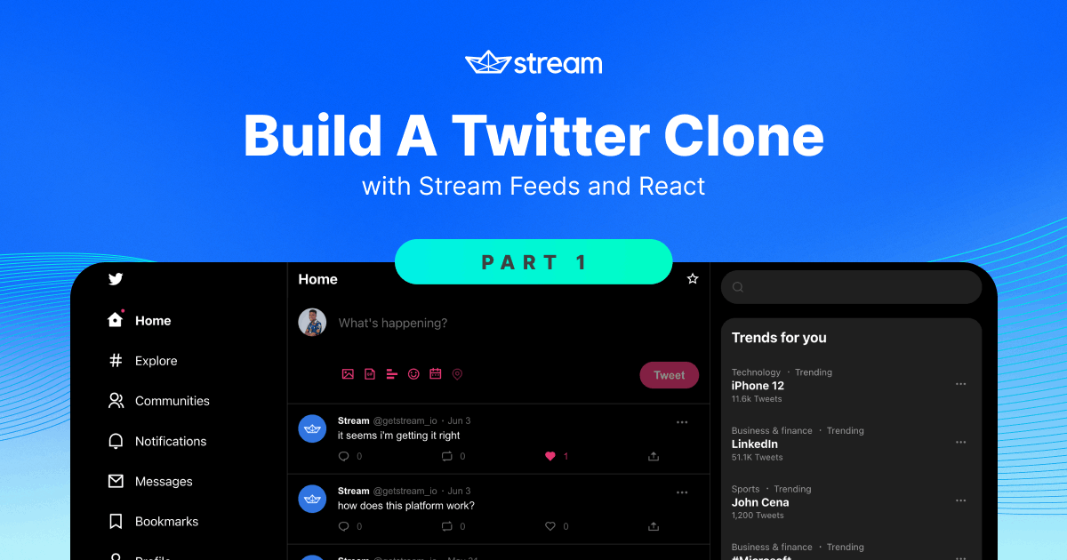
Create the User Homepage
In this section, you will create a homepage for the user.
Here is what the result of this section will look like:

Add Icon Components
A lot of icons are used throughout this project. I got the icons from remixicon and made them reusable React components. You can find all the icons in this archived file in the repo. Create a new folder src/components/Icons and save all the icons from the archive there.
All icons have a size and color property that you can use to customize the icon's look. Some icons also have the fill property, which specifies if the icon should be in stroke form or fill form.
Connect a User to Stream Feeds in App.js
The next step is to connect the selected user from the start page to the Feeds App on your Stream dashboard. To connect a user to Stream, you first need to create an instance of your Stream app in your React application. To do this, you use the StreamClient constructor from the getstream library. After creating the instance, then you can connect the user to Stream. And with the StreamApp component from the React SDK, you can provide feed methods and data to other components.
In your App.js file, add the following imports to the existing imports:
12345import { useEffect, useState } from "react";
import { StreamClient } from "getstream";
import { StreamApp } from "react-activity-feed";
import users from "./users";
import { getFromStorage } from "./utils/storage";
Using getFromStorage, you will get the user's id, and find that user in the users array. If such a user exists, then you connect them to Stream. This approach is our own method of authentication for development.
To connect to your feeds application, you need your App ID and API Key. You can get these from your dashboard, as shown in the screenshot below:

Assign these values to variables in App.js like this:
12const APP_ID = "1183905";
const API_KEY = "mx8gc4kmvpec";
Before the return statement in the App component, add these lines of code:
12345678910111213141516171819202122232425function App() {
  const userId = getFromStorage('user')

  const user = users.find((u) => u.id === userId) || users[0]

  const [client, setClient] = useState(null)

  useEffect(() => {
    async function init() {
      const client = new StreamClient(API_KEY, user.token, APP_ID)

      await client.user(user.id).getOrCreate({ ...user, token: '' })

      setClient(client)
    }

    init()
  }, [])

  if (!client) return <></>

  return (
    // ...
  )
}
First, you get the user's id. Next, you find the user from the users array. If the user does not exist, you set the user variable as the first user in the array.
You also keep track of the client state you will use in a second.
When the component mounts, you connect the user to Stream. The component must mount first because connecting a user to Stream creates a WebSocket connection on the browser. The useEffect hook with an empty dependency array runs when the component mounts.
In the useEffect hook, you create the app instance using your API_KEY, the user's token, and your APP_ID. Using the instance, you can define a user by their id, and add the user to the Stream database if they do not exist already using the getOrCreate method. As the name implies, this method retrieves the user's info from the database, and if the user does not exist, it adds the user to the database. You can find the user feeds in your dashboard explorer:

After connecting the user, you update the client state. Now, you can use the client object. In the App component, wrap the elements with the StreamApp component like this:
12345678910111213function App() {
  // ...

  return (
    <StreamApp token={user.token} appId={APP_ID} apiKey={API_KEY}>
      <Router>
        <Routes>
          <Route path="/" element={<StartPage />} />
        </Routes>
      </Router>
    </StreamApp>
  );
}
The StreamApp component provides feed methods and context data to the children components to trigger feed functionalities.
With the code so far, when you click on a user from the start page, the browser navigates to the /home route, and the selected user is connected to Stream. Now, you will create a layout for the home page.
Create Common Shareable Components
This project has some common components that you will reuse in many other components. Creating these components separately makes the code more manageable.
Create a Loading Indicator Component
Before creating the layouts, you need to create a loading indicator component that you will use in other components. Create a new file src/components/LoadingIndicator. In that file, paste the following:
1234567891011121314151617181920212223242526272829303132333435363738394041424344454647import styled from "styled-components";

const Container = styled.div`
  width: 100%;
  height: 100%;
  display: flex;
  justify-content: center;
  padding-top: 100px;
  background-color: black;

  .circle {
    border: 2px solid #333;
    border-radius: 50%;
    position: relative;
    width: 25px;
    height: 25px;

    &::after {
      content: "";
      position: absolute;
      left: 0;
      top: 0;
      width: 100%;
      height: 100%;
      border-top: 2px solid var(--theme-color);
      border-radius: 50%;
      animation: spin 500ms infinite linear;

      @keyframes spin {
        from {
          transform: rotate(0deg);
        }
        to {
          transform: rotate(360deg);
        }
      }
    }
  }
`;

export default function LoadingIndicator() {
  return (
    <Container>
      <div className="circle"></div>
    </Container>
  );
}
This creates an infinite rotating circle.
Create a Modal Component
The Modal component serves as a modal dialog for different elements such as the tweet form, comment form, etc.

Create a new file src/components/Modal.js and paste the imports and styles:
1234567891011121314151617181920212223242526272829303132333435363738import classNames from "classnames";
import styled from "styled-components";

import Close from "./Icons/Close";

const Container = styled.div`
  position: fixed;
  z-index: 6;
  width: 100%;
  height: 100vh;
  display: flex;
  justify-content: center;
  padding: 30px 0;
  left: 0;
  top: 0;

  .modal {
    z-index: 2;
    position: relative;

    background-color: black;
    border-radius: 20px;

    .close-btn {
      position: relative;
      left: -10px;
    }
  }
`;

const Backdrop = styled.div`
  position: absolute;
  width: 100%;
  height: 100%;
  left: 0;
  top: 0;
  background-color: rgba(255, 255, 255, 0.2);
`;
Next, the component:
12345678910111213export default function Modal({ className, children, onClickOutside }) {
  return (
    <Container>
      <Backdrop onClick={() => onClickOutside()} />
      <div className={classNames("modal", className)}>
        <button onClick={onClickOutside} className="close-btn">
          <Close color="white" size={24} />
        </button>
        {children}
      </div>
    </Container>
  );
}
On clicking the Backdrop styled component or the close button, the onClickOutside function is called, which is expected to hide the modal conditionally.
Create a ScrollToTop Component
When you navigate to a new page in React using the Link component from react-router-dom, the scroll position would usually retain its position. This component you are about to build will help resolve that by automatically scrolling to the top of the page on every route change.
Create a new file src/components/ScrollToTop.js with the following code:
1234567891011121314import { useEffect } from "react";
import { useLocation } from "react-router";

const ScrollToTop = (props) => {
  const location = useLocation();

  useEffect(() => {
    window.scrollTo(0, 0);
  }, [location]);

  return <>{props.children}</>;
};

export default ScrollToTop;
When the location object changes, the useEffect hook triggers the scroll to top expression.
Next, you will add this component in App.js.
12// other imports
import ScrollToTop from "./components/ScrollToTop";
1234567891011export default function App() {
  // ...
  return (
    <StreamApp token={user.token} appId={APP_ID} apiKey={API_KEY}>
      <Router>
        <ScrollToTop />
        // routes
      </Router>
    </StreamApp>
  );
}
Create FollowBtn Component

The follow button is used for following and unfollowing users. Create a new file src/components/FollowBtn. Add the imports and the styles:
123import classNames from "classnames";
import styled from "styled-components";
import { useState } from "react";
Next, the UI of the button:
123456789101112131415161718192021export default function FollowBtn({ userId }) {
  const [following, setFollowing] = useState(false);

  return (
    <Container>
      <button
        className={classNames(following ? "following" : "not-following")}
        onClick={() => setFollowing(!following)}
      >
        {following ? (
          <div className="follow-text">
            <span className="follow-text__following">Following</span>
            <span className="follow-text__unfollow">Unfollow</span>
          </div>
        ) : (
          "Follow"
        )}
      </button>
    </Container>
  );
}
This component is not fully functional as that is not the scope of this part. Part 3 adds more to the code. For now, the component receives the userId prop (which it doesn't use yet) and toggles the following state when clicked.
Create a TweetForm component

The TweetForm component is a shareable form component with the tweet input and a submit button. Create a new file src/components/Tweet/TweetForm.js. Import some libraries:
123456789101112import classNames from "classnames";
import { useEffect, useRef, useState } from "react";
import { useStreamContext } from "react-activity-feed";
import styled from "styled-components";

import Calendar from "../Icons/Calendar";
import Emoji from "../Icons/Emoji";
import Gif from "../Icons/Gif";
import Image from "../Icons/Image";
import Location from "../Icons/Location";
import Poll from "../Icons/Poll";
import ProgressRing from "../Icons/ProgressRing";
The ProgressRing component indicates the text length and shows when the text exceeds the maximum available length.
Next, the styles:
123456789101112131415161718192021222324252627282930313233343536373839404142434445464748495051525354555657585960616263646566676869707172737475767778798081828384858687888990919293949596979899100101102103104105106107108109110111112113114115116117118119120121122123124125const Container = styled.div`
  width: 100%;

  .reply-to {
    font-size: 14px;
    color: #888;
    display: flex;
    margin-left: 55px;
    margin-bottom: 10px;

    &--name {
      margin-left: 4px;
      color: var(--theme-color);
    }
  }
`;

const Form = styled.form`
  width: 100%;
  display: flex;
  align-items: ${({ inline }) => (inline ? "center" : "initial")};

  .user {
    width: 40px;
    height: 40px;
    border-radius: 50%;
    overflow: hidden;
    margin-right: 15px;

    img {
      width: 100%;
      height: 100%;
      object-fit: cover;
    }
  }

  .input-section {
    width: 100%;
    display: flex;
    flex: 1;
    flex-direction: ${({ inline }) => (inline ? "row" : "column")};
    align-items: ${({ inline }) => (inline ? "center" : "initial")};
    height: ${({ inline, minHeight }) => (inline ? "40px" : minHeight)};

    textarea {
      padding-top: 10px;
      background: none;
      border: none;
      padding-bottom: 0;
      font-size: 18px;
      width: 100%;
      flex: 1;
      resize: none;
      outline: none;
      color: white;
    }

    .actions {
      margin-top: ${({ inline }) => (inline ? "0" : "auto")};
      display: flex;
      height: 50px;
      align-items: center;

      button {
        &:disabled {
          opacity: 0.5;
        }
      }

      .right {
        margin-left: auto;
        display: flex;
        align-items: center;
      }

      .tweet-length {
        position: relative;

        svg {
          position: relative;
          top: 2px;
        }

        &__text {
          position: absolute;
          color: #888;
          font-size: 14px;
          top: 0;
          bottom: 0;
          left: 0;
          right: 0;
          margin: auto;
          height: max-content;
          width: max-content;

          &.red {
            color: red;
          }
        }
      }

      .divider {
        height: 30px;
        width: 2px;
        border: none;
        background-color: #444;
        margin: 0 18px;
      }

      .submit-btn {
        background-color: var(--theme-color);
        padding: 10px 20px;
        color: white;
        border-radius: 30px;
        margin-left: auto;
        font-weight: bold;
        font-size: 16px;

        &:disabled {
          opacity: 0.6;
        }
      }
    }
  }
`;
The action buttons, though non-functional:
1234567891011121314151617181920212223242526272829303132const actions = [
  {
    id: "image",
    Icon: Image,
    alt: "Image",
  },
  {
    id: "gif",
    Icon: Gif,
    alt: "GIF",
  },
  {
    id: "poll",
    Icon: Poll,
    alt: "Poll",
  },
  {
    id: "emoji",
    Icon: Emoji,
    alt: "Emoji",
  },
  {
    id: "schedule",
    Icon: Calendar,
    alt: "Schedule",
  },
  {
    id: "location",
    Icon: Location,
    alt: "Location",
  },
];
And for the component, paste this:
123456789101112131415161718192021222324252627282930313233343536373839404142434445464748495051export default function TweetForm({
  submitText = "Tweet",
  onSubmit,
  className,
  placeholder,
  collapsedOnMount = false,
  minHeight = 120,
  shouldFocus = false,
  replyingTo = null,
}) {
  const inputRef = useRef(null);

  const { client } = useStreamContext();

  const [expanded, setExpanded] = useState(!collapsedOnMount);
  const [text, setText] = useState("");

  useEffect(() => {
    if (shouldFocus && inputRef.current) inputRef.current.focus();
  }, []);

  const user = client.currentUser.data;

  const MAX_CHARS = 280;

  const percentage =
    text.length >= MAX_CHARS ? 100 : (text.length / MAX_CHARS) * 100;

  const submit = async (e) => {
    e.preventDefault();

    if (exceededMax)
      return alert("Tweet cannot exceed " + MAX_CHARS + " characters");

    await onSubmit(text);

    setText("");
  };

  const onClick = () => {
    setExpanded(true);
  };

  const isInputEmpty = !Boolean(text);

  const charsLeft = MAX_CHARS - text.length;
  const maxAlmostReached = charsLeft <= 20;
  const exceededMax = charsLeft < 0;

  const isReplying = Boolean(replyingTo);
}
The component receives eight props:
submitText: The text on the submit button, which by default is "Tweet"onSubmit: The function called when the submit button is called. This function will be called with the text argument from the inputclassName: For custom class names passed to this componentplaceholder: Placeholder for the inputcollapsedOnMount: A boolean to specify if the form is collapsed on mount.minHeight: For the minimum height of the formshouldFocus: A boolean to specify if the input should be focused on mountreplyingTo: If the form is a reply to a user, then the user's id will be passed here.
The percentage variable calculates how many characters the user has typed. This value works with the ProgressRing component to indicate how much has been typed and how many characters are left based on the maximum amount.
When the form is submitted, and the input exceeds the maximum length, it throws an alert warning.
Next, the UI of the form:
123456789101112131415161718192021222324252627282930313233343536373839404142434445464748495051525354555657585960616263646566676869707172737475767778798081export default function TweetForm() {
  //
  return (
    <Container>
      {isReplying && expanded && (
        <span className="reply-to">
          Replying to <span className="reply-to--name">@{replyingTo}</span>
        </span>
      )}
      <Form
        minHeight={minHeight + "px"}
        inline={!expanded}
        className={className}
        onSubmit={submit}
      >
        <div className="user">
          <img src={user.image} alt="" />
        </div>
        <div className="input-section">
          <textarea
            ref={inputRef}
            onChange={(e) => setText(e.target.value)}
            placeholder={placeholder}
            value={text}
            onClick={onClick}
          />
          <div className="actions">
            {expanded &&
              actions.map((action) => {
                return (
                  <button
                    type="button"
                    disabled={action.id === "location" && "disabled"}
                    key={action.id}
                  >
                    <action.Icon size={19} color="var(--theme-color)" />
                  </button>
                );
              })}
            <div className="right">
              {!isInputEmpty && (
                <div className="tweet-length">
                  <ProgressRing
                    stroke={2.2}
                    color={
                      exceededMax
                        ? "red"
                        : maxAlmostReached
                          ? "#ffd400"
                          : "var(--theme-color)"
                    }
                    radius={maxAlmostReached ? 19 : 14}
                    progress={percentage}
                  />
                  {maxAlmostReached && (
                    <span
                      className={classNames(
                        "tweet-length__text",
                        exceededMax && "red",
                      )}
                    >
                      {charsLeft}
                    </span>
                  )}
                </div>
              )}
              {!isInputEmpty && <hr className="divider" />}
              <button
                type="submit"
                className="submit-btn"
                disabled={isInputEmpty}
              >
                {submitText}
              </button>
            </div>
          </div>
        </div>
      </Form>
    </Container>
  );
}
Create the Left Section

The left section shows the different navigation links, the "Tweet" button, and the user icon at the bottom.
Create a new file called src/components/LeftSide.js. Add the following imports:
12345678910111213141516import classNames from "classnames";
import { useEffect, useState } from "react";
import { useStreamContext } from "react-activity-feed";
import { Link, useLocation } from "react-router-dom";
import styled from "styled-components";

import LoadingIndicator from "./LoadingIndicator";
import Bell from "./Icons/Bell";
import Group from "./Icons/Group";
import Home from "./Icons/Home";
import Hashtag from "./Icons/Hashtag";
import Mail from "./Icons/Mail";
import Bookmark from "./Icons/Bookmark";
import User from "./Icons/User";
import More from "./Icons/More";
import Twitter from "./Icons/Twitter";
useStreamContext is an exported custom hook from the react-activity-feed library, which exposes context data from the StreamApp component you added in App.js. From this hook, you can get the logged-in user details.
You will use the useLocation hook to get information about the URL path, which can be useful for getting the active link.
Next, the styles:
123456789101112131415161718192021222324252627282930313233343536373839404142434445464748495051525354555657585960616263646566676869707172737475767778798081828384858687888990919293949596979899100101102103104105106107108109110111112113114115116117118119120121122123124125126127128129130131132133134135136137138139140141142143144145146147const Container = styled.div`
  display: flex;
  flex-direction: column;
  padding: 0 30px;
  height: 100%;

  .header {
    padding: 15px;
  }

  .buttons {
    margin-top: 5px;
    max-width: 200px;

    a,
    button {
      display: block;
      margin-bottom: 12px;
      color: white;
      padding: 10px 15px;
      display: flex;
      align-items: center;
      border-radius: 30px;
      font-size: 18px;
      padding-right: 25px;
      text-decoration: none;
      --icon-size: 25px;

      .btn--icon {
        margin-right: 15px;
        height: var(--icon-size);
        width: var(--icon-size);

        position: relative;
        .notifications-count {
          position: absolute;
          font-size: 11px;
          /* min-width: 14px; */
          background-color: var(--theme-color);
          top: -5px;
          padding: 1px 5px;
          border-radius: 10px;
          left: 0;
          right: 0;
          margin: 0 auto;
          width: max-content;
        }
      }

      &.active {
        font-weight: bold;

        img {
          --size: 27px;
        }
      }

      &:hover {
        background-color: #333;
      }

      &.btn--home {
        position: relative;
        &.new-tweets::after {
          content: "";
          position: absolute;
          width: 5px;
          height: 5px;
          left: 35px;
          top: 7px;
          border-radius: 50%;
          background-color: var(--theme-color);
        }
      }

      &.btn--more {
        svg {
          border: 1px solid #fff;
          border-radius: 50%;
          display: flex;
          align-items: center;
          justify-content: center;
        }
      }
    }
  }

  .tweet-btn {
    background-color: var(--theme-color);
    margin-top: 10px;
    border-radius: 30px;
    color: white;
    text-align: center;
    padding: 15px 0;
    font-size: 16px;
  }

  .profile-section {
    margin-top: auto;
    margin-bottom: 20px;
    padding: 10px;
    display: flex;
    text-align: left;
    align-items: center;
    justify-content: space-between;
    border-radius: 30px;

    &:hover {
      background-color: #333;
    }

    .details {
      display: flex;
      align-items: center;
      &__img {
        margin-right: 10px;
        width: 40px;
        border-radius: 50%;
        height: 40px;
        overflow: hidden;

        img {
          width: 100%;
          height: 100%;
        }
      }

      &__text {
        span {
          display: block;
        }

        &__name {
          color: white;
          font-size: 16px;
          font-weight: bold;
        }

        &__id {
          font-size: 14px;
          margin-top: 2px;
          color: #aaa;
        }
      }
    }
  }
`;
Add the following to the LeftSide.js file:
12345678910111213141516171819202122232425262728293031323334353637383940414243444546474849505152535455export default function LeftSide({ onClickTweet }) {
  const location = useLocation();
  const { userData } = useStreamContext();

  const [newNotifications, setNewNotifications] = useState(0);

  if (!userData)
    return (
      <Container>
        <LoadingIndicator />
      </Container>
    );

  const menus = [
    {
      id: "home",
      label: "Home",
      Icon: Home,
      link: "/home",
    },
    {
      id: "explore",
      label: "Explore",
      Icon: Hashtag,
    },
    {
      id: "communities",
      label: "Communities",
      Icon: Group,
    },
    {
      id: "notifications",
      label: "Notifications",
      Icon: Bell,
      link: "/notifications",
      value: newNotifications,
    },
    {
      id: "messages",
      label: "Messages",
      Icon: Mail,
    },
    {
      id: "bookmarks",
      label: "Bookmarks",
      Icon: Bookmark,
    },
    {
      id: "profile",
      label: "Profile",
      Icon: User,
      link: `/${userData.id}`,
    },
  ];
}
The component receives an onClickTweet method prop which is called when the "Tweet" button is clicked.
First, you get the user object from useStreamContext. Also, you keep track of the notifications state.
**Note:**Part 3 of this series focuses on implementing notifications.
You also show the LoadingIndicator component if the userData object is undefined.
And you have the menu list. Now, for the UI:
123456789101112131415161718192021222324252627282930313233343536373839404142434445464748495051525354555657585960616263function App({ onClickTweet }) {
  // ...

  return (
    <Container>
      <Link to="/" className="header">
        <Twitter color="white" size={25} />
      </Link>
      <div className="buttons">
        {menus.map((m) => {
          const isActiveLink =
            location.pathname === `/${m.id}` ||
            (m.id === "profile" && location.pathname === `/${userData.id}`);

          return (
            <Link
              to={m.link ?? "#"}
              className={classNames(
                `btn--${m.id} new-tweets`,
                isActiveLink && "active",
              )}
              key={m.id}
              onClick={m.onClick}
            >
              <div className="btn--icon">
                {newNotifications && m.id === "notifications" ? (
                  <span className="notifications-count">
                    {newNotifications}
                  </span>
                ) : null}
                <m.Icon fill={isActiveLink} color="white" size={25} />
              </div>
              <span>{m.label}</span>
            </Link>
          );
        })}
        <button className="btn--more">
          <div className="btn--icon">
            <More color="white" size={20} />
          </div>
          <span>More</span>
        </button>
      </div>
      <button onClick={onClickTweet} className="tweet-btn">
        Tweet
      </button>
      <button className="profile-section">
        <div className="details">
          <div className="details__img">
            <img src={userData.image} alt="" />
          </div>
          <div className="details__text">
            <span className="details__text__name">{userData.name}</span>
            <span className="details__text__id">@{userData.id}</span>
          </div>
        </div>
        <div>
          <More color="white" />
        </div>
      </button>
    </Container>
  );
}
For the link, you determine if it is active if the id of the item in the menu is the same as the pathname of the URL. For the profile, you check if the pathname of the URL is the same as the id of the logged-in user.
With the left side done, you can proceed to the right side of the layout. The right side has a "Follow" button, so first, create a shareable follow button component.
Create the Right Section

The right section shows the search input, the "Trends for you" block, and the "Who to follow" block.
Create a new file src/components/RightSide.js. Add the following imports:
12345678910import classNames from "classnames";
import { useState } from "react";
import { useStreamContext } from "react-activity-feed";
import { Link } from "react-router-dom";
import styled from "styled-components";

import users from "../users";
import FollowBtn from "./FollowBtn";
import More from "./Icons/More";
import Search from "./Icons/Search";
Next, you have the trends demo data:
123456789101112131415161718192021222324252627const trends = [
  {
    title: "iPhone 12",
    tweetsCount: "11.6k",
    category: "Technology",
  },
  {
    title: "LinkedIn",
    tweetsCount: "51.1K",
    category: "Business & finance",
  },
  {
    title: "John Cena",
    tweetsCount: "1,200",
    category: "Sports",
  },
  {
    title: "#Microsoft",
    tweetsCount: "3,022",
    category: "Business & finance",
  },
  {
    title: "#DataSciencve",
    tweetsCount: "18.6k",
    category: "Technology",
  },
];
Now for the component:
12345678910export default function RightSide() {
  const [searchText, setSearchText] = useState("");

  const { client } = useStreamContext();

  const whoToFollow = users.filter((u) => {
    // filter out currently logged in user
    return u.id !== client.userId;
  });
}
You keep track of the searchText state and also have the whoToFollow array, which is the users array with the currently logged-in user filtered out.
For the UI, paste the following:
12345678910111213141516171819202122232425262728293031323334353637383940414243444546474849505152535455565758596061626364656667686970717273747576export default function RightSide() {
  // ...

  return (
    <Container>
      <div className="search-container">
        <form className="search-form">
          <div className="search-icon">
            <Search color="rgba(85,85,85,1)" />
          </div>
          <input
            onChange={(e) => setSearchText(e.target.value)}
            value={searchText}
          />
          <button
            className={classNames(!Boolean(searchText) && "hide", "submit-btn")}
            type="button"
            onClick={() => setSearchText("")}
          >
            X
          </button>
        </form>
      </div>

      <div className="trends">
        <h2>Trends for you</h2>
        <div className="trends-list">
          {trends.map((trend, i) => {
            return (
              <div className="trend" key={trend.title + "-" + i}>
                <div className="trend__details">
                  <div className="trend__details__category">
                    {trend.category}
                    <span className="trend__details__category--label">
                      Trending
                    </span>
                  </div>
                  <span className="trend__details__title">{trend.title}</span>
                  <span className="trend__details__tweets-count">
                    {trend.tweetsCount} Tweets
                  </span>
                </div>
                <button className="more-btn">
                  <More color="white" />
                </button>
              </div>
            );
          })}
        </div>
      </div>

      <div className="follows">
        <h2>Who to follow</h2>
        <div className="follows-list">
          {whoToFollow.map((user) => {
            return (
              <div className="user" key={user.id}>
                <Link to={`/${user.id}`} className="user__details">
                  <div className="user__img">
                    <img src={user.image} alt="" />
                  </div>
                  <div className="user__info">
                    <span className="user__name">{user.name}</span>
                    <span className="user__id">@{user.id}</span>
                  </div>
                </Link>
                <FollowBtn userId={user.id} />
              </div>
            );
          })}
        </div>
        <span className="show-more-text">Show more</span>
      </div>
    </Container>
  );
}
The UI shows the search input and loops through the trends and whoToFollow array and displays them on the UI.
Create the Layout Component
The Layout component shows the create tweet modal, so before the layout, create this component.
Create a CreateTweetDialog Component
Create a new file src/components/Tweet/CreateTweetDialog.js. Start with the import and styles:
123456789101112131415161718import styled from "styled-components";

import Modal from "../Modal";
import TweetForm from "./TweetForm";

const Container = styled.div`
  .modal-block {
    margin-top: 20px;
    padding: 15px;
    width: 600px;
    height: max-content;
    z-index: 10;
  }

  .tweet-form {
    margin-top: 20px;
  }
`;
The shareable TweetForm component will be used in this component. Next, the UI:
123456789101112131415161718192021export default function CreateTweetDialog({ onClickOutside }) {
  const onSubmit = async (text) => {
    // create tweet

    onClickOutside();
  };

  return (
    <Container>
      <Modal onClickOutside={onClickOutside} className="modal-block">
        <TweetForm
          onSubmit={onSubmit}
          shouldFocus={true}
          minHeight={240}
          className="tweet-form"
          placeholder="What's happening"
        />
      </Modal>
    </Container>
  );
}
The create tweet function itself will be created in a few sections below; this is just the layout.
Compose With the Layout Component
With the LeftSide, RightSide, and tweet modal components ready, you can create the Layout component.
Create a new file src/components/Layout.js. Add the imports:
12345678import { useState } from "react";
import { useStreamContext } from "react-activity-feed";
import styled from "styled-components";

import LeftSide from "./LeftSide";
import CreateTweetDialog from "./Tweet/CreateTweetDialog";
import RightSide from "./RightSide";
import LoadingIndicator from "./LoadingIndicator";
The styles:
123456789101112131415161718192021222324252627282930313233const Container = styled.div`
  min-height: 100vh;
  background: black;
  --left: 300px;
  --right: 400px;
  --middle: calc(100% - var(--left) - var(--right));

  .content {
    max-width: 1300px;
    margin: 0 auto;
    width: 100%;
    display: flex;
  }

  .left-side-bar {
    height: 100vh;
    width: var(--left);
    position: sticky;
    top: 0;
  }

  .main-content {
    position: relative;
    width: var(--middle);
    border-left: 1px solid #333;
    border-right: 1px solid #333;
    min-height: 100vh;
  }

  .right-side-bar {
    width: var(--right);
  }
`;
The Container styled component has three style variables: --left of 300px, --right of 400px, and --middle, which is calculated by subtracting the left and right from 100%. The left section uses the left variable, and so for the right and the middle content.
For the component:
12345678910111213141516171819202122232425262728293031export default function Layout({ children }) {
  const { user } = useStreamContext();

  const [createDialogOpened, setCreateDialogOpened] = useState(false);

  if (!user) return <LoadingIndicator />;

  return (
    <>
      {createDialogOpened && (
        <CreateTweetDialog
          onClickOutside={() => setCreateDialogOpened(false)}
        />
      )}
      <Container>
        <div className="content">
          <div className="left-side-bar">
            <LeftSide onClickTweet={() => setCreateDialogOpened(true)} />
          </div>
          <main className="main-content">
            {!user ? <LoadingIndicator /> : children}
          </main>
          <div className="right-side-bar">
            <RightSide />
          </div>
          <div />
        </div>
      </Container>
    </>
  );
}
The Layout component manages a createDialogOpened state which is updated to true when the "Tweet" button in the LeftSide component is clicked.
Create the HomeContent Component

This component will show the logged-in user's timeline. Their timeline shows the tweets of people they follow.
The HomeContent component houses the top header, the tweet form below the header, and the timeline feed. Let us start from the header.
Create the Home Top Header component
Create a new file src/components/Home/MainHeader.js with the following code:
12345678910111213141516171819202122232425262728import styled from "styled-components";

import Star from "../Icons/Star";

const Header = styled.header`
  display: flex;
  align-items: center;
  padding: 15px;
  color: white;
  width: 100%;
  font-weight: bold;
  justify-content: space-between;
  backdrop-filter: blur(2px);
  background-color: rgba(0, 0, 0, 0.5);

  h1 {
    font-size: 20px;
  }
`;

export default function MainHeader() {
  return (
    <Header>
      <h1>Home</h1>
      <Star color="white" />
    </Header>
  );
}
Create the CreateTweetTop component
The CreateTweetTop component shows the tweet form below the header. This component will also use the shareable TweetForm component.
Create a new file, src/components/Home/CreateTweetTop.js with the following code:
12345678910111213141516171819import styled from "styled-components";

import TweetForm from "../Tweet/TweetForm";

const Container = styled.div`
  padding: 15px;
`;

export default function CreateTweetTop() {
  const onSubmit = async (text) => {
    // create tweet here
  };

  return (
    <Container>
      <TweetForm placeholder="What's happening?" onSubmit={onSubmit} />
    </Container>
  );
}
The onSubmit method does nothing for you. Later on in this article, you will add the functionality to create a tweet. For now, let us focus on the layout.
For the remaining part of the HomeContent component, you also need a tweet block that shows a tweet's information, actor details, and reactions.
Create the TweetBlock component
The TweetBlock component is broken down into three elements: TweetActorName, the tweet's content, and a CommentDialog modal component.

Create the TweetActorName component
The TweetActorName is a shared component that shows the name and id of an actor. It also shows the time (hours difference or date) that the tweet was made. Create a new file called src/components/Tweet/TweetActorName.js.
Add the imports and styles:
123456789101112131415161718192021222324252627282930313233343536373839import { format } from "date-fns";
import { Link } from "react-router-dom";
import styled from "styled-components";

const TextBlock = styled(Link)`
  display: flex;

  &:hover .user--name {
    text-decoration: underline;
  }

  .user {
    &--name {
      color: white;
      font-weight: bold;
    }
    &--id {
      margin-left: 5px;
      color: #777;
    }
  }
  .tweet-date {
    margin-left: 15px;
    color: #777;
    position: relative;

    &::after {
      content: "";
      width: 2px;
      height: 2px;
      background-color: #777;
      position: absolute;
      left: -8px;
      top: 0;
      bottom: 0;
      margin: auto 0;
    }
  }
`;
And the component:
123456789101112131415161718192021222324export default function TweetActorName({ time, name, id }) {
  const timeDiff = Date.now() - new Date(time).getTime();

  // convert ms to hours
  const hoursBetweenDates = timeDiff / (60 * 60 * 1000);

  const lessThan24hrs = hoursBetweenDates < 24;

  const lessThan1hr = hoursBetweenDates < 1;

  const timeText = lessThan1hr
    ? format(timeDiff, "m") + "m"
    : lessThan24hrs
      ? format(timeDiff, "H") + "h"
      : format(new Date(time), "MMM d");

  return (
    <TextBlock to={`/${id}`}>
      <span className="user--name">{name}</span>
      <span className="user--id">@{id}</span>
      <span className="tweet-date">{timeText}</span>
    </TextBlock>
  );
}
The time is interpreted in three ways. If it is less than one hour, it shows as "[X]m". If it is less than twenty-four hours, it shows as "[X]h". And if it is none of these conditions, it is displayed as "Month Date".
Create a Tweet Link Generator Utility
Tweet links usually exist in this format: /{username}/status/{tweet-id}/. You will create a reusable function that generates a link like this.
Create a new file src/utils/links.js with the following code:
123export function generateTweetLink(actorId, tweetActivityId) {
  return `/${actorId}/status/${tweetActivityId}`;
}
Create a Text Formatter Utility for Links
Because texts can contain links, hashtags, and mentions, you will create a utility for formatting such texts and replacing some of the texts with anchor tags.
Create a new file src/utils/string.js. And add the following function:
123456789101112131415161718192021222324252627282930export function formatStringWithLink(text, linkClass, noLink = false) {
  // regex to match links, hashtags and mentions
  const regex = /((https?:\/\/\S*)|(#\S*))|(@\S*)/gi;

  const modifiedText = text.replace(regex, (match) => {
    let url, label;

    if (match.startsWith("#")) {
      // it is a hashtag
      url = match;
      label = match;
    } else if (match.startsWith("@")) {
      // it is a mention
      url = `/${match.replace("@", "")}`;
      label = match;
    } else {
      // it is a link
      url = match;
      label = url.replace("https://", "");
    }

    const tag = noLink ? "span" : "a";

    return `<${tag} class="${
      noLink ? "" : linkClass
    }" href="${url}">${label}</${tag}>`;
  });

  return modifiedText;
}
This utility returns an HTML string that can be embedded into an element.
Create the CommentDialog Component
The CommentDialog modal popups up when the comment icon is clicked on a tweet block:
This dialog will be used to add a comment to a tweet. Create a new file src/components/Tweet/CommentDialog. Let us start with the imports and styles:
123456789101112131415161718192021222324252627282930313233343536373839404142434445464748495051525354555657585960616263646566676869707172737475767778798081828384858687888990919293949596979899100101102103104105106import styled from "styled-components";

import { formatStringWithLink } from "../../utils/string";
import Modal from "../Modal";
import TweetActorName from "./TweetActorName";
import TweetForm from "./TweetForm";

const Container = styled.div`
  .modal-block {
    padding: 15px;
    width: 600px;
    height: max-content;
  }
`;

const BlockContent = styled.div`
  .tweet {
    margin-top: 30px;
    display: flex;
    position: relative;

    &::after {
      content: "";
      background-color: #444;
      width: 2px;
      height: calc(100% - 35px);
      position: absolute;
      left: 20px;
      z-index: 0;
      top: 45px;
    }

    .img {
      width: 40px;
      height: 40px;
      border-radius: 50%;
      margin-right: 15px;
      border-radius: 50%;
      overflow: hidden;

      img {
        width: 100%;
        height: 100%;
        object-fit: cover;
      }
    }

    .details {
      .actor-name {
        font-size: 15px;
        &--name {
          color: white;
          font-weight: bold;
        }

        &--id {
          color: #888;
        }
      }

      .tweet-text {
        color: white;
        margin-top: 3px;
        font-size: 14px;
      }

      .replying-info {
        color: #555;
        display: flex;
        margin-top: 20px;
        font-size: 14px;

        &--actor {
          margin-left: 5px;
          color: var(--theme-color);
        }
      }
    }
  }

  .comment {
    display: flex;
    margin-top: 20px;

    .img {
      width: 35px;
      height: 35px;
      margin-left: 3px;
      border-radius: 50%;
      margin-right: 15px;
      border-radius: 50%;
      overflow: hidden;

      img {
        width: 100%;
        height: 100%;
        object-fit: cover;
      }
    }

    .comment-form {
      flex: 1;
      height: 120px;
    }
  }
`;
This component uses the shareable TweetForm and TweetActorName components.
Next, the component:
1234567891011121314151617export default function CommentDialog({
  activity,
  onPostComment,
  onClickOutside,
}) {
  const {
    object: { data: tweet },
  } = activity;

  const tweetActor = activity.actor;

  const onSubmit = async (text) => {
    await onPostComment(text);

    onClickOutside();
  };
}
This component receives three props:
activity: The active activity that the comment should be added toonPostComment: A function called with thetextargument when the submit button from theTweetFormcomponent is calledonClickOutside: A function called when the backdrop of the modal is called
Now, for the UI:
123456789101112131415161718192021222324252627282930313233343536373839404142434445464748495051export default function CommentDialog(
  {
    // ...
  },
) {
  // ...

  return (
    <Container>
      <Modal onClickOutside={onClickOutside} className="modal-block">
        <BlockContent>
          <div className="tweet">
            <div className="img">
              <img src={tweetActor.data.image} alt="" />
            </div>
            <div className="details">
              <TweetActorName
                time={activity.time}
                name={tweetActor.data.name}
                id={tweetActor.data.id}
              />
              <p
                className="tweet-text"
                dangerouslySetInnerHTML={{
                  __html: formatStringWithLink(
                    tweet.text,
                    "tweet__text--link",
                    true,
                  ).replace(/\n/g, "<br/>"),
                }}
              />
              <div className="replying-info">
                Replying to{" "}
                <span className="replying-info--actor">@{tweetActor.id}</span>
              </div>
            </div>
          </div>
          <div className="comment">
            <TweetForm
              className="comment-form"
              submitText="Reply"
              placeholder="Tweet your reply"
              onSubmit={onSubmit}
              shouldFocus={true}
            />
          </div>
        </BlockContent>
      </Modal>
    </Container>
  );
}
Composing the TweetBlock Component
With the required components created, you can now compose this component.
Create a new file, src/components/Tweet/TweetBlock.js. Start with the imports:
123456789101112131415import classNames from "classnames";
import { useState } from "react";
import { useStreamContext } from "react-activity-feed";
import { useNavigate } from "react-router-dom";
import styled from "styled-components";

import { formatStringWithLink } from "../../utils/string";
import CommentDialog from "./CommentDialog";
import Comment from "../Icons/Comment";
import Heart from "../Icons/Heart";
import Retweet from "../Icons/Retweet";
import Upload from "../Icons/Upload";
import More from "../Icons/More";
import TweetActorName from "./TweetActorName";
import { generateTweetLink } from "../../utils/links";
Next, paste the styles:
123456789101112131415161718192021222324252627282930313233343536373839404142434445464748495051525354555657585960616263646566676869707172737475767778798081const Block = styled.div`
  display: flex;
  border-bottom: 1px solid #333;
  padding: 15px;

  .user-image {
    width: 40px;
    height: 40px;
    border-radius: 50%;
    overflow: hidden;
    margin-right: 10px;

    img {
      width: 100%;
      height: 100%;
      object-fit: cover;
    }
  }

  .tweet {
    flex: 1;
    .link {
      display: block;
      padding-bottom: 5px;
      text-decoration: none;
      width: 100%;
    }

    &__text {
      color: white;
      font-size: 15px;
      line-height: 20px;
      margin-top: 3px;
      width: 100%;

      &--link {
        color: var(--theme-color);
        text-decoration: none;
      }
    }

    &__actions {
      display: flex;
      justify-content: space-between;
      margin-top: 5px;

      button {
        display: flex;
        align-items: center;
      }

      &__value {
        margin-left: 10px;
        color: #666;

        &.colored {
          color: var(--theme-color);
        }
      }
    }

    &__image {
      margin-top: 20px;
      border-radius: 20px;
      border: 1px solid #333;
      overflow: hidden;
      width: calc(100% + 20px);

      width: 100%;
      height: 100%;
      object-fit: cover;
      object-position: center;
    }
  }

  .more {
    width: 40px;
    height: 40px;
    display: flex;
  }
`;
Then the component:
1234567891011121314151617181920212223242526272829303132333435363738394041424344454647484950515253545556575859export default function TweetBlock({ activity }) {
  const { user } = useStreamContext();
  const navigate = useNavigate();
  const [commentDialogOpened, setCommentDialogOpened] = useState(false);

  const actor = activity.actor;

  let hasLikedTweet = false;

  const tweet = activity.object.data;

  // check if current logged in user has liked tweet
  if (activity?.own_reactions?.like) {
    const myReaction = activity.own_reactions.like.find(
      (l) => l.user.id === user.id,
    );
    hasLikedTweet = Boolean(myReaction);
  }

  const onToggleLike = () => {
    // toggle like reaction
  };

  const actions = [
    {
      id: "comment",
      Icon: Comment,
      alt: "Comment",
      value: activity?.reaction_counts?.comment || 0,
      onClick: () => setCommentDialogOpened(true),
    },
    {
      id: "retweet",
      Icon: Retweet,
      alt: "Retweet",
      value: 0,
    },
    {
      id: "heart",
      Icon: Heart,
      alt: "Heart",
      value: activity?.reaction_counts?.like || 0,
      onClick: onToggleLike,
    },
    {
      id: "upload",
      Icon: Upload,
      alt: "Upload",
    },
  ];

  const tweetLink = activity.id
    ? generateTweetLink(actor.id, activity.id)
    : "#";

  const onPostComment = async (text) => {
    // create comment
  };
}
The hasLikedTweet variable is a boolean that indicates if the currently logged-in user has liked the current tweet. To find this information, you check the like object of the own_reactions object of the activity. The like object holds an array of objects which contains information about users that have added a like reaction to an activity.
The onToggleLike and onPostComment functions do nothing just yet. Part 3 covers adding reactions.
Next for this component is the UI:
12345678910111213141516171819202122232425262728293031323334353637383940414243444546474849505152535455565758596061626364656667686970717273747576export default function TweetBlock({ activity }) {
  //...

  return (
    <>
      <Block>
        <div className="user-image">
          <img src={actor.data.image} alt="" />
        </div>
        <div className="tweet">
          <button onClick={() => navigate(tweetLink)} className="link">
            <TweetActorName
              name={actor.data.name}
              id={actor.id}
              time={activity.time}
            />
            <div className="tweet__details">
              <p
                className="tweet__text"
                dangerouslySetInnerHTML={{
                  __html: formatStringWithLink(
                    tweet.text,
                    "tweet__text--link",
                  ).replace(/\n/g, "<br/>"),
                }}
              />
            </div>
          </button>

          <div className="tweet__actions">
            {actions.map((action) => {
              return (
                <button
                  onClick={(e) => {
                    e.stopPropagation();
                    action.onClick?.();
                  }}
                  key={action.id}
                  type="button"
                >
                  <action.Icon
                    color={
                      action.id === "heart" && hasLikedTweet
                        ? "var(--theme-color)"
                        : "#777"
                    }
                    size={17}
                    fill={action.id === "heart" && hasLikedTweet && true}
                  />
                  <span
                    className={classNames("tweet__actions__value", {
                      colored: action.id === "heart" && hasLikedTweet,
                    })}
                  >
                    {action.value}
                  </span>
                </button>
              );
            })}
          </div>
        </div>
        <button className="more">
          <More color="#777" size={20} />
        </button>
      </Block>
      {activity.id && commentDialogOpened && (
        <CommentDialog
          onPostComment={onPostComment}
          shouldOpen={commentDialogOpened}
          onClickOutside={() => setCommentDialogOpened(false)}
          activity={activity}
        />
      )}
    </>
  );
}
This UI shows the tweet block with the action buttons (comment, like) and the comment dialog when it is active. On submitting the tweet form in the comment dialog, nothing happens for now. You will add this functionality in Part 3.
Creating the Timeline Component
The Timeline component shows the tweets made by the users the currently logged-in user follows:
Since we haven't added the follow feature yet, you will create this component to show the tweets made by the currently logged-in user.
Create a new file src/components/Home/Timeline.js with the following code:
12345678910111213import { FlatFeed, useStreamContext } from "react-activity-feed";

import TweetBlock from "../Tweet/TweetBlock";

export default function Timeline() {
  const { user } = useStreamContext();

  return (
    <div>
      <FlatFeed Activity={TweetBlock} userId={user.id} feedGroup="user" />
    </div>
  );
}
The FlatFeed component allows you to pass a custom Activity component using the Activity prop.
Also, in the FlatFeed component, you can use the "timeline" or "user" feedGroup. The "timeline" shows a feed of activities made by the users a user follows. While the "user", similar to a user's profile page, shows a feed of activities made by a particular user (the logged-in user in our case). For now, we will leave this as "user". You will change this to "timeline" when you add the follow feature.
Composing the HomeContent Component
You can now compose the HomeContent component with the dialog, utilities, timeline, and other components created.
Create a new file src/components/Home/HomeContent.js. Add the import and styles:
123456789101112131415161718192021222324252627282930313233import styled from "styled-components";
import { Feed, useStreamContext } from "react-activity-feed";

import CreateTweetTop from "./CreateTweetTop";
import MainHeader from "./MainHeader";
import Timeline from "../Home/Timeline";
import LoadingIndicator from "../LoadingIndicator";

const Container = styled.div`
  .header {
    position: sticky;
    top: 0;
    z-index: 1;
  }

  .create-tweet-top {
    border-bottom: 1px solid #333;
  }

  .new-tweets-info {
    border-bottom: 1px solid #333;
    padding: 20px;
    text-align: center;
    color: var(--theme-color);
    display: block;
    width: 100%;
    font-size: 16px;

    &:hover {
      background: #111;
    }
  }
`;
The Feed component does not add anything to the UI. It provides feed data and methods such that the children of these components can create tweets in the user's feed.
Next, the component:
1234567891011121314151617181920212223242526export default function HomeContent() {
  const { client } = useStreamContext();

  const user = client.currentUser.data;

  if (!user)
    return (
      <Container>
        <LoadingIndicator />
      </Container>
    );

  return (
    <Container>
      <div className="header">
        <MainHeader />
      </div>
      <Feed feedGroup="user">
        <div className="create-tweet-top">
          <CreateTweetTop />
        </div>
        <Timeline />
      </Feed>
    </Container>
  );
}
Create a Page Component for the Homepage
With the layout and home content components ready, you can now create a page for the home content.
Create a new file src/pages/HomePage.js with the following code:
12345678910import Layout from "../components/Layout";
import HomeContent from "../components/Home/HomeContent";

export default function Home() {
  return (
    <Layout>
      <HomeContent />
    </Layout>
  );
}
In App.js, add a route for the home page like this:
12// other imports
import HomePage from "./pages/HomePage";
12// other routes
<Route element={<HomePage />} path="/home" />;
With your development server on, when you go to localhost:3000/home, you will see the Homepage result.
When you click the "Tweet" button on the left section, you can also see the create tweet modal.
For now, you cannot see the comment dialog as the tweet block is not in use. Next, I will walk you through adding the create tweet feature so you can see the other components at work.
Add a Create Tweet Feature
In this section, you add the create tweet feature that allows users to create tweets. After adding this feature and using it, you can see the TweetBlock components in the Timeline component.
Create a Custom useTweet Hook
The tweet feature can be triggered from the CreateTweetDialog and the CreateTweetTop components. Creating a custom hook for this feature makes things manageable.
Create a new file src/hooks/useTweet.js with the following code:
1234567891011121314151617181920212223import { nanoid } from "nanoid";
import { useStreamContext } from "react-activity-feed";

export default function useTweet() {
  const { client } = useStreamContext();

  const user = client.feed("user", client.userId);

  const createTweet = async (text) => {
    const collection = await client.collections.add("tweet", nanoid(), {
      text,
    });

    await user.addActivity({
      verb: "tweet",
      object: `SO:tweet:${collection.id}`,
    });
  };

  return {
    createTweet,
  };
}
In this hook, you retrieve the client object from useStreamContext. With the client object, you can instantiate the user's feed.
The createTweet function receives a text argument, and in that function, you create a tweet collection with the text data in an object. Then, you create an activity on the user's feed, with the collection id passed to the object property. This property receives a reference to a collection, which you have specified as a tweet reference, and the collection's id.
Now you can use the createTweet function in other components.
Add the useTweet Hook to the CreateTweetDialog Component
In the src/components/Tweet/CreateTweetDialog.js component file, import the hook:
12// other imports
import useTweet from "../../hooks/useTweet";
Then, use the hook in the component:
1234567891011export default function CreateTweetDialog({ onClickOutside }) {
  const { createTweet } = useTweet();

  const onSubmit = async (text) => {
    createTweet(text);

    onClickOutside();
  };

  return; // the UI
}
Add the useTweet Hook to the CreateTweetTop Component
In the src/components/Home/CreateTweetTop.js component file, import the hook:
12// other imports
import useTweet from "../../hooks/useTweet";
Then, use the hook in the component:
123456789export default function CreateTweetTop() {
  const { createTweet } = useTweet();

  const onSubmit = async (text) => {
    createTweet(text);
  };

  return; // the UI
}
And now, you can create tweets. Click on "Tweet" in the left section of the screen, and create your first tweet in the modal.

On submitting and refreshing, you will see the homepage showing the new tweet.
Conclusion
In this tutorial, you have successfully created the Twitter layout using the React Activity Feed SDK. This project currently allows a user to select a profile and authenticate them with the feeds application in your Stream dashboard. It also includes reusable components, and the create tweet feature.
Next on this series, check out part two where you learn how to add a profile page for users and integrate the follow-user functionality.