

In part 1 of this tutorial series, you learned how to set up your environment, build a channel list, define content and navigation, and build the message composer and message UI, alongside other UI/UX features.
In this part, you will focus on adding:
- Icons/symbols
- The channel list header
- The compose button
- The message action sheet.
Resources
Below are a few resources to help if you get stuck along the way:
- Slack Clone Repo v2.0 (latest version updated in 2026)
- Official Slack Clone Repo v1.0
- Official Slack Clone Repo for Expo v1.0
- Documentation for React Navigation
- Stream Chat Component Library
Begin With Part 1
Part 1 of this tutorial demonstrated how to configure your environment, install the React Native Chat SDK from Stream, and add required project dependencies. Download the completed project from GitHub to test the features you are about to add in part 2.
Add Utility Components
Icons and symbols are used throughout the app to enhance navigation and the user experience.
Below, we'll cover how to add these essential utilities to the app.
To start, create the following directories for storing SVG icons:
src/images/svgs/channel.src/images/svgs/channel-list.src/images/svgs/message.src/images/svgs/profile.src/images/svgs/tab-bar.
Next, download all the SVG icons from GitHub. To make it easy to use SVG icons across the app, create a separate component, SVGIcon, which accepts type, height, and width props and renders the icon on the view. Create the component in src/components/SVGIcon.js.
123456789101112131415161718192021222324252627282930313233343536373839404142434445464748495051525354555657585960616263646566676869707172737475767778798081828384858687888990919293949596979899100import React from "react";
import { useTheme } from "@react-navigation/native";

import FileAttachmentIcon from "../images/svgs/channel/attachment.svg";
import ImageAttachmentIcon from "../images/svgs/channel/picture.svg";
import FileAttachmentIconDark from "../images/svgs/channel/attachment-dark.svg";
import ImageAttachmentIconDark from "../images/svgs/channel/picture-dark.svg";

import NewMessageBubbleIcon from "../images/svgs/channel-list/new-message.svg";
import NewMessageBubbleIconDark from "../images/svgs/channel-list/new-message-dark.svg";

import SearchIcon from "../images/svgs/channel/search.svg";
import SearchIconDark from "../images/svgs/channel/search-dark.svg";
import InfoIcon from "../images/svgs/channel/info.svg";
import InfoIconDark from "../images/svgs/channel/info-dark.svg";
import EmojiIcon from "../images/svgs/channel/emoji.svg";
import EmojiIconDark from "../images/svgs/channel/emoji-dark.svg";
import ThreadsIcon from "../images/svgs/channel-list/threads.svg";
import ThreadsIconDark from "../images/svgs/channel-list/threads-dark.svg";
import DraftsIcon from "../images/svgs/channel-list/drafts.svg";
import DraftsIconDark from "../images/svgs/channel-list/drafts-dark.svg";
import GlobalSearchIconDark from "../images/svgs/channel-list/search-dark.svg";
import GlobalSearchIcon from "../images/svgs/channel-list/search.svg";

import DMTabIcon from "../images/svgs/tab-bar/dm.svg";
import DMTabIconActive from "../images/svgs/tab-bar/dm-selected.svg";
import HomeTabIcon from "../images/svgs/tab-bar/home.svg";
import HomeTabIconActive from "../images/svgs/tab-bar/home-selected.svg";
import MentionsTabIcon from "../images/svgs/tab-bar/mentions.svg";
import MentionsTabIconActive from "../images/svgs/tab-bar/mentions-selected.svg";
import YouTabIcon from "../images/svgs/tab-bar/you.svg";
import YouTabIconActive from "../images/svgs/tab-bar/you-selected.svg";

import DMTabIconDark from "../images/svgs/tab-bar/dm-dark.svg";
import DMTabIconActiveDark from "../images/svgs/tab-bar/dm-selected-dark.svg";
import HomeTabIconDark from "../images/svgs/tab-bar/home-dark.svg";
import HomeTabIconActiveDark from "../images/svgs/tab-bar/home-selected-dark.svg";
import MentionsTabIconDark from "../images/svgs/tab-bar/mentions-dark.svg";
import MentionsTabIconActiveDark from "../images/svgs/tab-bar/mentions-selected-dark.svg";
import YouTabIconDark from "../images/svgs/tab-bar/you-dark.svg";
import YouTabIconActiveDark from "../images/svgs/tab-bar/you-selected-dark.svg";

import AwayIcon from "../images/svgs/profile/away.svg";
import DNDIcon from "../images/svgs/profile/dnd.svg";
import NotificationsIcon from "../images/svgs/profile/notifications.svg";
import PreferencesIcon from "../images/svgs/profile/preferences.svg";
import SavedItemsIcon from "../images/svgs/profile/saved-items.svg";
import ViewProfileIcon from "../images/svgs/profile/view-profile.svg";
import AwayIconDark from "../images/svgs/profile/away-dark.svg";
import DNDIconDark from "../images/svgs/profile/dnd-dark.svg";
import NotificationsIconDark from "../images/svgs/profile/notifications-dark.svg";
import PreferencesIconDark from "../images/svgs/profile/preferences-dark.svg";
import SavedItemsIconDark from "../images/svgs/profile/saved-items-dark.svg";
import ViewProfileIconDark from "../images/svgs/profile/view-profile-dark.svg";

import CopyTextIcon from "../images/svgs/message/copy-text.svg";
import DeleteTextIcon from "../images/svgs/message/delete.svg";
import EditTextIcon from "../images/svgs/message/edit.svg";
import CopyTextIconDark from "../images/svgs/message/copy-text-dark.svg";
import DeleteTextIconDark from "../images/svgs/message/delete-dark.svg";
import EditTextIconDark from "../images/svgs/message/edit-dark.svg";

const iconMap = {
  "new-message": [NewMessageBubbleIcon, NewMessageBubbleIconDark],
  "file-attachment": [FileAttachmentIcon, FileAttachmentIconDark],
  "image-attachment": [ImageAttachmentIcon, ImageAttachmentIconDark],
  search: [SearchIcon, SearchIconDark],
  info: [InfoIcon, InfoIconDark],
  emoji: [EmojiIcon, EmojiIconDark],
  threads: [ThreadsIcon, ThreadsIconDark],
  drafts: [DraftsIcon, DraftsIconDark],
  "global-search": [GlobalSearchIcon, GlobalSearchIconDark],
  "dm-tab": [DMTabIcon, DMTabIconDark],
  "home-tab": [HomeTabIcon, HomeTabIconDark],
  "mentions-tab": [MentionsTabIcon, MentionsTabIconDark],
  "you-tab": [YouTabIcon, YouTabIconDark],
  "dm-tab-active": [DMTabIconActive, DMTabIconActiveDark],
  "home-tab-active": [HomeTabIconActive, HomeTabIconActiveDark],
  "mentions-tab-active": [MentionsTabIconActive, MentionsTabIconActiveDark],
  "you-tab-active": [YouTabIconActive, YouTabIconActiveDark],
  away: [AwayIcon, AwayIconDark],
  dnd: [DNDIcon, DNDIconDark],
  notifications: [NotificationsIcon, NotificationsIconDark],
  preferences: [PreferencesIcon, PreferencesIconDark],
  "saved-items": [SavedItemsIcon, SavedItemsIconDark],
  "view-profile": [ViewProfileIcon, ViewProfileIconDark],
  "copy-text": [CopyTextIcon, CopyTextIconDark],
  "delete-text": [DeleteTextIcon, DeleteTextIconDark],
  "edit-text": [EditTextIcon, EditTextIconDark],
};

export const SVGIcon = ({ type, height, width }) => {
  const { dark } = useTheme();
  const icons = iconMap[type];
  if (!icons) {
    return null;
  }
  const Component = dark ? icons[1] : icons[0];
  return <Component height={height} width={width} />;
};
Let's also create separate themes for the app to support dark mode in src/appTheme.js. Check out the React Navigation docs to learn more about themes and the useTheme hook.
12345678910111213141516171819202122232425262728293031323334353637// src/appTheme.js

export const DarkTheme = {
  dark: true,
  colors: {
    primary: "#121115",
    background: "#19181c",
    backgroundSecondary: "#212527",
    card: "rgb(255, 255, 255)",
    text: "#d8d8d9",
    textInverted: "#d8d8d9",
    dimmedText: "#303236",
    boldText: "#D0D0D0",
    linkText: "#1E75BE",
    shadow: "#232327",
    border: "#252529",
    notification: "rgb(255, 69, 58)",
  },
};

export const LightTheme = {
  dark: false,
  colors: {
    primary: "#3E3139",
    background: "white",
    backgroundSecondary: "#E9E9E9",
    card: "rgb(255, 255, 255)",
    text: "black",
    textInverted: "white",
    dimmedText: "#979A9A",
    boldText: "black",
    linkText: "#1E75BE",
    shadow: "#000",
    border: "#D3D3D3",
    notification: "rgb(255, 69, 58)",
  },
};
Next, create a Text component src/components/SCText.js with the Lato font-family to be used across the app.
123456789101112131415161718192021222324252627import React from "react";
import { Text } from "react-native";
import { useTheme } from "@react-navigation/native";

export const SCText = (props) => {
  const { colors } = useTheme();
  const style = Array.isArray(props.style)
    ? [
        {
          fontFamily: "Lato-Regular",
          color: colors.text,
          fontSize: 16,
        },
        ...props.style,
      ]
    : {
        fontFamily: "Lato-Regular",
        color: colors.text,
        fontSize: 16,
        ...props.style,
      };
  return (
    <Text {...props} style={style}>
      {props.children}
    </Text>
  );
};
Copy the rest of the utils from GitHub to the src/utils/ directory. Feel free to read through the comments in the code, but know they will make more sense as we use them through this tutorial.
The utils/useStreamChatTheme.js file exports a hook, which provides a theme for Stream Chat components. If you are not familiar with theming for chat components in the Stream Chat React Native library, please check custom styles.
Since we need these styles to change based on the system theme (dark or light), we built a hook around the theme object in src/utils/useStreamChatTheme.js in part 1 of this series.
Add the Top Bar and Floating Action Button
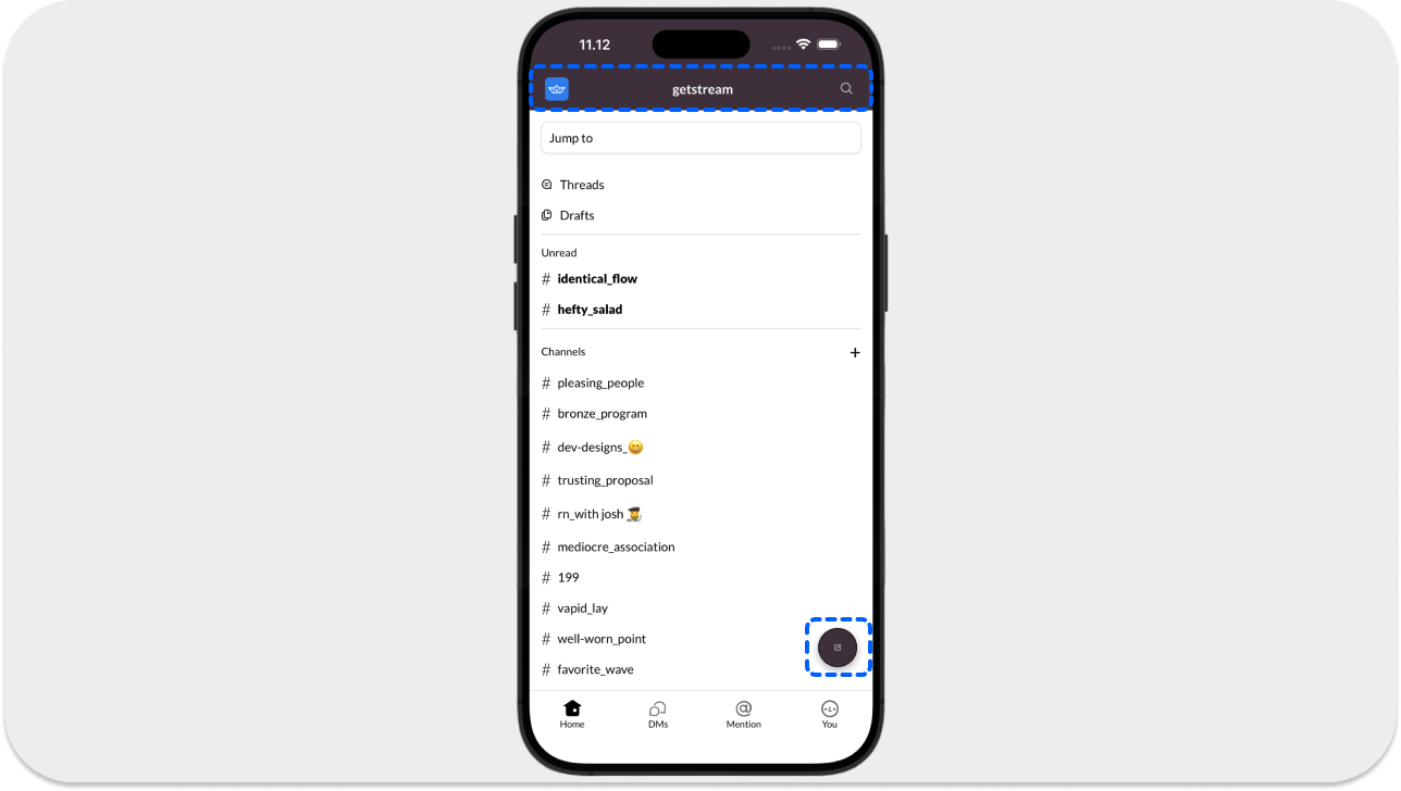
The header/top bar displays the screen title, logo, and a search button. The floating action menu is used for composing new messages. Create the ScreenHeader component in src/screens/ScreenHeader.js. It uses the useSafeAreaInsets hook to avoid overlapping content with the top inset of a device such as the iPhone 11.
The floating action button, which opens the new message screen should be added in src/components/NewMessageBubble.js. When you run the app with yarn ios or yarn android, you can also navigate through the tab bar items (Home, DMs, Mention, You) on the channel list screen.
Update the Channel List Screen
Let's update the channel list screen, similar to how we did in part 1 of the tutorial, with a few changes.
Here is an outline of the important specs that we need to implement:
- Channels categorized by grouped by
- Unread channels and conversations (
directMessagingConversations) - Direct Message (
directMessagingConversations)
The channels in this case are defined by a conversation with a non-empty name. directMessagingConversations are defined by conversations without a name.
- Unread channel labels are bold.
- In one-to-one conversations (a subgroup of
directMessagingConversations), users have a presence indicator next to their names. It appears green if they are online; otherwise, it appears as a hollow circle.
Update the following files in the project:
src/components/ChannelList/ChannelList.jssrc/components/ChannelListItem.js
The useWatchedChannels hook makes two calls to the queryChannels API to:
- Fetch all group channels (conversations with a name)
- Fetch all direct messages (conversations without a name)
Once fetched, the results are sorted into three variables: unreadChannels, readChannels, and directMessagingConversations.
We can reuse the queried channel data in other screens by caching it in CacheService. To keep things simple, use an object for caching. You can use redux or some other state management service for this purpose.
Add the Message Action Sheet
Message actions are handled by the Stream Chat React Native SDK's built-in overlay system, OverlayProvider. Long-pressing a message shows actions automatically. Add the sample code for the action sheet in src/components/MessageActionSheet.js.
123456789101112131415161718192021222324252627282930313233343536373839404142434445464748495051525354555657585960616263646566676869707172737475767778798081828384858687888990919293949596979899100101102103104105106107108109110111112113114115116117118119120121122123124125126127128129130131132133import React from "react";
import {
  View,
  Text,
  StyleSheet,
  Modal,
  TouchableOpacity,
  TouchableHighlight,
} from "react-native";
import { SCText } from "./SCText";
import { ChatClientService } from "../utils";
import { useTheme } from "@react-navigation/native";
import { SVGIcon } from "./SVGIcon";
import Clipboard from "@react-native-clipboard/clipboard";

export const MessageActionSheet = ({
  message,
  visible,
  onClose,
  handleEdit,
  handleDelete,
  handleReaction,
  openThread,
}) => {
  const chatClient = ChatClientService.getClient();
  const { colors, dark } = useTheme();

  if (!message || !visible) {
    return null;
  }

  const options = [];

  if (message.user?.id === chatClient?.user?.id) {
    options.push({
      id: "edit",
      title: "Edit Message",
      icon: "edit-text",
      handler: handleEdit,
    });
    options.push({
      id: "delete",
      title: "Delete message",
      icon: "delete-text",
      handler: handleDelete,
    });
  }

  options.push({
    id: "copy",
    title: "Copy Text",
    icon: "copy-text",
    handler: () => {
      Clipboard.setString(message.text || "");
      onClose();
    },
  });
  options.push({
    id: "reply",
    title: "Reply in Thread",
    icon: "threads",
    handler: () => {
      openThread && openThread();
      onClose();
    },
  });

  return (
    <Modal
      animationType="fade"
      transparent
      visible={visible}
      onRequestClose={onClose}
    >
      <TouchableHighlight
        style={styles.overlay}
        onPress={onClose}
        underlayColor="rgba(0,0,0,0.5)"
      >
        <View
          style={[
            styles.actionSheetContainer,
            { backgroundColor: colors.background },
          ]}
        >
          {options.map((option) => (
            <TouchableOpacity
              key={option.id}
              style={styles.actionItem}
              onPress={() => {
                option.handler && option.handler();
                onClose();
              }}
            >
              <SVGIcon height="20" width="20" type={option.icon} />
              <SCText
                style={[
                  styles.actionItemText,
                  { color: option.id === "delete" ? "#E01E5A" : colors.text },
                ]}
              >
                {option.title}
              </SCText>
            </TouchableOpacity>
          ))}
        </View>
      </TouchableHighlight>
    </Modal>
  );
};

const styles = StyleSheet.create({
  overlay: {
    flex: 1,
    backgroundColor: "rgba(0,0,0,0.5)",
    justifyContent: "flex-end",
  },
  actionSheetContainer: {
    borderTopLeftRadius: 15,
    borderTopRightRadius: 15,
    padding: 15,
    paddingBottom: 40,
  },
  actionItem: {
    flexDirection: "row",
    alignItems: "center",
    padding: 15,
  },
  actionItemText: {
    marginLeft: 20,
    fontSize: 16,
  },
});
Now, you assign the ChannelScreen component to the HomeStack.Screen in App.js using this code snippet.
1234567import {ChannelScreen} from './src/screens/ChannelScreen';
...
<HomeStack.Screen
    name="ChannelScreen"
    component={ChannelScreen}
    options={{headerShown: false}}
/>
If you run the app with yarn ios or yarn android, you should see the complete ChannelScreen with the topbar, compose button, and tab bar components.

Congratulations!
You've completed part 2 of our tutorial on Slack clone using the Stream Chat SDK for React Native. In part 3 of the tutorial, we cover the search screen, threads and replies, and more.
We'll see you in the final part!