

In part one of the series, we did not cover any UI work and instead focused on setting up the project and integrating the Stream Chat SDK. Having laid this groundwork, we can now start implementing the UI.
We will start with the overall layout of the application and then build it step-by-step. This part will tackle the server list as the first column of the application. Before we start, we want to discuss quickly our customization options.
The Stream Chat SDK comes with built-in components for getting started quickly. If we want to build up our UI, we have three options:
- Theming: this is using CSS and the variables that are used in the SDK to change basic appearance properties of the UI elements, such as colors, radii, and more.
- Inject custom components into existing ones; certain elements (such as the
ChannelList) allow us to use the skeleton of the SDK and customize the appearance of the elements contained inside of them (we will see this in action in part 3 of this series). - Build a completely custom UI and populate it with data from the
clientourselves.
All of these options are viable in certain use cases. Generally, they are getting more powerful, but they also require more work from the developer side, going from points one to three.
In this article, we want to build the server list. As we discussed in part one, the SDK doesn't come with that out of the box (but is easily expandable to support it). Due to that fact, we need to come up with our UI.
This article will contain mainly HTML and CSS work, with some logic involved to bring it all together.
The final code for the project can be found in this GitHub repository.
Establish the Layout of the App
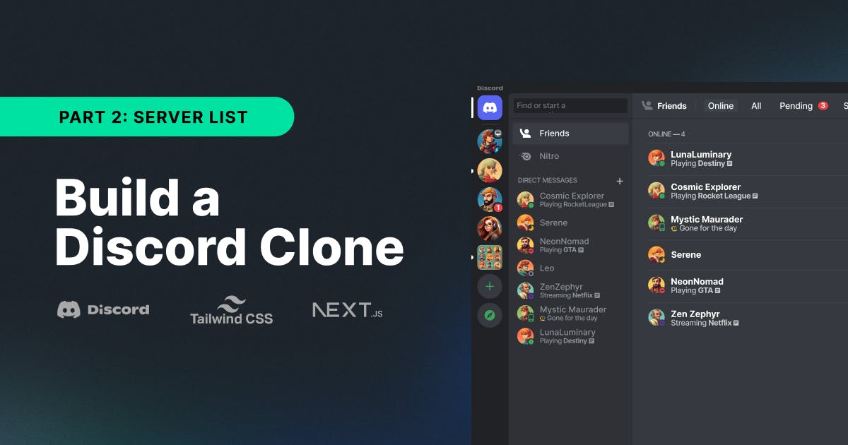
The Discord app uses a three-pane layout, as shown in the screenshot below. It has the list of servers the user is part of on the left as rounded icons (with a nice hover effect that we will replicate). It then shows the list of channels on the active server, structured into categories. There's also a header (showing the name and some options) and a footer (displaying the current user's profile).On the right side, there's the list of messages on the currently selected channel.

Creating this layout is straightforward using CSS. We add a class to the root element that creates a grid. Let's open up globals.css and add the following code snippet:
1234.layout {
  display: grid;
  grid-template-columns: auto auto 1fr;
}
It creates three columns and says that the first two elements will take up the space they need (auto), and the third column fills the remaining space (1fr).
For this to work, we will now create the templates for the respective elements and fill them out throughout the rest of this article.
We create a new folder in the project's root called components; inside it, we create a new file called ServerList.tsx.
For now, the code inside of it will be this:
12345const ServerList = () => {
  return <div className="bg-blue-500 w-32 h-full">Server List</div>;
};

export default ServerList;
Next, we create a new file inside the components folder called CustomChannelList.tsx.
Again, we fill it with a raw code snippet to get the layout working for now:
123const CustomChannelList = () => {
  return <div className="bg-green-500 w-64 h-full">Channel List</div>;
};
With that, we can turn towards the page.tsx file to get our layout working and replace the return code in the Home component with this:
1234567891011121314<Chat client={chatClient} theme="str-chat__theme-light">
  <section className="flex h-screen w-screen layout">
    <ServerList />
    <ChannelList List={CustomChannelList} />
    <Channel>
      <Window>
        <ChannelHeader />
        <MessageList />
        <MessageInput />
      </Window>
      <Thread />
    </Channel>
  </section>
</Chat>;
We will get into more detail about how the single components work, but for now, we can see the layout in action when we hit save and check the browser.

This means we're ready to implement the components themselves.
Creating the Server List
The server list consists of the following parts:
- A Discord icon that brings users to their DMs with other users.
- A round icon for each server (for that, we require users to add a link to an image when creating new servers.
- A plus icon that opens up a form to create a new server (we will work with URL parameters to achieve that).
Before we show the UI and the list of servers, though, we need to create a list of our servers. We will use a useState hook to keep track of those in a serverList variable.
For that, we create a function called loadServerList that will follow these steps:
- get all the channels from the
client(that we can handily import through theuseChatContext()hook) - go over all channels, extract the server info from their
datadictionaries, and filter out ones that might not have that information - convert this array to a set to only have distinct channels, eliminating duplicates
- update our
serverListvariable usingsetServerList - in case there are servers present (the
serverListcontains at least one element), we change the server to the first entry (using thechangeServerfunction of theDiscordContextthat we created in the previous article.
Finally, we'll execute that function using a useEffect hook in our previously created ServerList component.
Add this code inside of ServerList:
12345678910111213141516171819202122232425const { changeServer } = useDiscordContext();
const [serverList, setServerList] = useState<DiscordServer[]>([]);

const loadServerList = useCallback(async (): Promise<void> => {
  const channels = await client.queryChannels({});
  const serverSet: Set<DiscordServer> = new Set(
    channels
      .map((channel: Channel) => {
        return {
          name: (channel.data?.data?.server as string) ?? "Unknown",
          image: channel.data?.data?.image,
        };
      })
      .filter((server: DiscordServer) => server.name !== "Unknown"),
  );
  const serverArray = Array.from(serverSet.values());
  setServerList(serverArray);
  if (serverArray.length > 0) {
    changeServer(serverArray[0], client);
  }
}, [client, changeServer]);

useEffect(() => {
  loadServerList();
}, [loadServerList]);
We already mentioned that we want a Discord icon as the first element, so let's download this and import it. Luckily, Discord provides a branding page where we can download the icons we need. We need the Mark only as SVGs in black and white color (we need the second one when we create the hover effect in a later chapter).
After downloading them, we create a new assets folder at the root of our project and drop the SVGs inside.
With that, we can write the code. First, we use the Discord icon to create a button that will change the server to undefined, which we used to show a list of Direct Messages in the Discord Context (check the previous article if you're unsure how this worked).
Next, we iterate over the serverList and show the image of the server embedded in a button that will change to the respective server.
Finally, we show a link with a plus icon that goes to /?createServer=true, where we will add a form to create a new server in the next chapter.
Here's the code:
1234567891011121314151617181920212223242526272829303132333435<div className="bg-gray-200 h-full flex flex-col items-center">
  <button
    className="w-14 h-14 m-4 p-3 bg-white border-b-2 border-gray-300 relative discord-icon"
    onClick={() => changeServer(undefined, client)}
  />
  {serverList.map((server) => {
    return (
      <button
        key={server.name}
        className="p-4"
        onClick={() => {
          changeServer(server, client);
        }}
      >
        {server.image ? (
          <Image
            className="rounded-full"
            src={server.image}
            width={50}
            height={50}
            alt="Server Icon"
          />
        ) : (
          <span className="text-sm">{server.name.charAt(0)}</span>
        )}
      </button>
    );
  })}
  <Link
    href={"/?createServer=true"}
    className="flex items-center justify-center rounded-full bg-white text-green-500 p-2 my-2 text-2xl font-light h-12 w-12"
  >
    <span className="inline-block">+</span>
  </Link>
</div>;
There's one more thing missing. If we look closely at the first button element, we don't have the Discord icon set yet. We could add it with an Image element, as we do with the other server images, but we will use the background property of the button element because we want to animate it in a later chapter.
Therefore, we added the discord-icon CSS class to the button and put the following code into the globals.css file (we should scope it locally, but for simplicity in this article, we will keep all CSS in one file):
1234.discord-icon {
  background: url('../assets/discord-black.svg') no-repeat center center, white;
  background-origin: content-box;
}
Note that I named the file discord-black.svg, so if you did this differently, you need to change it in the snippet.
With that, our ServerList is almost ready. The only thing missing is creating servers, so let's create the form for that next.
Adding a Form To Create a New Server
Creating a form is straightforward, but we must prepare a few things. We need to create a new file in the components folder called CreateServerForm.tsx.
Again, we will add an empty component that we will fill up step-by-step:
123const CreateServerForm = () => {
  return <div>Server Form</div>;
};
First, let's think about the things we need to get from the user to be able to create a server:
- a
serverName - a
serverImage - a list of
usersthat should be part of this new server
This type is local to this component, so let's define it first in this file:
12345type FormState = {
  serverName: string;
  serverImage: string;
  users: UserObject[];
};
We're using another new type here, that is UserObject. Why do we need this?
We want to show a list of users we can select using checkboxes to add to the new server. To display this nicely, we need a few properties. Let's create a new folder in the root of our project called model and add a file called UserObject.ts. We define the type like this:
1234567export type UserObject = {
  id: string;
  name: string;
  image?: string;
  online?: boolean;
  lastOnline?: string;
};
To display users, we first need to load them. Let's create a helper function for this inside of our component and call it inside of a useEffect hook:
12345678910111213141516171819202122const { client } = useChatContext();
const [users, setUsers] = useState<UserObject[]>([]);

const loadUsers = useCallback(async () => {
  const response = await client.queryUsers({});
  const users: UserObject[] = response.users
    .filter((user) => user.role !== "admin")
    .map((user) => {
      return {
        id: user.id,
        name: user.name ?? user.id,
        image: user.image as string,
        online: user.online,
        lastOnline: user.last_active,
      };
    });
  if (users) setUsers(users);
}, [client]);

useEffect(() => {
  loadUsers();
}, [loadUsers]);
The client allows us to queryUsers and map these to UserObject objects, making displaying them easy.
The way we want this form to work is like this:
- In a
useEffecthook, we detect whethercreateServeris in the current URL (using theuseSearchParamshook) - If yes, we open a
dialogmodal (that we reference using theuseRefhook) using itsshowModalfunction - If no, we close the
dialogusing itsclosefunction - Once we close the
dialog, we removecreateServerfrom the current URL (and with the logic from the previous step, close the modal
Here's the code for it:
1234567891011const params = useSearchParams();
const showCreateServerForm = params.get("createServer");
const dialogRef = useRef<HTMLDialogElement>(null);

useEffect(() => {
  if (showCreateServerForm && dialogRef.current) {
    dialogRef.current.showModal();
  } else {
    dialogRef.current?.close();
  }
}, [showCreateServerForm]);
With this in place, we can write the UI for our form. We wrap everything in a dialog element (that we attach the dialogRef that we mentioned before). The form itself has three input elements:
- the
serverName - the
serverImageURL - allows to check boxes for each user that should be added to the new server
We are managing the state of the form in a formData variable that we update when values change. Here's the code for the UI:
123456789101112131415161718192021222324252627282930313233343536373839404142434445464748495051525354555657585960616263646566676869707172737475767778798081828384const initialState: FormState = {
  serverName: "",
  serverImage: "",
  users: [],
};

const [formData, setFormData] = useState<FormState>(initialState);
const { createServer } = useDiscordContext();

return (
  <dialog
    className="absolute py-16 px-20 z-10 space-y-8 rounded-xl serverDialog"
    ref={dialogRef}
  >
    <Link href="/" className="absolute right-8 top-8">
      <svg
        xmlns="http://www.w3.org/2000/svg"
        fill="none"
        viewBox="0 0 24 24"
        strokeWidth={1.5}
        stroke="currentColor"
        className="w-8 h-8 text-gray-500 hover:text-black hover:font-bold"
      >
        <path
          strokeLinecap="round"
          strokeLinejoin="round"
          d="M9.75 9.75l4.5 4.5m0-4.5l-4.5 4.5M21 12a9 9 0 11-18 0 9 9 0 0118 0z"
        />
      </svg>
    </Link>
    <h2 className="text-3xl font-bold text-gray-600">Create new server</h2>
    <form method="dialog" action={createClicked} className="flex flex-col">
      <label className="labelTitle" htmlFor="serverName">
        Server Name
      </label>
      <input
        type="text"
        id="serverName"
        name="serverName"
        value={formData.serverName}
        onChange={(e) =>
          setFormData({ ...formData, serverName: e.target.value })
        }
        required
      />
      <label className="labelTitle" htmlFor="serverImage">
        Image URL
      </label>
      <input
        type="text"
        id="serverImage"
        name="serverImage"
        value={formData.serverImage}
        onChange={(e) =>
          setFormData({ ...formData, serverImage: e.target.value })
        }
        required
      />
      <h2 className="mb-2 labelTitle">Add Users</h2>
      {users.map((user) => (
        <div
          key={user.id}
          className="flex items-center justify-start w-full space-x-6 my-2"
        >
          <input
            type="checkbox"
            id={user.id}
            name={user.id}
            className="w-4 h-4 mb-0"
            onChange={(event) => userBoxChecked(event.target.checked, user)}
          />
          <UserCard user={user} />
        </div>
      ))}

      <button
        type="submit"
        className="bg-discord rounded p-3 text-white font-bold uppercase"
      >
        Create
      </button>
    </form>
  </dialog>
);
We need to add a few more things to make this work. We need to create two more functions:
userBoxChecked: when acheckboxis clicked, it will take that event and either add theuserto theformDataor remove it from itcreateClicked: when the user hits the create button, we call thecreateServerfunction from ourDiscordContext, reset theformDatato its initial state, and remove thecreateServerURL parameter (effectively closing the modal)
Here is the code for the two functions:
123456789101112131415161718192021222324function userBoxChecked(checked: Boolean, user: UserObject) {
  if (checked) {
    setFormData({
      ...formData,
      users: [...formData.users, user],
    });
  } else {
    setFormData({
      ...formData,
      users: formData.users.filter((u) => u.id !== user.id),
    });
  }
}

function createClicked() {
  createServer(
    client,
    formData.serverName,
    formData.serverImage,
    formData.users.map((user) => user.id),
  );
  setFormData(initialState);
  router.replace("/");
}
Also, we use the Discord purple with Tailwind (for the background of our create button), so we need to add this to the tailwind.config.ts (in the root of our project):
1234567891011const config: Config = {
  /* ... */
  theme: {
    extend: {
      colors: {
        discord: "#7289da",
      },
      /* ... */
    },
  },
};
Lastly, we use a UserCard to show the user data. We extract this code into a separate component to reuse it later when we want to create channels. We create a new file in the components folder called UserCard.tsx and fill it with the following code:
1234567891011121314151617181920212223242526272829303132333435363738394041const UserCard = ({ user }: { user: UserObject }) => {
  return (
    <label className="w-full flex items-center space-x-6" htmlFor="users">
      {user.image && (
        <Image
          src={user.image}
          width={40}
          height={40}
          alt={user.name}
          className="w-8 h-8 rounded-full"
        />
      )}
      {!user.image && (
        <svg
          xmlns="http://www.w3.org/2000/svg"
          fill="none"
          viewBox="0 0 24 24"
          strokeWidth={1.5}
          stroke="currentColor"
          className="w-8 h-8"
        >
          <path
            strokeLinecap="round"
            strokeLinejoin="round"
            d="M17.982 18.725A7.488 7.488 0 0012 15.75a7.488 7.488 0 00-5.982 2.975m11.963 0a9 9 0 10-11.963 0m11.963 0A8.966 8.966 0 0112 21a8.966 8.966 0 01-5.982-2.275M15 9.75a3 3 0 11-6 0 3 3 0 016 0z"
          />
        </svg>
      )}
      <p>
        <span className="block text-gray-600">{user.name}</span>
        {user.lastOnline && (
          <span className="text-sm text-gray-400">
            Last online: {user.lastOnline.split("T")[0]}
          </span>
        )}
      </p>
    </label>
  );
};

export default UserCard;
With that, we have a fully functional form to create a server that will allow the users to create new ones, add an image URL, and select the users they want to include.
While this works, we want to take it further and make it fun. Discord is an example of a playful application; we want to do our best to replicate that.
Adding Delight to the Server List
The last thing we did was to add the form to create a new server. Meanwhile, the dialog shows, but it is not great yet. We want it to be centered on the screen and give the modal a backdrop. This should be a gradient that includes the brand color.
We can achieve all of this using only CSS, so we open up globals.css and add this code to it:
12345678910.serverDialog {
  top: 50%;
  left: 50%;
  transform: translate(-50%, -50%);
}

::backdrop {
  background-image: linear-gradient(-45deg, #7289da, rebeccapurple);
  opacity: 0.5;
}
Note that this only works because we added the serverDialog CSS class to the dialog element in the previous chapter (probably without you noticing).
Next, we want to add hover effects to each of the icons in the list. We'll start with the roundness. We aim to go from a complete circle to a smaller border radius when the user hovers over an icon.
While we could use pure Tailwind for that, it has a little problem. All the images in the list currently have the rounded-full Tailwind class. This will give the border-radius a property of 9999px. While this achieves the rounded effect, when we animate this, it will look laggy.
Instead, we add a custom CSS class with a hover in our globals.css:
12345678.rounded-icon {
  @apply transition-all duration-200 ease-in-out;
  border-radius: 50%;
}

.rounded-icon:hover {
  border-radius: 1rem;
}
Inside ServerList.tsx, we add this rounded-icon class to the button that holds the Discord icon and to the Image elements for both the server.image and our plus icon.
In addition to animating the border, we want to slide in a sidebar whenever the icon is hovered. Again, we can achieve this only using CSS. We'll add a sidebar-icon class with a ::before element (learn more about pseudo-elements here).
We can use CSS variables to change the height, width, and offset of the before element when hovered. With that, we don't add unnecessary DOM elements and keep the code clean.
Add this to the globals.css:
123456789101112131415161718192021222324.sidebar-icon {
  @apply flex items-center justify-center w-full relative transition-all ease-in-out duration-200;
}

.sidebar-icon::before {
  @apply transition-all duration-300 ease-in-out;
  --content-height: 0rem;
  --content-width: 0rem;
  --offset: -0.4rem;
  content: "";
  display: block;
  height: var(--content-height);
  width: var(--content-width);
  background: black;
  position: absolute;
  border-radius: 3px;
  left: var(--offset);
}

.sidebar-icon:hover::before {
  --content-height: 2.5rem;
  --content-width: 0.5rem;
  --offset: -0.15rem;
}
For this to work, we must add the sidebar-icon to both the Discord button element and the server list button inside our ServerList component.
The last remaining thing is that we want to indicate which server is currently selected. Discord does this by showing the sidebar in a smaller way. So, let's add a new selected-icon class to globals.css:
12345.selected-icon::before {
  --content-height: 1.25rem;
  --content-width: 0.5rem;
  --offset: -0.15rem;
}
Using CSS variables, we only need one line of code to adopt this.
However, we must still add this to the icons in our ServerList component. Since we expose the active server in our DiscordContext, we can add checks to add the selected-icon CSS class conditionally.
First, we need to change the import from DiscordContext to look like this:
1const { server: activeServer, changeServer } = useDiscordContext();
First, for the Discord button, we change the code to this:
12345678<button
  className={`block p-3 aspect-square sidebar-icon ${
    activeServer === undefined ? "selected-icon" : ""
  }`}
  onClick={() => changeServer(undefined, client)}
>
  <div className="rounded-icon discord-icon"></div>
</button>;
Then, for the server icon, we change it to this:
123456789<button
  key={server.name}
  className={`p-4 sidebar-icon ${
    server === activeServer ? 'selected-icon' : ''
  }`}
  onClick={() => {
    changeServer(server, client);
  }}
>
With these updates, we added fun interactions to the ServerList component, providing more context and indications of what's happening to the user.
Summary
In the first part, we prepared the application with some necessary logic. In this article, we built the UI by defining the three-pane layout.
In the introduction of this article, we discussed the different customization options we have for the Stream Chat SDK. Here, because the server functionality is something we built ourselves, we also had to implement the UI entirely from scratch.
Then, we added the logic to create a list of servers and show them. We also added a button with the Discord icon to show a list of DMs from the current user.
Lastly, we added a button to open a form to create a new server with a list of users. With this, the first part of our three-pane layout is done. We're still missing the channel list of a server (middle pane) and the message list (right pane).
We will cover the channel list in the following article, so stay tuned for this coming out soon. Don't forget to give the project a star on Github, and let us know what you build!