

Since Google announced the Jetpack Compose 1.0 stable release, many companies have adopted Jetpack Compose to leverage its numerous advantages. With Compose's widespread adoption across the Android ecosystem, libraries and SDKs have also begun integrating support for Compose.
Traditionally, in XML-based projects, UI components were delivered as custom views with customizable options via attributes. While this approach made it easy to integrate components into XML layouts, it introduced challenges such as inconsistencies in applying theme styles across multiple components and the misuse of APIs due to exposed methods from the underlying View class.
Jetpack Compose offers a fundamentally different strategy for designing components compared to traditional custom views. Its declarative structure allows for more intuitive and flexible API design. This shift not only benefits library and SDK developers but also large teams building shared UI components, enabling them to enforce better practices, reduce misuse, and enhance the overall developer experience.
In this article, you will discover effective strategies for designing UI components in Jetpack Compose, drawing on best practices from the Stream Video SDK.
Best Practices for Modifier
The Modifier is a powerful API in Jetpack Compose that enables you to decorate and augment UI elements in a chained and composable manner. However, it should be used thoughtfully, as its properties can propagate to other composable functions, potentially leading to unintended effects if not managed properly.
The order of modifier functions is especially crucial, as each function modifies the Modifier returned by the previous one or the Modifier passed from outside the composable. This sequencing directly impacts the final output. In this section, we’ll explore three key principles and best practices that can guide you in designing effective and predictable UI component APIs in Jetpack Compose.
1. Apply Modifiers to the top-most layout of the component
Modifiers in Jetpack Compose are passed down through the layout hierarchy, but they should ideally be applied only to the top-most layout node in your composable function. Applying modifiers at arbitrary levels within the hierarchy can lead to unexpected behavior and increase the likelihood of misuse by users, making your component less predictable and harder to use effectively.
For instance, imagine you want to create a component that represents a rounded shape button like the example below:
123456789101112131415@Composable
fun RoundedButton(
  modifier: Modifier = Modifier,
  onClick: () -> Unit
) {
  Button(
    modifier = modifier.clip(RoundedCornerShape(32.dp)),
    onClick = onClick
  ) {
    Text(
      modifier = Modifier.padding(10.dp),
      text = "Rounded"
    )
  }
}
However, you shouldn’t apply the Modifier into Text instead of the Button, which is the top-most composable function in the layout hierarchy like the below:
123456789101112131415@Composable
fun RoundedButton(
  modifier: Modifier = Modifier,
  onClick: () -> Unit
) {
  Button(
    modifier = Modifier.clip(RoundedCornerShape(32.dp)),
    onClick = onClick
  ) {
    Text(
      modifier = modifier.padding(10.dp), // Don't do this
      text = "Rounded"
    )
  }
}
The primary purpose of the custom composable function, RoundedButton, is to represent a Button, not a Text. Therefore, you should avoid shifting the focus or purpose of the primary component you are creating.
Additionally, if the layout hierarchy becomes complex and you apply the Modifier at an intermediate level within the composable function, it can be challenging for users to predict which component the provided Modifier parameter will ultimately affect. This lack of clarity can lead to confusion and misuse.
If you want to give users the flexibility to modify the internal content of the Button, you can achieve this by using a slot, as demonstrated in the example below:
12345678910111213@Composable
fun RoundedButton(
  modifier: Modifier = Modifier,
  onClick: () -> Unit,
  content: @Composable RowScope.() -> Unit
) {
  Button(
    modifier = modifier.clip(RoundedCornerShape(32.dp)),
    onClick = onClick
  ) {
    content()
  }
}
2. Use single parameter for Modifier
You might wonder if it's possible to accept multiple Modifier parameters to apply to specific components in the layout hierarchy while restricting the structure of a component, as shown in the example below:
12345678910111213141516@Composable
fun RoundedButton(
  modifier: Modifier = Modifier,
  textModifier: Modifier = Modifier,
  onClick: () -> Unit,
) {
  Button(
    modifier = modifier.clip(RoundedCornerShape(32.dp)),
    onClick = onClick
  ) {
    Text(
      modifier = textModifier.padding(10.dp),
      text = "Rounded"
    )
  }
}
However, the Modifier is inherently designed to be a single, chainable parameter, enabling users to define the external behavior and appearance of a Composable function. Introducing multiple Modifier parameters in a Composable adds unnecessary complexity, increases the risk of misuse, and deviates from Jetpack Compose's principle of keeping APIs intuitive and predictable.
It's better to use a slot-based approach to give users the flexibility to customize internal content. For instance, rather than adding multiple Modifier parameters, you can define a slot that allows users to provide custom content while still maintaining a single Modifier for external customization.
12345678910111213@Composable
fun RoundedButton(
  modifier: Modifier = Modifier,
  onClick: () -> Unit,
  content: @Composable RowScope.() -> Unit
) {
  Button(
    modifier = modifier.clip(RoundedCornerShape(32.dp)),
    onClick = onClick
  ) {
    content()
  }
}
3. Avoid reusing Modifiers across components
Another important consideration when designing components is to avoid reusing the provided Modifier instances. Some developers might worry that creating new instances of Modifier for every component could lead to increased memory usage or negatively impact performance, especially in complex layout hierarchies with numerous modifiers.
However, this concern is generally unfounded due to the optimized nature of Modifier implementation in Jetpack Compose. Modifiers are intended to be applied to a single layout node within a Composable function, ensuring clear and predictable behavior. If the same Modifier is used across multiple composables at different levels in the layout hierarchy, it can lead to unintended side effects and unpredictable behavior, compromising the consistency and usability of the component.
For instance, consider a scenario where the same Modifier parameter is reused across the entire layout hierarchy, as shown in the example below:
123456789101112131415161718192021222324252627@Composable
fun MyButtons(
  modifier: Modifier = Modifier,
  onClick: () -> Unit,
) {
  Column(modifier = modifier) {
    Button(
      modifier = modifier,
      onClick = onClick
    ) {
      Text(
        modifier = modifier.padding(10.dp),
        text = "Rounded"
      )
    }

    Button(
      modifier = modifier,
      onClick = onClick
    ) {
      Text(
        modifier = modifier.padding(10.dp),
        text = "Not Rounded"
      )
    }
  }
}
At first glance, the code may appear to work correctly. However, you'll notice unexpected behavior when you modify the modifier at the call site, potentially altering the entire layout in unintended ways.
12345MyButtons(
  modifier = Modifier
    .clip(RoundedCornerShape(32.dp))
    .background(Color.Blue)
) {}
To ensure proper behavior and avoid unexpected issues, you should refrain from reusing Modifiers across multiple components. In this section, you’ve gained insights into best practices for managing Modifiers when designing Compose components. Next, let’s dive into providing consistent UI styles by implementing themes.
Theming For UI Consistencies
Now, imagine you need to offer a variety of Compose components that should share a consistent style. If these components are provided independently, the responsibility of maintaining consistent styles across them falls entirely on the users. This can be quite challenging, as each component might expose different APIs for customizing their styles, making synchronization a cumbersome and error-prone task.
In this scenario, you can draw inspiration from the MaterialTheme API provided by the Compose Material library. The key takeaway is to ensure consistent component styling while allowing users to seamlessly customize and maintain different styles consistently across various components.

The Stream Video SDK for Compose demonstrates best practices by offering a dedicated theming API called VideoTheme. This VideoTheme API ensures consistent styling across all Compose components provided by the SDK, including colors, dimensions, typography, shapes, ripple effects, and more.
123456789101112131415161718setContent {
    VideoTheme(
        colors = StreamColors.defaultColors().copy(appBackground = Color.Black),
        dimens = StreamDimens.defaultDimens().copy(callAvatarSize = 72.dp),
        shapes = StreamShapes.defaultShapes().copy(
            avatar = RoundedCornerShape(8.dp),
            callButton = RoundedCornerShape(16.dp),
            callControls = RectangleShape,
            callControlsButton = RoundedCornerShape(8.dp)
        )
    ) {
        CallContent(
            modifier = Modifier.fillMaxSize(),
            call = call,
            onBackPressed = { finish() },
        )
    }
}
By wrapping the components provided by the Stream SDK with the VideoTheme like the above example, customized styles are automatically applied consistently across all components. This approach enables users to maintain uniformity in their UI effortlessly while adapting the theme to fit their application's design requirements.
Implementing a Custom Theme
Let’s dive into implementing a custom theme. The first step is to define the design specifications that will be shared across your components or made customizable for users. Consider including aspects like colors, shapes, and dimensions, as these are often the most important for ensuring a consistent design system.
For example, in the Stream SDK, all the color sets required by the components are predefined in StreamColors class, offering users a seamless way to maintain consistency across their UI. Here’s an example of how Stream SDK ensures uniformity with a well-structured color set:
1234567891011public data class StreamColors(
    val brandPrimary: Color,
    val brandPrimaryLt: Color,
    val brandPrimaryDk: Color,
    val brandSecondary: Color,
    val brandSecondaryTransparent: Color,
    val brandCyan: Color,
    val brandGreen: Color,
    val brandYellow: Color,
    ..
  )
Next, you should create a CompositionLocal to hold the design specifications. This will allow your components and users to seamlessly access these specifications within the context of a custom theme by using StreamTheme.colors invocation.
123456789101112131415/**
 * Local providers for various properties we connect to our components, for styling.
 */
private val LocalColors = compositionLocalOf<StreamColors> {
    error("No colors provided! Make sure to wrap all usages of Stream components in a VideoTheme.")
}

public interface StreamTheme {
    /**
     * Retrieves the current [StreamColors] at the call site's position in the hierarchy.
     */
    public val colors: StreamColors
        @Composable @ReadOnlyComposable
        get() = LocalColors.current
}
Then, you need to encapsulate these design specifications within a custom theme by leveraging CompositionLocal. This approach allows you to provide and propagate your design specifications efficiently throughout the composable hierarchy.
1234567891011public fun VideoTheme(
    isInDarkMode: Boolean = isSystemInDarkTheme(),
    colors: StreamColors = StreamColors.defaultColors(),
    content: @Composable () -> Unit,
) {
    CompositionLocalProvider(
        LocalColors provides colors,
    ) {
        content()
    }
}
Now, all your components should assume they are wrapped within the custom theme (e.g., VideoTheme in this example) and use the provided design specifications to ensure consistent styling across the entire component set. This approach not only enables your component APIs to adopt a unified style but also allows users to leverage these design specifications for their customizations, promoting flexibility and consistency simultaneously.
12345678910111213141516171819202122232425262728293031323334@Composable
fun VideoRendererCallContent(
    call: Call,
    video: ParticipantState.Video,
    onRendered: (View) -> Unit = {},
) {
    VideoRenderer(
        modifier = Modifier
            .fillMaxSize()
            .background(VideoTheme.colors.baseSheetTertiary), // use pre-defined color styles
        call = call,
        video = video,
        onRendered = onRendered,
    )
}

@Composable
fun MyScreen() {

  VideoRendererCallContent(..)

  // some complicated components
}

class MainActivity : ComponentActivity() {
    override fun onCreate(savedInstanceState: Bundle?) {
        super.onCreate(savedInstanceState)

         setContent {
            VideoTheme {
               MyScreen()
            }
         }
}
This approach is equally effective for building your application, not just for implementing APIs (library or SDK), as it enables easy maintenance of design consistency using well-structured, pre-defined design specifications. For practical examples and real-world use cases, you can explore real-world best practices on GitHub.
Customizability
When implementing UI components, especially for libraries or SDKs, it’s crucial to offer robust customization and flexibility for UI and UX behaviors. This ensures that users can easily reuse the components and adapt them to fit their specific requirements. You can adopt various strategies to achieve this level of customizability effectively in Jetpack Compose.
1. Utilizing Style Classes
If you aim to provide more tailored customization for specific components, consider offering a dedicated style class. This class can define and enable users to easily modify the UI and UX behaviors of the component to suit their specific needs.
A great example is TextStyle, a default class provided by the Compose UI library:
1234567891011121314@Immutable
class TextStyle internal constructor(
  ..
) {
    constructor(
        color: Color = Color.Unspecified,
        fontSize: TextUnit = TextUnit.Unspecified,
        fontWeight: FontWeight? = null,
        fontStyle: FontStyle? = null,
        fontSynthesis: FontSynthesis? = null,
        fontFamily: FontFamily? = null,
        ..
     )
}
As demonstrated in the code above, the TextStyle class encapsulates all the styling properties for the Text composable. By simply passing a TextStyle instance to the Text composable, you can effortlessly customize its design, as shown in the example below:
12345678910111213Text(
    modifier = Modifier
        .fillMaxWidth()
        .padding(top = 16.dp),
    text = "Stats",
    style = TextStyle(
        fontSize = 16.sp,
        lineHeight = 24.sp,
        fontWeight = FontWeight(600),
        color = Color.White,
        textAlign = TextAlign.Center,
    ),
)
The advantage of using style classes is that they allow component developers to consolidate all design specifications into a single, centralized class. This approach prevents design elements from being scattered across multiple layouts, making the codebase cleaner and easier to manage.
For users, style classes provide a straightforward and intuitive way to modify designs. Additionally, users can reuse the same style instance across multiple layouts, making it more convenient to apply consistent customization across different layouts.
One potential drawback is that due to the recomposition mechanism, the Compose runtime will compare all properties of the style class whenever an input changes to determine if recomposition is necessary. This makes it slightly more expensive compared to defining individual parameters directly in the composable function. However, from an API design perspective, the improved user experience and simplified API management often outweigh this cost, making it a worthwhile trade-off in many scenarios.
2. Flexibility With Slots
Another effective strategy to enhance customization flexibility is to provide a slot that accepts a composable function, allowing users to define specific implementations tailored to their needs. By offering a default implementation, you ensure that users can leverage the provided functionality without additional effort, while still having the option to customize as required.
For example, the CallContent component, provided by the Stream Video SDK, is a high-level API that integrates multiple subcomponents, including the top app bar, video renderer, layout structures, grid participants, and more. While the CallContent API includes a default implementation for ease of use, it also ensures flexibility by allowing customization through slot parameters, as demonstrated in the code below:
12345678910111213141516fun CallContent(
    call: Call,
    modifier: Modifier = Modifier,
    style: VideoRendererStyle = RegularVideoRendererStyle(),
    appBarContent: @Composable (call: Call) -> Unit = {
        CallAppBar(..)
    },
    videoRenderer: @Composable (..) -> Unit = {
        ParticipantVideo(..)
    },
    videoContent: @Composable RowScope.(call: Call) -> Unit = {
        ParticipantsLayout(..)
    },
) {
  ..
}
This approach allows users to implement their own custom versions of the top app bar, video renderer, layout structures, grid participants, and more. Additionally, another effective strategy is to group similar types of components and make them customizable through a slot, commonly known as the compound component pattern.
The compound component pattern involves creating a parent component that manages a collection of child components, offering customization by exposing slots for each child. This pattern allows users to replace or customize individual subcomponents while keeping the overall structure and functionality consistent.
Imagine a control panel on a video call screen that contains multiple action buttons, as illustrated in the image below:

Some users may prefer a different order for the action buttons, such as placing the microphone button first, while others might want to add, remove, or customize buttons based on their specific use cases. In such scenarios, the compound component pattern proves to be highly effective in accommodating these diverse requirements like the code below:
12345678910111213141516171819202122@Composable
public fun ControlActions(
    call: Call,
    modifier: Modifier = Modifier,
    actions: List<(@Composable () -> Unit)>
) {
    Box(
        modifier = modifier,
    ) {
        LazyRow(
            verticalAlignment = Alignment.CenterVertically,
            horizontalArrangement = Arrangement.spacedBy(
                VideoTheme.dimens.spacingM,
                Alignment.CenterHorizontally,
            ),
        ) {
            items(actions) { action ->
                action.invoke()
            }
        }
    }
}
The code above demonstrates a single slot that accepts a list of Composable functions, which are then rendered using a Row or LazyRow. This approach allows you to provide a highly flexible component API while maintaining control over the intended structure of the component layout.
Afterward, you can also provide a default implementation, as shown below, for added convenience.
1234567891011121314151617181920212223242526272829303132@Composable
public fun buildDefaultCallControlActions(
    onCallAction: (CallAction) -> Unit,
): List<@Composable () -> Unit> {

    return listOf(
        {
            ToggleCameraAction(
                onCallAction = onCallAction,
            )
        },
        {
            ToggleMicrophoneAction(
                onCallAction = onCallAction,
            )
        },
        {
            FlipCameraAction(
                onCallAction = onCallAction,
            )
        },
    )
}

@Composable
public fun ControlActions(
    call: Call,
    modifier: Modifier = Modifier,
    onCallAction: (CallAction) -> Unit = { DefaultOnCallActionHandler.onCallAction(call, it) },
    actions: List<(@Composable () -> Unit)> = buildDefaultCallControlActions(onCallAction)
) {
}
For more real-world examples of ControlActions, you can explore the implementation on GitHub.
3. Customization With Theming
Another common challenge when designing Compose components arises as the component hierarchy grows larger, making it harder to provide clear and straightforward customizability. For example, imagine you want to offer customizability for a video renderer that is used in multiple parts of your component, but the UI hierarchy is deeply nested and complex, as shown in the example below:
12345678910111213141516@Composable
fun CallContent() {
    ParticipantsLayout {
      ParticipantsRegularGrid {
        OrientationVideoRenderer {
          LazyVerticalGrid {
            VideoRenderer() // <-- users want to customize this renderer style
          }
        }
      }

      FloatingVideoRenderer {
        VideoRenderer() // <-- users want to customize this renderer style
      }
    }
}
In this case, it's not ideal to pass a slot or style parameter from the topmost component all the way down to the VideoRenderer component. As you add more customizability across different components, the topmost component (CallContent) could become overloaded with numerous slot and style parameters. This not only makes your APIs harder to maintain but also increases the likelihood of user confusion or misuse, as it becomes unclear which parameter serves what purpose.
For addressing this, you can leverage a custom theme along with CompositionLocal to achieve customizability while keeping the API cleaner and more manageable, as shown in the example below:
123456789101112131415161718192021@Immutable
public data class VideoRendererStyle(
    val backgroundColor: Color = Color.Black,
    ..
)

private val LocalVideoRendererStyle = compositionLocalOf<VideoRendererStyle> {
    error("No VideoRendererStyle provided! Make sure to wrap all usages of Stream components in a VideoTheme.")
}

@Composable
public fun VideoTheme(
    videoRendererStyle: VideoRendererStyle = VideoRendererStyle(),
    content: @Composable () -> Unit,
) {
    CompositionLocalProvider(
        LocalVideoRendererStyle provides videoRendererStyle,
    ) {
        content()
    }
}
Now, you can ensure consistent component styles by utilizing the provided styles across different components, avoiding the need to pass them down repeatedly as parameters. Additionally, users can easily customize the styles by creating their own custom theme, as demonstrated in the example below:
1234567setContent {
    VideoTheme(
        videoRendererStyle = VideoRendererStyle(backgroundColor = Color.Blue)
    ) {
      ..
    }
}
If you want to apply this strategy on a broader scale and manage more styles efficiently, you can consolidate them into a single class, such as StreamStyles, and provide a unified style class instead of multiple individual styles within the CompositionLocal.
While some might be concerned about the performance impact of CompositionLocal due to its triggering of recomposition across the layout hierarchy when values change, themes are typically not frequently updated in an application. They are generally static for ensuring design consistency, making the use of CompositionLocal a suitable and efficient choice in such cases.
Preview Compatibilities
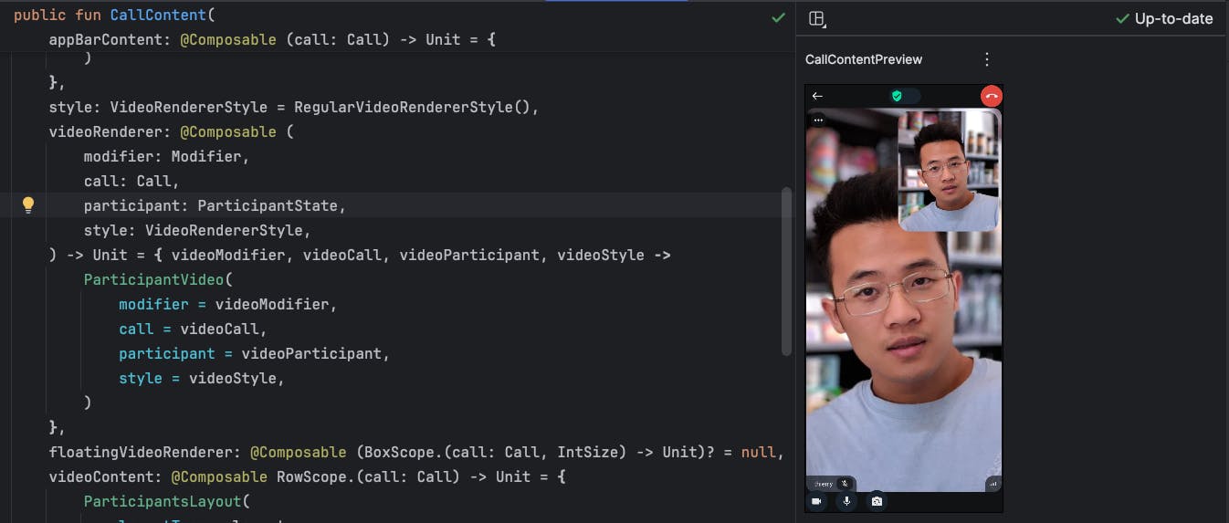
Providing previews is important, especially when building component APIs, as they allow developers to visualize and verify their UI designs directly in Android Studio. Some developers rely on Live Literals to dynamically showcase changes in previews, and others use screenshot testing to ensure the visual consistency of their components. Therefore, when implementing Compose components, it's essential to ensure they are fully compatible with the preview functionality in Android Studio as you can see like the screenshot below:
Sometimes, your component may involve side-effects, such as rendering an image after making a network request or handling dynamic states, which can cause the preview to malfunction. In such cases, you can leverage LocalInspectionMode.
LocalInspectionMode allows you to determine if a composable is being rendered in preview mode, enabling you to render a dedicated layout specifically for preview purposes. This approach ensures the preview remains functional, even when your component depends on complex logic or external resources. You can find a real-world example from Landscapist a Jetpack Compose library for network image loading, which demonstrates best practices for handling previews.
The composable function below checks whether it is in preview mode. If it is, it renders a static image instead of executing side effects like fetching network data. This approach allows users to build their own previews for the GlideImage composable function without encountering runtime errors during preview rendering.
12345678910111213141516171819@Composable
public fun GlideImage(
  imageModel: () -> Any?,
  modifier: Modifier = Modifier,
  previewPlaceholder: Painter? = null,
  ..
) {
  if (LocalInspectionMode.current && previewPlaceholder != null) {
      Image(
        modifier = modifier,
        painter = previewPlaceholder,
        ..
      )
      return
  }

  // complex logic about requesting network data and render it
  ..
)
To enhance your overall preview strategies in your project, consider exploring Designing Effective UIs for Enhancing Compose Previews. This resource provides valuable insights and techniques to optimize your Compose previews effectively.
Conclusion
In this article, we explored strategies for crafting effective UI components in Jetpack Compose, focusing on best practices such as handling Modifier efficiently, ensuring design consistency with theming, implementing strategies for customizability, and enhancing preview compatibility. Designing intuitive and robust APIs is always a challenge, but the effort pays off by significantly improving user experience and developer satisfaction.
If you have any questions or feedback on this article, you can find the author on Twitter @github_skydoves or GitHub if you have any questions or feedback. If you’d like to stay up to date with Stream, follow us on Twitter @getstream_io for more great technical content.
As always, happy coding!
— Jaewoong