 React
React iOS
iOS Android
 Flutter
 Angular
 JavaScript
 Unity
Unity Unreal
 Node
Node Python
 Ruby
Ruby PHP
PHP Java
Java .NET
.NET Go
Go REST
RESTimport {
OverlayProvider,
Chat,
ChannelDetailsContextProvider,
ChannelMemberList,
} from "stream-chat-react-native";
const ChannelMembersScreen = () => {
return (
<OverlayProvider>
<Chat client={client}>
<ChannelDetailsContextProvider channel={channel}>
<ChannelMemberList />
</ChannelDetailsContextProvider>
</Chat>
</OverlayProvider>
);
};ChannelMemberList
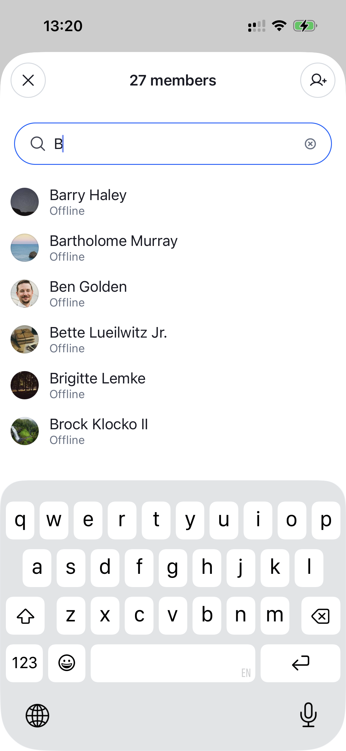
The full, searchable list of a channel's members. It renders a search input over a paginated FlatList of members and opens a per-member actions sheet when a row is tapped. Needs to be wrapped in a ChannelDetailsContextProvider that supplies the channel.
This is the component rendered behind the "view all" entry point of ChannelDetails. Render it yourself to build a custom, full-screen members screen — for example a dedicated navigation route instead of a modal.
Best Practices
- Wrap it in
ChannelDetailsContextProviderso the list can resolve the channel. - Render it as a full-screen route (or any container you control) and supply your own header —
ChannelMemberListno longer ships its own modal chrome. - Customize the per-member actions through
ChannelMemberActionsSheet'sgetChannelMemberActionItemsinstead of rebuilding the sheet. - Override and configure building blocks like
ChannelMemberItemorChannelMemberActionsSheetby wrapping the list inWithComponentswith anoverridesmap.
General Usage
Props
| Prop | Description | Type |
|---|---|---|
additionalFlatListProps | Override the underlying FlatList props of the list. | Partial<FlatListProps<ChannelMemberResponse>> |
searchInputProps | Additional props forwarded to the search input. | SearchInputProps |
searchSource | A custom ChannelMemberSearchSource used to query and paginate members. Overrides the source created by default (pre-configured to autocomplete by name). | ChannelMemberSearchSource |
Building blocks
ChannelMemberList renders a ChannelMemberItem per member and opens a ChannelMemberActionsSheet on press. Both are sourced from the components context and can be overridden through WithComponents.
ChannelMemberItem
A single member row. It renders the member's roles as badges via the overridable RoleList/RoleItem components.
| Prop | Description | Type |
|---|---|---|
member * | The member to render. | ChannelMemberResponse |
getMemberRoles | Override the roles shown next to the member; returns an array of { key, label }. Defaults to the built-in Owner / Admin / Moderator logic. | GetMemberRoles |
onPress | Fired when the row is pressed. | (member: ChannelMemberResponse) => void |
size | Visual size of the row. 'sm' (default) is a compact row; 'lg' is a profile-style header. | 'sm' | 'lg' |
testID | Test identifier. | string |
RoleList
The horizontal list of role badges rendered inside ChannelMemberItem. Each badge is rendered by the overridable RoleItem component. Sourced from the components context and overridable through WithComponents.
| Prop | Description | Type |
|---|---|---|
roles * | The roles to render, as an array of { key, label }. | RoleLabel[] |
RoleItem
A single role badge (pill). owner roles use the accent (blue) palette; every other role uses the neutral (grey) palette. Colors are themeable via theme.channelDetails.roleItem (ownerBackgroundColor, ownerColor, roleBackgroundColor, roleColor). Sourced from the components context and overridable through WithComponents.
| Prop | Description | Type |
|---|---|---|
role * | The role to render, as a { key, label } pair. | RoleLabel |
viewStyle | Style applied to the badge container, layered over the theme override. | StyleProp<ViewStyle> |
textStyle | Style applied to the badge label, layered over the theme override. | StyleProp<TextStyle> |
ChannelAddMembersButton
A button that opens the add-members form (ChannelAddMembersForm) in a modal. Useful as a header action on a custom members screen.
| Prop | Description | Type |
|---|---|---|
onPress | Override the default behavior, which opens the add-members modal. | () => void |
style | Style forwarded to the underlying Button. | ButtonProps['style'] |
variant | Render the button as an icon or a text button. | 'icon' | 'text' |
testID | Test identifier. | string |
ChannelMemberActionsSheet
Opened when a member is tapped. It renders a ChannelMemberItem (size='lg') header followed by ChannelDetailsActionItem rows.
| Prop | Description | Type |
|---|---|---|
member * | The member the actions apply to. | ChannelMemberResponse |
onClose * | Fired when the sheet is closed. | () => void |
visible * | Controls sheet visibility. | boolean |
getChannelMemberActionItems | Customize the list of action items rendered in the per-member actions sheet. | GetChannelMemberActionItems |