 React
React iOS
iOS Android
 Flutter
 Angular
 JavaScript
 Unity
Unity Unreal
 Node
Node Python
 Ruby
Ruby PHP
PHP Java
Java .NET
.NET Go
Go REST
RESTimport {
AutoCompleteSuggestionHeader,
WithComponents,
} from "stream-chat-react-native";
import { Text } from "react-native";
const CustomAutoCompleteSuggestionHeader = ({ queryText, triggerType }) => {
if (triggerType === "command") {
return <Text>Command Header Component</Text>;
} else if (triggerType === "emoji") {
return <Text>Emoji Header Component</Text>;
} else {
return (
<AutoCompleteSuggestionHeader
queryText={queryText}
triggerType={triggerType}
/>
);
}
};
<WithComponents
overrides={{
AutoCompleteSuggestionHeader: CustomAutoCompleteSuggestionHeader,
}}
>
<Channel channel={channel}>{/* The underlying components */}</Channel>
</WithComponents>;Custom Autocomplete Suggestion List
Autocomplete suggestion list components can be customized via WithComponents:
AutoCompleteSuggestionHeaderAutoCompleteSuggestionItemAutoCompleteSuggestionList
Best Practices
- Preserve default components for triggers you don't customize to keep expected behavior.
- Keep list rendering lightweight; suggestion updates happen on every keystroke.
- Use
keyboardShouldPersistTaps="always"in custom lists to avoid dismissing the keyboard. - Normalize
triggerTypemapping (/,:,@) to avoid mismatched UI. - Ensure
onSelectupdates the composer state rather than mutating input directly.
Header and item components are used inside the list's FlatList. These props let you customize the header, items, or the entire list.
The available suggestion trigger types are:
commandfor/emojifor:mentionfor@
You can render custom UI for specific triggers and fall back to defaults for the rest.
The mention trigger surfaces a typed MentionSuggestion union from stream-chat with five variants discriminated by item.mentionType:
mentionType | Token | Notifies |
|---|---|---|
user | @<name> | A single user |
channel | @channel | Everyone in the channel |
here | @here | Members currently online |
role | @<role> | Users with that role |
user_group | @<group> | Members of a named user group |
The default AutoCompleteSuggestionItem dispatches each variant to its own row component. See Customizing per-mention-type rows to override one or more variants while keeping the SDK defaults for the rest.
Enabling enhanced mentions on the dashboard
@<user> mentions work out of the box. The broadcast (@channel, @here), role (@<role>), and user-group (@<group>) variants require the matching permission to be granted to the sender's role on the channel type. Until the permissions are enabled, the variants are filtered out of the suggestion list returned by the API and the rendered tokens fall back to plain text.
Open the Stream Dashboard, pick your app, then navigate to Chat Messaging → Roles & Permissions. Select the role you want to grant the capability to (for example channel_member) and the scope of the channel type that should allow it (for example messaging), then enable the relevant permissions:
| Permission | Enables |
|---|---|
NotifyChannel | @channel |
NotifyHere | @here |
NotifyRole | @<role> |
NotifyGroup | @<group> |
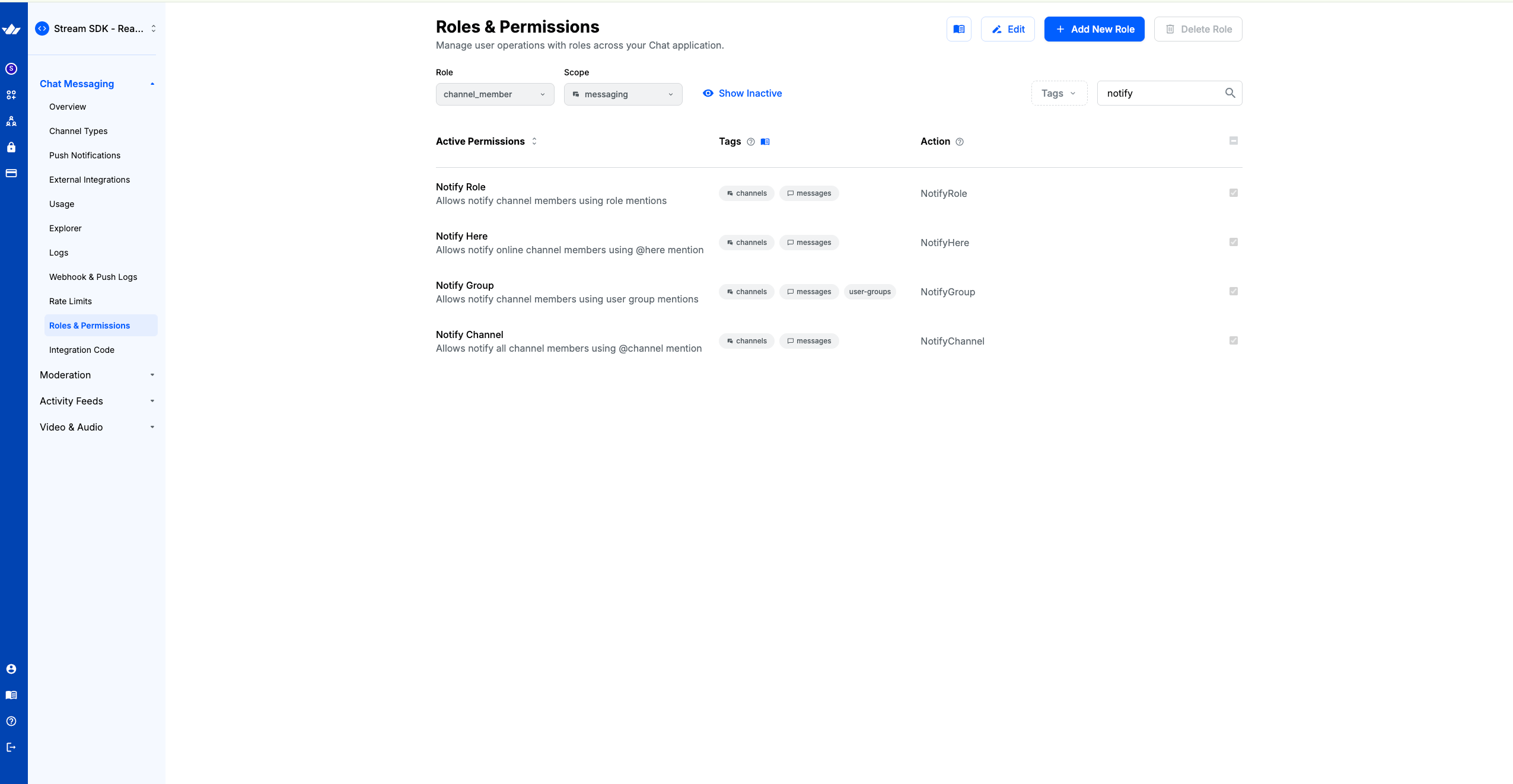
User group mentions additionally require user groups to be defined on the app via the user groups API. Role mentions resolve against the roles defined under Chat Messaging → Roles & Permissions in the same dashboard.
Customizing Header component
The header renders at the top of the list and is customized via AutoCompleteSuggestionHeader.
The props for the component are:
triggerType: The trigger type of the suggestion list.queryText: The value to display in the header.
An example for the same would be as follows:
Note: Return the default AutoCompleteSuggestionHeader to keep default behavior for a trigger.
Customizing Item Component
Customize list items via the AutoCompleteSuggestionItem override in WithComponents.
The props for the component are as follows:
triggerType: The trigger type of the suggestion list.itemProps: Varies by trigger.commandhasnameandargs,emojiis anEmoji, andmentionis aMentionSuggestionunion (fromstream-chat) — switch onitemProps.mentionTypeto distinguishuser,channel,here,role, anduser_groupvariants.
import {
  Avatar,
  AutoCompleteSuggestionItem,
  WithComponents,
} from "stream-chat-react-native";
import { Text, View } from "react-native";

const CustomAutoCompleteSuggestionItem = ({ itemProps, triggerType }) => {
  if (triggerType === "command") {
    return (
      <View>
        <Text>{itemProps.name}</Text>
        <Text>{itemProps.args}</Text>
      </View>
    );
  } else if (triggerType === "mention") {
    const { id, image, name, online } = itemProps;
    return (
      <View>
        <Avatar image={image} name={name} online={online} size={30} />
        <Text>{itemProps.name}</Text>
      </View>
    );
  } else {
    return (
      <AutoCompleteSuggestionItem
        itemProps={itemProps}
        triggerType={triggerType}
      />
    );
  }
};

<WithComponents
  overrides={{ AutoCompleteSuggestionItem: CustomAutoCompleteSuggestionItem }}
>
  <Channel channel={channel}>{/*The underlying components*/}</Channel>
</WithComponents>;
Note: Return the default AutoCompleteSuggestionItem to keep default behavior for a trigger.
Customizing per mention type rows
For the mention trigger, the SDK ships a built-in dispatcher (MentionSuggestionItem) that switches on item.mentionType and renders one of four built-in row components:
mentionType | Default component | Renders |
|---|---|---|
user | MentionUserItem | Avatar + tokenized display name (matched part bold) |
channel / here | MentionBroadcastItem | Megaphone icon + @channel / @here + description |
role | MentionRoleItem | Shield icon + role name + "Notify all … members" |
user_group | MentionUserGroupItem | People icon + group name + optional description |
To swap just one variant while delegating the rest to the SDK defaults, override AutoCompleteSuggestionItem and pass any unmodified variants through. The variant components and their underlying building blocks are exported from stream-chat-react-native:
import {
  AutoCompleteSuggestionItem,
  EnhancedMentionContent,
  EnhancedMentionIcon,
  MentionItem,
  WithComponents,
} from "stream-chat-react-native";

const MyBroadcastRow = ({ itemProps }) => (
  <MentionItem
    leading={
      <EnhancedMentionIcon
        Icon={({ height, width }) => (
          <Text style={{ height, width, textAlign: "center" }}>📣</Text>
        )}
      />
    }
  >
    <EnhancedMentionContent
      title={itemProps.mentionType === "channel" ? "@channel" : "@here"}
      subtitle={
        itemProps.mentionType === "channel"
          ? "Notify everyone in this channel"
          : "Notify every online member"
      }
    />
  </MentionItem>
);

const CustomAutoCompleteSuggestionItem = ({ itemProps, triggerType }) => {
  if (
    triggerType === "mention" &&
    (itemProps.mentionType === "channel" || itemProps.mentionType === "here")
  ) {
    return <MyBroadcastRow itemProps={itemProps} />;
  }

  return (
    <AutoCompleteSuggestionItem
      itemProps={itemProps}
      triggerType={triggerType}
    />
  );
};

<WithComponents
  overrides={{ AutoCompleteSuggestionItem: CustomAutoCompleteSuggestionItem }}
>
  <Channel channel={channel}>{/* The underlying components */}</Channel>
</WithComponents>;
Falling through to AutoCompleteSuggestionItem for everything else keeps the SDK defaults for the trigger types and mention variants you don't touch — you only need to handle the variants you actually want to override.
The building blocks you can compose with — all exported from stream-chat-react-native:
MentionItem— the row layout primitive ({ leading?, children, testID? }). Use it as the outer wrapper to inherit the default tap target and spacing.EnhancedMentionContent— title + optional subtitle pair ({ title, subtitle? }).EnhancedMentionIcon— circular icon chip wrapping anyIconProps-shaped component ({ Icon, size?, color? }).TokenizedSuggestionParts— renders a tokenized display name and bolds the substring that matches the current query ({ tokenizedDisplayName?, fallback? }). Useful inside a customuserrow.
Theming mention rows
Mention rows pick up styles from the messageComposer.suggestions.mention subtree:
messageComposer: {
  suggestions: {
    mention: {
      avatarSize: number;
      column: ViewStyle;
      container: ViewStyle;
      // Applied to the user mention row (`MentionUserItem`)
      name: TextStyle;
      tag: TextStyle;
      // Applied to broadcast/role/user_group rows
      enhancedMentionContainer: ViewStyle;
      enhancedMentionIcon: ViewStyle;
      enhancedMentionTitle: TextStyle;
      enhancedMentionSubtitle: TextStyle;
    }
  }
}
name and tag still drive user-mention typography — they are kept separate from enhancedMention* so user-mention rows and broadcast/role/group rows can be themed independently.
const themeStyle = {
  messageComposer: {
    suggestions: {
      mention: {
        enhancedMentionTitle: {
          fontWeight: "600",
          fontSize: 16,
        },
        enhancedMentionSubtitle: {
          color: "#7a7a7a",
        },
      },
    },
  },
};

<Chat style={themeStyle}>{/* ... */}</Chat>;
Theming rendered mention text
When a sent message is rendered, every mention token (@<user>, @channel, @here, @<role>, @<group>) is colored using one of four per-type semantic tokens:
| Token | Used for |
|---|---|
chatTextMentionUser | @<user> mentions |
chatTextMentionBroadcast | @channel and @here |
chatTextMentionRole | @<role> mentions |
chatTextMentionGroup | @<group> mentions |
Matching background tokens (chatBgMentionUser, chatBgMentionBroadcast, chatBgMentionRole, chatBgMentionGroup) are available for any UI that wants a background swatch per mention type.
All per-type tokens fall back to the umbrella chatTextMention / chatBgMention by default, so existing themes look identical until you opt in to per-type coloring. Override them via the semantics block of your theme:
const themeStyle = {
  semantics: {
    chatTextMentionBroadcast: "#e62e2e",
    chatTextMentionRole: "#9c27b0",
    chatTextMentionGroup: "#0c8d3a",
  },
};

<Chat style={themeStyle}>{/* ... */}</Chat>;
Pressing a rendered mention fires onPressMessage with emitter: "textMention" and an additionalInfo.mentionedEntity that carries the same mentionType discriminator. See Custom message press handler for the payload shape.
Customizing the AutoComplete suggestion list
You can also replace the entire list via the AutoCompleteSuggestionList override in WithComponents.
The props available to the component are:
AutoCompleteSuggestionHeader- The header component to be used in the list.AutoCompleteSuggestionItem- The item component to be used in the list.
Example:
import {
  AutoCompleteSuggestionHeader,
  AutoCompleteSuggestionItem,
  useMessageComposer,
  useStateStore,
  WithComponents,
} from "stream-chat-react-native";
import { FlatList, Text, View } from "react-native";
import { TextComposerState, SearchSourceState } from "stream-chat";

const textComposerStateSelector = (state: TextComposerState) => ({
  suggestions: state.suggestions,
  text: state.text,
});

const searchSourceStateSelector = (nextValue: SearchSourceState) => ({
  items: nextValue.items,
});

const CustomAutoCompleteSuggestionList = () => {
  const messageComposer = useMessageComposer();
  const { textComposer } = messageComposer;
  const { suggestions } = useStateStore(
    textComposer.state,
    textComposerStateSelector,
  );
  const { items } =
    useStateStore(suggestions?.searchSource.state, searchSourceStateSelector) ??
    {};
  const trigger = suggestions?.trigger;
  const queryText = suggestions?.query;

  const triggerType = {
    "/": "command",
    ":": "emoji",
    "@": "mention",
  }[trigger ?? ""];

  const onSelect = (item) => {
    // Handle the selection of the item
    console.log("Selected item:", item);
  };

  if (triggerType === "command") {
    return (
      <View>
        <View>
          <Text>Command suggestions for {queryText}</Text>
        </View>
        {data.map((item) => (
          <AutoCompleteSuggestionItem
            itemProps={item}
            key={item.name}
            triggerType={triggerType}
          />
        ))}
      </View>
    );
  } else if (triggerType === "emoji") {
    return (
      <FlatList
        data={data}
        keyboardShouldPersistTaps="always"
        ListHeaderComponent={
          <AutoCompleteSuggestionHeader
            queryText={queryText}
            triggerType={triggerType}
          />
        }
        renderItem={({ index, item }) => (
          <TouchableOpacity
            onPress={() => {
              onSelect(item);
            }}
          >
            <Text>{item.unicode}</Text>
          </TouchableOpacity>
        )}
      />
    );
  } else {
    return (
      <View>
        <AutoCompleteSuggestionHeader
          queryText={queryText}
          triggerType={triggerType}
        />
        {data.map((item) => (
          <AutoCompleteSuggestionItem
            itemProps={item}
            key={item.name}
            triggerType={triggerType}
          />
        ))}
      </View>
    );
  }
};

<WithComponents
  overrides={{ AutoCompleteSuggestionList: CustomAutoCompleteSuggestionList }}
>
  <Channel channel={channel}>{/*The underlying components*/}</Channel>
</WithComponents>;
Note: Return the default AutoCompleteSuggestionList to keep default behavior for a trigger.
On this page: