 React
React iOS
iOS Android
 Flutter
 Angular
 JavaScript
 Unity
Unity Unreal
 Node
Node Python
 Ruby
Ruby PHP
PHP Java
Java .NET
.NET Go
Go REST
RESTimport { GetMemberRoles } from "stream-chat-react-native";
const getMemberRoles: GetMemberRoles = ({ defaultRoleLabels, member }) => {
if (member.user?.custom.vip) {
return [...defaultRoleLabels, { key: "vip", label: "VIP" }];
}
return defaultRoleLabels;
};Custom Member Roles
This cookbook shows how to customize the role badges rendered next to each member in the ChannelDetails component.
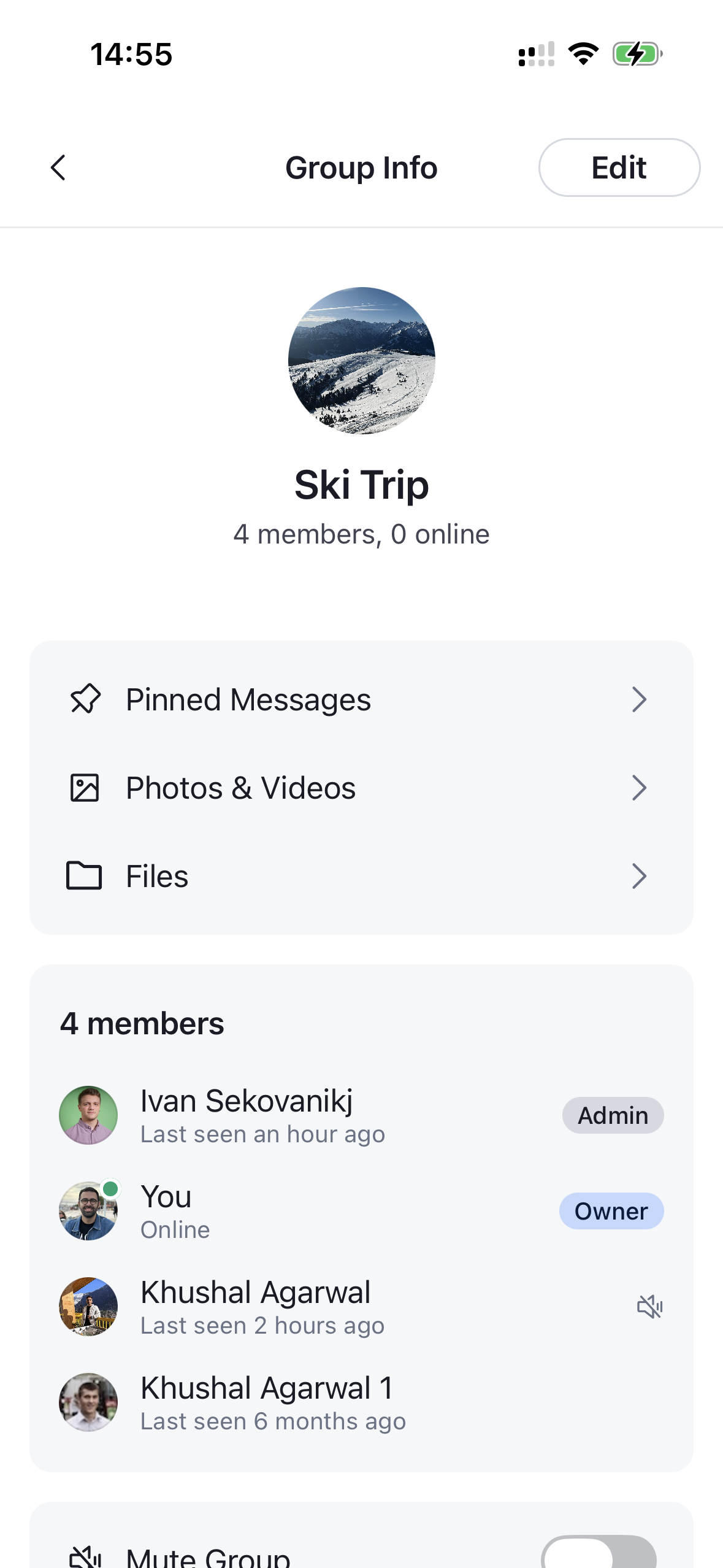
Roles are driven by a single getMemberRoles callback. It receives the default roles the SDK computed for a member (defaultRoleLabels) plus the channel, member, and t (translation) helpers, and returns the final list of { key, label } roles to render. With it you can extend the defaults (add your own role, for example VIP) or overwrite them entirely (return a list you build from scratch). The default implementation marks members as owner (channel creator), admin (user.role === 'admin') and moderator (channel_role === 'channel_moderator').
Each role is then rendered by the overridable RoleItem badge, so you can also restyle a specific role — for example, give a VIP badge a yellow label.
getMemberRoles is a prop on ChannelMemberItem, and the parent lists don't forward it for you. To apply it, override ChannelMemberItem through WithComponents and pass your callback — a single override covers both the member preview on the details screen and the full members list.
Best Practices
- Spread
defaultRoleLabelswhen extending so members keep their built-in roles (and any roles added in future SDK versions) instead of rebuilding the list from scratch. - Return an empty array to render no roles for a member.
getMemberRolesisn't forwarded by the parent lists — overrideChannelMemberItemwithWithComponentsand pass it. One override applies everywhere members are listed.RoleItemis the overridable badge. Reuse it and passviewStyle/textStylefor light styling, or render your own view for total control.- The
channelDetails.roleItemtheme keys only distinguish owner vs non-owner badges globally — to color a specific role like VIP, overrideRoleItemand branch onrole.key.
Extending the Default Roles
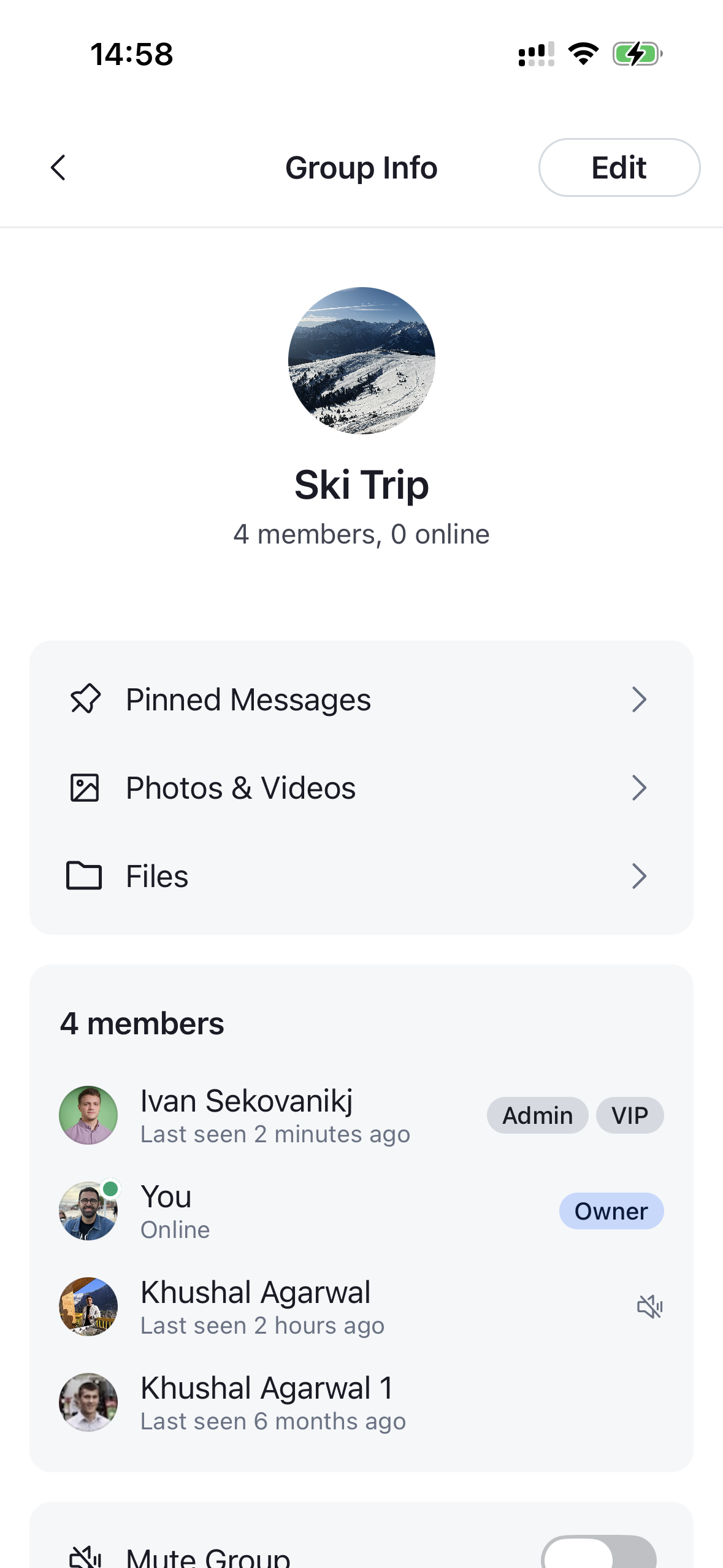
To add a role on top of the built-in ones, keep defaultRoleLabels and append your own entry. Here we add a VIP badge for members flagged as VIP (a custom user field on user):
getMemberRoles lives on ChannelMemberItem, so wire it by overriding that component through WithComponents and forwarding the props the SDK passes in. Everything must live inside the ChannelDetailsContextProvider:
import {
  ChannelDetails,
  ChannelDetailsContextProvider,
  ChannelMemberItem,
  ChannelMemberItemProps,
  WithComponents,
} from "stream-chat-react-native";

const MemberItem = (props: ChannelMemberItemProps) => (
  <ChannelMemberItem {...props} getMemberRoles={getMemberRoles} />
);

const ChannelDetailsScreen = ({ route, navigation }) => {
  const { channel } = route.params;
  return (
    <ChannelDetailsContextProvider channel={channel}>
      <WithComponents overrides={{ ChannelMemberItem: MemberItem }}>
        <ChannelDetails onBack={() => navigation.goBack()} />
      </WithComponents>
    </ChannelDetailsContextProvider>
  );
};
A VIP badge now appears next to every member your getMemberRoles flags, in addition to their built-in Owner / Admin / Moderator roles.
| Default roles | With VIP badge |
|---|---|
 |  |
Overriding the Default Roles
To take full control, ignore defaultRoleLabels and build the list yourself. Here we drop the built-in rules entirely and only show an Admin badge for members whose role is your own my_admin role:
import { GetMemberRoles, RoleLabel } from "stream-chat-react-native";

const getMemberRoles: GetMemberRoles = ({ member, t }) => {
  const roles: RoleLabel[] = [];

  if (member.user?.role === "my_admin") {
    roles.push({ key: "admin", label: t("Admin") });
  }

  return roles;
};
Wire it exactly as before — override ChannelMemberItem with WithComponents and pass this getMemberRoles. Members without the my_admin role now render no badges at all.
Styling the Roles
Each badge is rendered by the overridable RoleItem component, which receives RoleItemProps (role, plus optional viewStyle / textStyle). Override it through WithComponents to style a specific role. The role.key tells you which role you're rendering ("owner", "admin", "moderator", or any custom key like "vip").
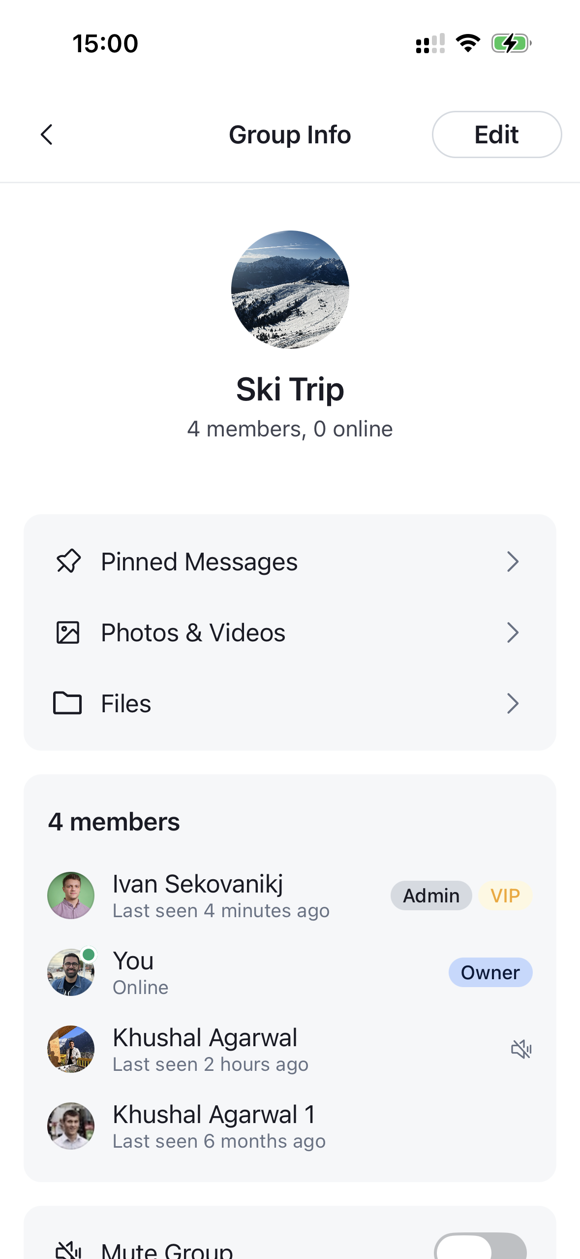
The simplest approach is to reuse the default RoleItem and pass it viewStyle / textStyle — they layer over the badge's default (and themed) styles. Here we color the VIP badge yellow and delegate every other role to the default rendering:
import { RoleItem, RoleItemProps } from "stream-chat-react-native";

const CustomRoleItem = (props: RoleItemProps) =>
  props.role.key === "vip" ? (
    <RoleItem
      {...props}
      textStyle={{ color: "#F5A623" }}
      viewStyle={{ backgroundColor: "#FFF8E1" }}
    />
  ) : (
    <RoleItem {...props} />
  );
Register the override through WithComponents, alongside the ChannelDetailsContextProvider:
import {
  ChannelDetails,
  ChannelDetailsContextProvider,
  WithComponents,
} from "stream-chat-react-native";

const ChannelDetailsScreen = ({ route, navigation }) => {
  const { channel } = route.params;
  return (
    <ChannelDetailsContextProvider channel={channel}>
      <WithComponents
        overrides={{ ChannelMemberItem: MemberItem, RoleItem: CustomRoleItem }}
      >
        <ChannelDetails onBack={() => navigation.goBack()} />
      </WithComponents>
    </ChannelDetailsContextProvider>
  );
};| Default VIP badge | Styled VIP badge |
|---|---|
|  |