 React
React iOS
iOS Android
 Flutter
 Angular
 JavaScript
 Unity
Unity Unreal
 Node
Node Python
 Ruby
Ruby PHP
PHP Java
Java .NET
.NET Go
Go REST
RESTimport { Linking } from "react-native";
import {
ChannelDetailsNavigationItem,
GetChannelDetailsNavigationItems,
} from "stream-chat-react-native";
const getNavigationItems: GetChannelDetailsNavigationItems = ({
context,
defaultItems,
}) => {
const sharepointItem: ChannelDetailsNavigationItem = {
// Your custom icon that accepts IconProps
Icon: SharepointIcon,
label: "Project Sharepoint",
section: "project-sharepoint",
onPress: () => Linking.openURL("https://my.sharepoint.com/sites/project"),
};
return [...defaultItems, sharepointItem];
};Custom Navigation Items
This cookbook shows how to customize the navigation rows rendered in the ChannelDetails component.
The navigation section — the rows for Pinned Messages, Photos & Videos, and Files — is driven by a single getNavigationItems callback. It receives the default items the SDK builds for the current channel plus a context, and returns the final list to render. With it you can extend the defaults (add your own row), narrow them (hide a row), or overwrite their behavior (route a row to your own screen).
If you want to move the whole navigation flow into your own navigator rather than the built-in modals, see Custom Navigation — this cookbook focuses on the getNavigationItems / defaultItems shape.
Best Practices
- Match the
ChannelDetailsNavigationItemshape (Icon,label,section,onPress) so your rows render consistently with the built-in ones. - Reuse
defaultItemsand map/filter over it instead of rebuilding the list — rows you leave untouched keep their built-in behavior, including sections added in future SDK versions. - Leave a row's
onPressunset to keep its built-in behavior (opening the built-in modal); set it to route the row somewhere else (your own screen, an external link, …). - Override
ChannelDetailsNavigationSectionwithWithComponents, forward its props, and pass yourgetNavigationItems— don't rebuild the section. - Read the
channelfromuseChannelDetailsContext()when you need it; the callback'scontextonly carries the translation functiont.
Add a "Project Sharepoint" Row
Build a getNavigationItems callback that appends your own row to defaultItems. A custom row uses any section string you like and sets its own onPress:
Wire the callback by overriding ChannelDetailsNavigationSection through WithComponents. Forward the props the SDK passes in and add your getNavigationItems:
import {
  ChannelDetails,
  ChannelDetailsContextProvider,
  ChannelDetailsNavigationSection,
  ChannelDetailsNavigationSectionProps,
  WithComponents,
} from "stream-chat-react-native";

const NavigationSection = (props: ChannelDetailsNavigationSectionProps) => (
  <ChannelDetailsNavigationSection
    {...props}
    getNavigationItems={getNavigationItems}
  />
);

const ChannelDetailsScreen = ({ route, navigation }) => {
  const { channel } = route.params;
  return (
    <ChannelDetailsContextProvider channel={channel}>
      <WithComponents
        overrides={{ ChannelDetailsNavigationSection: NavigationSection }}
      >
        <ChannelDetails onBack={() => navigation.goBack()} />
      </WithComponents>
    </ChannelDetailsContextProvider>
  );
};
That's it — a "Project Sharepoint" row now appears alongside the default rows and opens your link when tapped.
| Default navigation rows | With Project Sharepoint row |
|---|---|
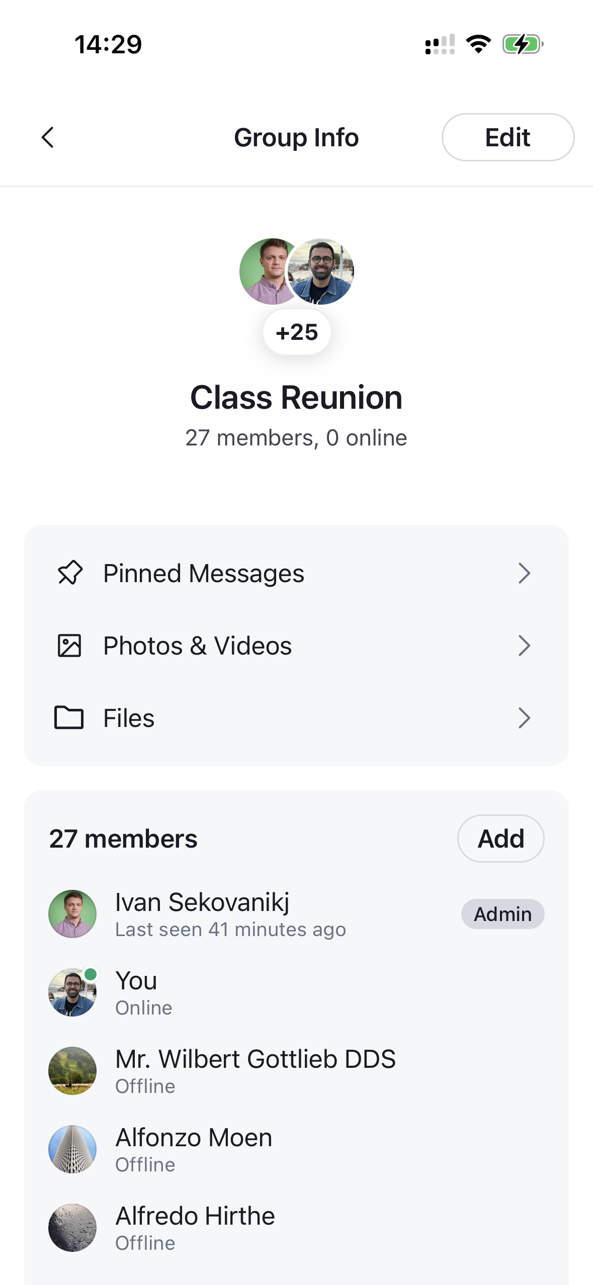 | 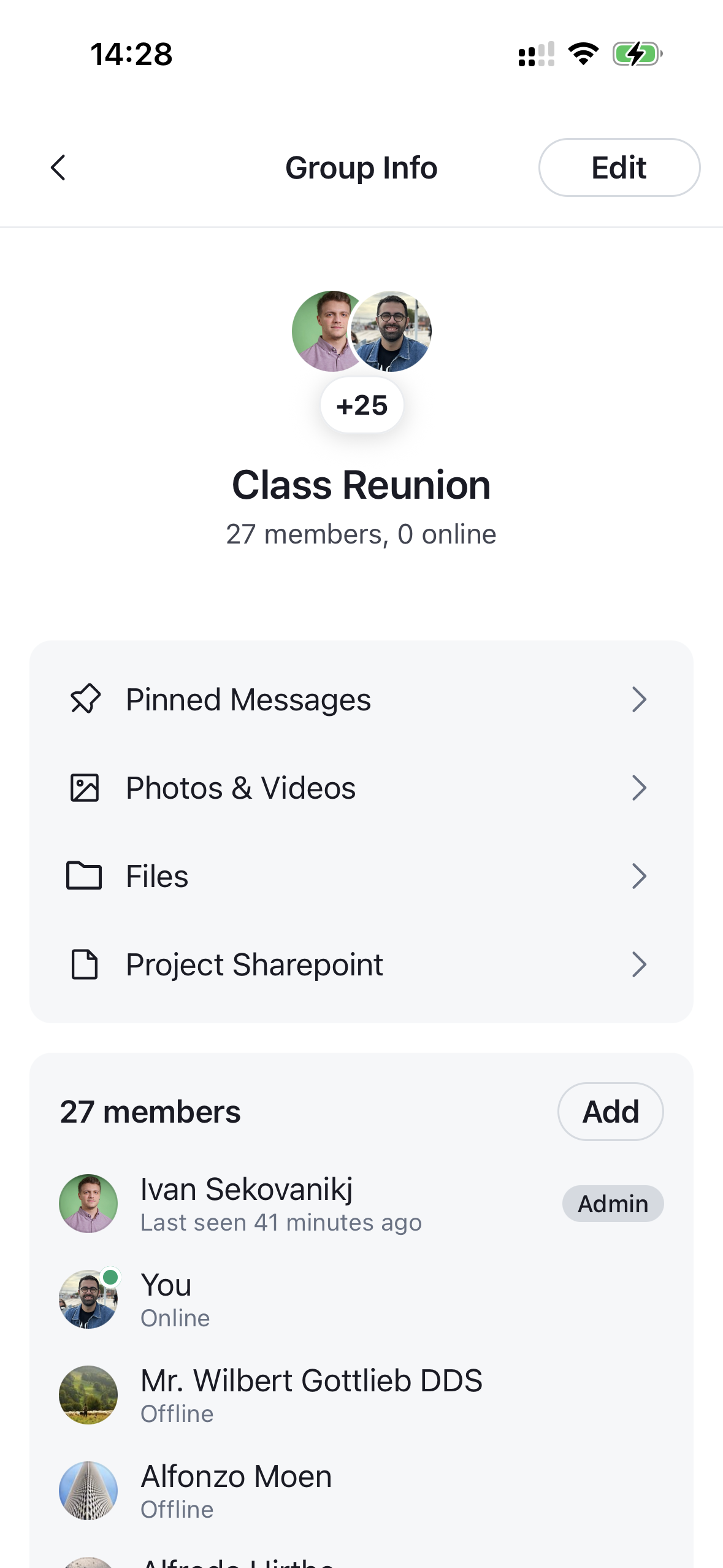 |
Hide the Pinned Messages Section
To hide a row, filter defaultItems by section. Each built-in row carries a stable section (pinned-messages, photos-and-videos, files), so you can drop the ones you don't want. Here we remove the pinned messages row:
import { GetChannelDetailsNavigationItems } from "stream-chat-react-native";

const getNavigationItems: GetChannelDetailsNavigationItems = ({
  defaultItems,
}) => defaultItems.filter((item) => item.section !== "pinned-messages");