















Incoming vs Outgoing Message Styles
It's common to want to have different colors for incoming and outgoing messages. The SDK's default theme uses blue for outgoing and grey color for incoming messages (based on isMyMessage). The difference reaches much further than the bubble — the surfaces nested inside it follow too, including attachments, link previews, quoted replies, poll bars and the thread connector.
Two mechanisms control how each side looks:
- Semantic tokens are the theme's named color roles. Every surface that changes with the side resolves from a pair of them —
chat*Outgoingandchat*Incoming— so overriding one token recolors that surface on that side, everywhere it appears. This is the broadest tool, and the one to reach for first. myMessageThemeis aChannelprop that layers a theme over own-message rows only. Use it when semantic tokens are not enough or when you want to override global tokens — likeaccentPrimary— on the own-message level only.
This guide walks through restyling the outgoing side with an orange palette, one layer of the theming system at a time — starting with semantic tokens and only reaching for myMessageTheme when a surface can't be reached from the layer above.
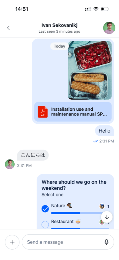
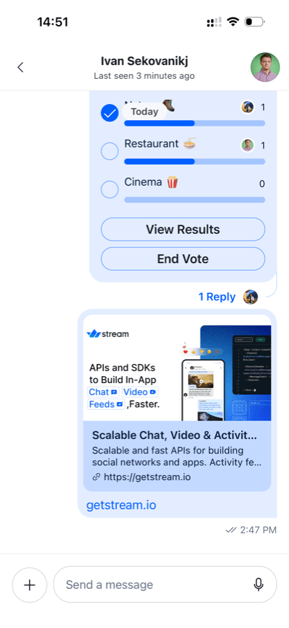
This is the conversation we are starting from, on the default theme. Note how much of it is blue: the bubbles, the image and file surfaces inside them, the read receipts, the poll progress bars and vote buttons, the thread reply count and the link preview.
| Messages and attachments | Poll and link preview |
|---|---|
 |
 |
Best Practices
- Start at the semantic-token layer. One value recolors every component that reads it, so most palette changes need no component overrides at all.
- Declare light and dark values separately — several of these tokens invert between schemes.
- Keep the theme object stable and rebuild it only when the color scheme changes.
- Use
myMessageThemewhen semantic tokens don't provide enough flexibility.
Step 1: Semantic tokens
Semantic tokens are the middle tier of the theme — named roles like "the outgoing bubble background" that individual components read, rather than raw colors or per-component style objects. Every surface that changes with the side of the conversation resolves from a pair of them: chat*Outgoing for your own messages, chat*Incoming for everybody else's.
Because the components already read these tokens, overriding them is enough to restyle the entire outgoing message UI: bubble, attachments, quoted replies, poll bars and thread connectors all follow.
Build the theme from useColorScheme and pass it to Chat through the style prop.
import { useEffect, useState } from "react";
import { ColorSchemeName, useColorScheme } from "react-native";
import { Chat } from "stream-chat-react-native";
import type { DeepPartial, Theme } from "stream-chat-react-native";

const lightSemantics = {
  chatBgOutgoing: "#FFE0B2",
  chatBgAttachmentOutgoing: "#FFB74D",
  chatThreadConnectorOutgoing: "#FFE0B2",
  chatReplyIndicatorOutgoing: "#FF9800",
  chatBorderOnChatOutgoing: "#FF9800",
  chatPollProgressFillOutgoing: "#FF9800",
  chatPollProgressTrackOutgoing: "#FFCC80",
  accentPrimary: "#FF9800",
  textLink: "#FF9800",
};

const darkSemantics = {
  chatBgOutgoing: "#3E2200",
  chatBgAttachmentOutgoing: "#6D3C00",
  chatThreadConnectorOutgoing: "#6D3C00",
  chatReplyIndicatorOutgoing: "#FF9800",
  chatBorderOnChatOutgoing: "#FFA726",
  chatPollProgressFillOutgoing: "#FFA726",
  chatPollProgressTrackOutgoing: "#7A4A00",
  accentPrimary: "#FFA726",
  textLink: "#FF9800",
};

const getTheme = (colorScheme: ColorSchemeName): DeepPartial<Theme> => ({
  semantics: colorScheme === "dark" ? darkSemantics : lightSemantics,
});

export const App = () => {
  const colorScheme = useColorScheme();
  const [theme, setTheme] = useState(getTheme(colorScheme));

  useEffect(() => {
    setTheme(getTheme(colorScheme));
  }, [colorScheme]);

  return (
    <Chat client={client} style={theme}>
      {/* ... */}
    </Chat>
  );
};
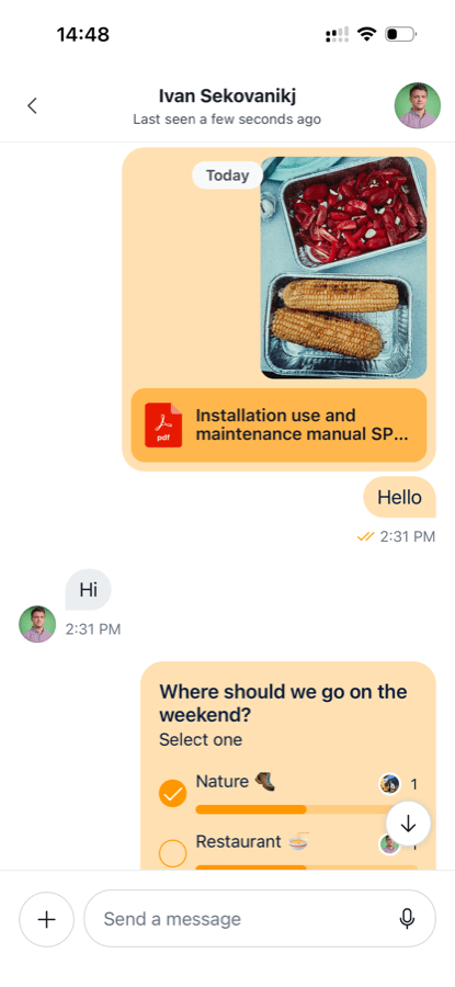
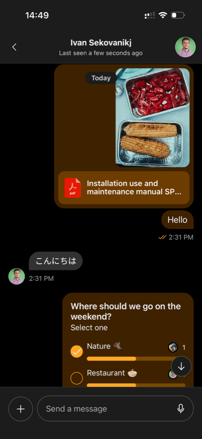
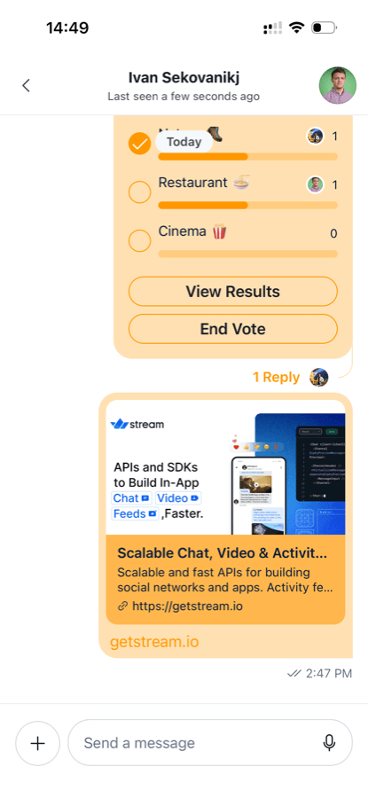
That is the whole of Step 1. Every own-message surface is now orange, in both schemes, with no component overridden:
| Light | Dark |
|---|---|
 |
 |
 |
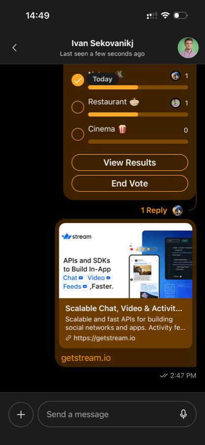 |
Two notes on the snippet:
accentPrimaryandtextLinkare not side-specific tokens. Setting them here applies to both sides. If you wish to override them for outgoing messages only, see the next step, where we show how to usemyMessageTheme.- Incoming messages are untouched — the grey bubble and the received text keep their defaults, because nothing in the snippet names an
*Incomingtoken.
Step 2: A dark outgoing bubble
For more complex customizations, like different outgoing and incoming text colors, semantic tokens are not enough. Let's set semantic tokens for the fields we have, and notice how we can't set textLink globally any more, because incoming and outgoing messages need a different color.
2.1 Different incoming and outgoing text colors
So far the outgoing text has been the SDK default, which meant it always matched the scheme. Now we set chatTextOutgoing ourselves and let the outgoing side run against the scheme: a dark bubble with light text in light mode, and a light bubble with dark text in dark mode. Incoming messages keep their defaults in both.
const lightSemantics = {
  chatBgOutgoing: "#C75000",
  chatBgAttachmentOutgoing: "#A34200",
  chatThreadConnectorOutgoing: "#A34200",
  chatReplyIndicatorOutgoing: "#FFB74D",
  chatBorderOnChatOutgoing: "#FFB74D",
  chatPollProgressFillOutgoing: "#FFB74D",
  chatPollProgressTrackOutgoing: "#8A3A00",
  chatTextOutgoing: "#FFFFFF",
  accentPrimary: "#FF9800",
};

const darkSemantics = {
  chatBgOutgoing: "#FFE0B2",
  chatBgAttachmentOutgoing: "#FFCC80",
  chatThreadConnectorOutgoing: "#FFCC80",
  chatReplyIndicatorOutgoing: "#C75000",
  chatBorderOnChatOutgoing: "#C75000",
  chatPollProgressFillOutgoing: "#C75000",
  chatPollProgressTrackOutgoing: "#FFCC80",
  chatTextOutgoing: "#3E2200",
  accentPrimary: "#FFA726",
};

const getTheme = (colorScheme: ColorSchemeName): DeepPartial<Theme> => ({
  semantics: colorScheme === "dark" ? darkSemantics : lightSemantics,
});
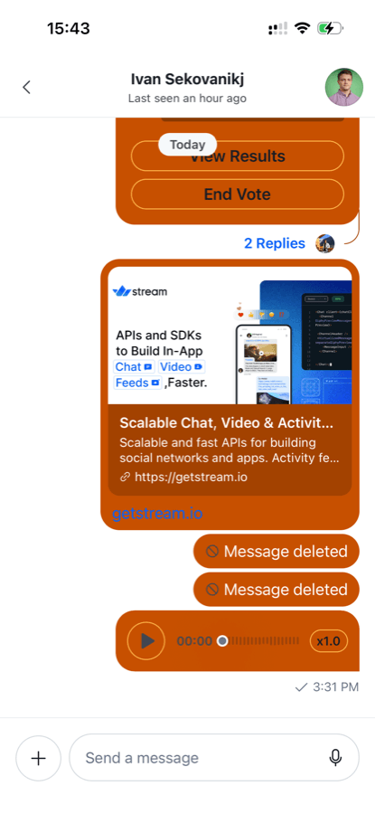
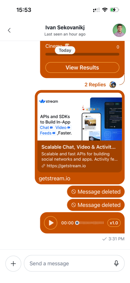
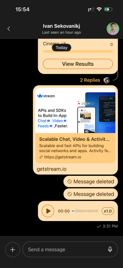
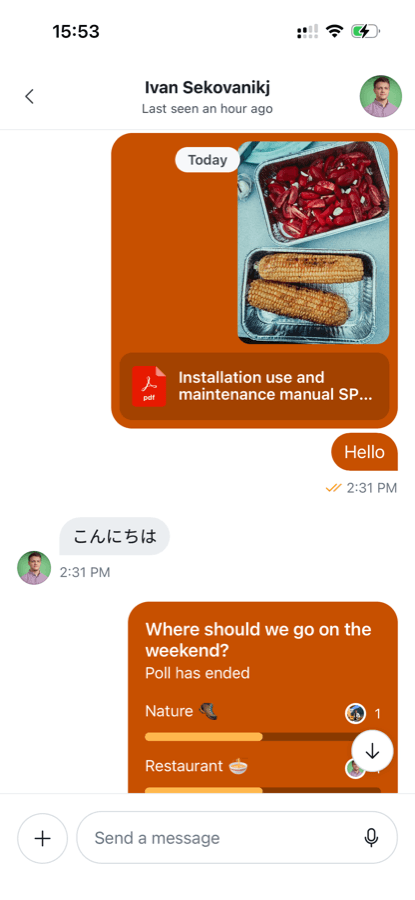
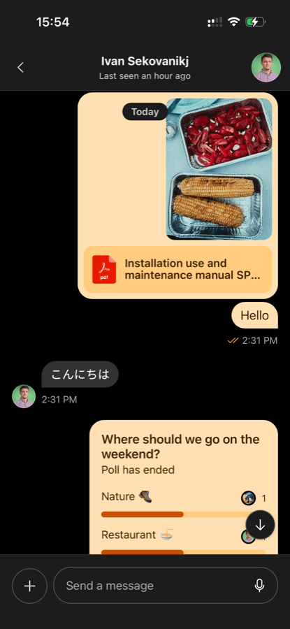
This is as far as semantic tokens get us:
| Light — dark bubble | Dark — light bubble |
|---|---|
 |
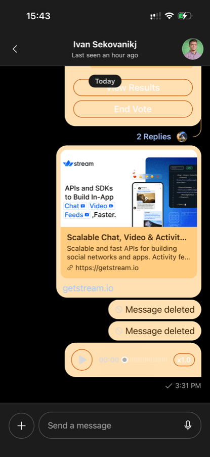 |
Notice how some text colors weren't updated to a light color. We solve this in the next step.
2.2 Separate theme for outgoing messages
myMessageTheme is a Channel prop whose theme is merged in only for rows where the current user is the author. It is where colors go when they cannot be expressed per-side as a semantic token.
import { useMemo } from "react";
import { useColorScheme } from "react-native";
import { Channel, MessageList } from "stream-chat-react-native";
import type { DeepPartial, Theme } from "stream-chat-react-native";

export const MyChannel = ({ channel }) => {
  const colorScheme = useColorScheme();

  const myMessageTheme: DeepPartial<Theme> = useMemo(() => {
    const onDarkBubble = colorScheme !== "dark";

    return {
      semantics: {
        textLink: onDarkBubble ? "#FFFFFF" : "#3E2200",
        buttonSecondaryText: onDarkBubble ? "#FFFFFF" : "#3E2200",
        controlPlaybackToggleText: onDarkBubble ? "#FFFFFF" : "#3E2200",
        textSecondary: onDarkBubble ? "#FFE9D9" : "#7A4A00",
        chatWaveformBar: onDarkBubble
          ? "rgba(255, 255, 255, 0.35)"
          : "rgba(26, 27, 37, 0.25)",
        chatWaveformBarPlaying: onDarkBubble ? "#FFFFFF" : "#C75000",
      },
      messageItemView: {
        file: {
          title: { color: onDarkBubble ? "#FFFFFF" : "#3E2200" },
          fileSize: { color: onDarkBubble ? "#FFFFFF" : "#3E2200" },
        },
        replies: {
          messageRepliesText: { color: onDarkBubble ? "#C75000" : "#FFB74D" },
        },
      },
    };
  }, [colorScheme]);

  return (
    <Channel channel={channel} myMessageTheme={myMessageTheme}>
      <MessageList />
    </Channel>
  );
};
Both schemes now read correctly, with the outgoing side running against each one:
| Light — dark bubble | Dark — light bubble |
|---|---|
 |
 |
 |
 |