 React
React iOS
iOS Android
 Flutter
 Angular
 JavaScript
 Unity
Unity Unreal
 Node
Node Python
 Ruby
Ruby PHP
PHP Java
Java .NET
.NET Go
Go REST
RESTimport {
OverlayProvider,
Chat,
ChannelDetails,
ChannelDetailsContextProvider,
} from "stream-chat-react-native";
const App = () => {
return (
<OverlayProvider>
<Chat client={client}>
<ChannelDetailsContextProvider channel={channel}>
<ChannelDetails onBack={() => navigation.goBack()} />
</ChannelDetailsContextProvider>
</Chat>
</OverlayProvider>
);
};ChannelDetails
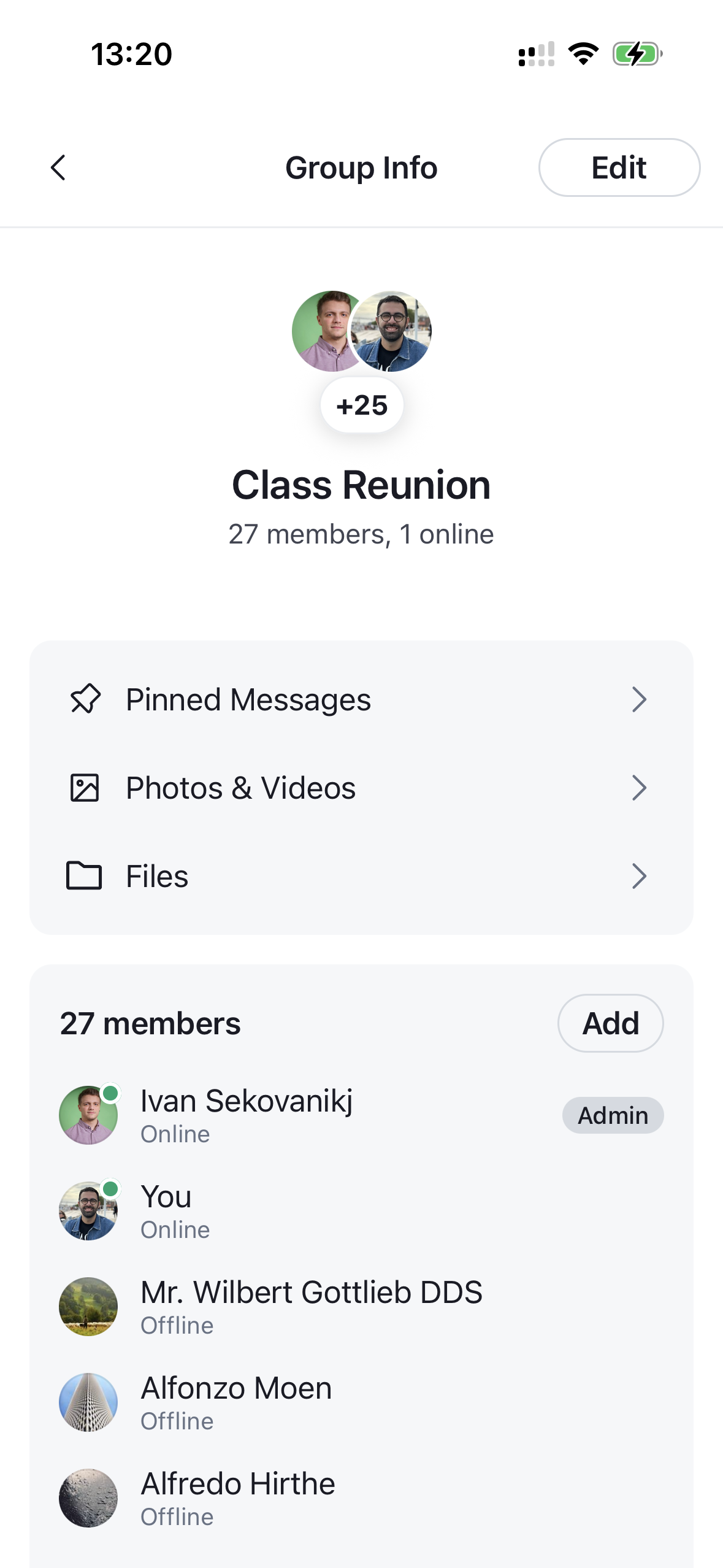
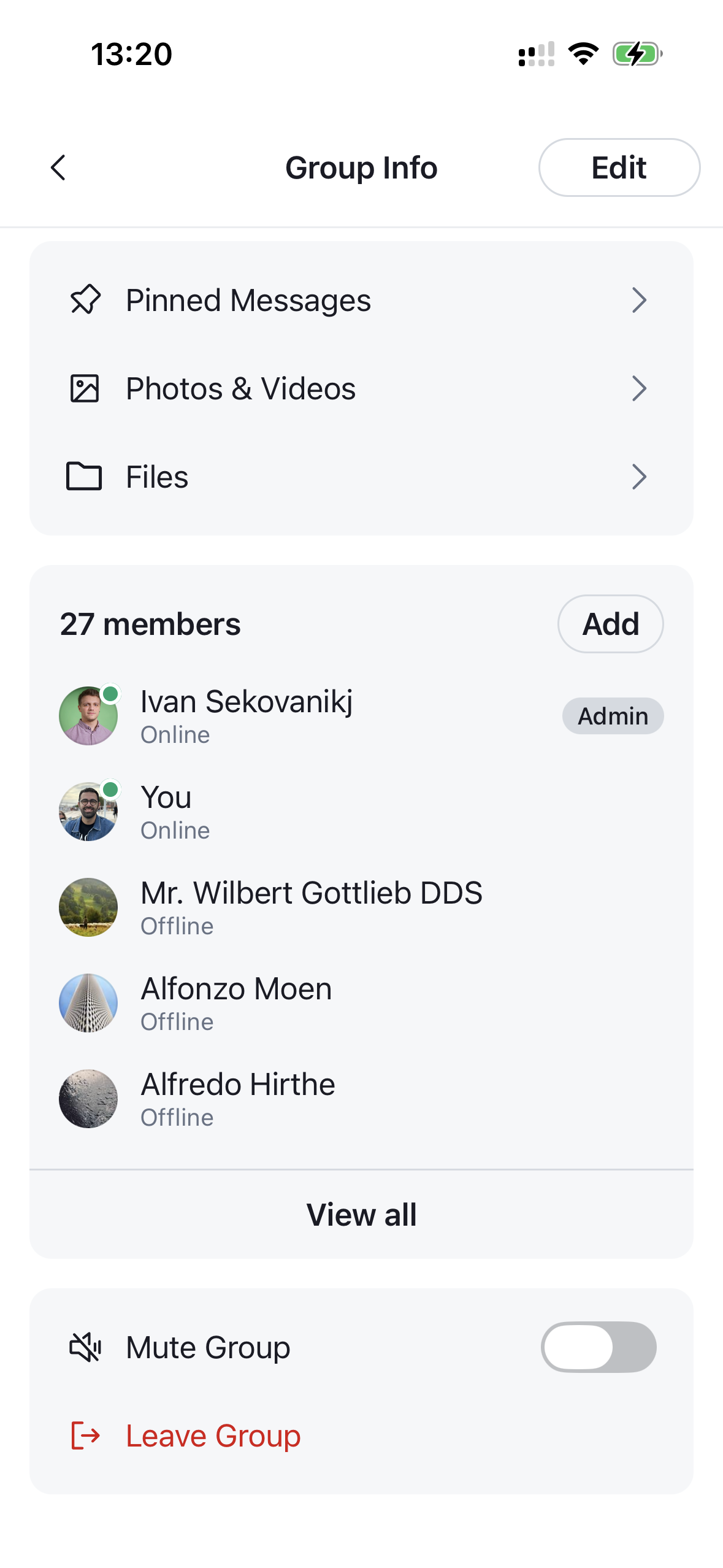
The entry component for the channel details screen. It renders a full layout for a channel, composed of a navigation header, the channel profile, a navigation section (pinned messages, files and media), a members section and an actions section. Needs to be wrapped in a ChannelDetailsContextProvider that supplies the channel it renders. The component expects an already-initialized channel (for example via channel.watch() or by querying channels), as it reads the channel's state and data directly.
 |  |
|---|
Best Practices
- Wrap
ChannelDetailsinChannelDetailsContextProviderand pass thechannelwhose details you want to display. - Render it inside
Channelso the section building blocks can access channel state and capabilities. - Override and configure individual building blocks (e.g.
ChannelDetailsProfile,ChannelDetailsActionsSection,ChannelMemberItem) by wrapping the component inWithComponentswith anoverridesmap, instead of rewriting the whole screen. - Use
onBackto wire the header back button into your navigation stack. - Use
getChannelActionItems/getNavigationItemsto tailor the rows without losing built-in behavior.
General Usage
Props
| Prop | Description | Type |
|---|---|---|
onBack | Fired when the back button is pressed on the channel details header. | () => void |
Building blocks
ChannelDetails composes the following sections. Each is sourced from the components context and can be overridden through the Channel component.
ChannelDetailsNavHeader
The top navigation header.
| Prop | Description | Type |
|---|---|---|
action | Content rendered on the trailing side of the header (e.g. the edit button). | React.ReactNode |
onBack | Fired when the back button is pressed. The back button only renders when provided. | () => void |
title | Override the auto-resolved screen title (1:1 → "Contact Info", group → "Group Info"). | string |
ChannelDetailsEditButton
Trailing header button that opens the channel edit form (ChannelEditDetailsForm) in a modal. Hidden for direct chats.
| Prop | Description | Type |
|---|---|---|
onPress | Override the default behavior, which opens the edit modal. | () => void |
style | Style forwarded to the underlying Button. | ButtonProps['style'] |
ChannelDetailsProfile
Renders the channel avatar, name and description from the channel details context. Takes no props.
ChannelDetailsMemberSection
A preview of the channel members with an entry point to the full list. Omitted for direct chats.
| Prop | Description | Type |
|---|---|---|
onViewAllMembersPress | Fired when the user taps the "view all members" button. By default it opens the full member list (ChannelMemberList) in a modal; provide this to navigate to your own members screen instead, in which case the built-in modal is not rendered. | () => void |
It renders the following member building blocks:
-
ChannelMemberItem — a single member row. Renders the member's roles as badges via
RoleList/RoleItem.Prop Description Type member*The member to render. ChannelMemberResponsegetMemberRolesOverride the roles shown next to the member; returns an array of { key, label }. Defaults to the built-in Owner / Admin / Moderator logic.GetMemberRolesonPressFired when the row is pressed. (member: ChannelMemberResponse) => voidsizeVisual size of the row. 'sm'(default) is a compact row;'lg'is a profile-style header.'sm' | 'lg'testIDTest identifier. string -
RoleList — the horizontal list of role badges rendered inside
ChannelMemberItem. Takesroles: RoleLabel[]and renders each via the overridableRoleItem. -
RoleItem — a single role badge (pill). Takes
role: RoleLabel;ownerroles use the accent (blue) palette, all others the neutral (grey) palette. Themeable viatheme.channelDetails.roleItem, and accepts optionalviewStyle/textStyleprops for per-instance overrides. -
ChannelAddMembersButton — opens the add-members form (
ChannelAddMembersForm) in a modal.Prop Description Type onPressOverride the default behavior, which opens the add-members modal. () => voidstyleStyle forwarded to the underlying Button.ButtonProps['style']variantRender the button as an icon or a text button. 'icon' | 'text'testIDTest identifier. string -
ChannelMemberList — the full, searchable member list opened by "View all". See
ChannelMemberList. -
ChannelMemberActionsSheet — opened when a member is tapped. It renders a
ChannelMemberItem(size='lg') header followed byChannelDetailsActionItemrows.Prop Description Type member*The member the actions apply to. ChannelMemberResponseonClose*Fired when the sheet is closed. () => voidvisible*Controls sheet visibility. booleangetChannelMemberActionItemsCustomize the list of action items rendered in the per-member actions sheet. GetChannelMemberActionItems
ChannelDetailsNavigationSection
The section that surfaces the PinnedMessageList, FileAttachmentList and MediaList navigation rows.
| Prop | Description | Type |
|---|---|---|
getNavigationItems | Customize the navigation rows. Receives the built-in defaultItems (and a context) and returns the rows to render. Untouched rows keep their built-in behavior. | GetChannelDetailsNavigationItems |
ChannelDetailsActionsSection
The section listing channel actions (mute, leave, delete, block, etc.).
| Prop | Description | Type |
|---|---|---|
getChannelActionItems | Customize the list of action items. Receives the default items and returns the final list to render (filter, reorder, replace, or add). | GetChannelActionItems |
onChannelDismiss | Fired after the channel is no longer available to the current user (delete, leave, or block actions). | () => void |
It renders ChannelDetailsActionItem rows:
| Prop | Description | Type |
|---|---|---|
Icon * | Icon component rendered at the leading edge of the row. | React.ComponentType<IconProps> |
label * | The row label. | string |
destructive | Renders the row with destructive styling. | boolean |
onPress | Fired when the row is pressed. | () => void |
trailing | Content rendered at the trailing edge of the row. | React.ReactNode |
testID | Test identifier. | string |