

The primary responsibility of mobile clients is to render components based on data received from the backend, which typically dictates what should be displayed. This means client-side developers must focus on two key tasks: understanding what to do with the data provided by the backend and how to do it by rendering the data into platform-specific components.
There are several well-known approaches that reduce the burden on mobile clients while increasing flexibility in delivering app features or content. One example is using web-based content, which allows for updates without waiting for the Google Play review process. However, if your service requires high performance for users, a web app may not be suitable in every case.
For those seeking both the flexibility of feature delivery and the performance benefits of native apps, you can explore another approach: designing layout structures and action handlers on the backend, while passively rendering and handling behaviors on the client side. This approach is commonly known as Server-Driven UI (SDUI) or Server-Side Rendering (SSR).
In this article, you'll explore the concepts of Server-Driven UI, its pros and cons, how to implement it with Jetpack Compose, and how to configure your backend using Firebase Realtime Database.
Approaches to Server-Driven UI
Typically, mobile clients are responsible for rendering data provided by the backend, with the layout structure largely determined by the client side. This means mobile developers must design the layout for each component according to their UI/UX guidelines, while also managing the finer details of how each component is rendered, as shown in the image below:
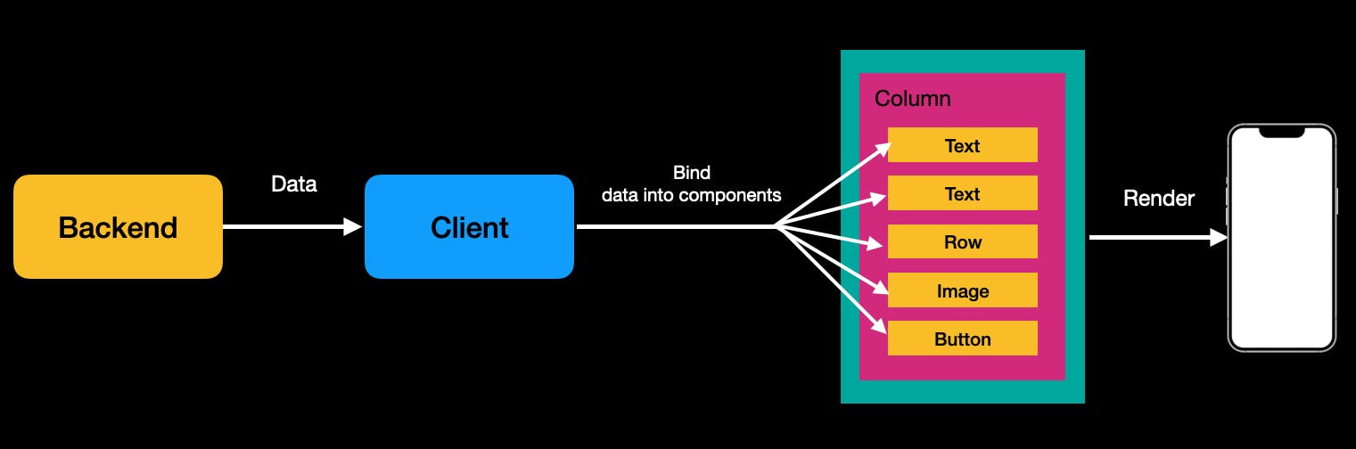
On the other hand, Server-Driven UI (SDUI) is an architectural pattern designed to minimize client-side logic and ensure consistency across multiple platforms (web, iOS, Android, etc.). Instead of returning raw domain data, the API delivers layout information, allowing the UI to be dynamically consumed and reducing the need for platform-specific code as you’ve seen in the illustration below:

As a result, the client side becomes more passive, simply receiving data with layout information from the backend. This shift allows developers to focus exclusively on how to render the data, rather than what to render, offering greater flexibility in delivering content. It also enables developers to concentrate on component development rather than managing complex layout systems.
Many large companies, such as Airbnb and Netflix, have adopted this approach for their primary products. There are also well-known solutions like Epoxy and Litho, which allow developers to implement complex screens in a declarative manner, built on top of traditional Android View systems.
The Challenges of Native App Releases
In most cases, the release process for native apps is slow, making it difficult to keep users updated with the latest version. Sometimes, you may even need to force users to update their apps to fix a critical issue, which can negatively impact the user experience. Traditional native apps typically face the following challenges:
- Slower Update Cycle: The time-consuming release process causes delays in delivering critical updates.
- Slower User Adoption: Users need to manually download and install updates, resulting in slower adoption of new features and bug fixes.
- Slower Feature Experimentation: Due to the slower update cycle, it becomes challenging to experiment with and iterate on specific features that your team wants to test.
- Slow Feedback Loop: Collecting user feedback and implementing quick changes is more difficult due to the slower update cycle and adoption rates.
In many cases, you can experiment with features by enabling or disabling them using Firebase Remote Config. However, this approach may fall short when greater flexibility is required, such as re-structuring an entire screen layout. So, why choose server-driven UI? Here are some key advantages you can leverage:
-
Faster Feature Experimentation: You can easily modify and deploy new layouts without requiring users to update their app. This results in a much faster feedback loop and quicker iterations.
-
Consistent UI Across App Versions: By establishing a solid component design system, and as long as the core specifications remain stable, users will experience consistent UI and behavior across multiple app versions.
-
Native Performance: You can still achieve native performance for rendering components while benefiting from the flexibility of server-driven UI.
-
Reduced Burden on Mobile Developers: Layout designs and app specifications are typically defined by product managers and designers rather than mobile developers. With server-driven UI, layout design responsibilities can shift to the product manager, allowing developers to focus on building and rendering individual components based on backend data.
The Challenges of Server-Driven UI
As always, there’s no one-size-fits-all solution. While server-driven UI offers several advantages, it also presents challenges when integrated into your product.
-
Latency and Performance: This is one of the biggest challenges. Since the client needs to fetch layout information from the backend, it may take longer to render and display components compared to a purely native app. Additionally, rendering becomes dependent on internet connectivity, which can impact performance.
-
Complexity and Cost: Your entire team must establish clear layout system protocols, such as how layout data is rendered on the client side, component versioning, and role distribution. Without a well-designed system that allows product managers to easily generate and upload layout information to the backend, the backend team may shoulder the burden of creating complex layouts, or the client team will need to frequently collaborate with the backend team, potentially increasing both complexity and costs.
-
Proper Fallback Handling: Data isn’t always perfect, and mistakes can happen. If the product manager designs a flawed layout system or if backend data becomes corrupted, the client must handle these errors gracefully with proper fallbacks to ensure a smooth user experience.
Ultimately, server-driven UI can increase development complexity and team costs, as it involves coordination across the entire team. Therefore, it's important to carefully assess whether this approach is suitable before implementing it. In many cases, you can introduce server-driven UI gradually, starting with highly flexible screens, such as the home screen of your application, where dynamic updates may offer the most value.
Now, let's dive into the implementation details using the open-source project server-driven-compose, which demonstrates server-driven UI approaches in Jetpack Compose using Firebase.
Configuring Firebase Realtime Database
The server-driven-compose project chose Firebase Realtime Database as the backend to visualize UI changes in real time. However, in real-world scenarios, it's generally recommended to implement server-driven UI through your own backend system, as UI components typically don’t require real-time updates. Alternatively, you can also consider using Firestore if it better aligns with your requirements.
You can easily configure the Firebase Realtime Database by following these steps:
- Firebase Setup: Download the
google-services.jsonfile following the Firebase setting up guidelines, and place it in theappdirectory of this project. - Realtime Database Setup: Set up Firebase Realtime Database on your Firebase dashboard. Once done, you can import the JSON file.
- Download JSON File: Download the demo JSON file for the Timeline UI (provided as a Gist) to your local machine.
- Configure Database URL: Create a file named
secrets.propertiesin the root directory of the project, and copy & paste your Realtime Database URL into it, as demonstrated in the example below.
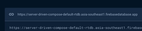
REALTIME_DATABASE_URL=https://server-driven-compose-default-rtdb.asia-southeast1.firebasedatabase.app/Firebase Realtime Database KTX
One of the main limitations of the official Firebase Realtime Database library is that it relies heavily on Java and callback listeners, making it less compatible with Kotlin Coroutines and Jetpack Compose. Additionally, since it returns snapshot values in a non-JSON format, handling data objects and implementing custom serialization becomes complex. For instance, the example below illustrates the challenge of dealing with such snapshot values:
1234567891011val listener = object : ValueEventListener {
  override fun onDataChange(snapshot: DataSnapshot) {
    val value = snapshot.child("timeline")
    // ..
  }

  override fun onCancelled(error: DatabaseError) {
    // ..
  }
}
database.addValueEventListener(listener)
As the data is not in JSON format, direct serialization into a target object isn't feasible. To address this, the firebase-android-ktx library provides a more Kotlin-friendly solution. It allows you to observe changes in the Realtime Database as a Flow and offers fully customizable serialization options. This simplifies handling data streams and adapts the data format to your app’s requirements, ensuring smooth integration with Kotlin Coroutines and Jetpack Compose.
To get started with this library, add the following dependency to your app’s module.gradle.ktx file:
123dependencies {
    implementation("com.github.skydoves:firebase-database-ktx:0.2.0")
}
You can continuously observe changes in snapshot data as a Flow using the flow() method and your custom serialization method to your DatabaseReference instance, as demonstrated in the example below:
12345678910111213141516internal class TimelineRepositoryImpl @Inject constructor(
  private val databaseReference: DatabaseReference,
  private val json: Json
) : TimelineRepository {

  override fun fetchTimelineUi(): Flow<Result<TimelineUi?>> {
    return databaseReference.flow(
      path = { snapshot ->
        snapshot.child("timeline")
      },
      decodeProvider = { jsonString ->
        json.decodeFromString(jsonString)
      }
    )
  }
}
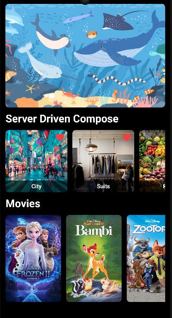
Once these steps are completed, you're ready to build the server-driven-compose project locally. From there, you can manipulate the values in your Realtime Database dashboard, and the changes will be reflected in real-time within the application, as demonstrated below.
Designing Rendering Interfaces
Now, let’s design the rendering interfaces. Typically, clients receive data in JSON format containing only domain-specific information. The client is responsible for processing and transforming this raw data into a format suitable for binding to the predefined layout on the client side, as illustrated in the JSON response below:
12345678910111213{
    "title": "Server Driven Compose",
    "items": [
        {
            "title": "City",
            "url": "https://github.com/user-attachments/assets/f1da7897-c7c9-41c2-8f3c-3358cf490696",
        },
        {
            "title": "Suits",
            "url": "https://github.com/user-attachments/assets/4d59d695-1c5a-4edb-b26a-4fe1f1f71928",
        }
    ]
}
This approach can be referred to as a “domain-driven interface”, where the data consists solely of core domain information, leaving higher-level details—such as text size or colors—to be handled by the client-side presentation logic.
In a server-driven UI, the approach differs a bit. It includes dynamic information that can be applied directly to the client side, such as text size, colors, font weight, image dimensions, and other design properties that can alter the appearance of each component. This can be referred to as a "layout-driven interface".
In this model, the server provides both component properties and domain data, allowing the UI to be rendered dynamically. You can see an example below where component properties are included alongside the domain data in JSON format:
1234567891011121314151617181920212223242526{
    "title": {
        "text": "Server Driven Compose",
        "size": 26,
        "fontWeight": "bold"
    },
    "list": {
        "layout": "grid",
        "itemSize": {
            "width": 150,
            "height": 150
        },
        "items": [
            {
                "title": "City",
                "url": "https://github.com/user-attachments/assets/f1da7897-c7c9-41c2-8f3c-3358cf490696",
                "scaleType": "crop"
            },
            {
                "title": "Suits",
                "url": "https://github.com/user-attachments/assets/4d59d695-1c5a-4edb-b26a-4fe1f1f71928",
                "scaleType": "crop"
            }
        ]
    }
}
This is the key, though the initial impression might be confusing and unfamiliar because it's a departure from traditional approaches. In server-driven UI, the server delivers a combination of component properties and domain data, giving the client significant flexibility. However, the downside is that the response can become quite complex, and the backend workload may increase significantly compared to previous methods.
Despite this challenge, if your team frequently needs to introduce flexibility to specific screens or features, or if you often experiment with new UI/UX styles, this approach could be well-suited to your needs.
The ideal scenario is to develop a system where the design and product teams can create initial versions of the layout-driven interface, reducing reliance on the backend team. Since most UI/UX decisions are typically made by design teams, this shift in responsibility would streamline the development process.
Component Design in Jetpack Compose
Now, let’s move on to designing components in Jetpack Compose. Before diving into implementation, it's important to consider the design approach. You’ll need to create components that are highly flexible and capable of consuming the "layout-driven interface." These components should be passive, meaning they don’t dictate the layout but adapt dynamically based on the API response, allowing for flexibility and variations as needed.
In the era of XML-based layouts, you would need solutions like Epoxy or Litho to dynamically build layouts using traditional View systems. However, with Jetpack Compose, which is inherently based on a declarative UI approach, this process becomes much simpler. You can easily build your own design systems, making dynamic layouts more flexible and manageable.
If you take a look at the code for the timeline screen in the Server Driven Compose project, you'll notice how simple it is. The code only needs to consume the provided layout information and domain data, without having to define the layout details for each component or screen individually. This simplicity is evident in the code snippet below:
1234567891011121314151617val timelineUi by timelineViewModel.timelineUi.collectAsStateWithLifecycle()

Column(
    modifier = Modifier
      .fillMaxSize()
      .padding(12.dp),
    verticalArrangement = Arrangement.spacedBy(12.dp)
) {
    timelineUi.components.forEach { uiComponent ->
      uiComponent.Consume(
        version = timelineUi.uiVersion,
        navigator = { clickedComponent ->
          navigateToDetails.invoke(clickedComponent, timelineUi.version)
      }
    )
  }
}
You’re probably curious about what the UiComponent is and how the UiComponent.Consume composable function works internally. Let’s dive into the design system implemented for the Server Driven Compose project to explore these components in more detail.
Interfacing UI Component
The UiComponent represents the highest level of abstraction for each UI element, meaning every component that can be rendered through a server-driven UI approach should extend from UiComponent. This allows you to handle various types of components with greater flexibility by interfacing them through the UiComponent interface. The way you implement this interface can vary depending on the specific requirements and scenarios of your project.
123@Stable
@Serializable
sealed interface UiComponent
Now, you need to define each UI component you want to render using the layout information provided by the backend. This means encapsulating the layout data and applying it to the individual properties of your components.
For example, you can create a data class called TextUi that encapsulates all the properties of the Text composable. This allows you to apply those properties flexibly to the Text composable, as shown in the example code below:
1234567@Immutable
@Serializable
data class TextUi(
  val text: String,
  val size: Int,
  val fontWeight: String
) : UiComponent
Let’s look at another example for rendering images. Similar to the TextUi data class, you can define a data class called ImageUi that encapsulates all the properties needed for flexible image rendering, as demonstrated in the code below:
123456789101112131415@Immutable
@Serializable
data class ImageUi(
  val title: String = "",
  val url: String,
  val size: DpSizeUi = DpSizeUi(0, 0),
  val scaleType: String,
) : UiComponent

@Immutable
@Serializable
data class DpSizeUi(
  val width: Int,
  val height: Int
)
These can be used to construct the response from the backend, as demonstrated in the code below:
12345678910111213141516171819@Serializable
data class TimelineTopUi(
  override val order: Int,
  val banner: ImageUi
): UiComponent

@Serializable
data class TimelineCenterUi(
  override val order: Int,
  val title: TextUi,
  val list: ListUi
)

@Serializable
data class TimelineBottomUi(
  override val order: Int,
  val title: TextUi,
  val list: ListUi
)
Binding Component Data into Composable
Now that you've fetched the data from the backend server, it's time to render the layout information into composable functions and display it on the screen. The first step is to implement a basic version of the UI component, ensuring it reflects the properties provided by the backend.
If you receive properties for rendering text, you would create a composable function that consumes the TextUi, as shown in the code below:
12345678910111213@Composable
fun ConsumeTextUi(
  textUi: TextUi,
  modifier: Modifier = Modifier
) {
  Text(
    modifier = modifier,
    text = textUi.text,
    color = ServerDrivenTheme.colors.textHighEmphasis,
    fontSize = textUi.size.sp,
    fontWeight = textUi.fontWeight.toFontWeight()
  )
}
For rendering images, you can apply the same approach by consuming the ImageUi data class.
123456789101112131415161718@Composable
fun ConsumeImageUi(
  imageUi: ImageUi,
  modifier: Modifier = Modifier,
  imageOptions: ImageOptions? = null
) {
  GlideImage(
    modifier = modifier
      .size(imageUi.size)
      .clip(RoundedCornerShape(8.dp)),
    imageModel = { imageUi.url },
    imageOptions = imageOptions ?: ImageOptions(
      contentScale = imageUi.scaleType.toContentScale(),
      contentDescription = imageUi.title
    ),
    previewPlaceholder = painterResource(R.drawable.preview)
  )
}
Composing Lists
You've already learned how to bind simple UI components like Text and Image. Now, let's dive into handling list data and binding it into a composable function. Since a list consists of multiple items, the structure can be a bit more complex, but the core concept remains similar to that of other components. First, let's take a look at the layout information that will be provided by the backend server for rendering:
1234567891011121314151617181920212223242526{
    "title": {
        "text": "Server Driven Compose",
        "size": 26,
        "fontWeight": "bold"
    },
    "list": {
        "layout": "grid",
        "itemSize": {
            "width": 150,
            "height": 150
        },
        "items": [
            {
                "title": "City",
                "url": "https://github.com/user-attachments/assets/f1da7897-c7c9-41c2-8f3c-3358cf490696",
                "scaleType": "crop"
            },
            {
                "title": "Suits",
                "url": "https://github.com/user-attachments/assets/4d59d695-1c5a-4edb-b26a-4fe1f1f71928",
                "scaleType": "crop"
            }
        ]
    }
}
The parent node (list) of this response defines the layout type (grid, column, or row), the item size for flexibility, and the items themselves—in this example, images. Based on this structure, you can create a ListUi model to handle the layout response on the client side:
12345678910111213141516@Serializable
data class ListUi(
  val layout: String,
  val itemSize: DpSizeUi,
  val items: List<ImageUi>,
) : UiComponent

fun String.toLayoutType(): LayoutType {
  return if (this == "grid") LayoutType.GRID
  else if (this == "column") LayoutType.COLUMN
  else LayoutType.ROW
}

enum class LayoutType(val value: String) {
  GRID("grid"), COLUMN("column"), ROW("row")
}
Lastly, you need to consume the ListUi information within a composable function. You can implement a ConsumeList composable function that renders different list styles—such as grid, column, or row—based on the provided layout type. In the example below, only the grid layout type is implemented for demonstration purposes.
1234567891011121314151617181920212223242526272829303132333435363738@Composable
fun ConsumeList(
  listUi: ListUi,
  modifier: Modifier = Modifier,
) {
  val layoutType = listUi.layout.toLayoutType()

  when (layoutType) {
    LayoutType.GRID -> {
      LazyHorizontalGrid(
        modifier = modifier
          .fillMaxWidth()
          .height(listUi.itemSize.heightDp()),
        rows = GridCells.Adaptive(minSize = listUi.itemSize.widthDp()),
        horizontalArrangement = Arrangement.spacedBy(12.dp)
      ) {
        items(items = listUi.items, key = { it.url }) { imageUi ->
          Box(
            modifier = Modifier
              .clip(RoundedCornerShape(8.dp))
              .size(
                width = listUi.itemSize.widthDp(),
                height = listUi.itemSize.widthDp()
              )
          ) {
            ConsumeImageUi(
              imageUi = imageUi.copy(size = listUi.itemSize),
            )
          }
        }
      }
    }

    LayoutType.COLUMN -> Unit // custom implementation

    LayoutType.ROW -> Unit // custom implementation
  }
}
Mapping UiComponents into Consumers
You should now have a good grasp of the concept of combining layout rendering data with composable functions by interfacing with the UiComponent. Now, it’s time to take the next step and map the layout data into composable functions using abstraction.
Let’s assume the screen is divided into three sections: top, center, and bottom. You can configure the layout response data for these sections as shown and observe it as a flow in the example below:
12345678910111213141516171819@Serializable
data class TimelineUi(
  val top: TimelineTopUi,
  val center: TimelineCenterUi,
  val bottom: TimelineBottomUi
) : UiComponent

internal class TimelineRepositoryImpl @Inject constructor(
  private val databaseReference: DatabaseReference,
  private val json: Json
) : TimelineRepository {

  override fun fetchTimelineUi(): Flow<Result<TimelineUi?>> {
    return databaseReference.flow(
      path = { snapshot -> snapshot.child("timeline") },
      decodeProvider = { jsonString -> json.decodeFromString(jsonString) }
    )
  }
}
Now, you should manage the request as a state in the ViewModel, as demonstrated in the example below:
123456789101112131415@HiltViewModel
class TimelineViewModel @Inject constructor(
  repository: TimelineRepository
) : ViewModel() {

  val timelineUi: StateFlow<List<UiComponent>> = repository.fetchTimelineUi()
    .flatMapLatest { response -> flowOf(response.getOrNull()) }
    .filterNotNull()
    .map { it.buildUiComponentList() }
    .stateIn(
      scope = viewModelScope,
      started = SharingStarted.WhileSubscribed(5000),
      initialValue = emptyList()
    )
}
If you look at the code above, you’ll notice that all components inside TimelineUi are placed into a list of UiComponent using the buildUiComponentList method. This approach is necessary because it allows different types of components to be unified under the same UiComponent interface, enabling them to be handled and consumed consistently.
Once this is done, it's time to map each UiComponent to a composable function and use the layout data to render the UI components. Since you've already unified all the components under the UiComponent interface, this can be easily achieved by implementing an extension function, called Consume, as shown in the example below:
123456789101112131415161718192021222324@Composable
fun UiComponent.Consume(
  modifier: Modifier = Modifier,
) {
  when (this) {
    is TextUi -> ConsumeTextUi(
      textUi = this,
    )

    is ImageUi -> ConsumeImageUi(
      imageUi = this,
      modifier = modifier,
    )

    is ListUi -> ConsumeList(
      listUi = this,
      modifier = modifier,
    )

    else -> ConsumeDefaultUi(
      uiComponent = this,
    )
  }
}
One important consideration is how to handle fallbacks, such as displaying a fallback view when something goes wrong, like receiving an undefined component type. In this example, fallback scenarios are handled with a ConsumeDefaultUi function, ensuring that undefined types are managed gracefully.
Finally, you can structure the overall layout using a Column or any other layout container that best suits your project. Then, you can render each unified UiComponent by utilizing the Consume extension you’ve implemented, as shown in the code below:
1234567891011121314151617val timelineUi by timelineViewModel.timelineUi.collectAsStateWithLifecycle()

Column(
    modifier = Modifier
      .fillMaxSize()
      .padding(12.dp),
    verticalArrangement = Arrangement.spacedBy(12.dp)
) {
    timelineUi.components.forEach { uiComponent ->
      uiComponent.Consume(
        version = timelineUi.uiVersion,
        navigator = { clickedComponent ->
          navigateToDetails.invoke(clickedComponent, timelineUi.version)
      }
    )
  }
}
As a result, you'll see the following output:
Action Handler
You may still encounter some challenges, one of which is handling actions, such as item click listeners and navigation to other screens. As discussed in previous sections, in a server-driven UI approach, all component behaviors, including actions, should be defined by the backend response rather than the client.
This allows the client side to focus on how to handle actions rather than what actions to handle. In this approach, the action handling logic is delivered through the backend as part of the component interface, ensuring consistency and flexibility in the UI.
For example, if you need to navigate to a details screen when users click a banner image, you can define the action handler interfaces within the backend response, as shown below:
12345678910111213141516{
    "banner": {
        "url": "https://github.com/user-attachments/assets/f1da7897-c7c9-41c2-8f3c-3358cf490696",
        "size": {
            "width": 0,
            "height": 250
        },
        "scaleType": "crop",
        "handler": {
            "type": "click",
            "actions": {
                "navigate": "to"
            }
        }
    }
}
Then, you should define action handler interfaces that align with your service requirements and goals. For instance, you can specify each handler type, the corresponding action, and details such as navigation, deep links, or other relevant behaviors.
1234567891011121314151617@Serializable
data class Handler(
  val type: String,
  val actions: Map<String, String>
)

enum class HandlerType(val value: String) {
  CLICK("click")
}

enum class HandlerAction(val value: String) {
  NAVIGATION("navigation")
}

enum class NavigationHandler(val value: String) {
  TO("to")
}
Next, you can add the handler parameter to your UI models, as shown in the example below. This parameter can be nullable since not all components will require an action handler. This ensures flexibility, allowing components without actions to function as expected.
12345678@Serializable
data class ImageUi(
  val title: String = "",
  val url: String,
  val size: DpSizeUi = DpSizeUi(0, 0),
  val scaleType: String,
  val handler: Handler? = null
) : UiComponent
Now, you need to consume the handler for each component. In this example, the handler is handled by implementing a custom Modifier extension called consumeHandler, which simplifies the process.
123456789101112131415161718192021222324252627@Composable
fun Modifier.consumeHandler(
  handler: Handler?,
  navigator: () -> Unit
): Modifier {
  if (handler == null) return this

  handler.actions.forEach { element ->
    val action =
      if (element.key == HandlerAction.NAVIGATION.value &&
        element.value == NavigationHandler.TO.value
      ) {
        { navigator }
      } else {
        {}
      }

    val newModifier = if (handler.type == HandlerType.CLICK.value) {
      Modifier.clickable { action.invoke() }
    } else {
      Modifier
    }

    then(newModifier)
  }
  return this
}
Finally, you can apply the action handlers by incorporating the consumeHandler into your component's composable functions, as demonstrated in the example below:
1234567891011121314151617181920212223@Composable
fun ConsumeImageUi(
  imageUi: ImageUi,
  modifier: Modifier = Modifier,
  navigator: (UiComponent) -> Unit = {},
  imageOptions: ImageOptions? = null
) {
  GlideImage(
    modifier = modifier
        .consumeHandler(
            handler = imageUi.handler,
            navigator = { navigator.invoke(imageUi) }
        )
        .size(imageUi.size)
        .clip(RoundedCornerShape(8.dp)),
    imageModel = { imageUi.url },
    imageOptions = imageOptions ?: ImageOptions(
      contentScale = imageUi.scaleType.toContentScale(),
      contentDescription = imageUi.title
    ),
    previewPlaceholder = painterResource(R.drawable.preview)
  )
}
Component Versioning
One major issue you need to address when introducing server-driven UI to your project is component versioning. As software libraries evolve and UI/UX designs change, the structure and behavior of your pre-defined components may need fundamental adjustments or new additions. In such cases, it’s essential to implement proper versioning for your components to manage these changes effectively.
First and foremost, you should include version information either in the root of the response or wherever you need to specify a version for a particular component, as demonstrated in the example JSON file below:
12345678{
    "timeline": {
        "version": 1,
        "top": {
            ..
        }
    }
}
Next, you can update the TimelineUi model to include the version information, as illustrated in the code example below:
1234567@Serializable
data class TimelineUi(
  val version: Int,
  val top: TimelineTopUi,
  val center: TimelineCenterUi,
  val bottom: TimelineBottomUi
) : UiComponent
Additionally, you can define different versions using an enum class, as demonstrated here:
123456789101112131415enum class UiVersion(val value: Int) {
  VERSION_1_0(1),
  VERSION_2_0(2);

  companion object {

    fun toUiVersion(value: Int): UiVersion {
      return when (value) {
        VERSION_1_0.value -> VERSION_1_0
        VERSION_2_0.value -> VERSION_2_0
        else -> throw RuntimeException("undefined version!")
      }
    }
  }
}
With this setup, you can implement different component versions based on the provided version information. For example, you can modify the ConsumeTextUi composable function, as shown below:
123456789101112131415161718192021222324@Composable
fun ConsumeTextUi(
  version: UiVersion,
  textUi: TextUi,
  modifier: Modifier = Modifier
) {
  if (version == UiVersion.VERSION_1_0) {
    Text(
      modifier = modifier,
      text = textUi.text,
      color = ServerDrivenTheme.colors.textHighEmphasis,
      fontSize = textUi.size.sp,
      fontWeight = textUi.fontWeight.toFontWeight()
    )
  } else {
    Text(
      modifier = modifier,
      text = textUi.text,
      color = ServerDrivenTheme.colors.primary,
      fontSize = textUi.size.sp,
      fontWeight = textUi.fontWeight.toFontWeight()
    )
  }
}
To ensure the version information is passed correctly from the response, update the Consume composable function like in the following example:
1234567891011121314151617181920212223@Composable
fun UiComponent.Consume(
  modifier: Modifier = Modifier,
  version: UiVersion = UiVersion.VERSION_1_0,
  navigator: (UiComponent) -> Unit = {}
) {
  when (this) {
    is TextUi -> ConsumeTextUi(
      textUi = this,
      modifier = modifier,
      version = version
    )

    is ImageUi -> ConsumeImageUi(
      imageUi = this,
      modifier = modifier,
      version = version,
      navigator = navigator
    )

    ..
  }
}
Finally, each component can be rendered with the appropriate version information, as shown in the timeline screen example below:
123456789101112131415161718192021222324@Composable
private fun TimelineContent(
  timelineViewModel: TimelineViewModel = hiltViewModel(),
  navigateToDetails: (UiComponent, Int) -> Unit
) {
  val timelineUi by timelineViewModel.timelineUi.collectAsStateWithLifecycle()

  Column(
    modifier = Modifier
      .background(ServerDrivenTheme.colors.background)
      .fillMaxSize()
      .padding(12.dp),
    verticalArrangement = Arrangement.spacedBy(12.dp)
  ) {
    timelineUi.components.forEach { uiComponent ->
      uiComponent.Consume(
        version = timelineUi.uiVersion,
        navigator = { clickedComponent ->
          navigateToDetails.invoke(clickedComponent, timelineUi.version)
        }
      )
    }
  }
}
If you run the Server Driven Compose project, you'll notice that each component is rendered differently based on the specified version provided in the response:
Conclusion
In this article, you've explored the key concepts of server-driven UI, including how to implement layout interfaces and design systems in Jetpack Compose. Additionally, you've covered advanced topics like handling fallbacks, action handlers, and component versioning.
Jetpack Compose enables a declarative approach to UI development, making it easier to implement a server-driven UI approach compared to traditional view systems. However, while the server-driven UI approach offers significant flexibility—similar to web applications—and maintains stronger performance than web applications, it also requires a considerable initial investment to establish the necessary design systems across the team. Therefore, it's crucial to carefully assess both the benefits and challenges before deciding to adopt this approach for your project.
If you have any questions or feedback on this article, you can find the author on Twitter @github_skydoves or GitHub if you have any questions or feedback. If you’d like to stay up to date with Stream, follow us on Twitter @getstream_io for more great technical content.
As always, happy coding!
— Jaewoong