

Animated message reactions, like the ones found in iMessage, offer you a way to quickly respond and add your sentiment to a single chat message.
In this tutorial, we will focus on making animated message reactions more lively by adding animations to the reaction icons and their container.
We will go through the process step by step for you to follow along. You can also find the entirety of the content in this Github repository.
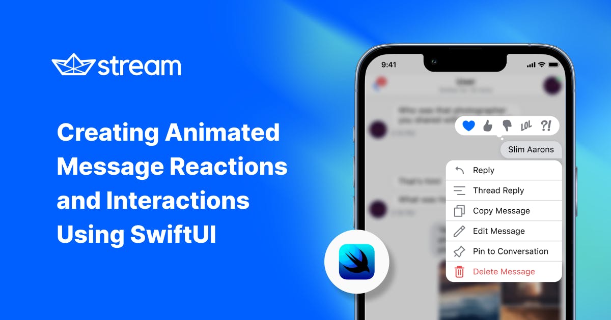
Below, you can see the desired result that we'll build from scratch:
If you prefer to follow along on video, I highly recommend the video edition of this tutorial by my amazing colleague Amos.
1. Setup
To get the most out of this tutorial, we recommend cloning this starter repo into your project folder.
To do so, in your Terminal use the following command:
1$ git clone https://github.com/GetStream/swiftui-animated-message-reactions-tutorial.git
Now, you can simply open the AnimatedMessageReactions.xcodeproj (with the open AnimatedMessageReactions.xcodeproj command) and you're good to go.
Note: Each step of this tutorial has a dedicated branch that you can reference as you code along. The
mainbranch contains the final result. The other feature branches follow the<chapter-number>-<chapter-name>nomenclature. For example, the first chapter1-setupshows the progress at the end of chapter one.
If you want to follow along from chapter one, run the following command in your project folder:
1$ git checkout 1-setup
Also, if you're interested in SwiftUI and would like to learn more about how to incorporate it into your chat app, please check out Stream's SwiftUI tutorial.
2. Creating and Animating the Container for the Icons
Let's get started by adding a container to place all the reaction icons. We will animate the container's appearance in the first step and then add the icons in the next section.
The place to do that is the MessageListView. In the body, we have a VStack holding only the MessageView that is used to display our chat message.
Now, let's take a few steps to achieve our goal:
- Create a
@Stateproperty to keep track of showing our container - or not - Add a
ZStackto hold theRoundedRectangleserving as the background of our container (Why not use theRoundedRectangledirectly you ask? Great question. The reason is that we will add the icons to theZStacklater to be shown on top of theRoundedRectangle.) - Use a
longPressGestureon ourMessageViewto animate our container
2.1 Creating a State Property for the Container Animation
The ultimate goal is to toggle between two different states. The initial state will hide our container with the reactions inside it, and the second state will show it.
With only two possible values, a Bool is perfect. Go ahead and add the following code inside of the MessageListView component (but outside of the body block):
1@State private var showReactionsBackground = false
2.2 Adding the ZStack and the RoundedRectangle
We need to create a RoundedRectangle, which will function as the background of our container.
Because we are clever and thinking ahead, we're embedding it into a ZStack so later we can add the different reaction icons on top of it.
We'll insert the following code right before the MessageView as the first child of the VStack in the MessageListView.
1234567891011121314ZStack {
    RoundedRectangle(cornerRadius: 28)
                // 1. set the background color
        .fill(Color(UIColor.tertiarySystemGroupedBackground))
                // 2. set the size
        .frame(width: 216, height: 40)
                // 3. scale the view depending on whether we're showing it or not
        .scaleEffect(showReactionsBackground ? 1 : 0, anchor: .bottomTrailing)
                // 4. tie the animation to the value of our state variable
        .animation(
                    .interpolatingSpring(stiffness: 170, damping: 15).delay(0.05),
                    value: showReactionsBackground
                )
}
Let's go through the code above line by line:
- Our container needs a background, so we're using the
.fillmodifier combined with thetertiarySystemGroupedBackgroundcolor, which looks great in both light and dark mode - The size can be set with the
.framemodifier - Using
.scaleEffectwill either show the view in its entirety or not at all depending on the value ofshowReactionsBackground, while theanchorparameter specifies where the center of the animation is - In our
.animationmodifier, we're defining a spring animation that is tied to changes for theshowReactionsBackgroundvariable
By using the
.animationmodifier, we're creating an implicit animation. That means that whenever the value forshowReactionsBackgroundchanges it will trigger the animation without specifying anything else.
The parameters for the interpolatingSpring animation might not be intuitive from their naming:
Stiffness is defined as the tension in the spring. A larger value of stiffness results in a snappier spring animation.
Damping, on the other hand, is the back-drag frictional force that affects the animation. A smaller damping value results in more bounciness, whereas a larger damping value reduces the bounciness of the spring animation.
Feel free to play around with the parameters and see how this affects the animation.
Now, we have everything set up to trigger the animation. Well, everything except for the trigger itself.
2.3 Create the Long Press Gesture
We'll use a long press on the message to show the possible reactions to the user.
Luckily for us, SwiftUI's .onLongPressGesture modifier makes it very easy to add such a gesture here, which is perfect for our use case. All we need to do is to attach the modifier to the MessageView and we're set:
1234MessageView(/* ... */)
    .onLongPressGesture {
        showReactionsBackground.toggle()
    }
With that last piece, we have everything in place to animate the container. Calling the toggle() function on a boolean value will alternate it between true or false depending on what the current value is.
Let's see this in action:
Awesome-the first part of the tutorial is finished! We created an implicit animation of the reactions container. Now, let's tackle the rest!
3. Setting Up the Message Reaction Icons
Now that we have the container ready, we can take care of the icons. Again, we will start by creating the necessary @State variables and then proceed by creating the respective View for each icon.
This will include preparing the modifiers we need for the explicit animations to work.
Let's dive in.
3.1 Preparing the State Variables for the Animations
Preparing our state variables will be very similar to the process we used to animate the RoundedRectangle container.
Using the .scaleEffect again, we can create a nice upscaling effect for the appearance and a downscaling effect for the dismissal.
Let's look carefully at the code for these effects and see if we can spot any surprises:
1234567@State private var showLike = false
@State private var showThumbsUp = false
@State private var thumbsUpRotation: Double = -45 // 🤔
@State private var showThumbsDown = false
@State private var thumbsDownRotation: Double = -45 // 🤔
@State private var showLol = false
@State private var showWutReaction = false
Great job, detective! The Bool values we create look very familiar but there are two new things in there, which are the thumbsUpRotation and the thumbsDownRotation variables.
Based on their names we could guess what they do, but let's keep them in mind for now and continue by building out the UI.
3.2 Creating the Views for the Icons
While creating the container, we already knew that we wanted to set up the reaction icons so they appear above the background.
The ZStack we created is the perfect spot for that. An HStack will lay out the items horizontally (we put a little spacing between them) and each icon will be displayed with a simple Image view.
Note: The project we cloned already has image resources for each of the different reaction icons.
We will have a look at the code first and then discuss the two different modifiers we use:
123456789101112131415161718HStack(spacing: 20) {
    Image("like")
        .scaleEffect(showLike ? 1 : 0)

    Image("thumbs_up")
        .scaleEffect(showThumbsUp ? 1 : 0)
        .rotationEffect(.degrees(thumbsUpRotation))

    Image("thumbs_down")
        .scaleEffect(showThumbsDown ? 1 : 0)
        .rotationEffect(.degrees(thumbsDownRotation))

    Image("lol")
        .scaleEffect(showLol ? 1 : 0)

    Image("wut_reaction")
        .scaleEffect(showWutReaction ? 1 : 0)
}
For the regular .scaleEffect modifier, not much has changed. It takes the respective @State variable and scales the Image to full size when true and to zero when it should not be shown.
However, an interesting addition here is the .rotationEffect modifier. Remember the old times (okay, it was 10 lines above) when we created thumbsUpRotation and thumbsDownRotation variables and nobody knew what they were for? Now is their time to shine.
The .rotationEffect takes an argument of type Angle and, since we all loved geometry in school, we know it can be displayed in .degrees, right? Right!
So, using it is as simple as giving it a rotation angle. And, we can use it to animate the rotation of our Image as well. That's convenient.
Note: The
.degreesinitializer takes aDoublevalue which is why - when creatingthumbRotation- we specifically set it to be of the typeDouble.
With that, we have everything in place to go to the final step and add the explicit animations.
4. Explicitly Animating Each Message Reaction Icon
Now, we've been talking about explicit animations quite a bit, but what does that even mean? First, let's take a step back and think about the type of animation we created at the beginning of this article.
Our container view received an .animation modifier, which referenced a variable as the value (in our case showReactionsBackground).
This implies that whenever this exact variable changes, the animation will be triggered - hence the name implicit animation.
In this section, we will do things differently. The setup on the Images is similar as they each have a .scaleEffect attached that depends on their respective variables. Note, that there is no .animationModifier used. Instead, we will tell SwiftUI explicitly what it should do.
Therefore, we use the withAnimation function which takes two parameters:
- (Optional) The type of animation we want to trigger
- A closure where we manipulate the state variables we want the animation to occur with
With the theory wrapped up, we can now dive into the real code to achieve this.
4.1 Implementing the Appearance Animation of the Reaction Icons
It is best to start with a single icon first to understand the principle. Let's pick the heart icon (Image("like")) where the scale effect is tied to the showLike state variable.
We can use the withAnimation function to explicitly animate the appearance and dismissal like this:
123withAnimation(.interpolatingSpring(stiffness: 170, damping: 15).delay(0.1)) {
    showLike.toggle()
}
Since we enjoyed the container animation so much, we will reuse the .interpolatingSpring with the same values here.
Notice that we add a .delay to the animation. This allows us to first scale up our container and then show each icon one after the other rather than displaying them all at the same time. This has a nice effect.
Inside of our closure, we simply call the .toggle function on the showLike variable. Because the scale of our Image depends on the showLike variable, SwiftUI is smart enough to know that it will animate the changes automatically.
The other icons in sequence will work simultaneously. The only change we need to apply is a slightly longer delay to each icon so that we can stagger the animations. If you take a close look at the following code you will notice that there is no other difference:
12345678910111213141516171819withAnimation(.interpolatingSpring(stiffness: 170, damping: 15).delay(0.1)) {
  showLike.toggle()
}

withAnimation(.interpolatingSpring(stiffness: 170, damping: 15).delay(0.2)) {
  showThumbsUp.toggle()
}

withAnimation(.interpolatingSpring(stiffness: 170, damping: 15).delay(0.3)) {
  showThumbsDown.toggle()
}

withAnimation(.interpolatingSpring(stiffness: 170, damping: 15).delay(0.4)) {
  showLol.toggle()
}

withAnimation(.interpolatingSpring(stiffness: 170, damping: 15).delay(0.5)) {
  showWutReaction.toggle()
}
Of course, this is a lot of duplicated code and when we integrate this into a real codebase (did someone say follow-up article?) we can optimize it. But, for the sake of this tutorial, I think this structure is all you need to understand what's going on here.
We put this code into the .onLongPressGesture closure right after the call to showReactionsBackground.toggle() and we're good to go.
When we take a look at the preview and trigger the animation, it already looks really good:
But we can add a little more delight, so let's go the extra mile, shall we?
4.2 Adding the Rotation Animation On Top
Aside from the .scaleEffect modifiers, we prepared the .rotationEffect for the thumbsUp and thumbsDown icons. We can integrate this to be animated in a very straightforward way.
The only difference is that we don't animate a Bool here, but a Double. Our goal here is to have the icon rotate to 0 rotation on appearance and reset to the initial value of -45 when the reaction icon list is dismissed.
The first step is to create two computed properties in the root of our MessageListView below the creation of all the @State variables:
1234567var isThumbsUpRotated: Bool {
  thumbsUpRotation == -45
}

var isThumbsDownRotated: Bool {
  thumbsDownRotation == -45
}
With that we can now manipulate the rotation variables inside of the withAnimation closure and cue the explicit animations.
The following code snippet will add the changes to the respective icon animation closures and finish our entire logic:
123456789withAnimation(.interpolatingSpring(stiffness: 170, damping: 15).delay(0.2)) {
  showThumbsUp.toggle()
  thumbsUpRotation = isThumbsUpRotated ? 0 : -45
}

withAnimation(.interpolatingSpring(stiffness: 170, damping: 15).delay(0.3)) {
  showThumbsDown.toggle()
  thumbsDownRotation = isThumbsDownRotated ? 0 : -45
}
Great job! Let's have a look at the result and enjoy the wonderful rotations of the icons as well as the smooth flow of the appearing and disappearing icons:
Conclusion
We finished the animation of the message reaction icons! We staggered the appearance of the container with those of the icons themselves, and we explored both implicit and explicit animations.
There is not a single way that is to be preferred to another one, but it's nice to know that we have multiple approaches in our toolkit.
It's amazing to see how little effort is required to add this pretty advanced interaction pattern. This is one of the areas where SwiftUI shines-the options it provides us make this implementation possible in a very straightforward way.
Thanks again to Amos for making the initial video on the topic (which you can (and should!) watch here).
If you want more SwiftUI content, feel free to check out this take on using SwiftUI instead of interaction design tools or follow along as Amos prototypes Stream's iOS Chat SDK.
If you have any other questions or feedback, feel free to reach out to the team via Twitter or through Github.
And as always, happy coding!