 React
React iOS
iOS Android
 Flutter
 Angular
 JavaScript
 Unity
Unity Unreal
 Node
Node Python
 Ruby
Ruby PHP
PHP Java
Java .NET
.NET Go
Go REST
REST<Chat client={client}>
<ChannelList
filters={filters}
sort={sort}
options={options}
showChannelSearch
/>
<Channel>
<Window>
<ChannelHeader />
<MessageList />
<MessageInput />
</Window>
<Thread />
</Channel>
</Chat>ChannelSearch
ChannelSearch searches for users and displays results in a list. Use it standalone or inside ChannelList with showChannelSearch (default: false). By default it searches users; set searchForChannels to include channels, or override queries with searchFunction. Selecting a result activates the existing channel or creates a new one for the user.
Best Practices
- Keep search scoped to relevant users/channels to avoid noisy results.
- Use
searchForChannelsonly when channel discovery is a core feature. - Provide a custom
searchFunctionwhen you need membership-based filtering. - Keep results open intentionally with
clearSearchOnClickOutside={false}for power users. - Treat search UI as a fast path; avoid heavy rendering in result items.
Basic Usage
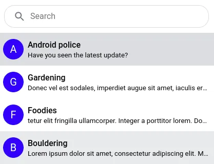
Example 1 - used via the showChannelSearch prop.
ChannelSearch renders two parts:
- the search input
- the search results list
Search input and SearchResults state
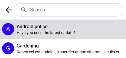
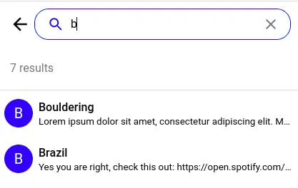
The input naturally transitions between 3 states:
| Input state | Input | Search results |
|---|---|---|
| inactive | not focused | not rendered |
| focused | focused and empty | not rendered |
| active search | contains non-empty search string | rendered |
You can exit active search by pressing Esc or clearing the input. Results render only when the input has text.
Once results render, they transition through:
| Search results state | Search results |
|---|---|
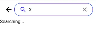
| loading | the search API call is in progress |
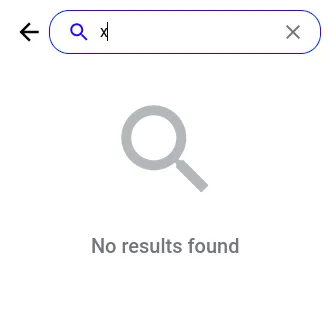
| empty search (result) | the search API call returned an empty array |
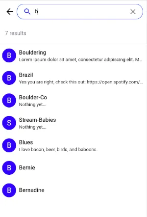
| non-empty search (result) | the search API call returned an array of channel and user objects |
SearchInput component
SearchInput renders a single text input. You can provide a custom SearchInput.
SearchBar component
SearchBar renders buttons plus the input. Buttons and icons are conditional based on state, and can be customized via a custom SearchBar.
SearchBar states
The SearchBar transitions between the same states as the SearchInput, but renders more elements.
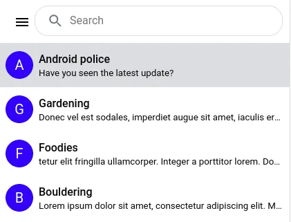
1. Inactive state
SearchBar shows an app menu icon if you pass a custom AppMenu. Otherwise only the input is visible.
2. Active state
When focused, a return-arrow button (ExitSearchIcon) appears to exit the active state, replacing the app menu icon. After typing, a clear-input button (ClearInputIcon) appears inside the input.
Clicking the return-arrow returns to inactive. Clicking clear-input clears text but keeps focus and the return-arrow visible.
You can also exit active search with Escape.
SearchResults component
The following states are reflected in the SearchResults:
- The search query being in progress (can be customized with
SearchLoading) - The empty search result (can be customized with
SearchEmpty) - The listing of found channels (if
searchForChannelsis set totrue) and users
Customize the results with SearchResultsHeader, SearchResultItem, and SearchResultsList (renders the list of SearchResultItem).
The default styling of the first two states are as follows:
Search results in popup
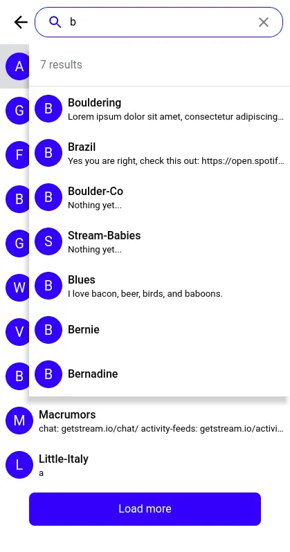
Results can render inline (replacing the channel list) or in a floating container above it. Toggle this with popupResults.
Keep the search results open on channel select
To keep results open while clicking between them, set clearSearchOnClickOutside to false. If the selected channel wasn’t already listed, it’s added to the list.
Customizing the search method
By default, the ChannelSearch component searches just for users. Use the searchForChannels prop to also search for channels.
To override search completely, use searchFunction. This is useful if you only want channels where the currently logged-in user is a member.
const customSearchFunction = async (
  props: ChannelSearchFunctionParams,
  event: { target: { value: SetStateAction<string> } },
  client: StreamChat,
) => {
  const { setResults, setSearching, setQuery } = props;
  const value = event.target.value;

  const filters = {
    name: { $autocomplete: value },
    members: { $in: client.userID },
  };

  setSearching(true);
  setQuery(value);
  const channels = await client.queryChannels(filters);
  setResults(channels);
  setSearching(false);
};
const { client } = useChatContext();
<ChannelList
additionalChannelSearchProps={{
searchFunction: (params, event) => {
return customSearchFunction(params, event, client);
},
}}
showChannelSearch
/>;Props
AppMenu
Application menu / drop-down to be displayed when clicked on MenuIcon. Prop is consumed only by the SearchBar component. No default component is provided by the SDK. The library does not provide any CSS for AppMenu. Consult the customization tutorial on how to add AppMenu to your application. The component is passed a prop close, which is a function that can be called to hide the app menu (e.g. on menu item selection).
| Type | Default |
|---|---|
React.ComponentType | undefined |
channelType
The type of channel to create on user result selection.
| Type | Default |
|---|---|
livestream | messaging | team | gaming | commerce | messaging |
ClearInputIcon
Custom icon component used as a content of the button used to clear the search input. Prop is consumed only by the SearchBar component.
| Type | Default |
|---|---|
React.ComponentType | XIcon |
clearSearchOnClickOutside
Signals that the search state / results should be cleared on every click outside the search input (e.g. selecting a search result or exiting the search UI), defaults to true. If set to false, the search results are kept in the UI meanwhile the user changes between the channels.
| Type | Default |
|---|---|
boolean | true |
disabled
Disables execution of the search queries and makes the search text input element disabled. Defaults to false.
| Type | Default |
|---|---|
boolean | false |
ExitSearchIcon
Custom icon component used as a content of the button used to exit the search UI. Prop is consumed only by the SearchBar component.
| Type | Default |
|---|---|
React.ComponentType | ReturnIcon |
MenuIcon
Custom icon component used as a content of the button used to invoke the AppMenu. Prop is consumed only by the SearchBar component. The menu icon button is displayed only if AppMenu component has been passed to ChannelSearch props.
| Type | Default |
|---|---|
React.ComponentType | MenuIcon |
onSearch
Callback invoked with every search input change handler. SDK user can provide own implementation. The prop is used by the ChannelList component to set a flag determining that the search has been initiated. If the search has been initiated and search result are to be displayed instead of the list of loaded channels (popupResults flag is set to false), then the list of loaded channels is not rendered. This logic is executed despite passing custom implementation of onSearch function to ChanneList props.
| Type |
|---|
React.ChangeEventHandler<HTMLInputElement\> |
onSearchExit
Callback invoked when the search UI is deactivated. The ChannelList component uses it to set a flag that the search has been terminated and search results are not expected to be displayed in place of the list of loaded channels. And so the ChannelList renders the list of loaded channels. This logic is executed despite passing custom implementation of onSearchExit function to ChanneList props.
| Type |
|---|
() => void |
onSelectResult
Custom handler function to run on search result item selection. If not provided then the default selection handler takes care of:
- loading the active channel
- adding the selected channel to the channel list
- clearing the search results, if
clearSearchOnClickOutsideflag is set to true (default)
| Type |
|---|
(params: ChannelSearchFunctionParams, result: ChannelOrUserResponse) => Promise<void> | void |
placeholder
Custom placeholder text to be displayed in the search input. Can be passed down from ChannelList via its additionalChannelSearchProps. If using custom i18n translations, it is preferable to change the placeholder value in your translations files under the key 'Search'.
| Type | Default |
|---|---|
string | 'Search' |
popupResults
Display search results as an absolutely positioned popup, defaults to false and shows inline.
| Type | Default |
|---|---|
boolean | false |
SearchBar
Custom component to be rendered instead of the default SearchBar. The default SearchBar component is a composite of multiple buttons and a search input. You can find more information about its features in an above section.
| Type | Default |
|---|---|
React.ComponentType<SearchBarProps\> | SearchBar |
SearchEmpty
Custom UI component to display empty search results.
| Type | Default |
|---|---|
React.ComponentType | DefaultSearchEmpty |
searchForChannels
Boolean to search for channels as well as users in the server query, default is false and just searches for users.
| Type | Default |
|---|---|
boolean | false |
searchFunction
Custom search function to override default. The first argument should expect an object of type ChannelSearchFunctionParams. It carries references to the Dispatch<SetStateAction> functions that allow to control the search state:
setQuery- sets the search input value, the default value is an empty stringsetResults- sets the array of search results, the default value is an empty arraysetSearching- signals that the HTTP search request is in progress
| Type |
|---|
(params: ChannelSearchFunctionParams, event: React.BaseSyntheticEvent ) => Promise<void> | void |
See also Customizing the search method.
searchDebounceIntervalMs
The number of milliseconds to debounce the search query.
| Type | Default |
|---|---|
number | 300 |
SearchInput
Custom UI component to display the search text input.
| Type | Default |
|---|---|
React.ComponentType<SearchInputProps> | SearchInput |
SearchLoading
Custom UI component to display the search loading state. Rendered within the SearchResults component.
| Type | Default |
|---|---|
React.ComponentType | a div with: 'Searching...' |
searchQueryParams
Object containing filters/sort/options overrides for user / channel search.
The filters attribute (SearchQueryParams.userFilters.filters) can be either UserFilters object describing the filter query or a function with a single argument of the search / filter (query) string. The function is then expected to derive and return the UserFilters from the provided query string.
| Type |
|---|
SearchQueryParams |
SearchResultsHeader
Custom UI component to display the search results header.
| Type | Default |
|---|---|
React.ComponentType | DefaultSearchResultsHeader |
SearchResultItem
Custom UI component to display a search result list item.
| Type | Default |
|---|---|
React.ComponentType<SearchResultItemProps> | DefaultSearchResultItem |
SearchResultsList
Custom UI component to display all the search results.
| Type | Default |
|---|---|
React.ComponentType<SearchResultsListProps> | DefaultSearchResultsList |
On this page:
- Best Practices
- Basic Usage
- Customizing the search method
- Props
- AppMenu
- channelType
- ClearInputIcon
- clearSearchOnClickOutside
- disabled
- ExitSearchIcon
- MenuIcon
- onSearch
- onSearchExit
- onSelectResult
- placeholder
- popupResults
- SearchBar
- SearchEmpty
- searchForChannels
- searchFunction
- searchDebounceIntervalMs
- SearchInput
- SearchLoading
- searchQueryParams
- SearchResultsHeader
- SearchResultItem
- SearchResultsList