 React
React iOS
iOS Android
 Flutter
 Angular
 JavaScript
 Unity
Unity Unreal
 Node
Node Python
 Ruby
Ruby PHP
PHP Java
Java .NET
.NET Go
Go REST
REST@import "stream-chat-react/dist/css/index.css" layer(stream);Introduction
The SDK ships with default CSS that you can override.
Best Practices
- Prefer CSS variables over selector overrides to keep upgrades painless.
- Use CSS layers (
stream,stream-overrides) so overrides remain readable and conflict-free. - Scope theme changes to
.str-chatto avoid leaking styles into the rest of the app. - Use component variables when you need targeted changes without global side effects.
- Use the root
dist/css/*entrypoints; legacy/v2/style import paths no longer resolve.
Importing the stylesheet
Most examples use the CSS layers API to keep override specificity predictable.
Customization
The theming system supports both small and large UI changes. This document walks through the available options.
CSS variables
CSS variables are the easiest way to customize the theme. They’re organized into two tiers:
- global
- component
Global variables
Use global variables to change the overall chat UI (instead of individual components).
The full list of global variables can be found in our global variables guide.
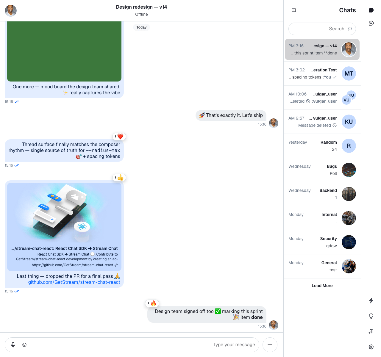
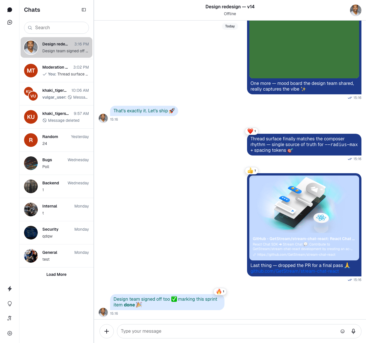
Here is the default chat UI:
Here is how you can customize global variables:
@layer stream, stream-overrides;
@import "stream-chat-react/dist/css/index.css" layer(stream);
@layer stream-overrides {
.str-chat {
/* Accent color — used by mentions, read receipts, attachment actions, focus states, etc. */
--str-chat__accent-primary: #0d47a1;
/* Message bubble colors */
--str-chat__chat-bg-outgoing: #1e3a8a;
--str-chat__chat-bg-attachment-outgoing: #0d47a1;
--str-chat__chat-bg-incoming: #dbeafe;
--str-chat__chat-text-outgoing: #ffffff;
--str-chat__chat-reply-indicator-outgoing: #93c5fd;
/* Link colors (inside bubbles and elsewhere) */
--str-chat__text-link: #1e40af;
--str-chat__chat-text-link: #93c5fd;
/* Panel backgrounds */
--str-chat__background-core-elevation-1: #dbeafe; /* channel list and surrounding panels */
--str-chat__background-core-app: #c7dafc; /* message list background */
/* Focus ring */
--str-chat__border-utility-focused: #1e40af;
/* Radii — the SDK uses --str-chat__radius-max / --str-chat__button-radius-full for pill shapes */
--str-chat__radius-max: 8px;
--str-chat__button-radius-full: 6px;
}
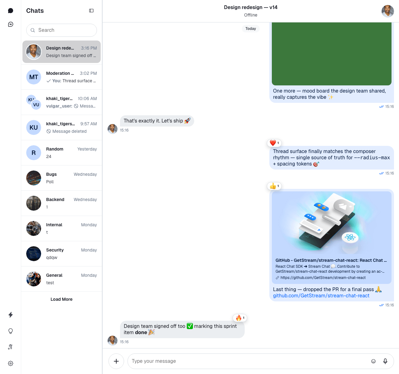
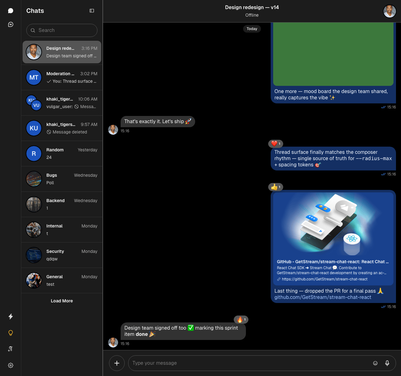
}Here is the result:
The str-chat class is applied to the ChannelList and Channel components, and the SDK's global tokens are declared at this level — so scoping your overrides here reaches both panes.
Component variables
You can use component layer variables to change the design of individual components. The full list of component variables can be found in our component variables guide.
To change avatar colors without affecting the rest of the UI, use avatar-specific variables:
@layer stream-overrides {
.str-chat {
/* Accent + bubble colors from the previous example */
--str-chat__accent-primary: #0d47a1;
--str-chat__chat-bg-outgoing: #1e3a8a;
--str-chat__chat-text-outgoing: #ffffff;
--str-chat__chat-bg-incoming: #dbeafe;
/* Avatar colors (v14 tokens) */
--str-chat__avatar-bg-default: #bf360c;
--str-chat__avatar-text-default: #ffffff;
}
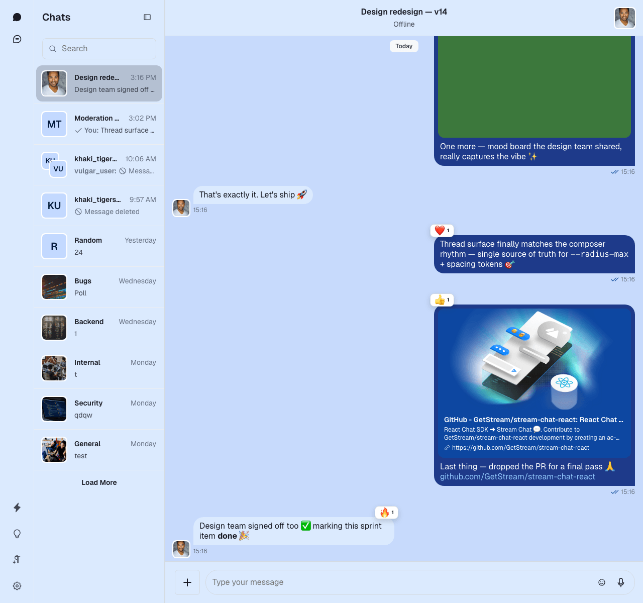
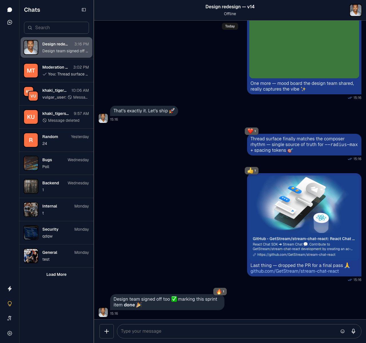
}Here is the result:
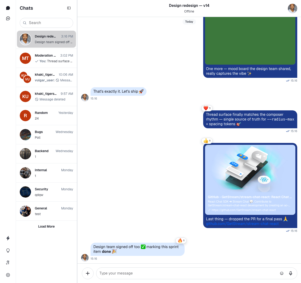
Component variables are local to their component — overriding one doesn't cascade into others. Here is the default message bubble:
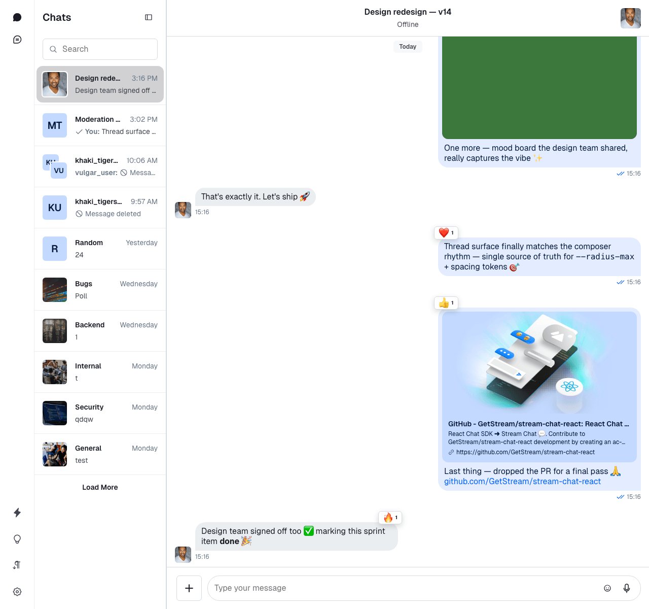
And with a custom text color set via the component token:
@layer stream-overrides {
  .str-chat {
    --str-chat__accent-primary: #0d47a1;
    --str-chat__chat-bg-outgoing: #1e3a8a;
    --str-chat__chat-bg-incoming: #dbeafe;
    --str-chat__avatar-bg-default: #bf360c;
    --str-chat__avatar-text-default: #ffffff;

    /* Message bubble text color (driven by the chat-text tokens) */
    --str-chat__chat-text-outgoing: #00695c;
    --str-chat__chat-text-incoming: #00695c;
  }
}
In v14 the message bubble and its link-attachment card share the same text color through the internal --chat-text alias, which resolves to --str-chat__chat-text-outgoing or --str-chat__chat-text-incoming depending on who sent the message. If you want bubble text and link attachments to match, override --str-chat__chat-text-outgoing / --str-chat__chat-text-incoming at the .str-chat scope.
Dark and light themes
The default theme has dark and light variants. Here is how you can switch between the different themes:
<Chat client={client} theme="str-chat__theme-dark">
  {/* ... */}
</Chat>
or only to a specific component (Channel or/and ChannelList):
<Chat
  client={client}
  customClasses={{
    channelList: "str-chat__theme-dark str-chat__channel-list",
    channel: "str-chat__theme-light str-chat__channel",
  }}
>
  {/* ... */}
</Chat>
Using the customClasses approach for either of the components will override default class names.
Remember to add those to your theme class names (as defined in the snippet) for the styling to work properly.
Here is what the dark theme looks like:
The str-chat__theme-dark/str-chat__theme-light class is applied to the ChannelList and Channel components, these classes are responsible for switching between the dark and light theme color combinations.
Here is how you can provide different color configurations for the dark and light themes:
@layer stream, stream-overrides;
@import "stream-chat-react/dist/css/index.css" layer(stream);
@layer stream-overrides {
/* Shape tokens shared by both themes */
.str-chat {
--str-chat__radius-max: 8px;
--str-chat__button-radius-full: 6px;
}
/* Light theme palette */
.str-chat__theme-light {
--str-chat__accent-primary: #0d47a1;
--str-chat__chat-bg-outgoing: #1e3a8a;
--str-chat__chat-bg-incoming: #dbeafe;
--str-chat__chat-text-outgoing: #ffffff;
--str-chat__text-link: #1e40af;
--str-chat__background-core-elevation-1: #dbeafe;
--str-chat__background-core-app: #c7dafc;
--str-chat__avatar-bg-default: #bf360c;
--str-chat__avatar-text-default: #ffffff;
}
/* Dark theme palette */
.str-chat__theme-dark {
--str-chat__accent-primary: #4a90e2;
--str-chat__chat-bg-outgoing: #1e3a8a;
--str-chat__chat-bg-incoming: #1f2937;
--str-chat__chat-text-outgoing: #e2e8f0;
--str-chat__chat-text-incoming: #e2e8f0;
--str-chat__text-link: #93c5fd;
--str-chat__background-core-elevation-1: #0f172a;
--str-chat__background-core-app: #020617;
--str-chat__avatar-bg-default: #ff7043;
--str-chat__avatar-text-default: #ffffff;
}
}Here is the custom dark theme:
Creating your own theme
You can extend the built-in themes with your own. Here is an example creating round and square themes:
@layer stream, stream-overrides;
@import "stream-chat-react/dist/css/index.css" layer(stream);
@layer stream-overrides {
.str-chat__theme-round {
--str-chat__radius-max: 9999px;
--str-chat__button-radius-full: 9999px;
}
.str-chat__theme-square {
--str-chat__radius-max: 6px;
--str-chat__button-radius-full: 6px;
}
}<Chat client={client} theme="str-chat__theme-square">
{/* ... */}
</Chat>or only to a specific component (Channel or/and ChannelList):
<Chat
  client={client}
  customClasses={{
    channelList: "str-chat__theme-square str-chat__channel-list",
    channel: "str-chat__theme-round str-chat__channel",
  }}
>
  {/* ... */}
</Chat>
Using the customClasses approach for either of the components will override default class names. Don't forget to add those to your theme class names (as defined in the snippet) for the styling to work properly.
RTL support
The layout was built with RTL support in mind. You can use the RTL layout by providing the dir attribute in your HTML:
<html dir="rtl">
  <!-- ... -->
</html>
Here is the result: