 React
React iOS
iOS Android
 Flutter
 Angular
 JavaScript
 Unity
Unity Unreal
 Node
Node Python
 Ruby
Ruby PHP
PHP Java
Java .NET
.NET Go
Go REST
RESTimport { useMessageContext } from "stream-chat-react";
const CustomMessageUi = () => {
const { message } = useMessageContext();
return <div data-message-id={message.id}>{message.text}</div>;
};Message UI
The Message UI component is a core building block of the chat experience. Designing it well is tricky, so the SDK includes a pre-built MessageSimple component that’s easy to customize via CSS variables or component overrides (ComponentContext).
Best Practices
- Start by theming
MessageSimplebefore building a custom Message UI component. - Use
MessageTextto preserve markdown, links, and mentions. - Keep custom message layout consistent with thread and list views.
- Access message data via
useMessageContextinstead of prop drilling. - Test the custom Message UI component with all message types (system, deleted, attachments).
In this guide, we’ll build a simplified custom Message UI component using both pre-built and custom components.
Message Text and Avatars
Start with the simplest Message UI component: render raw text.
The Message UI component and its children can access MessageContext via useMessageContext for message data and handlers.
To see the changes, register this component with WithComponents so nested MessageList, Thread, or VirtualizedMessageList surfaces can read it from ComponentContext.
import {
  Channel,
  MessageComposer,
  MessageList,
  WithComponents,
} from "stream-chat-react";

<WithComponents overrides={{ Message: CustomMessageUi }}>
  <Channel>
    <MessageList />
    <MessageComposer />
  </Channel>
</WithComponents>;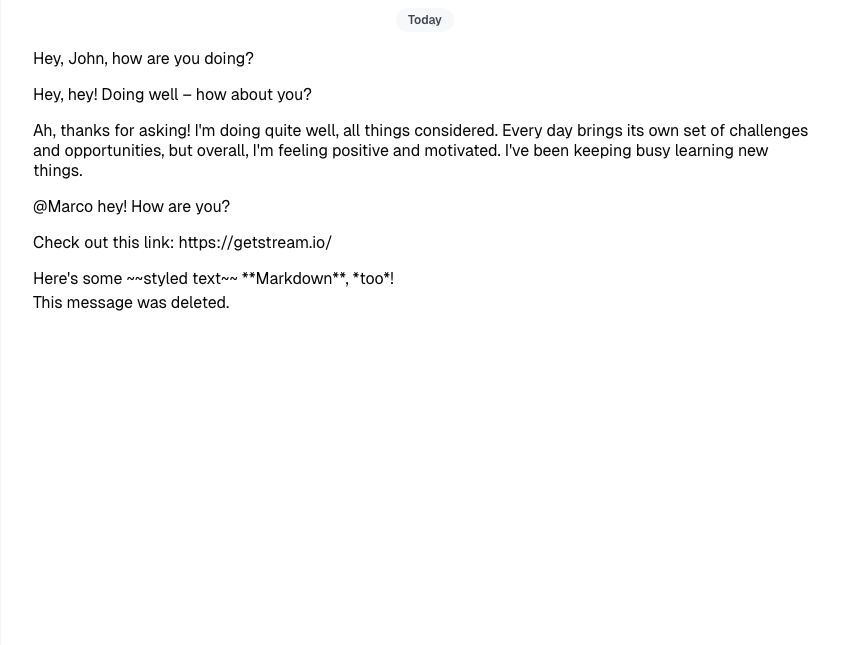
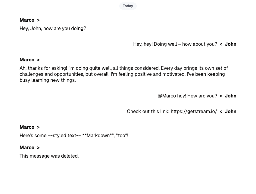
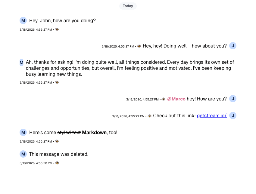
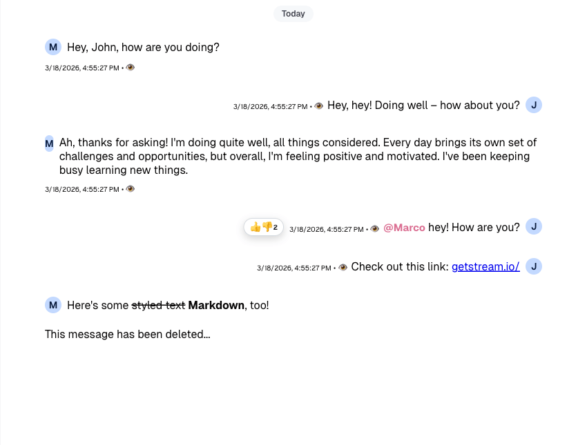
All messages now appear on one side and we can’t tell who sent them. Let’s fix that with CSS and render the sender name via message.user.
Our message will be on the right and the message of the other senders will be on the left side of the screen.
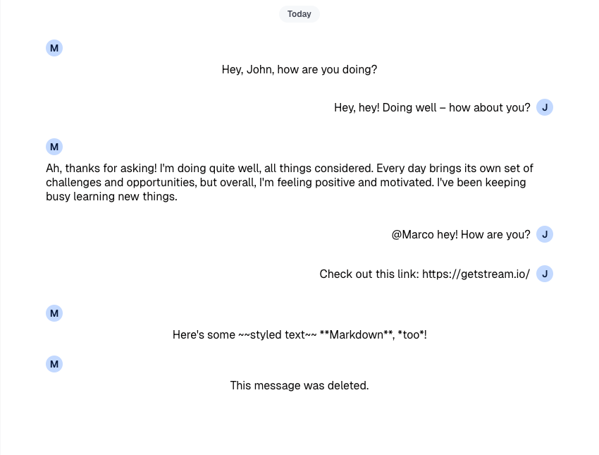
This already looks better, but we can do more. Let’s switch to avatars using the pre-built Avatar component.
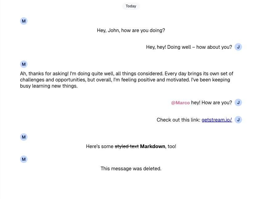
Our UI looks good, but what about complex text (links, mentions, markdown)? Right now it’s plain text and not interactive.
Let’s improve this by using MessageText, which uses renderText to turn links, mentions, and Markdown into interactive elements.
Mention highlights don’t include a default click handler. See the Mentions Actions guide for more.
Metadata
So far we’ve covered avatars and text rendering, but the UI still feels sparse. Let’s add creation date, “edited” status, and delivery/read indicators.
Message grouping is handled by the SDK. Each message wrapper gets a class, so you can show metadata only when it makes sense and keep the UI clean.
.custom-message-ui__metadata {
  /* removed-line */
  display: flex;
  /* added-line */
  display: none;
  font-size: x-small;
  align-items: baseline;
}

/* added-block-start */
.str-chat__li--bottom .custom-message-ui__metadata,
.str-chat__li--single .custom-message-ui__metadata {
  display: flex;
}
/* added-block-end */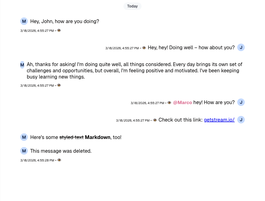
You can utilize MessageContext properties firstOfGroup, endOfGroup, and groupedByUser if you use VirtualizedMessageList for conditional metadata rendering. These properties are not available in regular MessageList.
The SDK also provides MessageStatus and MessageTimestamp. They include extra logic and cover most use cases, so we won’t replace them here.
Message Actions
So far we’ve focused on presentation. Beyond mentions and links, there’s little interactivity. Next, we’ll add message actions (delete, reply, pin, etc.) and reactions.
MessageContext provides message data and handlers. To implement a subset of actions, use handleDelete, handlePin, handleFlag, and handleThread and wire them to your UI buttons. Treat handleDelete() as async in custom UIs so you can recover from server-side delete failures if your app needs to.
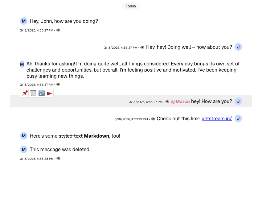
Now that actions are enabled, we also need UI that reflects message state. We already handle the "pinned" state via message.pinned. See the Pin Indicator guide for more options. Let’s cover a few remaining pieces.
The following code samples contain only the code related to the appropriate components, if you're following along you can copy and add the following examples to whatever you have created up until now. The whole example is at the bottom of this guide.
Thread and Reply Count
First - upon opening a thread and replying to a message, the message's property reply_count changes; let's add the count indicator button beside the rest of the metadata elements so the end users can access the thread from two places.
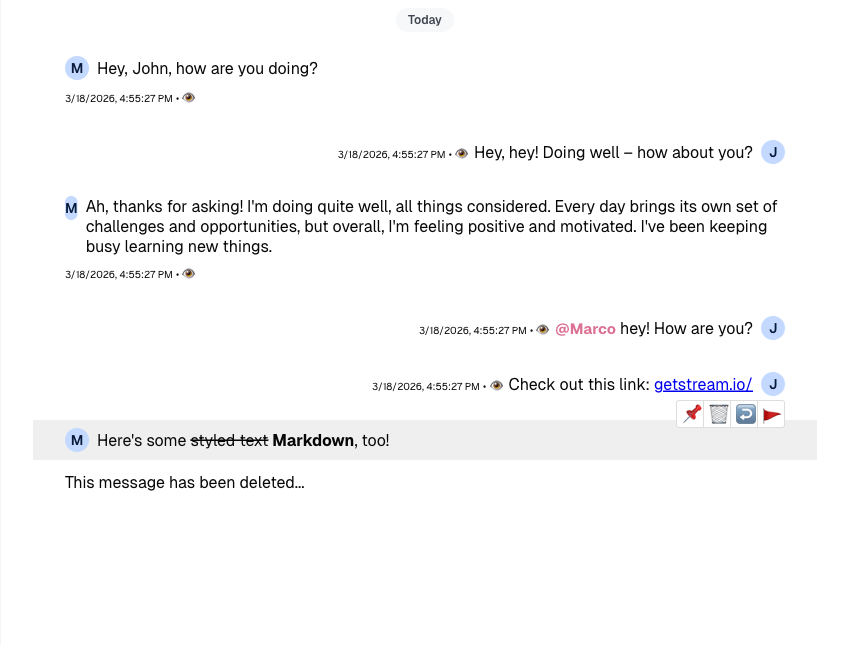
Deleted Message
If you allow soft delete, render a different UI for deleted messages. Check the broader deleted-message state instead of only message.deleted_at, because the default SDK UI also treats message.type === "deleted" and message.deleted_for_me as deleted-message states.
const CustomMessageUi = () => {
  const { isMyMessage, message } = useMessageContext();

  const messageUiClassNames = ["custom-message-ui"];
  const isDeleted = Boolean(
    message.deleted_at || message.type === "deleted" || message.deleted_for_me,
  );

  if (isMyMessage()) {
    messageUiClassNames.push("custom-message-ui--mine");
  } else {
    messageUiClassNames.push("custom-message-ui--other");
  }

  return (
    <div className={messageUiClassNames.join(" ")} data-message-id={message.id}>
      // added-block-start
      {isDeleted && (
        <div className="custom-message-ui__body">
          This message has been deleted...
        </div>
      )}
      {!isDeleted && (
        <>
          <div className="custom-message-ui__body">
            <Avatar
              imageUrl={message.user?.image}
              size="sm"
              userName={message.user?.name || message.user?.id}
            />
            <MessageText />
          </div>
          <CustomMessageUiMetadata />
          <CustomMessageUiActions />
        </>
      )}
      // added-block-end
    </div>
  );
};
Reactions
With message actions in place, the UI is more interactive but still incomplete. Next we’ll add a simple reactions selector (thumbs up/down) by reusing MessageReactions. Start by defining customReactionOptions (see Reactions Customization) and registering them in ComponentContext with WithComponents.
const customReactionOptions = [
  { name: "Thumbs up", type: "+1", Component: () => <>👍</> },
  { name: "Thumbs down", type: "-1", Component: () => <>👎</> },
];

<WithComponents
  overrides={{
    Message: CustomMessageUi,
    reactionOptions: customReactionOptions,
  }}
>
  <Channel>...</Channel>
</WithComponents>;
And now that's done we can continue by extending our CustomMessageUiActions component using these newly defined options.
const CustomMessageUiActions = () => {
  const {
    handleDelete,
    handleFlag,
    handleOpenThread,
    handlePin,
    // added-line
    handleReaction,
    message,
    threadList,
  } = useMessageContext();

  // added-line
  const { reactionOptions = [] } = useComponentContext();

  const onDelete = async () => {
    try {
      await handleDelete();
    } catch {
      // The SDK already shows its default delete error notification.
    }
  };

  if (threadList) return null;

  return (
    <div className="custom-message-ui__actions">
      <div className="custom-message-ui__actions-group">
        <button onClick={handlePin} title={message.pinned ? "Unpin" : "Pin"}>
          {message.pinned ? "📍" : "📌"}
        </button>
        <button onClick={onDelete} title="Delete">
          🗑️
        </button>
        <button onClick={handleOpenThread} title="Open thread">
          ↩️
        </button>
        <button onClick={handleFlag} title="Flag message">
          🚩
        </button>
      </div>
      // added-block-start
      <div className="custom-message-ui__actions-group">
        {reactionOptions.map(({ Component, name, type }) => (
          <button
            key={type}
            onClick={(e) => handleReaction(type, e)}
            title={`React with: ${name}`}
          >
            <Component />
          </button>
        ))}
      </div>
      // added-block-end
    </div>
  );
};
Finally, we can add the MessageReactions component to our CustomMessageUi component and adjust the styles accordingly.
Complete Example
Attachments
The topic of attachments is pretty substantial by itself, so we won't be covering it in this guide. Please, refer to the source code of our default MessageSimple for details on implementation and see the Custom Attachment guide for more customization options.
Read More
Functionalities relevant to the Message UI component that are also not covered in this guide:
- Edit Message functionality
- Message Bounced functionality
- Permissions of the message actions