 React
React iOS
iOS Android
 Flutter
 Angular
 JavaScript
 Unity
Unity Unreal
 Node
Node Python
 Ruby
Ruby PHP
PHP Java
Java .NET
.NET Go
Go REST
REST.str-chat__message--pinned .str-chat__message-bubble::before {
content: "📌";
display: flex;
align-items: center;
justify-content: center;
position: absolute;
background-color: papayawhip;
font-size: 0.6rem;
width: 1.4rem;
height: 1.4rem;
border-radius: 9999px;
z-index: 1;
top: -10px;
}
.str-chat__message--other.str-chat__message--pinned
.str-chat__message-bubble::before {
right: -10px;
}
.str-chat__message--me.str-chat__message--pinned
.str-chat__message-bubble::before {
left: -10px;
}Pin Indicator
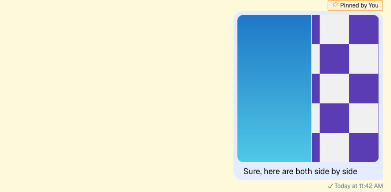
This example shows how to create a custom pin indicator for pinned messages. Pinned messages highlight important content.
Best Practices
- Use CSS-only pins for simple visuals; use components for richer data.
- Ensure pinned indicators don’t obscure message content.
- Respect permission rules for who can pin/unpin.
- Keep pin UI consistent between channel and thread views.
- Test pinned messages in grouped and quoted contexts.
Custom Pin Indicator
CSS Based Solution
Start with a simple CSS-only approach. The required classes are already toggled. Add a ::before pseudo-element with a pin icon when a message is pinned.
Component Based Solution
CSS is less flexible for JS interactions, so a component-based solution is useful. Here we show the user who pinned the message. Register your component with WithComponents so the nested message UI can read it from ComponentContext.
Read More
See Permissions v2 for pinning permissions.