 React
React iOS
iOS Android
 Flutter
 Angular
 JavaScript
 Unity
Unity Unreal
 Node
Node Python
 Ruby
Ruby PHP
PHP Java
Java .NET
.NET Go
Go REST
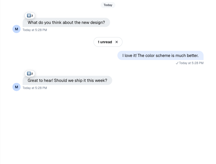
RESTimport { Channel, WithComponents } from "stream-chat-react";
const customReactionOptions = {
quick: {
arrow_down: {
Component: () => <>⬇️</>,
name: "Down vote",
},
arrow_up: {
Component: () => <>⬆️</>,
name: "Up vote",
},
},
extended: {
arrow_down: {
Component: () => <>⬇️</>,
name: "Down vote",
},
arrow_up: {
Component: () => <>⬆️</>,
name: "Up vote",
},
fire: {
Component: () => <>🔥</>,
name: "Fire",
},
},
};
export const WrappedChannel = ({ children }) => (
<WithComponents overrides={{ reactionOptions: customReactionOptions }}>
<Channel>{children}</Channel>
</WithComponents>
);Reactions Customization
This example shows how to customize the SDK reaction surfaces for a channel subtree.
Best Practices
- Keep custom reactions aligned with your product’s interaction model.
- Register shared reaction options through
WithComponentsso the selector and list stay in sync. - Prefer the
{ quick, extended }shape when you need different sets for the compact selector and expanded picker. - Keep custom reaction handlers permission-aware and idempotent.
- Test custom reactions in both channel and thread message lists.
- If you replace the reactions detail dialog, decide whether to keep the built-in add-reaction step via
ReactionSelectorExtendedList.
Shared Reaction Options
reactionOptions lives in ComponentContext, so the usual override path is WithComponents.
MessageReactions reads reactionOptions from ComponentContext. Keep reaction-option customization in WithComponents so ReactionSelector, MessageReactions, and MessageReactionsDetail stay aligned.
Override The Default Reaction Surfaces
Use WithComponents to replace ReactionSelector, MessageReactions, or MessageReactionsDetail.
import {
  Channel,
  MessageReactions,
  MessageReactionsDetail,
  ReactionSelector,
  ReactionSelectorExtendedList,
  WithComponents,
} from "stream-chat-react";

const CustomReactionSelector = (props) => <ReactionSelector {...props} />;

const CustomMessageReactions = (props) => (
  <MessageReactions {...props} visualStyle="segmented" />
);

const CustomMessageReactionsDetail = (props) => (
  <MessageReactionsDetail {...props} />
);
const CustomReactionSelectorExtendedList = (props) => (
  <ReactionSelectorExtendedList {...props} />
);

export const WrappedChannel = ({ children }) => (
  <WithComponents
    overrides={{
      MessageReactionsDetail: CustomMessageReactionsDetail,
      ReactionSelectorExtendedList: CustomReactionSelectorExtendedList,
      ReactionSelector: CustomReactionSelector,
      MessageReactions: CustomMessageReactions,
    }}
  >
    <Channel>{children}</Channel>
  </WithComponents>
);
When you customize the detail view, keep the current all-reactions behavior in mind:
selectedReactionType={null}means "show all reactions"- clicking the active reaction filter again should reset it back to
null - when no reaction type is selected, the default detail view can show the emoji for each user row
- the add-reaction button inside the detail dialog opens
ReactionSelectorExtendedList
If you want the default loading skeleton in a custom detail surface, reuse the exported loading indicator:
import { MessageReactionsDetailLoadingIndicator } from "stream-chat-react";

const CustomReactionsDetailLoadingState = () => (
  <MessageReactionsDetailLoadingIndicator />
);
If you need to handle very large reaction sets, note that the default MessageReactions trigger does not open the detail dialog once a message exceeds 1000 reactions. That guard lives in the stock component, so a fully custom MessageReactions override is the escape hatch.
Here's the difference between the two visualStyle options for MessageReactions:
| Clustered | Segmented |
|---|---|
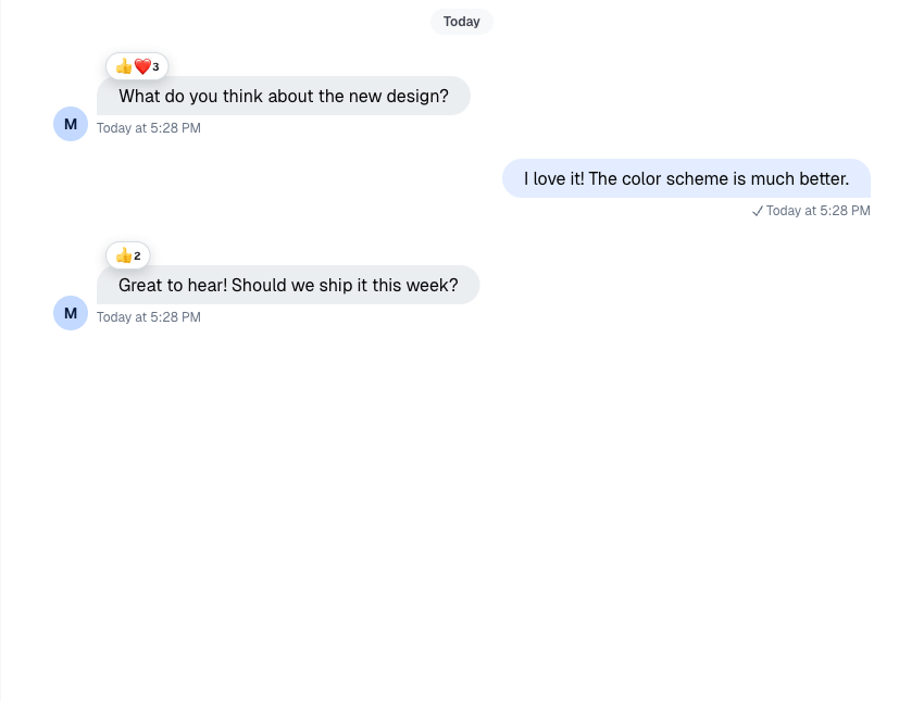 | 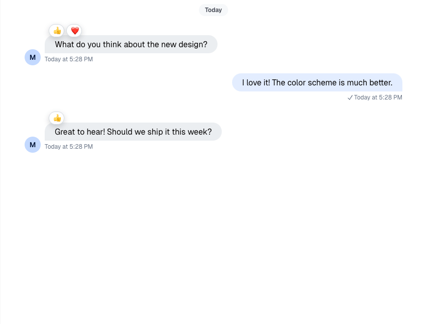 |
Custom Reaction Handler
If you want to change behavior without replacing the whole selector UI, wrap ReactionSelector and override handleReaction.
import { useCallback } from "react";
import {
  Channel,
  ReactionSelector,
  WithComponents,
  useChannelStateContext,
  useMessageContext,
} from "stream-chat-react";

const CustomReactionSelector = (props) => {
  const {
    message: { id: messageId, own_reactions: ownReactions = [] },
  } = useMessageContext("CustomReactionSelector");
  const { channel } = useChannelStateContext("CustomReactionSelector");

  const handleReaction = useCallback(
    async (reactionType, event) => {
      console.log({ event });

      const hasReactedWithType = ownReactions.some(
        (reaction) => reaction.type === reactionType,
      );

      if (hasReactedWithType) {
        await channel.deleteReaction(messageId, reactionType);
        return;
      }

      await channel.sendReaction(messageId, { type: reactionType });
    },
    [channel, messageId, ownReactions],
  );

  return <ReactionSelector {...props} handleReaction={handleReaction} />;
};

export const WrappedChannel = ({ children }) => (
  <WithComponents overrides={{ ReactionSelector: CustomReactionSelector }}>
    <Channel>{children}</Channel>
  </WithComponents>
);
Read More
The reference page for the current reaction surfaces lives here: