 React
React iOS
iOS Android
 Flutter
 Angular
 JavaScript
 Unity
Unity Unreal
 Node
Node Python
 Ruby
Ruby PHP
PHP Java
Java .NET
.NET Go
Go REST
RESTimport "stream-chat-react/dist/css/index.css";
import "stream-chat-react/dist/css/emoji-picker.css";Emoji Picker
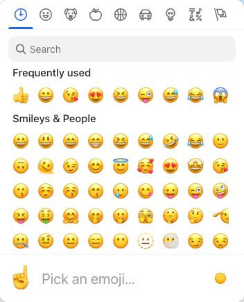
The SDK includes an EmojiPicker built on emoji-mart. It’s disabled by default. To enable it, install the emoji-mart packages, import the dedicated picker stylesheet, and register EmojiPicker through WithComponents. See the Basic Usage section.
Best Practices
- Enable the picker only when emoji usage is a core part of your UX.
- Import the dedicated picker stylesheet when you use the SDK
EmojiPicker. - Keep picker placement aligned with your app’s z-index and overflow rules.
- Set
closeOnEmojiSelectbased on input density and user flow. - Avoid heavy picker props that slow input responsiveness.
- Ensure emoji fonts render consistently across platforms.
Props
Setup
When you use the SDK picker, import its standalone stylesheet in addition to the main chat styles:
If your app uses CSS layers, import the picker stylesheet into the same layer strategy as your other chat styles:
@import url("stream-chat-react/dist/css/emoji-picker.css") layer(stream-plugins);Register the picker through WithComponents:
import { Channel, WithComponents } from "stream-chat-react";
import { EmojiPicker } from "stream-chat-react/emojis";

<WithComponents overrides={{ EmojiPicker }}>
  <Channel>{/* ... */}</Channel>
</WithComponents>;| Prop | Description | Type |
|---|---|---|
buttonClassName | Class name for the open/close button. Defaults to str-chat__emoji-picker-button. | string |
ButtonIconComponent | Icon component rendered inside the open/close button. Defaults to EmojiPickerIcon. | React.ComponentType |
closeOnEmojiSelect | Whether the picker closes after selecting an emoji. Defaults to false. | boolean |
pickerContainerClassName | Class name for the picker container. Defaults to str-chat__message-textarea-emoji-picker-container. | string |
pickerProps | Untyped properties forwarded to the emoji-mart Picker. | Partial<{ theme: 'auto' | 'light' | 'dark' } & Record<string, unknown>> |
placement | Floating UI placement for the picker popover. Defaults to "top-end". | PopperLikePlacement |
wrapperClassName | Class name for the wrapper element. Defaults to str-chat__message-textarea-emoji-picker. | string |