















Emoji Picker
This guide shows how to add EmojiPicker to your chat app—no chat experience is complete without emojis.
Best Practices
- Use the SDK
EmojiPickerfor the quickest and most consistent setup. - Keep the picker lightweight to avoid input latency.
- Return focus to the textarea after emoji insertion.
- Hide the picker on selection if your UI is compact.
- Verify emoji rendering across platforms and fonts.
Prerequisites
EmojiPicker is built on emoji-mart. Start by installing the required packages (make sure they meet our peer dependency requirements):
yarn add emoji-mart @emoji-mart/dataVersions prior to 14.11.0 also require @emoji-mart/react, because the SDK imported the React wrapper from that package instead of vendoring it:
yarn add emoji-mart @emoji-mart/data @emoji-mart/reactOn npm that extra package needs a workaround to install on React 19 - see npm and React 19 compatibility.
Import the dedicated picker stylesheet alongside the main chat CSS:
import "stream-chat-react/dist/css/index.css";
import "stream-chat-react/dist/css/emoji-picker.css";
If your app uses CSS layers, you can import the picker stylesheet into your plugin layer instead:
@import url("stream-chat-react/dist/css/emoji-picker.css") layer(stream-plugins);Basic Usage
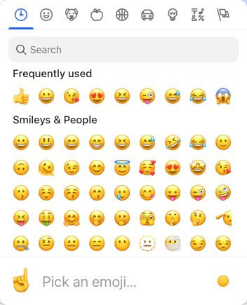
The SDK EmojiPicker includes both the button and picker UI and manages its own open state.
import { Channel, WithComponents } from "stream-chat-react";
import { EmojiPicker } from "stream-chat-react/emojis";

const WrappedChannel = ({ children }) => {
  return (
    <WithComponents overrides={{ EmojiPicker }}>
      <Channel>{children}</Channel>
    </WithComponents>
  );
};
Building custom EmojiPicker component
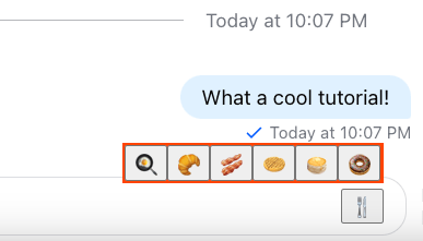
If emoji-mart is too heavy for your use case, you can build your own. Here’s a simple example using native emojis:
import { useState } from "react";
import {
  useMessageComposerContext,
  useMessageComposerController,
} from "stream-chat-react";

const emojis = ["🍳", "🥐", "🥓", "🧇", "🥞", "🍩"];

export const CustomEmojiPicker = () => {
  const [open, setOpen] = useState(false);

  const { textComposer } = useMessageComposerController();
  const { textareaRef } = useMessageComposerContext("CustomEmojiPicker");

  return (
    <div
      id="emoji-picker"
      style={{
        display: "flex",
        alignItems: "flex-end",
        justifyContent: "flex-end",
      }}
    >
      {open && (
        <div
          style={{
            position: "absolute",
            top: "-20px",
            background: "orangered",
            padding: "2px",
          }}
        >
          {emojis.map((emoji) => (
            <button
              key={emoji}
              onClick={() => {
                textComposer.insertText({ text: emoji });
                textareaRef.current?.focus(); // returns focus back to the message input element
              }}
            >
              {emoji}
            </button>
          ))}
        </div>
      )}

      <button onClick={() => setOpen((isOpen) => !isOpen)}>🍴</button>
    </div>
  );
};
npm and React 19 compatibility
Applies only to versions prior to 14.11.0, which require @emoji-mart/react. From 14.11.0 on the SDK vendors that wrapper itself, so you can ignore this section.
@emoji-mart/react declares its React peer as ^16.8 || ^17 || ^18, so npm fails to resolve it against React 19.
Both of the following are required - the override on its own is not enough, since npm validates a newly added package's peer range before it consults overrides:
- Add an
overridesblock to yourpackage.json, mapping the wrapper's React peers onto your app's versions:
{
  "overrides": {
    "@emoji-mart/react": {
      "react": "$react",
      "react-dom": "$react-dom"
    }
  }
}- Pass
--legacy-peer-depson the install itself:
npm install emoji-mart @emoji-mart/data @emoji-mart/react --legacy-peer-depsyarn and pnpm need neither change.