 React
React iOS
iOS Android
 Flutter
 Angular
 JavaScript
 Unity
Unity Unreal
 Node
Node Python
 Ruby
Ruby PHP
PHP Java
Java .NET
.NET Go
Go REST
RESTStreamMessageReactionPicker(
message: message,
onReactionPicked: (reaction) => _addReaction(reaction),
)Message Reactions
The Flutter SDK includes a full set of components for adding emoji reactions to messages. This page covers the reaction picker, reaction detail sheet, and paginated reactor list, along with how to customize their appearance and the available set of reactions.
Overview
The reactions system provides a set of components for displaying, picking, and listing reactions. The key components are:
StreamMessageReactionPicker— the quick-pick reaction bar that appears on long-press or hover. Shows up to five reactions fromdefaultReactionsplus a "+" button for the full emoji grid.ReactionDetailSheet— a bottom sheet showing total reaction count, per-type filter chips, and a paginated list of who reacted. Opened by tapping the reaction summary bar on a message.StreamReactionListView+StreamReactionListController— paginated reactor list and its data source. Used insideReactionDetailSheet, and also exported as a public building block for custom reactor UIs.ReactionIconResolver— abstract contract for customizing which reactions appear in the quick-pick bar and the full emoji grid, and how each reaction type is rendered.
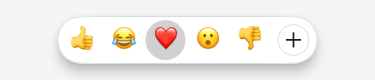
StreamMessageReactionPicker
StreamMessageReactionPicker displays the quick-pick reaction bar. The available reactions come from StreamChatConfigurationData.reactionIconResolver.defaultReactions (five reactions by default). A trailing "+" button opens the full emoji grid showing supportedReactions.
Visual customization is done via StreamReactionPickerTheme:
StreamReactionPickerTheme(
  data: StreamReactionPickerThemeData(
    backgroundColor: Colors.white,
    elevation: 4,
    spacing: 2,
    shape: RoundedRectangleBorder(
      borderRadius: BorderRadius.all(Radius.circular(24)),
    ),
  ),
  child: MyApp(),
)
ReactionIconResolver
ReactionIconResolver is an abstract contract for mapping reaction types to emoji or widgets. It controls:
defaultReactions— the small set shown in the quick-pick barsupportedReactions— the full set shown in the "+" emoji grid (and the add-emoji chip inReactionDetailSheet)
Extend DefaultReactionIconResolver and override only what you need:
class MyReactionIconResolver extends DefaultReactionIconResolver {
  const MyReactionIconResolver();

  // Which reactions appear in the quick-pick bar
  @override
  Set<String> get defaultReactions => const {'like', 'love', 'haha', 'wow', 'sad'};

  // Return a Unicode emoji for a reaction type, or null for fallback
  @override
  String? emojiCode(String type) {
    if (type == 'celebrate') return '🎉';
    return super.emojiCode(type); // delegates to streamSupportedEmojis map
  }
}
Register the resolver globally:
StreamChat(
  client: client,
  configData: StreamChatConfigurationData(
    reactionIconResolver: const MyReactionIconResolver(),
  ),
  child: MyHomePage(),
)
Bringing your own emoji set with custom icons
Each reaction is identified by a type string (e.g. 'like', 'grinning'). That key is what gets stored on the message in the backend. The resolver maps each key to its visual representation — a Unicode glyph or a custom image.
Two sets control which reactions are available:
defaultReactions— the small set (up to 5) shown in the quick-pick bar.supportedReactions— the full set shown in the "+" emoji grid and in the add-emoji chip insideReactionDetailSheet. Both the picker grid and the detail sheet chip honor this set.
Here is a complete example that defines a fully custom set with Unicode emoji:
class BrandedReactionResolver extends DefaultReactionIconResolver {
  const BrandedReactionResolver();

  // Map of reaction type key → Unicode emoji.
  // The key is what gets stored on the message; the value is what the user sees.
  static const Map<String, String> _emojiMap = {
    'grinning':  '😀',
    'heart':     '❤️',
    'thumbsup':  '👍',
    'fire':      '🔥',
    'clap':      '👏',
  };

  /// Types shown in the quick-pick bar (max 5).
  @override
  Set<String> get defaultReactions => const {'grinning', 'heart', 'thumbsup'};

  /// Full grid shown when the user taps "+".
  @override
  Set<String> get supportedReactions => _emojiMap.keys.toSet();

  /// Map a type key to its Unicode glyph.
  @override
  String? emojiCode(String type) => _emojiMap[type];
}
Register it once and it applies to both the quick-pick bar and the full grid:
StreamChat(
  client: client,
  configData: StreamChatConfigurationData(
    reactionIconResolver: const BrandedReactionResolver(),
  ),
  child: MyHomePage(),
)
Using custom image icons (e.g. Twemoji or branded PNGs):
Override resolve to return StreamImageEmoji. Every type that returns an image emoji will render that image instead of a Unicode glyph:
class TwemojiReactionResolver extends DefaultReactionIconResolver {
  const TwemojiReactionResolver();

  static const Map<String, String> _emojiMap = {
    'grinning': '😀',
    'heart':    '❤️',
    'thumbsup': '👍',
  };

  @override
  Set<String> get defaultReactions => _emojiMap.keys.toSet();

  @override
  Set<String> get supportedReactions => _emojiMap.keys.toSet();

  @override
  String? emojiCode(String type) => _emojiMap[type];

  @override
  StreamEmojiContent resolve(String type) {
    // Serve a type as an image from your CDN.
    // The URL can encode the type key, a Unicode codepoint, or any slug.
    // Use stillUrl to provide a non-animated fallback when system animations are disabled.
    if(type == 'grinning') {
      return StreamImageEmoji(
        url: Uri.parse('https://my-cdn/emoji/$type.png'),
      );
    }
    // Other types render as Unicode emoji.
    return super.resolve(type);
  }
}
Customizing the full "+" reaction grid
When a user taps the "+" button in the quick-pick bar (or the add-emoji chip in ReactionDetailSheet), the full emoji grid shows all reactions from ReactionIconResolver.supportedReactions. By default this is the entire streamSupportedEmojis catalog.
To show a curated subset, override supportedReactions on your custom resolver:
class MyReactionIconResolver extends DefaultReactionIconResolver {
  const MyReactionIconResolver();

  // Restrict the quick-pick bar to three reactions.
  @override
  Set<String> get defaultReactions => const {'like', 'love', 'haha'};

  // Restrict the full emoji grid ("+") to the same five reactions.
  @override
  Set<String> get supportedReactions => const {'like', 'love', 'haha', 'wow', 'sad'};
}
The same resolver is registered once on StreamChatConfigurationData and applies to both the quick-pick bar and the full grid automatically.
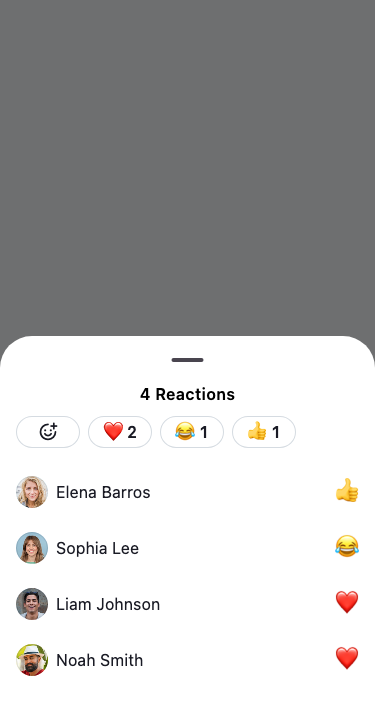
ReactionDetailSheet
ReactionDetailSheet shows a draggable bottom sheet with:
- Total reaction count
- Filter chips per reaction type (using the resolver to render each emoji)
- An add-emoji chip ("+") that opens the same
supportedReactionsgrid - Paginated list of users who reacted
Use the static show method — the constructor is private:
final action = await ReactionDetailSheet.show(
  context: context,
  message: message,
  initialReactionType: 'like', // optional: pre-select a type
);

if (action is SelectReaction) {
  _handleReactionSelected(action.reaction);
}
show returns MessageAction?:
SelectReaction— user picked or removed a reactionnull— sheet dismissed without selection
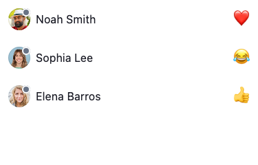
StreamReactionListController
StreamReactionListController loads and paginates reactions for a message. It extends PagedValueNotifier<String?, Reaction>.
final controller = StreamReactionListController(
  client: StreamChat.of(context).client,
  messageId: message.id,
  sort: const [SortOption.desc(ReactionSortKey.createdAt)],
  limit: 25,
);

await controller.doInitialLoad();
Filter reactions by type at runtime (e.g. when user taps a filter chip):
controller.filter = Filter.equal('type', 'like');
controller.doInitialLoad();
Reactions display configuration
Two fields on StreamChatConfigurationData control how the reaction summary bar is displayed relative to the message bubble.
reactionType — sets the visual style used to render the reaction summary bar (StreamReactionsType).
reactionPosition — controls where the reaction bar appears relative to the message bubble (StreamReactionsPosition). Position also controls overlap: StreamReactionsPosition.header (default) renders reactions overlapping the top edge of the bubble; StreamReactionsPosition.footer renders them flush below the bubble without overlap.
StreamChat(
  client: client,
  configData: StreamChatConfigurationData(
    reactionType: StreamReactionsType.expanded,
    reactionPosition: StreamReactionsPosition.header,
  ),
  child: MyApp(),
)
StreamReactionListView
StreamReactionListView renders a paginated list of reactions using a StreamReactionListController. The SDK uses it internally inside ReactionDetailSheet to power the scrollable reactor list. It is also exported as a public building block for building custom reactor list UIs outside the detail sheet.
StreamReactionListView(
  controller: controller,
  itemBuilder: (context, reactions, index) {
    final reaction = reactions[index];
    return ListTile(
      leading: Text(reaction.type),
      title: Text(reaction.user?.name ?? ''),
    );
  },
  emptyBuilder: (_) => const Center(child: Text('No reactions yet')),
)| Parameter | Required | Description |
|---|---|---|
controller | yes | Provides and paginates reaction data |
itemBuilder | yes | Builds each reaction item |
separatorBuilder | no | Builds separators between items |
emptyBuilder | no | Widget shown when there are no reactions |
loadingBuilder | no | Widget shown during initial load |
errorBuilder | no | Widget shown on error |
loadMoreTriggerIndex | no | How many items from end to trigger next page (default: 3) |