 React
React iOS
iOS Android
 Flutter
 Angular
 JavaScript
 Unity
Unity Unreal
 Node
Node Python
 Ruby
Ruby PHP
PHP Java
Java .NET
.NET Go
Go REST
RESTGestureDetector(
onTap: () => showProfile(user),
child: StreamUserAvatar(
user: user,
size: StreamAvatarSize.lg, // 40px diameter
showOnlineIndicator: true,
),
)Avatars
The Flutter SDK provides avatar components for displaying users and channels throughout your chat UI. This page covers the available avatar widgets, their configuration options, and how to customize their appearance using the theme system.
Overview
Avatar components use a StreamAvatarSize enum for sizing. To handle taps, wrap the avatar in a GestureDetector or InkWell.
StreamUserAvatar
Displays a user's avatar with optional online indicator.

StreamChannelAvatar
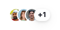
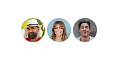
Displays an avatar for a channel. 1:1 channels show the other user's avatar; group channels show a 2×2 avatar grid.
GestureDetector(
  onTap: () => openChannel(channel),
  child: StreamChannelAvatar(
    channel: channel,
    size: StreamAvatarGroupSize.lg,   // 40px
  ),
)| 1:1 channel | Group channel |
|---|---|
|  |
StreamUserAvatarGroup
StreamUserAvatarGroup displays a grid of user avatars. It accepts users (Iterable<User>).
GestureDetector(
  onTap: () => showGroupInfo(),
  child: StreamUserAvatarGroup(
    users: otherMembers.map((m) => m.user!),
    size: StreamAvatarGroupSize.lg,
  ),
)
StreamUserAvatarStack
Displays overlapping user avatars (e.g., thread participants).
StreamUserAvatarStack(
  users: threadParticipants,
  size: StreamAvatarStackSize.xs,   // 20px
  max: 3,
  overlap: 0.33,
)
| Parameter | Type | Default | Description |
|---|---|---|---|
users | Iterable<User> | required | Users to display |
size | StreamAvatarStackSize? | .sm | Avatar size |
max | int | 5 | Max avatars before overflow badge |
overlap | double | 0.33 | Overlap fraction (0.0–1.0) |
Size Reference
StreamAvatarSize
| Enum | Diameter |
|---|---|
.xs | 20px |
.sm | 24px |
.md | 32px |
.lg | 40px |
.xl | 48px |
.xxl | 80px |
StreamAvatarGroupSize
| Enum | Diameter |
|---|---|
.lg | 40px |
.xl | 48px |
.xxl | 80px |
StreamAvatarStackSize
| Enum | Diameter |
|---|---|
.xs | 20px |
.sm | 24px |
Customizing with StreamComponentFactory
StreamComponentFactory provides three avatar slots that let you replace the default rendering at different levels of the component hierarchy. All changes apply to every avatar in the wrapped subtree.
avatar — replace every avatar circle
The avatar slot is the lowest-level hook. Because StreamUserAvatar, StreamChannelAvatar, and StreamUserAvatarGroup all delegate to StreamAvatar internally, a single avatar builder replaces every avatar circle across the whole chat UI.
StreamAvatarProps exposes imageUrl, placeholder, backgroundColor, foregroundColor, showBorder, and size.
StreamComponentFactory(
  builders: StreamComponentBuilders(
    avatar: (context, props) {
      // Square avatar with rounded corners instead of a circle.
      return ClipRRect(
        borderRadius: BorderRadius.circular(8),
        child: props.imageUrl != null
            ? Image.network(props.imageUrl!, fit: BoxFit.cover)
            : Container(
                color: props.backgroundColor,
                child: Builder(builder: props.placeholder),
              ),
      );
    },
  ),
  child: child,
)
avatarGroup — replace the group grid layout
The avatarGroup slot controls how multiple avatars are arranged in a grid, used by StreamChannelAvatar for group channels and StreamUserAvatarGroup.
StreamAvatarGroupProps exposes children (the pre-built avatar widgets) and size.
StreamComponentFactory(
  builders: StreamComponentBuilders(
    avatarGroup: (context, props) {
      // Horizontal row instead of the default 2×2 grid.
      final themeSize = switch (props.size ?? StreamAvatarGroupSize.lg) {
        StreamAvatarGroupSize.lg => StreamAvatarSize.sm,
        StreamAvatarGroupSize.xl => StreamAvatarSize.md,
        StreamAvatarGroupSize.xxl => StreamAvatarSize.xl,
      };
      return StreamAvatarTheme(
        data: StreamAvatarThemeData(size: themeSize),
        child: Row(
          mainAxisSize: MainAxisSize.min,
          children: props.children
              .take(3)
              .map((avatar) => Padding(
                    padding: const EdgeInsets.only(right: 2),
                    child: avatar,
                  ))
              .toList(),
        ),
      );
    },
  ),
  child: child,
)
avatarStack — replace the overlapping stack layout
The avatarStack slot controls the overlapping avatar row used by StreamUserAvatarStack (e.g. thread participants).
StreamAvatarStackProps exposes children, size, overlap, and max.
StreamComponentFactory(
  builders: StreamComponentBuilders(
    avatarStack: (context, props) {
      // Custom layout: 1 medium avatar on top (overlapping the row
      // below by 10%), rest in a small overlapping row (40% overlap).
      final visible = props.children.take(props.max).toList();
      if (visible.isEmpty) return const SizedBox.shrink();

      final topDiameter = StreamAvatarSize.md.value;
      final bottomDiameter = StreamAvatarSize.sm.value;
      final step = bottomDiameter * 0.6;
      final rest = visible.skip(1).toList();
      final bottomRowWidth =
          rest.isEmpty ? 0.0 : bottomDiameter + (rest.length - 1) * step;
      final totalWidth = bottomRowWidth.clamp(topDiameter, double.infinity);
      final topLeft = (totalWidth - topDiameter) / 2;
      final bottomLeft = (totalWidth - bottomRowWidth) / 2;
      final topOverlap = topDiameter * 0.1;
      final totalHeight = topDiameter + bottomDiameter - topOverlap;

      return SizedBox(
        width: totalWidth,
        height: totalHeight,
        child: Stack(
          children: [
            // Top avatar — rendered first so the bottom row paints over
            // it at the overlap, keeping the bottom avatars fully visible.
            Positioned(
              top: 0,
              left: topLeft,
              child: StreamAvatarTheme(
                data: const StreamAvatarThemeData(size: StreamAvatarSize.md),
                child: visible.first,
              ),
            ),
            // Bottom row — rendered last so it appears above the top avatar
            // at the overlap point.
            Positioned(
              top: topDiameter - topOverlap,
              left: bottomLeft,
              child: StreamAvatarTheme(
                data: const StreamAvatarThemeData(size: StreamAvatarSize.sm),
                child: SizedBox(
                  width: bottomRowWidth,
                  height: bottomDiameter,
                  child: Stack(
                    children: [
                      for (var i = 0; i < rest.length; i++)
                        Positioned(left: i * step, child: rest[i]),
                    ],
                  ),
                ),
              ),
            ),
          ],
        ),
      );
    },
  ),
  child: child,
)