 React
React iOS
iOS Android
 Flutter
 Angular
 JavaScript
 Unity
Unity Unreal
 Node
Node Python
 Ruby
Ruby PHP
PHP Java
Java .NET
.NET Go
Go REST
RESTclass ChannelPage extends StatelessWidget {
const ChannelPage({
super.key,
});
@override
Widget build(BuildContext context) {
return Scaffold(
appBar: const StreamChannelHeader(),
body: Column(
children: <Widget>[
Expanded(
child: StreamMessageListView(
threadBuilder: (_, parentMessage) {
return ThreadPage(
parent: parentMessage,
);
},
),
),
StreamMessageComposer(),
],
),
);
}
}StreamMessageComposer
StreamMessageComposer is the full-featured message composer widget, handling text input, media attachments, mentions, commands, quoted replies, and more out of the box. This page explains how to add it to a channel screen, configure its behavior, and customize its appearance. See the pub.dev documentation for the full API reference.
Background
In Stream Chat, we can send messages in a channel. However, sending a message isn't as simple as adding
a TextField and logic for sending a message. It involves additional processes like addition of media,
quoting a message, adding a custom command like a GIF board, and much more. Moreover, most apps also
need to customize the input to match their theme, overall color and structure pattern, etc.
To do this, we created a StreamMessageComposer widget which abstracts all expected functionality a
modern composer needs and allows you to use it out of the box. The widget is responsible for the full
composition flow: typing, sending messages, attaching files, recording voice messages, mentioning
users, running slash commands, and more.
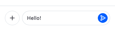
Basic Example
A StreamChannel is required above the widget tree in which the StreamMessageComposer is rendered since the channel is
where the messages sent actually go. Let's look at a common example of how we could use the StreamMessageComposer:
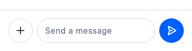
It is common to put this widget in the same page of a StreamMessageListView as the bottom widget.
Make sure to check the StreamMessageComposerController documentation for more information on how to use the controller to manipulate the StreamMessageComposer.
Adding Custom Actions
Custom actions can be added to the composer using the component builder system via StreamComponentFactory. The messageComposerInputLeading slot is empty by default and is designed for adding custom action buttons inside the text input field — to the left of the text area.
Register a custom builder using streamChatComponentBuilders and pass it to StreamChat (or StreamComponentFactory if scoped to a single screen):
StreamChat(
  client: client,
  componentBuilders: StreamComponentBuilders(
    extensions: streamChatComponentBuilders(
      messageComposerInputLeading: (context, props) {
        return IconButton(
          icon: Icon(
            Icons.location_on,
            color: StreamTheme.of(context).colorScheme.textSecondary,
          ),
          onPressed: () {
            // Do something here
          },
        );
      },
    ),
  ),
  child: MyApp(),
)
If you only want the custom action on a specific screen, wrap that screen with StreamComponentFactory instead:
StreamComponentFactory(
  builders: StreamComponentBuilders(
    extensions: streamChatComponentBuilders(
      messageComposerInputLeading: (context, props) {
        return IconButton(
          icon: Icon(
            Icons.location_on,
            color: StreamTheme.of(context).colorScheme.textSecondary,
          ),
          onPressed: () {
            // Do something here
          },
        );
      },
    ),
  ),
  child: StreamMessageComposer(),
)
The props parameter (of type MessageComposerInputLeadingProps) exposes the full composer state, including the controller, onAttachmentButtonPressed, focusNode, and other callbacks you may need in your custom action.
Disable Attachments
To disable attachments being added to the message, set the disableAttachments parameter to true.
StreamMessageComposer(
    disableAttachments: true,
),
Changing Position of Message Composer Components
You can change the position of the send button and actions by using componentBuilders via StreamComponentBuilders.
For example, to move the send button outside the TextField (to the trailing position), use messageComposerInputTrailing to remove it from inside the input, and messageComposerTrailing to render it outside:
StreamComponentFactory(
  builders: StreamComponentBuilders(
    extensions: streamChatComponentBuilders(
      messageComposerInputTrailing: (context, props) =>
          const SizedBox.shrink(),
      messageComposerTrailing: (context, props) =>
          DefaultStreamMessageComposerInputTrailing(props: props),
    ),
  ),
  child: StreamMessageComposer(),
)
Custom composer layout
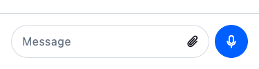
You can combine multiple slots to create a fully custom layout: an emoji icon inside the input on the left, an attachment button inside the input on the right, and a mic/send button that floats outside the input field and switches based on whether there is text.
StreamComponentFactory(
  builders: StreamComponentBuilders(
    extensions: streamChatComponentBuilders(
      messageComposerLeading: (context, props) => const SizedBox.shrink(),
      messageComposerInputLeading: (context, props) => StreamButton.icon(
        icon: Icon(context.streamIcons.emoji),
        type: StreamButtonType.ghost,
        style: StreamButtonStyle.secondary,
        size: StreamButtonSize.small,
        onPressed: () {
          // Open emoji picker
        },
      ),
      messageComposerInputTrailing: (context, props) => StreamButton.icon(
        icon: Icon(context.streamIcons.attachment),
        type: StreamButtonType.ghost,
        style: StreamButtonStyle.secondary,
        size: StreamButtonSize.small,
        onPressed: props.onAttachmentButtonPressed,
      ),
      messageComposerTrailing: (context, props) =>
          CustomComposerTrailingButton(props: props),
    ),
  ),
  child: StreamMessageComposer(
    placeholderBuilder: (context, placeholder) => switch (placeholder) {
      WriteMessagePlaceholder() => 'Type a message...',
      _ => null, // fall back to default for other placeholder types
    },
  ),
)
CustomComposerTrailingButton listens to the controller and shows a mic button when the input is empty, switching to a send button as soon as the user starts typing:
class CustomComposerTrailingButton extends StatefulWidget {
  const CustomComposerTrailingButton({super.key, required this.props});

  final MessageComposerComponentProps props;

  @override
  State<CustomComposerTrailingButton> createState() =>
      _CustomComposerTrailingButtonState();
}

class _CustomComposerTrailingButtonState
    extends State<CustomComposerTrailingButton> {
  var _isEmptyText = true;

  @override
  void initState() {
    super.initState();
    widget.props.controller.addListener(_updateIsEmptyText);
  }

  void _updateIsEmptyText() {
    final isEmptyText = widget.props.controller.text.trim().isEmpty;
    if (_isEmptyText != isEmptyText) {
      setState(() => _isEmptyText = isEmptyText);
    }
  }

  @override
  void dispose() {
    widget.props.controller.removeListener(_updateIsEmptyText);
    super.dispose();
  }

  @override
  Widget build(BuildContext context) {
    return _isEmptyText
        ? StreamButton.icon(
            icon: Icon(context.streamIcons.voice),
            type: StreamButtonType.solid,
            style: StreamButtonStyle.primary,
            size: StreamButtonSize.medium,
            onPressed: () {
              // Start voice recording
            },
          )
        : StreamButton.icon(
            icon: Icon(context.streamIcons.send),
            type: StreamButtonType.solid,
            style: StreamButtonStyle.primary,
            size: StreamButtonSize.medium,
            onPressed: widget.props.onSendPressed,
          );
  }
}
Adding content above the input field
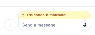
Use the messageComposerInputHeader slot to render content above the text entry row, inside the bordered composer surface. The default implementation renders the quoted-message preview, the attachment preview strip, and the OG link preview. Override it to add a custom banner, a status bar, or additional controls.
StreamComponentFactory(
  builders: StreamComponentBuilders(
    extensions: streamChatComponentBuilders(
      messageComposerInputHeader: (context, props) {
        // Replace the default header with a custom banner.
        // The default header renders quoted-message previews, attachment
        // previews, and OG link previews. Override it here and handle those
        // states yourself if needed (check props.controller.quotedMessage,
        // props.controller.ogAttachment, etc.) or omit them if you don't
        // need that behaviour.
        return Container(
          padding: const EdgeInsets.symmetric(horizontal: 12, vertical: 8),
          color: Colors.amber.shade50,
          child: const Row(
            children: [
              Icon(Icons.warning_amber_rounded, size: 16),
              SizedBox(width: 8),
              Text('This channel is moderated', style: TextStyle(fontSize: 12)),
            ],
          ),
        );
      },
    ),
  ),
  child: StreamMessageComposer(),
)
MessageComposerInputHeaderProps exposes the full composer state via props.controller, so you can conditionally show or hide header content based on whether there is a quoted message, ongoing attachments, or a link preview.
Thread: "Also Send to Channel" Checkbox
Use canAlsoSendToChannelFromThread to control whether the "also send to channel" checkbox appears in threads. It defaults to true.
// Hide the "also send to channel" checkbox
StreamMessageComposer(
  canAlsoSendToChannelFromThread: false,
)
Slow Mode
When slow mode is enabled on a channel, users must wait a cooldown period between messages. The composer automatically reflects this state: the send button is disabled and the input placeholder shows a live countdown until the user can send again.
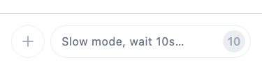
No additional configuration is needed — the composer reads the remaining cooldown from the channel and updates the UI automatically.
On this page: