 React
React iOS
iOS Android
 Flutter
 Angular
 JavaScript
 Unity
Unity Unreal
 Node
Node Python
 Ruby
Ruby PHP
PHP Java
Java .NET
.NET Go
Go REST
REST@import "stream-chat-react/dist/scss/v2/index.scss" layer(stream);Introduction
The SDK ships with default CSS that you can override.
Best Practices
- Start with CSS variables before overriding selectors to keep upgrades painless.
- Use CSS layers (
stream,stream-overrides) so overrides remain readable and conflict-free. - Scope theme changes to
.str-chatto avoid leaking styles into the rest of the app. - Use component variables when you need targeted changes without global side effects.
- If you build a full custom theme, import layout-only styles and recreate visuals intentionally.
Importing the stylesheet
Most examples use the CSS layers API. See CSS overrides for details.
Customization
The theming system supports both small and large UI changes. This document walks through the available options.
CSS variables
CSS variables are the easiest way to customize the theme. They’re organized into two scopes:
- global
- component
Global variables
Use global variables to change the overall chat UI (instead of individual components).
The full list of global variables can be found in our global variables guide.
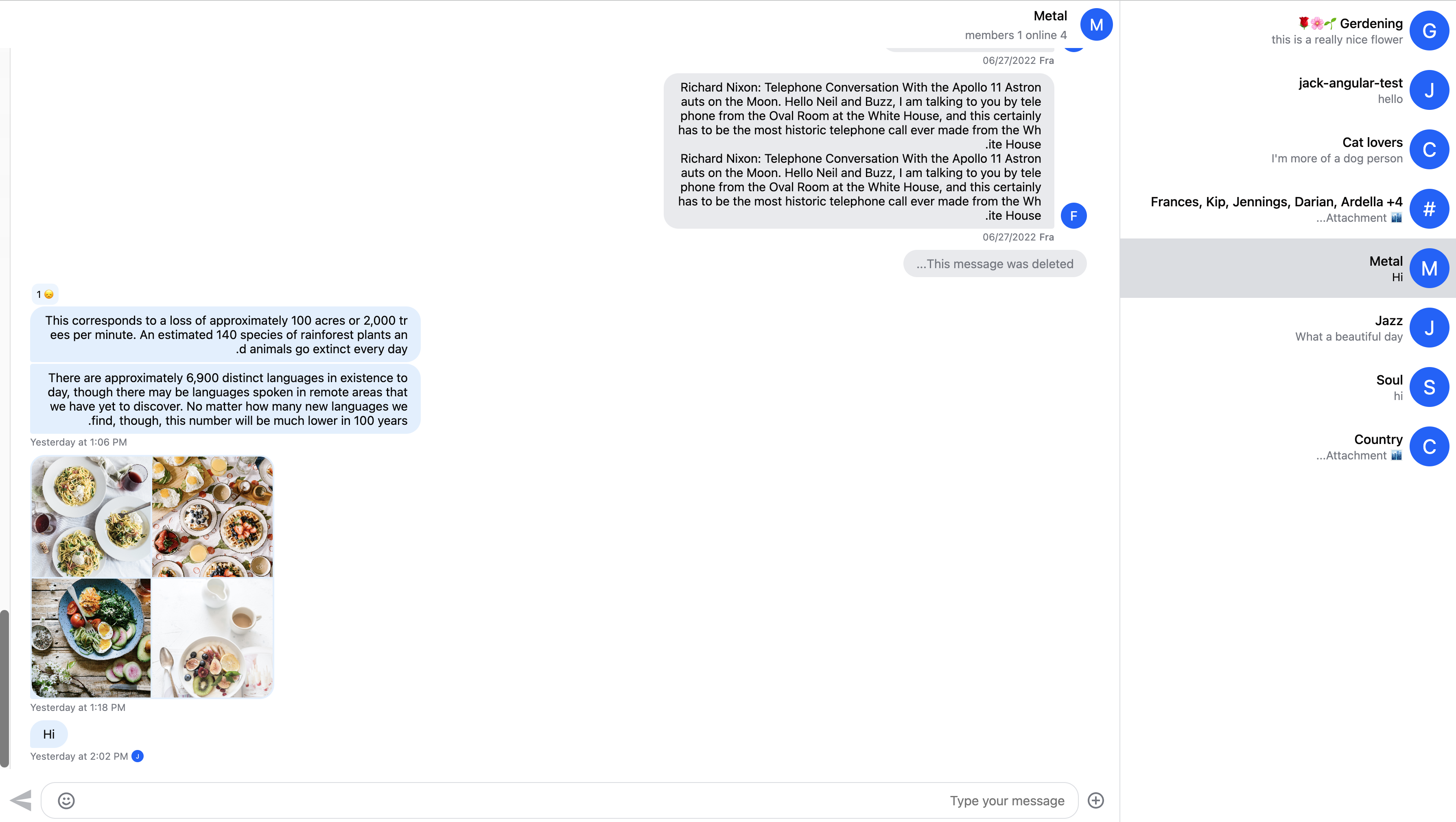
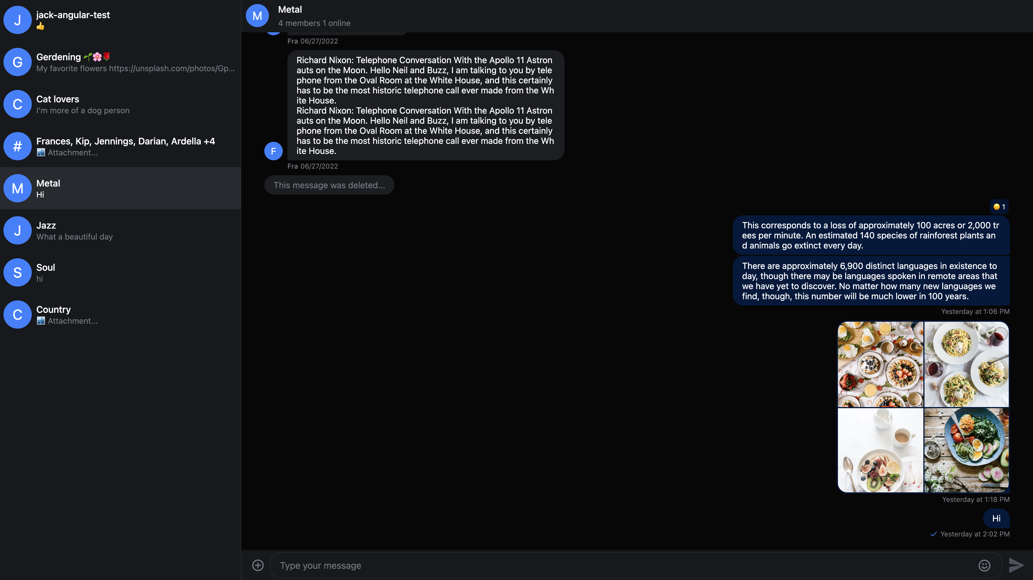
Here is the default chat UI:
Here is how you can customize global variables:
@layer stream, stream-overrides;
@import "stream-chat-react/dist/scss/v2/index.scss" layer(stream);
@layer stream-overrides {
.str-chat {
--str-chat__primary-color: #009688;
--str-chat__active-primary-color: #004d40;
--str-chat__surface-color: #f5f5f5;
--str-chat__secondary-surface-color: #fafafa;
--str-chat__primary-surface-color: #e0f2f1;
--str-chat__primary-surface-color-low-emphasis: #edf7f7;
--str-chat__border-radius-circle: 6px;
}
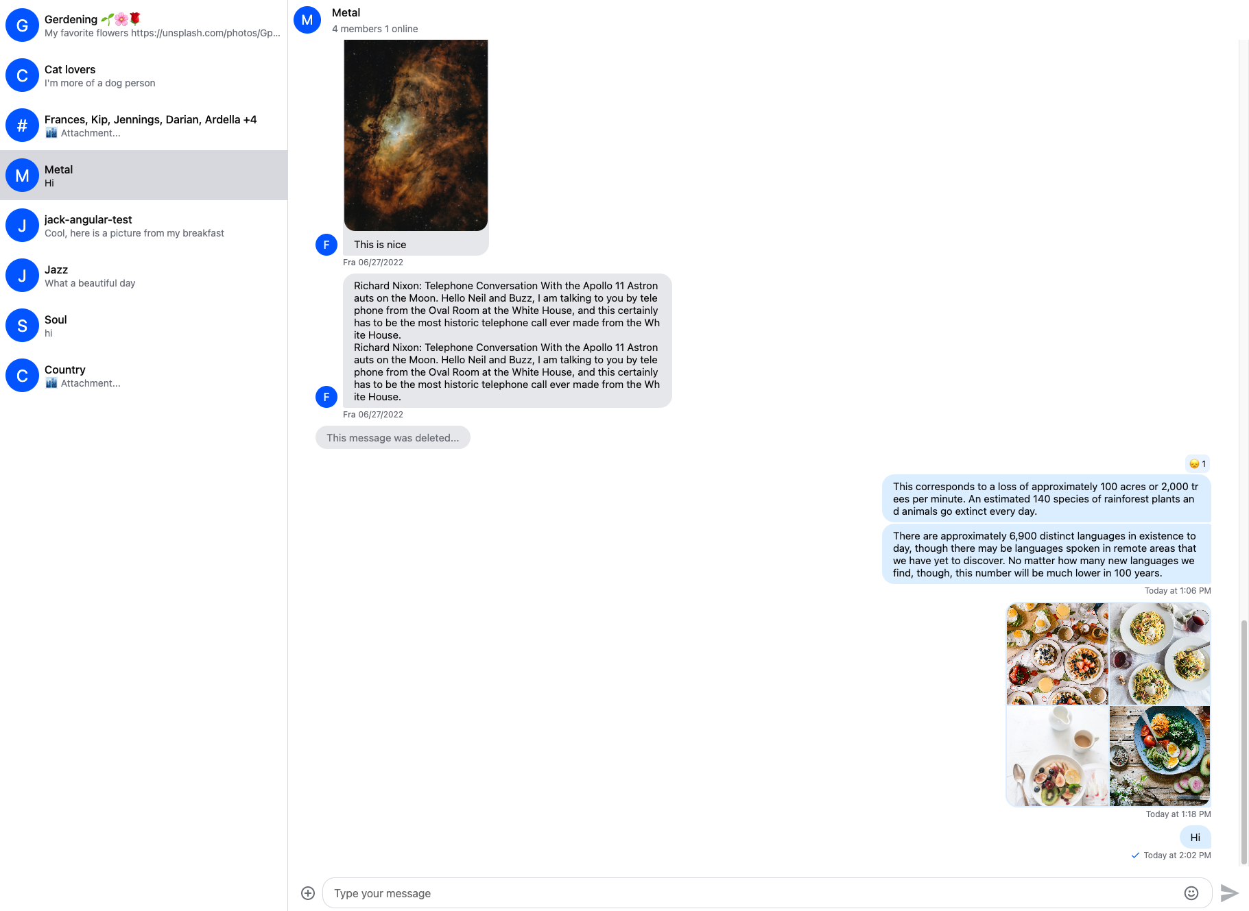
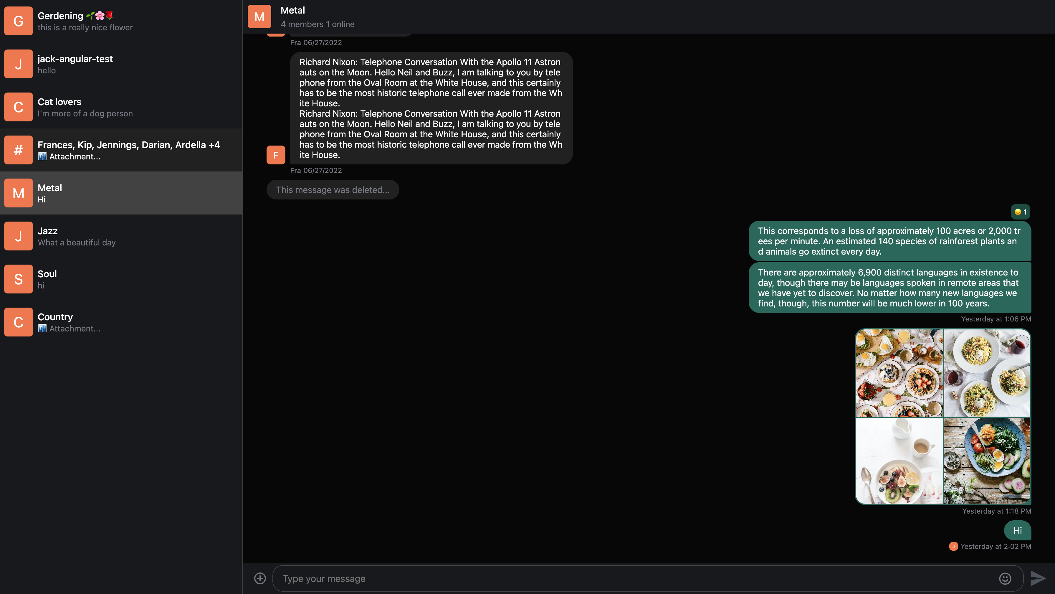
}Here is the result:
The str-chat class is applied to the ChannelList and Channel components, all CSS variables are declared on this level.
Component variables
You can use component layer variables to change the design of individual components. The full list of component variables can be found in our component variables guide.
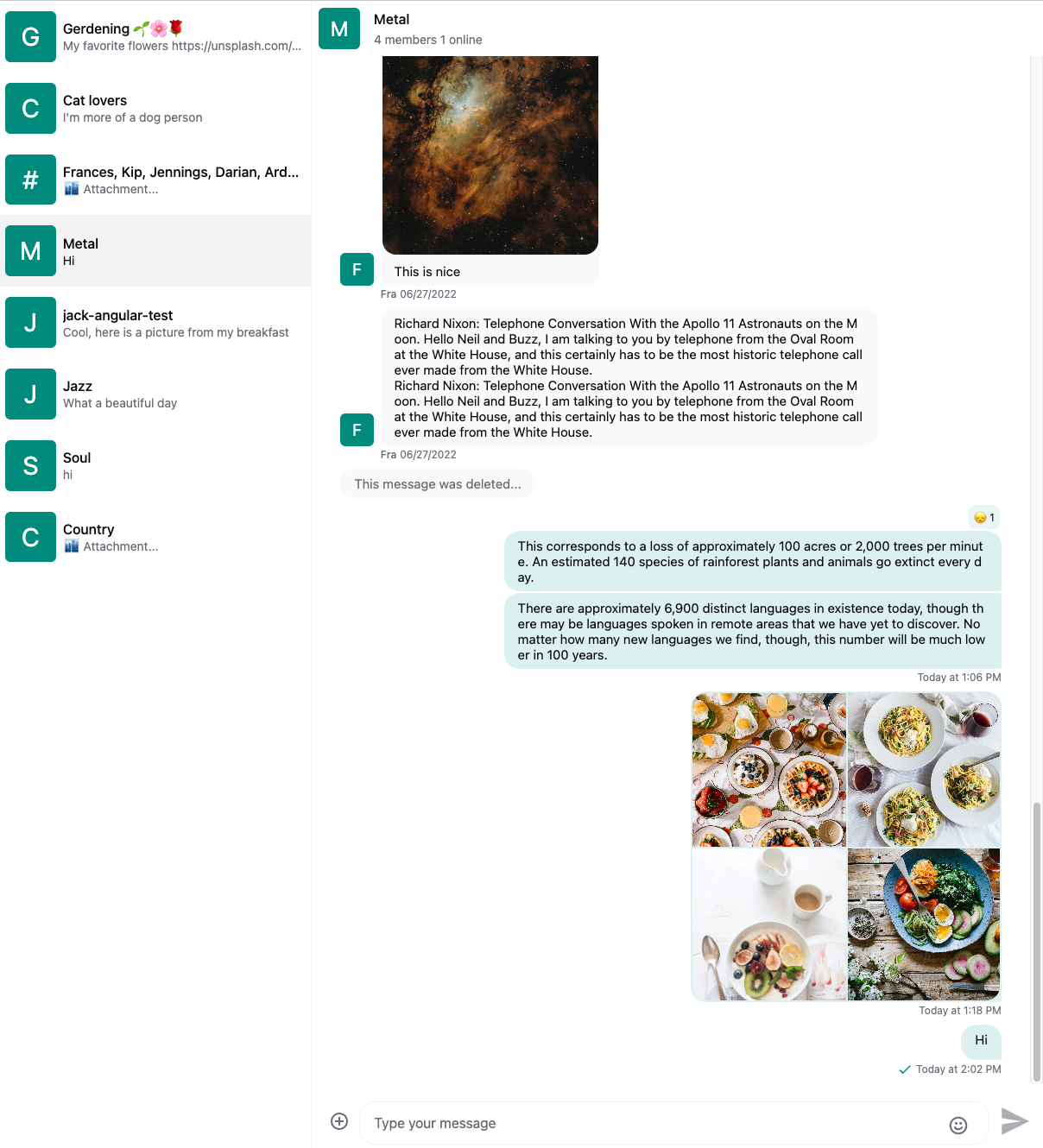
In the above example we set the avatar background color by setting the --str-chat__primary-color variable which also sets the color of other UI elements. If we want to change the background color only for the avatar component we can use the --str-chat__avatar-background-color variable:
@layer stream-overrides {
  .str-chat {
    --str-chat__primary-color: #009688;
    --str-chat__active-primary-color: #004d40;
    --str-chat__surface-color: #f5f5f5;
    --str-chat__secondary-surface-color: #fafafa;
    --str-chat__primary-surface-color: #e0f2f1;
    --str-chat__primary-surface-color-low-emphasis: #edf7f7;
    --str-chat__border-radius-circle: 6px;
    --str-chat__avatar-background-color: #bf360c; // Only changes the background color of the avatar component
  }
}
Here is the result:
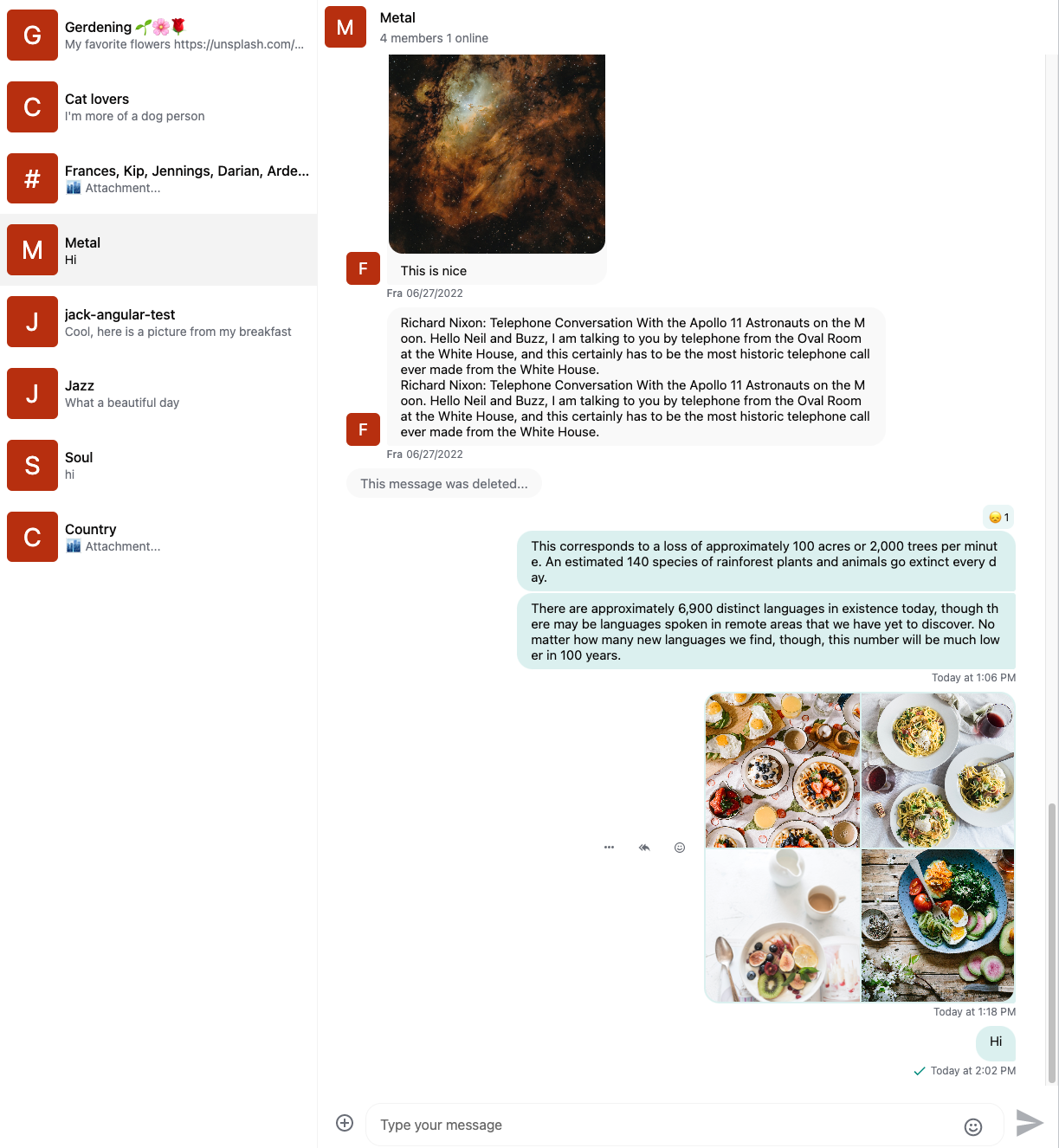
Component variables don’t inherit. Here’s an example.
Here is the message component without custom color:
Setting custom text color inside message bubble:
@layer stream-overrides {
  .str-chat {
    --str-chat__primary-color: #009688;
    --str-chat__active-primary-color: #004d40;
    --str-chat__surface-color: #f5f5f5;
    --str-chat__secondary-surface-color: #fafafa;
    --str-chat__primary-surface-color: #e0f2f1;
    --str-chat__primary-surface-color-low-emphasis: #edf7f7;
    --str-chat__border-radius-circle: 6px;
    --str-chat__avatar-background-color: #bf360c;
    --str-chat__message-bubble-color: #00695c; // Custom text color only for the message bubble
  }
}
Setting the message bubble text color doesn’t affect link attachments.
To solve this we also have to set the text color for the link attachment component:
@layer stream-overrides {
  .str-chat {
    --str-chat__primary-color: #009688;
    --str-chat__active-primary-color: #004d40;
    --str-chat__surface-color: #f5f5f5;
    --str-chat__secondary-surface-color: #fafafa;
    --str-chat__primary-surface-color: #e0f2f1;
    --str-chat__primary-surface-color-low-emphasis: #edf7f7;
    --str-chat__border-radius-circle: 6px;
    --str-chat__avatar-background-color: #bf360c;
    --str-chat__message-bubble-color: #00695c;
    --str-chat__card-attachment-color: #00695c; // Setting text color of link attachments
  }
}
CSS overrides
If you need overrides beyond CSS variables, override the default CSS. We recommend using CSS layers and ordering your stream-overrides layer after stream. This lets your selectors stay simple and keeps overrides easy to test.
ReactionsList Placement Example
To change the placement of the ReactionsList (from top to bottom of the message) without layers you'd have to define your selectors like this:
@import "stream-chat-react/dist/scss/v2/index.scss";

.str-chat__message,
.str-chat__quoted-message-preview {
  .str-chat__message-inner {
    grid-template-areas:
      "message-bubble options"
      "reactions reactions";
  }

  &.str-chat__message--me .str-chat__message-inner {
    grid-template-areas:
      "reminder reminder"
      "options message-bubble"
      "reactions reactions";
  }
}
With layers the override becomes a bit simpler and easier to read:
@layer stream, stream-overrides;
@import "stream-chat-react/dist/scss/v2/index.scss" layer(stream);

// you can define overrides in a separate file and import them into a layer
@layer stream-overrides {
  // apply default for all messages
  .str-chat__message-inner {
    grid-template-areas:
      "message-bubble options"
      "reactions reactions";
  }

  // for messages sent by the current user
  .str-chat__message--me .str-chat__message-inner {
    grid-template-areas:
      "reminder reminder"
      "options message-bubble"
      "reactions reactions";
  }
}
While this specific example might not be the most complex you might encounter cases where you'll find yourself having to use !important flag and your stylesheet with overrides becomes convoluted, hard to read and even harder to maintain.
If you're using SCSS it's also possible to import component stylesheets separately (instead of our whole bundled stylesheet) and attach them all to the same "stream" layer:
@layer stream, stream-overrides;
// Use default theme for channel list and channel preview components
@import "stream-chat-react/dist/scss/v2/ChannelList/ChannelList-layout.scss"
  layer(stream);
@import "stream-chat-react/dist/scss/v2/ChannelList/ChannelList-theme.scss"
  layer(stream);
@import "stream-chat-react/dist/scss/v2/ChannelPreview/ChannelPreview-layout.scss"
  layer(stream);
@import "stream-chat-react/dist/scss/v2/ChannelPreview/ChannelPreview-theme.scss"
  layer(stream);
@layer stream-overrides {
.str-chat__avatar {
// Custom CSS for avatar component
}
}Apply your own look and feel
If you want to create a truly custom look and feel, it can be exhausting to override the default styling. In that case, it's possible only to apply layout rules from the default theme.
Here is how you can import the layout stylesheet:
@import "stream-chat-react/dist/scss/v2/index.layout.scss" layer(stream);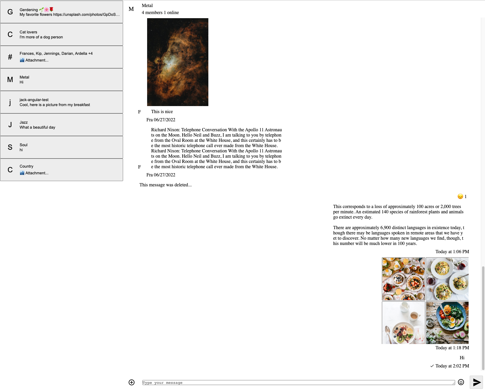
The result will be a minimalistic UI without
- coloring
- fonts
- borders
- shadows
Please note that if you're only using the layout rules, you can only use the layout CSS variables.
Dark and light themes
The default theme has dark and light variants.
Here is how you can switch between the different themes:
<Chat client={client} theme="str-chat__theme-dark">
  {/* ... */}
</Chat>
or only to a specific component (Channel or/and ChannelList):
Using the customClasses approach for either of the components will override default class names. Don't forget to add those to your theme class names (as defined in the snippet) for the styling to work properly.
<Chat
  client={client}
  customClasses={{
    channelList: "str-chat__theme-dark str-chat__channel-list",
    channel: "str-chat__theme-light str-chat__channel",
  }}
>
  {/* ... */}
</Chat>
Here is what the dark theme looks like:
The str-chat__theme-dark/str-chat__theme-light class is applied to the ChannelList and Channel components, these classes are responsible for switching between the dark and light theme color combinations.
Here is how you can provide different color configurations for the dark and light themes:
@layer stream, stream-overrides;
@import "stream-chat-react/dist/scss/v2/index.scss" layer(stream);
@layer stream-overrides {
.str-chat {
--str-chat__border-radius-circle: 6px;
}
.str-chat__theme-light {
--str-chat__primary-color: #009688;
--str-chat__active-primary-color: #004d40;
--str-chat__surface-color: #f5f5f5;
--str-chat__secondary-surface-color: #fafafa;
--str-chat__primary-surface-color: #e0f2f1;
--str-chat__primary-surface-color-low-emphasis: #edf7f7;
--str-chat__avatar-background-color: #bf360c;
}
.str-chat__theme-dark {
--str-chat__primary-color: #26a69a;
--str-chat__active-primary-color: #00796b;
--str-chat__surface-color: #424242;
--str-chat__secondary-surface-color: #212121;
--str-chat__primary-surface-color: #00695c;
--str-chat__primary-surface-color-low-emphasis: #004d40;
--str-chat__avatar-background-color: #ff7043;
}
}Here is the custom dark theme:
Creating your own theme
It's possible to extend the existing themes with your own themes.
Here is an example creating 'round' and 'square' themes:
@layer stream, stream-overrides;
@import "stream-chat-react/dist/scss/v2/index.scss";
@layer stream-overrides {
// Make sure to use the proper naming convention: str-chat__theme-<your theme>
.str-chat__theme-round {
// You can use the predefined theme and component layer variables
--str-chat__border-radius-circle: 999px;
}
.str-chat__theme-square {
--str-chat__border-radius-circle: 6px;
}
}<Chat client={client} theme="str-chat__theme-square">
{/* ... */}
</Chat>or only to a specific component (Channel or/and ChannelList):
Using the customClasses approach for either of the components will override default class names. Don't forget to add those to your theme class names (as defined in the snippet) for the styling to work properly.
<Chat
  client={client}
  customClasses={{
    channelList: "str-chat__theme-square str-chat__channel-list",
    channel: "str-chat__theme-round str-chat__channel",
  }}
>
  {/* ... */}
</Chat>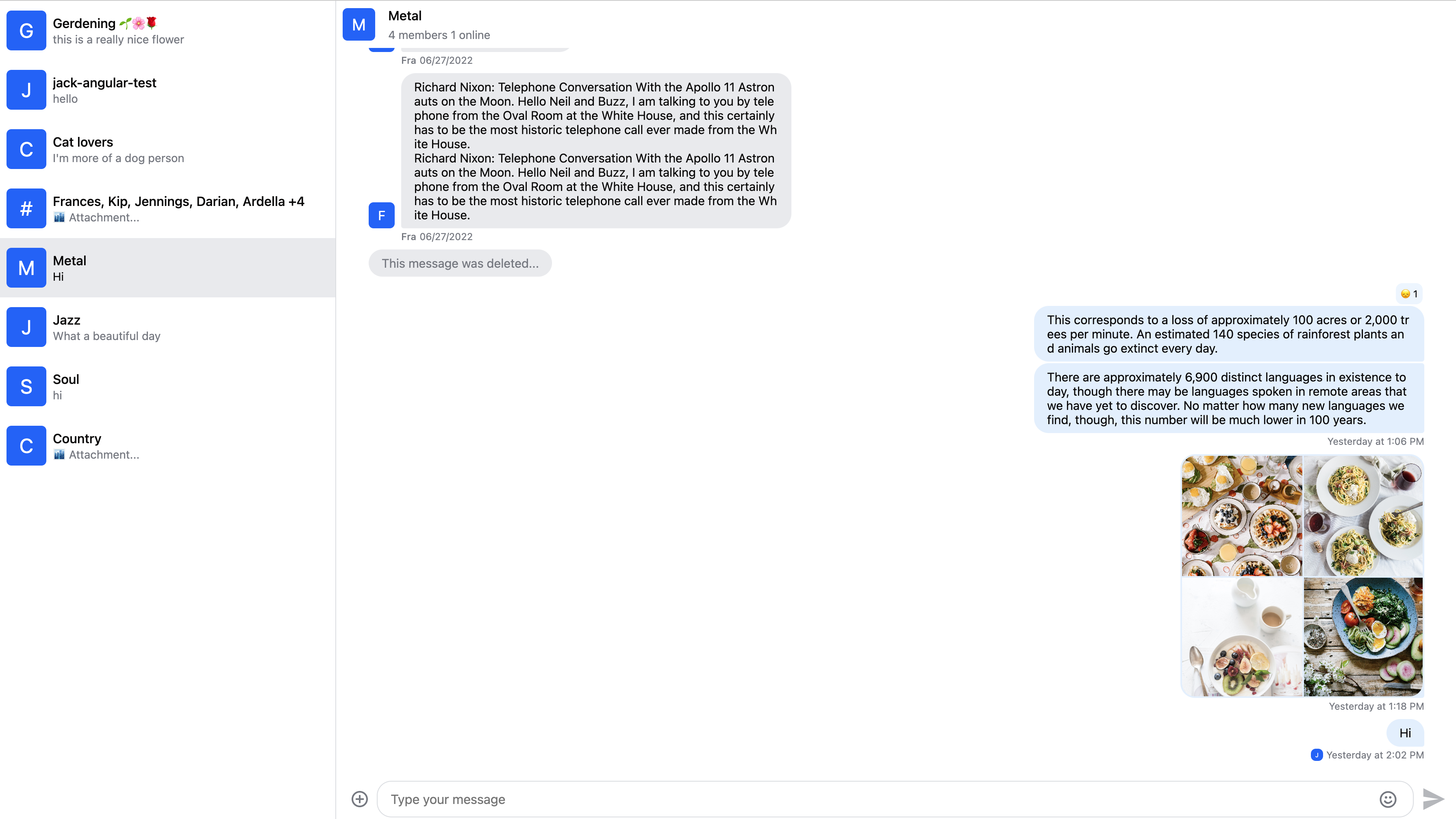
RTL support
The layout was built with RTL support in mind. You can use the RTL layout by providing the dir attribute in your HTML:
<html dir="rtl">
  <!-- ... -->
</html>
Here is the result: