 React
React iOS
iOS Android
 Flutter
 Angular
 JavaScript
 Unity
Unity Unreal
 Node
Node Python
 Ruby
Ruby PHP
PHP Java
Java .NET
.NET Go
Go REST
REST<Chat client={client}>
<ChannelList />
<Channel>
<VirtualizedMessageList />
<MessageInput />
</Channel>
</Chat>Troubleshooting
Common troubleshooting topics:
Context Providers
The React SDK relies on Context Providers to share values without prop drilling. For custom components, use the provided hooks to access context.
A common issue is using a hook outside its provider; values will be undefined. See Core Components for which components provide context.
User Roles and Permission Policies
If a user has unexpected access (or missing access), check roles and permissions.
Channels are grouped by type (livestream, messaging, team, gaming, commerce), set when the channel is created. Each channel type comes with a default permission policy pre-configured. These can then be modified as needed to fit different use cases. A policy is structured by a user role being allowed or denied access to a resource (ex: user with admin role is allowed to create a channel and ban a user).
Docs: User Permissions, Channel Permissions, User Roles.
You can change/create permission policies applied to a channel type at any time through the Dashboard. You can also change a user role to admin or moderator using the API, however this must be done server side.
Watching Channels
channel.watch() is intended for client-side use and creates the channel if it doesn’t exist. If it does, it returns a detailed channel instance (messages, watchers, read state) and subscribes the user to events (new messages, members, etc.).
This differs from channel.create() (creates but doesn’t subscribe) and channel.query() (fetches state but doesn’t subscribe).
Watcher vs Member
A watcher is a user who is subscribed to updates on a channel (new messages, etc). This actually doesn't imply membership, for example a non-member can watch a Livestream channel-type.
A member is a user role associated with a specific channel, typically granted more permissions than a non-member user. For example, default permissions on our "messaging" type channel allow a user to read and write to the channel, as well as receive push notifications.
Livestream Best Practices
Livestream chat UI poses several hard technological challenges since users can spend a few hours watching a certain event. For that period, the chat UI should be able to handle a constant stream of messages, reactions, and media attachments.
The React SDK offers a special component for that purpose - the VirtualizedMessageList. The component renders only the messages visible in the viewport and dynamically updates its contents as the user scrolls.
This decreases browser memory usage and does not degrade the performance of the page even if the user receives thousands of messages in a single session.
In this article, we will go through the best practices and tweaks for configuring the VirtualizedMessageList to ensure a smooth user experience during a high message traffic.
Get Started
The VirtualizedMessageList is mostly compatible with the non-virtualized MessageList, although not all properties are the same. The simplest configuration and placement are the same:
With this configuration, the virtualized list will look identical to the non-virtualized version. With the next few steps, we can configure the component for maximum performance.
Disable the automatic scroll to bottom transition
By default, the VirtualizedMessageList will scroll down to display new messages using the "smooth" scroll behavior (MDN link). This works well for moderately busy chat rooms but can be unwieldy in chats with more than 2-3 incoming messages per second. A safer, snappier option is "auto". With that setting, the list scrolls to the latest received message instantly.
<VirtualizedMessageList stickToBottomScrollBehavior="auto" />Specify the default item height
The VirtualizedMessageList supports items with varying heights and automatically keeps track of the rendered item sizes, while estimating the not-yet-rendered sizes based on latest message during load. To optimize this further and minimize potential recalculations, set the defaultItemHeight to the height of your usual one-line message (If in doubt, use the developer tools inspector to determine the sizing).
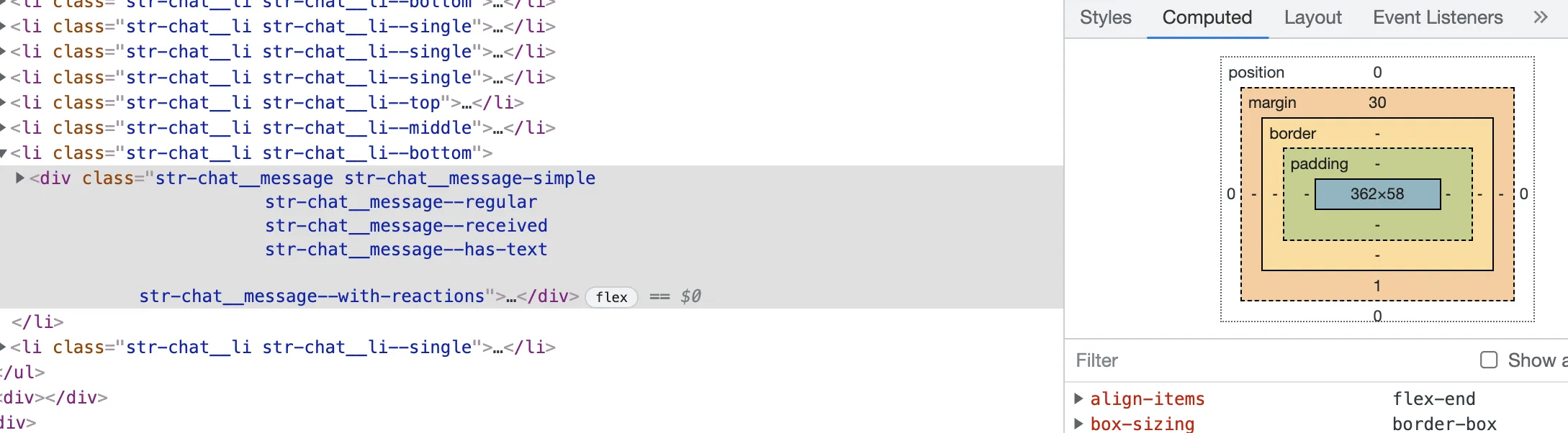
The element above is 58px tall, so let's put that at the defaultItemHeight prop value:
<VirtualizedMessageList defaultItemHeight={58} />Avoid vertical CSS margins
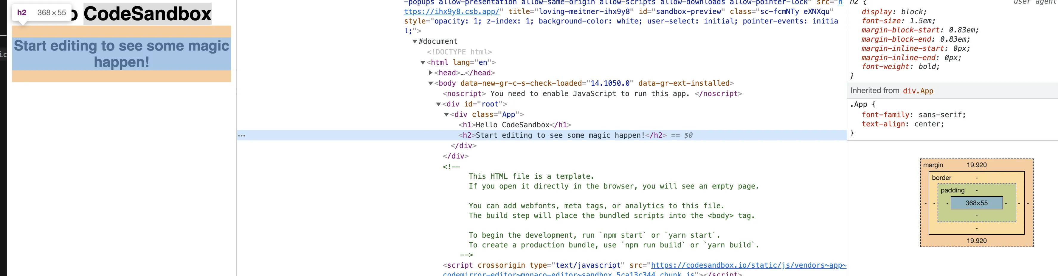
If the custom Message component has vertical margins that affect its height, the message list might behave erratically (blinking, rendering white areas, etc).
This could be a potential pitfall if you're using a custom message component. The VirtualizedMessageList uses getBoundingClientRect (MDN) on the outermost message element.
This method does not measure CSS margins, which are tricky to measure in the first place due to collapsing.
If the custom Message component has vertical margins that affect its height, the message list might behave erratically (blinking, rendering white areas, etc).
Use your DOM inspector and look for any orange gaps between the message elements. See the screenshot below for example of headings with margins:
Choose the right Giphy size
This practice is not unique to the virtualized message list but might help you build a more compact chat timeline and reduce the overall traffic for your users. By default, the Giphy attachments use the original Giphy version image. You can override that by setting the giphyVersion property of the Channel Component to a smaller one - use the keys from the Giphy documentation.
<Chat client={client}>
  <ChannelList />
  <Channel giphyVersion="fixed_height_small">
    <VirtualizedMessageList />
    <MessageInput />
  </Channel>
</Chat>
Design reactions so that they don't change the message size
One final best practice: make sure that adding reactions to the message does not increase the message height if you're using a custom Message component. Good examples for such design would be the chat boxes of Twitch and Telegram.
Avoiding that will make the message list appear more stable and less jumpy during high traffic.