 React
React iOS
iOS Android
 Flutter
 Angular
 JavaScript
 Unity
Unity Unreal
 Node
Node Python
 Ruby
Ruby PHP
PHP Java
Java .NET
.NET Go
Go REST
RESTexport const CustomTypingIndicator = (props: TypingIndicatorProps) => {
const { threadList } = props;
const { channelConfig, thread } = useChannelStateContext();
const { client } = useChatContext();
const { typing = {} } = useTypingContext();
if (channelConfig?.typing_events === false) {
return null;
}
const typingInChannel = !threadList
? Object.values(typing).filter(
({ parent_id, user }) => user?.id !== client.user?.id && !parent_id,
)
: [];
const typingInThread = threadList
? Object.values(typing).filter(
({ parent_id, user }) =>
user?.id !== client.user?.id && parent_id === thread?.id,
)
: [];
return (
<div
className={`str-chat__typing-indicator ${
(threadList && typingInThread.length) ||
(!threadList && typingInChannel.length)
? "str-chat__typing-indicator--typing"
: ""
}`}
>
<div className="str-chat__typing-indicator__avatars">
{(threadList ? typingInThread : typingInChannel).map(({ user }, i) => (
<div className="username">
<div className="typing-indicator-name">{user?.name}</div>
<div className="typing-indicator-role ">{user?.role}</div>
</div>
))}
</div>
<div className="str-chat__typing-indicator__dots">
<div className="str-chat__typing-indicator__dot" />
<div className="str-chat__typing-indicator__dot" />
<div className="str-chat__typing-indicator__dot" />
</div>
</div>
);
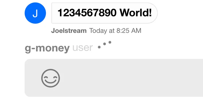
};Typing Indicator
This example shows how to build a custom TypingIndicator based on the default.
Best Practices
- Respect
typing_eventsin channel config to avoid false indicators. - Filter out the current user to prevent self-typing noise.
- Keep the indicator compact for busy channels and small screens.
- Avoid rendering long user lists; cap or summarize typers.
- Match the default dot animation timing for consistency.
Create the Component
Using the typing object from TypingContext, you can access the name and role of users currently typing. The threadList prop lets you render in the main message list or at the bottom of a thread.
.str-chat__typing-indicator__dots {
  border: none;
  display: flex;
  margin-left: 0;
  width: fit-content;
}

.str-chat__typing-indicator__dot {
  background: var(--grey);
  opacity: 1;
  height: 4px;
  width: 4px;
  border-radius: var(--border-radius-round);
  display: flex;
}

.str-chat__typing-indicator__dot:nth-child(3) {
  opacity: 1;
}

.str-chat__typing-indicator__dot:nth-child(2) {
  opacity: 1;
}

.typing-indicator-name {
  font-weight: var(--font-weight-bold);
  color: var(--grey);
}
.typing-indicator-role {
  font-weight: var(--font-weight-regular);
  color: var(--grey-whisper);
  margin-left: var(--xxs-m);
}

.username {
  display: flex;
}
From here, all we need to do is override the default component in Channel:
<Channel TypingIndicator={CustomTypingIndicator}>
  {/* children of Channel component */}
</Channel>
The Result