 React
React iOS
iOS Android
 Flutter
 Angular
 JavaScript
 Unity
Unity Unreal
 Node
Node Python
 Ruby
Ruby PHP
PHP Java
Java .NET
.NET Go
Go REST
REST<ChannelList Preview={CustomChannelPreview} />
// Don't forget to provide filter and sort options as well!Channel List UI
ChannelList is the primary navigation in a chat app. Because chat is real-time, it subscribes to many event types to keep the list updated (new messages, updates, channel changes, presence, etc.).
That’s a lot of logic to reimplement. We recommend building on the SDK’s ChannelList even if you need heavy customization. It supports:
Best Practices
- Use
ChannelListas the base and override only the preview UI you need. - Keep preview rendering fast to avoid sluggish navigation.
- Read channel state from
Previewprops (for examplechannel) instead of re-querying. - Preserve selection handling so active channel updates stay consistent.
- Add timestamps or metadata only when it improves scanability.
This guide takes a deep dive into these customization options.
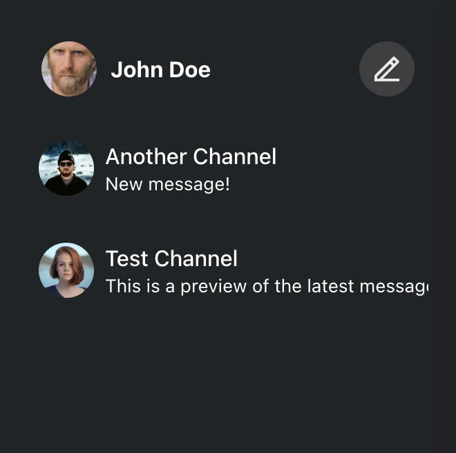
Custom Channel Preview
A channel preview is a single item in the list. It should reflect current channel state and handle selection.
Customize previews by passing a component to Preview. ChannelList wraps each item in ChannelPreview, which handles events (new/updated/deleted messages). You can just read the latest state from props.
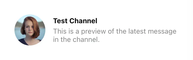
Let's implement a simple custom preview:
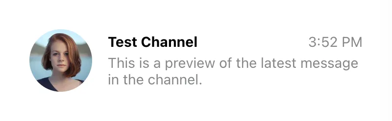
const CustomChannelPreview = ({
  displayImage,
  displayTitle,
  latestMessagePreview,
}) => (
  <div className="channel-preview">
    <img className="channel-preview__avatar" src={displayImage} alt="" />
    <div className="channel-preview__main">
      <div className="channel-preview__header">{displayTitle}</div>
      <div className="channel-preview__message">{latestMessagePreview}</div>
    </div>
  </div>
);
.channel-preview {
display: flex;
gap: 16px;
align-items: center;
font-size: 0.9em;
line-height: 1.2em;
}
.channel-preview__avatar {
width: 64px;
height: 64px;
border-radius: 50%;
object-fit: cover;
}
.channel-preview__main {
flex-grow: 1;
}
.channel-preview__header {
font-weight: bold;
margin-bottom: 4px;
}
.channel-preview__message {
max-height: 2.4em;
overflow: hidden;
color: #858688;
}
.channel-preview__message p {
margin: 0;
}(See also the complete reference of the available preview component props.)
The preview props are usually enough. If you need more data, read it from the channel state. In this example we add the timestamp of the latest message:
const CustomChannelPreview = (props) => {
  const { channel, displayImage, displayTitle, latestMessagePreview } = props;
  const { userLanguage } = useTranslationContext();
  const latestMessageAt = channel.state.last_message_at;

  const timestamp = useMemo(() => {
    if (!latestMessageAt) {
      return "";
    }
    const formatter = new Intl.DateTimeFormat(userLanguage, {
      timeStyle: "short",
    });
    return formatter.format(latestMessageAt);
  }, [latestMessageAt, userLanguage]);

  return (
    <div className="channel-preview">
      <img className="channel-preview__avatar" src={displayImage} alt="" />
      <div className="channel-preview__main">
        <div className="channel-preview__header">
          {displayTitle}
          <time
            dateTime={latestMessageAt?.toISOString()}
            className="channel-preview__timestamp"
          >
            {timestamp}
          </time>
        </div>
        <div className="channel-preview__message">{latestMessagePreview}</div>
      </div>
    </div>
  );
};
.channel-preview {
display: flex;
gap: 16px;
align-items: center;
font-size: 0.9em;
line-height: 1.2em;
}
.channel-preview__avatar {
width: 64px;
height: 64px;
border-radius: 50%;
object-fit: cover;
}
.channel-preview__main {
flex-grow: 1;
}
.channel-preview__header {
display: flex;
justify-content: space-between;
font-weight: bold;
margin-bottom: 4px;
}
.channel-preview__timestamp {
font-weight: normal;
color: #858688;
}
.channel-preview__message {
max-height: 2.4em;
overflow: hidden;
color: #858688;
}
.channel-preview__message p {
margin: 0;
}
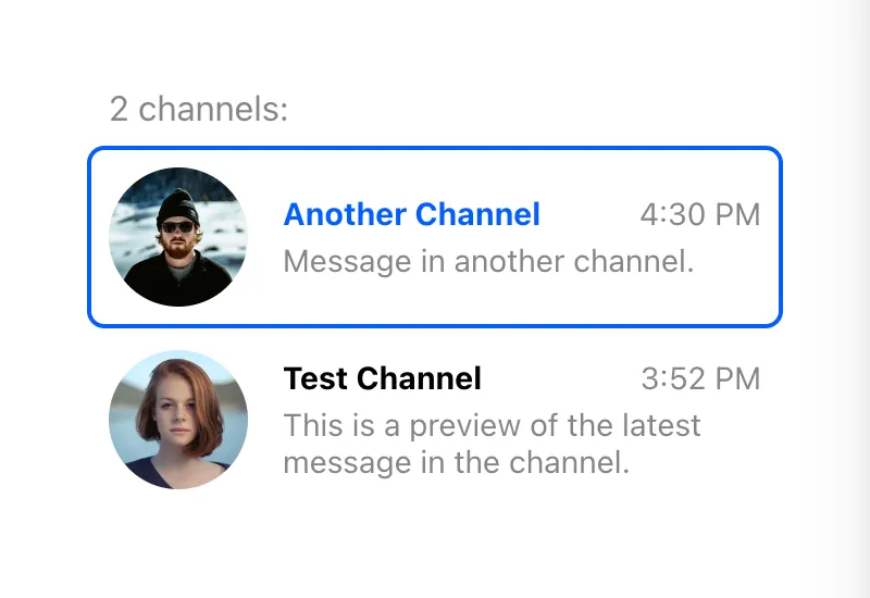
One more thing we should add is the click event handler, which should change the currently active channel. That's easy enough to do:
const CustomChannelPreview = (props) => {
  const {
    channel,
    activeChannel,
    displayImage,
    displayTitle,
    latestMessagePreview,
    setActiveChannel,
  } = props;
  const latestMessageAt = channel.state.last_message_at;
  const isSelected = channel.id === activeChannel?.id;
  const { userLanguage } = useTranslationContext();

  const timestamp = useMemo(() => {
    if (!latestMessageAt) {
      return "";
    }
    const formatter = new Intl.DateTimeFormat(userLanguage, {
      timeStyle: "short",
    });
    return formatter.format(latestMessageAt);
  }, [latestMessageAt, userLanguage]);

  const handleClick = () => {
    setActiveChannel?.(channel);
  };

  return (
    <button
      className={`channel-preview ${isSelected ? "channel-preview_selected" : ""}`}
      disabled={isSelected}
      onClick={handleClick}
    >
      <img className="channel-preview__avatar" src={displayImage} alt="" />
      <div className="channel-preview__main">
        <div className="channel-preview__header">
          {displayTitle}
          <time
            dateTime={latestMessageAt?.toISOString()}
            className="channel-preview__timestamp"
          >
            {timestamp}
          </time>
        </div>
        <div className="channel-preview__message">{latestMessagePreview}</div>
      </div>
    </button>
  );
};
.channel-preview {
font: inherit;
border: 2px solid transparent;
border-radius: 8px;
background: none;
text-align: left;
padding: 8px;
display: flex;
gap: 16px;
align-items: center;
font-size: 0.9em;
line-height: 1.2em;
cursor: pointer;
}
.channel-preview_selected {
background: #fff;
border-color: #005fff;
cursor: auto;
}
.channel-preview__avatar {
width: 64px;
height: 64px;
border-radius: 50%;
object-fit: cover;
}
.channel-preview__main {
flex-grow: 1;
}
.channel-preview__header {
display: flex;
justify-content: space-between;
font-weight: bold;
margin-bottom: 4px;
}
.channel-preview_selected .channel-preview__header {
color: #005fff;
}
.channel-preview__timestamp {
font-weight: normal;
color: #858688;
}
.channel-preview__message {
max-height: 2.4em;
overflow: hidden;
color: #858688;
}
.channel-preview__message p {
margin: 0;
}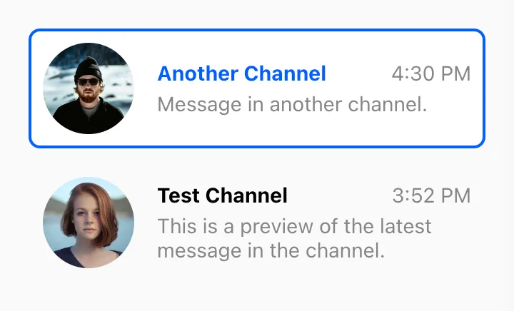
We also add a class when the channel is active (by comparing the active channel ID with the current channel ID).
Custom Channel List Wrapper
The channel list wrapper renders items and handles loading/error states. It’s a good place to add a custom loader or extra UI like a header/footer.
You can do this by providing a custom component in the List prop of the
ChannelList component. It will get a bunch of props from the parent
ChannelList, including a list of loaded channels, a loading flag, and an error
object (if any).
<ChannelList List={CustomChannelList} />
// Don't forget to provide filter and sort options as well!
The simplest implementation of the custom channel list wrapper looks like this:
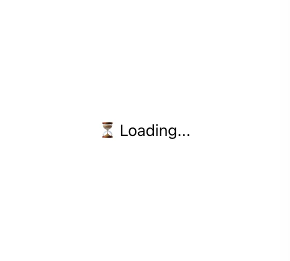
const CustomChannelList = ({ children, loading, error }) => {
if (loading) {
return <div className="channel-list__placeholder">⏳ Loading...</div>;
}
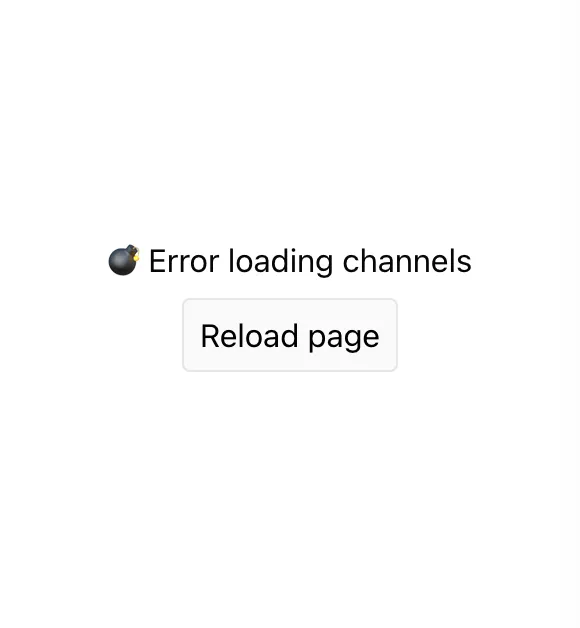
if (error) {
return (
<div className="channel-list__placeholder">
💣 Error loading channels
<br />
<button
className="channel-list__button"
onClick={() => window.location.reload()}
>
Reload page
</button>
</div>
);
}
return (
<div className="channel-list">
{loadedChannels && (
<div className="channel-list__counter">
{loadedChannels.length} channels:
</div>
)}
{children}
</div>
);
};.channel-list__placeholder {
padding: 120px 20px;
text-align: center;
}
.channel-list__button {
border: 1px solid #00000014;
outline: 0;
background: #fafafa;
font: inherit;
border-radius: 4px;
margin: 8px;
padding: 8px;
cursor: pointer;
}
.channel-list__button:focus {
border-color: #005fff;
}
If you need the channel array, use loadedChannels. It updates frequently, so you must opt in by setting sendChannelsToList on ChannelList:
<ChannelList List={CustomChannelList} sendChannelsToList />;
// Don't forget to provide filter and sort options as well!

const CustomChannelList = ({
  loadedChannels,
  children,
  loading,
  error,
}: React.PropsWithChildren<ChannelListMessengerProps>) => {
  if (loading) {
    return <div className="channel-list__placeholder">⏳ Loading...</div>;
  }

  if (error) {
    return (
      <div className="channel-list__placeholder">
        💣 Error loading channels
        <br />
        <button
          className="channel-list__button"
          onClick={() => window.location.reload()}
        >
          Reload page
        </button>
      </div>
    );
  }

  if (loadedChannels?.length === 0) {
    return (
      <div className="channel-list__placeholder">
        🤷 You have no channels... yet
      </div>
    );
  }

  return (
    <div className="channel-list">
      {loadedChannels && (
        <div className="channel-list__counter">
          {loadedChannels.length} channels:
        </div>
      )}
      {children}
    </div>
  );
};
.channel-list__placeholder {
padding: 120px 20px;
text-align: center;
}
.channel-list__button {
border: 1px solid #00000014;
outline: 0;
background: #fafafa;
font: inherit;
border-radius: 4px;
margin: 8px;
padding: 8px;
cursor: pointer;
}
.channel-list__button:focus {
border-color: #005fff;
}
.channel-list__counter {
color: #858688;
margin: 0 10px 8px;
}
Custom Channel List Renderer
By default, ChannelList renders previews in query order. To inject custom grouping or subheadings, provide a custom renderChannels function.
The function receives the loaded channels and a preview renderer. That renderer is the Preview component wrapped with ChannelPreview so event listeners are already wired. renderChannels runs only when the list is loaded and non-empty.
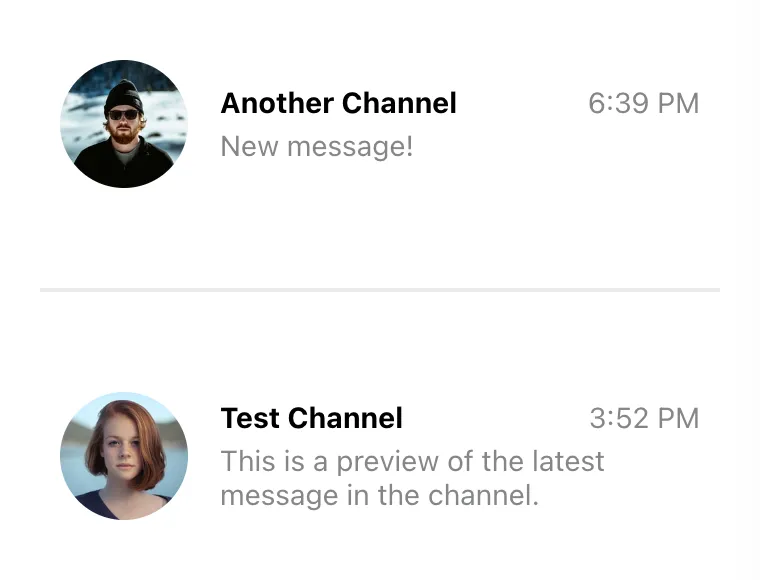
This example adds a separator between read and unread channels:
const renderChannels = (channels, getChannelPreview) => {
  const unreadChannels = [];
  const readChannels = [];

  for (const channel of channels) {
    const hasUnread = channel.countUnread();
    (hasUnread ? unreadChannels : readChannels).push(channel);
  }

  return [unreadChannels, readChannels]
    .filter((group) => group.length > 0)
    .map((group, index) => (
      <div key={index} className="channel-group">
        {group.map((channel) => (
          <div key={channel.id}>{getChannelPreview(channel)}</div>
        ))}
      </div>
    ));
};
.channel-group + .channel-group {
padding-top: 40px;
margin-top: 40px;
border-top: 2px solid #00000014;
}