 React
React iOS
iOS Android
 Flutter
 Angular
 JavaScript
 Unity
Unity Unreal
 Node
Node Python
 Ruby
Ruby PHP
PHP Java
Java .NET
.NET Go
Go REST
RESTimport { useMemo } from "react";
import { Channel } from "stream-chat-react";
import {
MessageActions,
defaultMessageActionSet,
DefaultDropdownActionButton,
} from "stream-chat-react/experimental";
import { useCustomMessageActionRules } from "./useCustomMessageActionRules";
const CustomMessageActions = () => {
const customRules = useCustomMessageActionRules(); // your implementation
const customMessageActionSet = useMemo(() => {
return [
// reuse the default set if you need
...defaultMessageActionSet,
{
type: "myCustomTypeDropdown",
placement: "dropdown",
// we recommend defining components outside the scope of
// the CustomMessageActions component to keep them stable
Component: () => (
<DefaultDropdownActionButton>🚀 Custom</DefaultDropdownActionButton>
),
},
{
type: "myCustomTypeQuick",
placement: "quick",
Component: () => <button>a</button>,
},
].filter(
// apply custom filter with access to values from contexts and hooks
(action) => {
return !customRules.disallow.includes(action.type);
},
);
}, [customRules]);
return (
<MessageActions
// though not recommended, it's possible to completely disable the default filter
disableBaseMessageActionSetFilter
messageActionSet={customMessageActionSet}
/>
);
};
<Channel MessageActions={CustomMessageActions}>...</Channel>;Message Actions
The Problem(s)
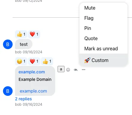
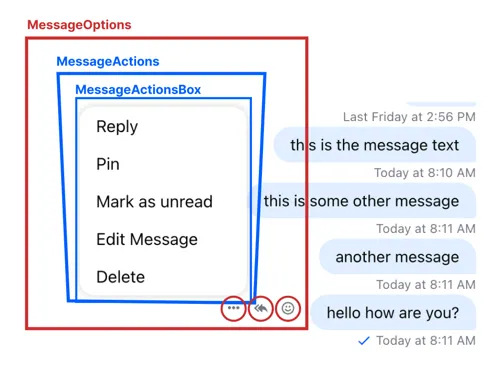
Message actions are handled by MessageOptions and its children (MessageActions, MessageActionsBox). Actions are buttons in a dropdown tied to a specific message or its author.
Customizing action buttons (text, translations, etc.) is hard with the current components. CustomMessageActionsList lets you override dropdown buttons via ComponentContext, but it doesn’t control when or how options buttons (dropdown, reply, react) appear.
The New Approach
To address these gaps, the experimental MessageActions component allows:
- defining the button components rendered in the dropdown
- placing actions in the dropdown or as quick actions
- filtering which actions appear in each place
Best Practices
- Use the experimental API only when default message actions are insufficient.
- Keep custom action components stable to avoid re-render churn.
- Always filter actions based on permissions and roles.
- Prefer merging with the default action set for compatibility.
- Re-validate UI after SDK upgrades due to experimental changes.
This feature is experimental and may change. In a future major version, `MessageOptions` might no longer wrap `MessageActions`, which would change the markup. This is because `MessageActions` distinguishes between `dropdown` and `quick` placement.
The Customization Process
- Define action components with
quickordropdownplacement. - Decide whether to merge with the default action set.
- Define a filter (or use the default) based on permissions and app logic.
The customization example follows: