 React
React iOS
iOS Android
 Flutter
 Angular
 JavaScript
 Unity
Unity Unreal
 Node
Node Python
 Ruby
Ruby PHP
PHP Java
Java .NET
.NET Go
Go REST
REST.str-chat {
--str-chat__image-fallback-icon: url("data:image/svg+xml;base64,PHN2ZyB3aWR0aD0iMTAiIGhlaWdodD0iOSIgdmlld0JveD0iMCAwIDEwIDkiIGZpbGw9Im5vbmUiIHhtbG5zPSJodHRwOi8vd3d3LnczLm9yZy8yMDAwL3N2ZyI+CiAgICA8cGF0aCBkPSJNOS4xOTk0OSAwLjMwNTY3MUM4LjkzOTQ5IDAuMDQ1NjcwNyA4LjUxOTQ5IDAuMDQ1NjcwNyA4LjI1OTQ5IDAuMzA1NjcxTDQuOTk5NDkgMy41NTlMMS43Mzk0OSAwLjI5OTAwNEMxLjQ3OTQ5IDAuMDM5MDAzOSAxLjA1OTQ5IDAuMDM5MDAzOSAwLjc5OTQ5MiAwLjI5OTAwNEMwLjUzOTQ5MiAwLjU1OTAwNCAwLjUzOTQ5MiAwLjk3OTAwNCAwLjc5OTQ5MiAxLjIzOUw0LjA1OTQ5IDQuNDk5TDAuNzk5NDkyIDcuNzU5QzAuNTM5NDkyIDguMDE5IDAuNTM5NDkyIDguNDM5IDAuNzk5NDkyIDguNjk5QzEuMDU5NDkgOC45NTkgMS40Nzk0OSA4Ljk1OSAxLjczOTQ5IDguNjk5TDQuOTk5NDkgNS40MzlMOC4yNTk0OSA4LjY5OUM4LjUxOTQ5IDguOTU5IDguOTM5NDkgOC45NTkgOS4xOTk0OSA4LjY5OUM5LjQ1OTQ5IDguNDM5IDkuNDU5NDkgOC4wMTkgOS4xOTk0OSA3Ljc1OUw1LjkzOTQ5IDQuNDk5TDkuMTk5NDkgMS4yMzlDOS40NTI4MyAwLjk4NTY3MSA5LjQ1MjgzIDAuNTU5MDA0IDkuMTk5NDkgMC4zMDU2NzFaIiBmaWxsPSIjNzI3NjdFIi8+Cjwvc3ZnPgo=");
}BaseImage
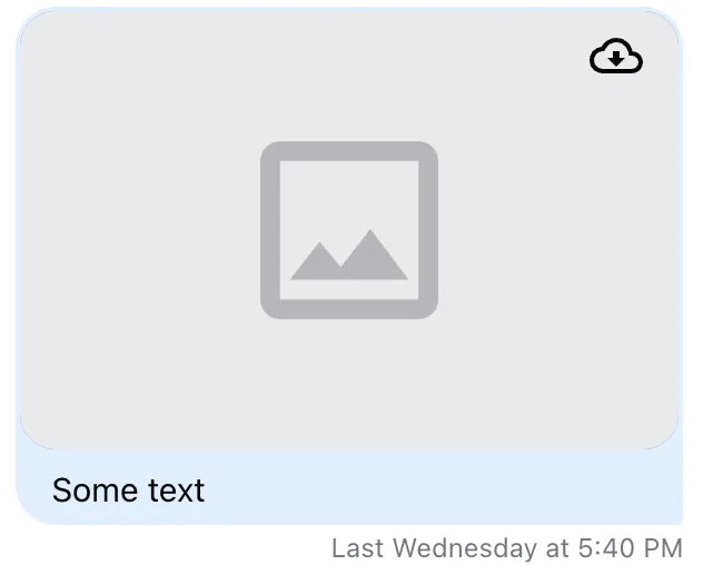
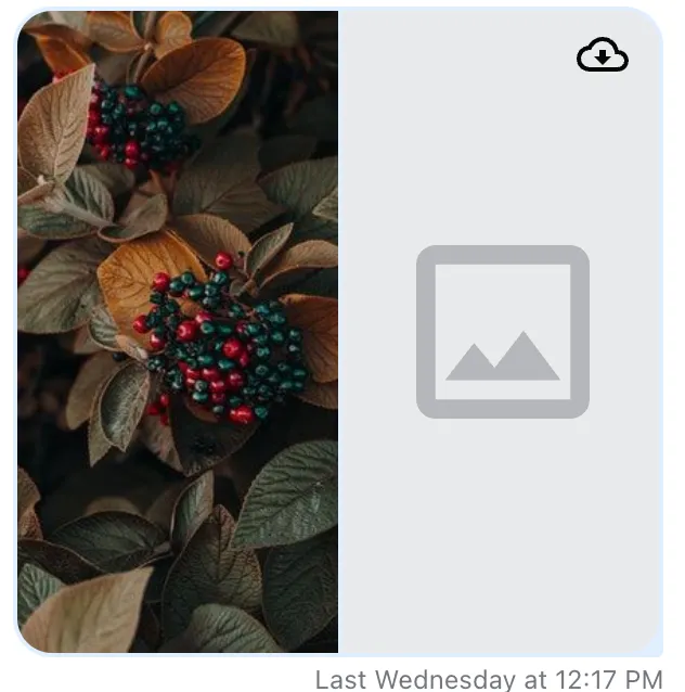
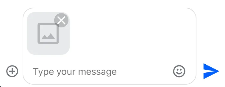
BaseImage displays an image or a fallback when loading fails. It’s used internally by:
Imagecomponent - used to display image attachments inMessageGallerycomponent - used to display image gallery amongMessageattachmentsAttachmentPreviewListcomponent - used to display attachment previews inMessageInput
Best Practices
- Prefer CSS fallback customization before replacing
BaseImage. - Keep fallback visuals lightweight to avoid layout shifts on load failure.
- Use a consistent fallback icon across attachments and previews.
- Keep custom
BaseImagealigned with<img>props for compatibility. - Test fallback behavior on slow or failed network conditions.
Default fallbacks look like this:
Usage
Custom image fallback
To change the default fallback, set a new data image on the --str-chat__image-fallback-icon CSS variable within .str-chat:
To change mask size or color, target .str-chat__base-image--load-failed:
:root {
  --custom-icon-fill-color: #223344;
  --custom-icon-width-and-height: 4rem 4rem;
}

.str-chat__base-image--load-failed {
  mask-size: var(--custom-icon-width-and-height);
  -webkit-mask-size: var(--custom-icon-width-and-height);
  background-color: var(--custom-icon-fill-color);
}
Custom BaseImage
Override the default BaseImage by passing a custom component to Channel:
import { ComponentProps } from "react";
import { Channel } from "stream-chat-react";

const CustomBaseImage = (props: ComponentProps<"img">) => {
  // your implementation...
};

export const MyUI = () => {
  return (
    <Channel BaseImage={CustomBaseImage}>
      {
        {
          /* more components */
        }
      }
    </Channel>
  );
};
Props
This component accepts standard <img> props.