CallControls
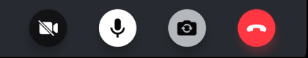
CallControls allows users to execute actions during the call(for example, mute/unmute audio/video, reactions, hang-up calls, etc.).
We provide a built-in CallControls component that displays all relevant call controls during a call.
General Usage
The CallControls component displays the available controls for the call.
import {
  Call,
  CallContent,
  CallControls,
  StreamCall,
} from '@stream-io/video-react-native-sdk';

const VideoCallUI = () => {
  let call: Call;

  return (
    <StreamCall call={call}>
      <CallControls />
    </StreamCall>
  );
};
Props
onHangupCallHandler
Handler to be called when the call is left using the hangup call button in call controls.
| Type |
|---|
() => void | undefined |
landscape
Applies the landscape mode styles to the component, if true.
| Type |
|---|
boolean | undefined |
Built-in call controls
Each call control is available as a separate UI component.
AcceptCallButton
This component is used in the Incoming Call component to accept an incoming call.
| Type | Type | Description |
|---|---|---|
onPressHandler | () => void | undefined | Handler to be called when the accept call button is pressed. Used to override the default behaviour. |
onAcceptCallHandler | () => void | undefined | Handler to be called after the incoming call is accepted. |
HangupCallButton
This component is used to hangup/leave an active call/outgoing call.
| Type | Type | Description |
|---|---|---|
onPressHandler | () => void | undefined | Handler to be called when the hang up call button is pressed. Used to override the default behaviour. |
onHangupCallHandler | () => void | undefined | Handler to be called after the call is hanged up. |
RejectCallButton
This component is used in the Incoming Call component to reject an incoming call.
| Type | Type | Description |
|---|---|---|
onPressHandler | () => void | undefined | Handler to be called when the reject call button is pressed. Used to override the default behaviour. |
onRejectCallHandler | () => void | undefined | Handler to be called after the incoming call is rejected. |
ToggleAudioPreviewButton
This component is used to toggle audio mute/unmute status before joining the call.
| Type | Type | Description |
|---|---|---|
onPressHandler | () => void | undefined | Handler to be called when the audio preview button is pressed. Used to override the default behaviour. |
ToggleVideoPreviewButton
This component is used to toggle video mute/unmute status before joining the call.
| Type | Type | Description |
|---|---|---|
onPressHandler | () => void | undefined | Handler to be called when the video preview button is pressed. Used to override the default behaviour. |
ToggleAudioPublishingButton
This component is used to toggle audio mute/unmute status while in the call.
| Type | Type | Description |
|---|---|---|
onPressHandler | () => void | undefined | Handler to override the default behaviour of the audio publishing button.. |
ToggleVideoPublishingButton
This component is used to toggle video mute/unmute status while in the call.
| Type | Type | Description |
|---|---|---|
onPressHandler | () => void | undefined | Handler to override the default behaviour of the video publishing button. |
ToggleCameraFaceButton
This component is used to toggle camera face(front/back) when in the call.
| Type | Type | Description |
|---|---|---|
onPressHandler | () => void | undefined | Handler to override the default behaviour of the toggle camera face button. |
ReactionsButton
This component is used to display the list of Reactions supported in the call. It can also be used to send reactions.
The following reactions are supported by default:
- like 👍
- raise hand ✋
- fireworks 🎉
| Type | Type | Description |
|---|---|---|
onPressHandler | () => void | undefined | Handler to override the default behaviour when the reactions button is pressed. |
ChatButton
This component is used to display/open the chat window while in the call.
| Type | Type | Description |
|---|---|---|
onPressHandler | () => void | undefined | Handler to override the default behaviour when the chat button is pressed. |
unreadBadgeCount | number | undefined | The count of the current unread message to be displayed above on the Chat button. |
Customization
You can create your own custom component using the built-in call controls as building blocks.
If you want to create custom call controls, follow the Call Controls UI Cookbook guide for more information.