 React
React iOS
iOS Android
 Flutter
 JavaScript
 Unity
Unity ESP32
ESP32 Platform
 Vision Agents
import { Pressable, Text, StyleSheet } from "react-native";
import { useCall } from "@stream-io/video-react-native-sdk";

export const CustomAcceptCallButton = () => {
  const call = useCall();

  const onCallAcceptHandler = async () => {
    await call?.join();
  };

  return (
    <Pressable
      onPress={onCallAcceptHandler}
      style={[styles.button, styles.acceptButton]}
    >
      <Text style={styles.buttonText}>Accept Call</Text>
    </Pressable>
  );
};

const styles = StyleSheet.create({
  button: {
    height: 80,
    width: 80,
    borderRadius: 40,
    justifyContent: "center",
  },
  buttonText: {
    textAlign: "center",
  },
  acceptButton: {
    backgroundColor: "#20E070",
  },
});Call Controls
The Stream Video React Native SDK enables building custom call controls views. Call controls comprise buttons that manage different call functions. This guide shows how to assemble these buttons into a custom layout.
Best Practices
- Use built-in components - Start with SDK-provided controls before building custom ones
- Handle permissions - Check user permissions before enabling control actions
- Provide visual feedback - Show clear on/off states for toggle buttons
- Keep controls accessible - Ensure touch targets are at least 44x44 points
- Test all states - Verify behavior when joining, during calls, and when leaving
The React Native SDK exports Built-in Call Controls components for common use cases.
Building Custom Controls Buttons
Building custom buttons with SDK hooks is straightforward. The following sections demonstrate various call control implementations.
Call control buttons often require permission handling. See the permissions and moderation guide for details.
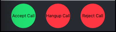
Button to accept a call
For ring call workflows, accept incoming calls using call.join():
Example:
Button to hangup a call
Hang up or leave calls using call.leave():
Example:
import { Pressable, Text, StyleSheet } from "react-native";
import { useCall } from "@stream-io/video-react-native-sdk";

export const CustomHangupCallButton = () => {
  const call = useCall();

  const onCallHangupHandler = async () => {
    await call?.leave();
  };

  return (
    <Pressable
      onPress={onCallHangupHandler}
      style={[styles.button, styles.hangupButton]}
    >
      <Text style={styles.buttonText}>Hangup Call</Text>
    </Pressable>
  );
};

const styles = StyleSheet.create({
  button: {
    height: 80,
    width: 80,
    borderRadius: 40,
    justifyContent: "center",
  },
  buttonText: {
    textAlign: "center",
  },
  hangupButton: {
    backgroundColor: "#FF3742",
  },
});
Button to reject a call
For ring call workflows, reject calls using call.leave({ reject: true, reason }):
Example:
import { Pressable, Text, StyleSheet } from "react-native";
import { useCall } from "@stream-io/video-react-native-sdk";
export const CustomRejectCallButton = () => {
const call = useCall();
const onCallRejectHandler = async () => {
const reason = call.isCreatedByMe ? "cancel" : "decline";
await call?.leave({ reject: true, reason });
};
return (
<Pressable
onPress={onCallRejectHandler}
style={[styles.button, styles.rejectButton]}
>
<Text style={styles.buttonText}>Reject Call</Text>
</Pressable>
);
};
const styles = StyleSheet.create({
button: {
height: 80,
width: 80,
borderRadius: 40,
justifyContent: "center",
},
buttonText: {
textAlign: "center",
},
rejectButton: {
backgroundColor: "#FF3742",
},
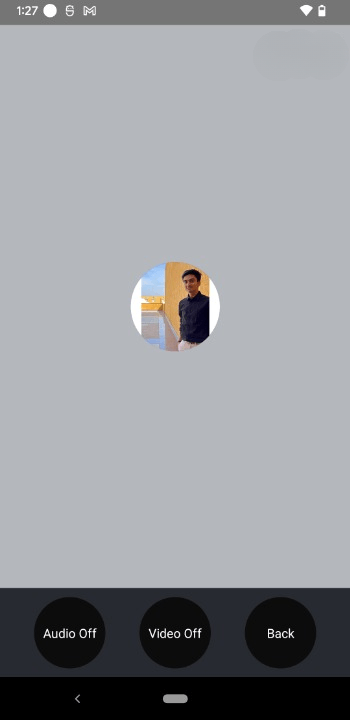
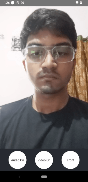
});Button to toggle audio
Toggle microphone state during active calls using call.microphone.toggle():
Example:
import { useCall, useCallStateHooks } from "@stream-io/video-react-native-sdk";

export const ToggleAudioButton = () => {
  const call = useCall();
  const { useMicrophoneState } = useCallStateHooks();
  const { status } = useMicrophoneState();

  const toggleAudioMuted = async () => {
    await call?.microphone.toggle();
  };

  const audioButtonStyles = [
    styles.button,
    {
      backgroundColor: status === "disabled" ? "#080707dd" : "white",
    },
  ];

  const audioButtonTextStyles = [
    styles.mediaButtonText,
    {
      color: status === "disabled" ? "white" : "#080707dd",
    },
  ];

  return (
    <Pressable onPress={toggleAudioMuted} style={audioButtonStyles}>
      {status === "disabled" ? (
        <Text style={audioButtonTextStyles}>Audio On</Text>
      ) : (
        <Text style={audioButtonTextStyles}>Audio Off</Text>
      )}
    </Pressable>
  );
};

const styles = StyleSheet.create({
  button: {
    height: 80,
    width: 80,
    borderRadius: 40,
    justifyContent: "center",
  },
  buttonText: {
    textAlign: "center",
  },
  mediaButtonText: {
    textAlign: "center",
  },
});
Button to toggle video
Toggle camera state during active calls using call.camera.toggle():
Example:
import { useCall, useCallStateHooks } from "@stream-io/video-react-native-sdk";

export const ToggleVideoButton = () => {
  const call = useCall();
  const { useCameraState } = useCallStateHooks();
  const { status } = useCameraState();

  const toggleVideoMuted = async () => {
    await call?.camera.toggle();
  };

  const videoButtonStyles = [
    styles.button,
    {
      backgroundColor: status === "disabled" ? "#080707dd" : "white",
    },
  ];

  const videoButtonTextStyles = [
    styles.mediaButtonText,
    {
      color: status === "disabled" ? "white" : "#080707dd",
    },
  ];

  return (
    <Pressable onPress={toggleVideoMuted} style={videoButtonStyles}>
      {status === "disabled" ? (
        <Text style={videoButtonTextStyles}>Video On</Text>
      ) : (
        <Text style={videoButtonTextStyles}>Video Off</Text>
      )}
    </Pressable>
  );
};

const styles = StyleSheet.create({
  button: {
    height: 80,
    width: 80,
    borderRadius: 40,
    justifyContent: "center",
  },
  buttonText: {
    textAlign: "center",
  },
  mediaButtonText: {
    textAlign: "center",
  },
});
Button to toggle Camera Face
Switch between front and back cameras using call.camera.flip():
Example:
import { useCall, useCallStateHooks } from "@stream-io/video-react-native-sdk";

export const ToggleCameraFaceButton = () => {
  const call = useCall();
  const { useCameraState } = useCallStateHooks();
  const { direction } = useCameraState();

  const toggleCameraFacingMode = async () => {
    onPressHandler?.();
    await call?.camera.flip();
  };

  const videoFaceButtonStyles = [
    styles.button,
    {
      backgroundColor: direction === "back" ? "#080707dd" : "white",
    },
  ];

  const videoFaceButtonTextStyles = [
    styles.mediaButtonText,
    {
      color: direction === "back" ? "white" : "#080707dd",
    },
  ];

  return (
    <Pressable onPress={toggleCameraFacingMode} style={videoFaceButtonStyles}>
      {direction === "front" ? (
        <Text style={videoFaceButtonTextStyles}>Back</Text>
      ) : (
        <Text style={videoFaceButtonTextStyles}>Front</Text>
      )}
    </Pressable>
  );
};

const styles = StyleSheet.create({
  button: {
    height: 80,
    width: 80,
    borderRadius: 40,
    justifyContent: "center",
  },
  buttonText: {
    textAlign: "center",
  },
  mediaButtonText: {
    textAlign: "center",
  },
});
Assembling it all together
Call Buttons
import { View, StyleSheet } from "react-native";
import { CallContent } from "@stream-io/video-react-native-sdk";

export const CustomCallControls = () => {
  return (
    <View style={styles.buttonGroup}>
      <ToggleAudioButton />
      <ToggleVideoButton />
      <ToggleCameraFaceButton />
    </View>
  );
};

export const App = () => {
  return (
    <View style={styles.container}>
      <CallContent CallControls={CustomCallControls} />
    </View>
  );
};

const styles = StyleSheet.create({
  container: {
    flex: 1,
  },
  buttonGroup: {
    flexDirection: "row",
    justifyContent: "space-evenly",
    paddingVertical: 10,
  },
});
Media Button
import { View, StyleSheet } from "react-native";

export const CustomCallControls = () => {
  return (
    <View style={styles.buttonGroup}>
      <CustomAcceptCallButton />
      <CustomHangupCallButton />
      <CustomRejectCallButton />
    </View>
  );
};

const styles = StyleSheet.create({
  buttonGroup: {
    flexDirection: "row",
    justifyContent: "space-evenly",
    paddingVertical: 10,
  },
});On this page: