<ParticipantView participant={participant} />Overview
Build video calling, audio rooms, and live streams easily with Stream SDK. Use the low-level client, our guides, or pre-built UI components to add calling to your app in under an hour.
Best Practices
- Start with built-in components - Use
CallContentandRingingCallContentfor quick implementation - Customize incrementally - Override specific props before building from scratch
- Use ParticipantView - Includes label, network indicator, mute state, fallback, and reactions
- Mix and match - Combine built-in components with custom ones
Rendering Participant
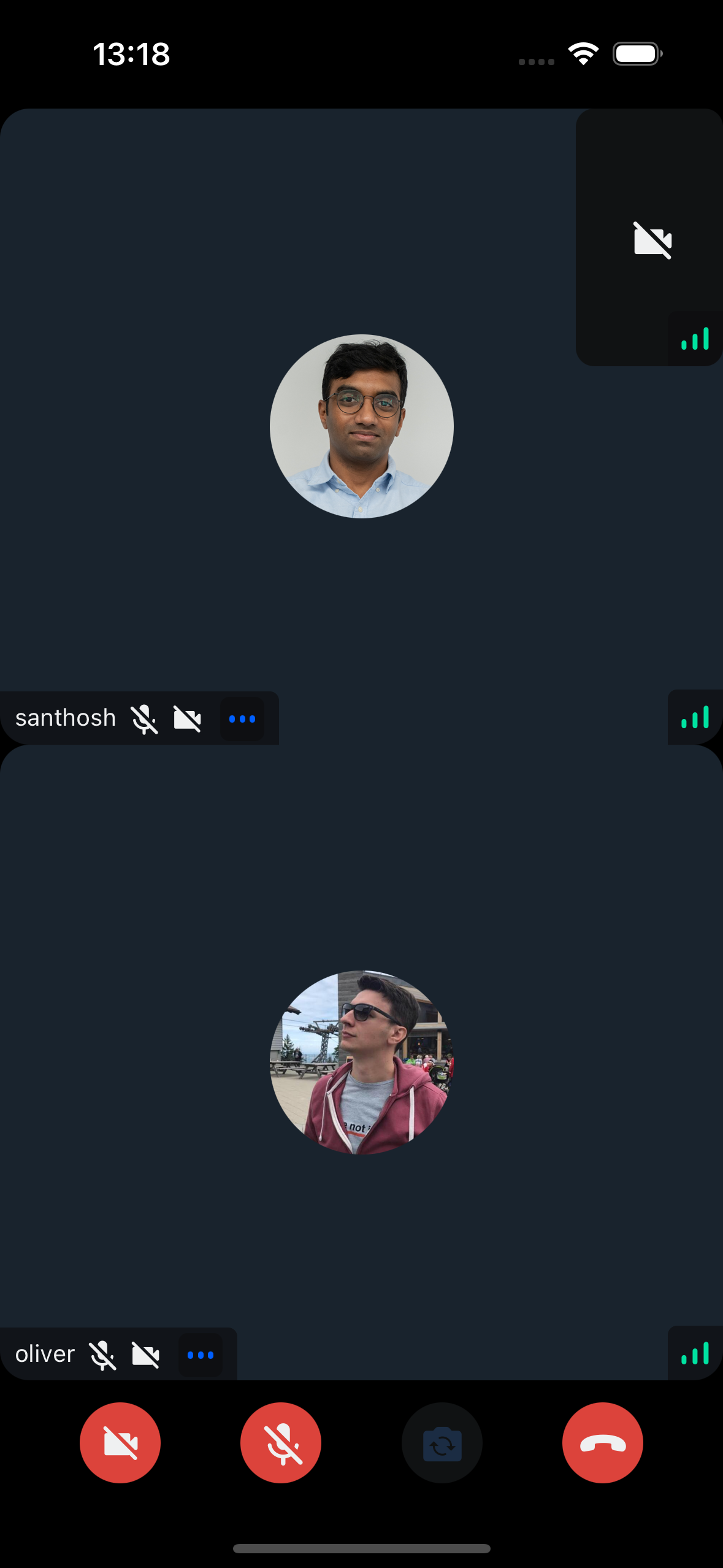
Render participant video with label, network indicator, mute state, fallback, and reactions using ParticipantView:
You will see the result as below:


Video Call UI
Use CallContent for:
- Call Participants Layout - Renders all participants
- Controls - Actions to control a joined call
const App = () => {
  return (
    <View style={styles.container}>
      <CallContent />
    </View>
  );
};

const styles = StyleSheet.create({
  container: {
    flex: 1,
  },
});
Ringing (Incoming/Outgoing calls)
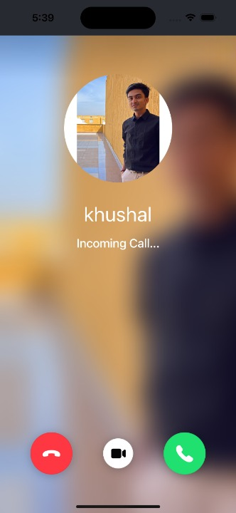
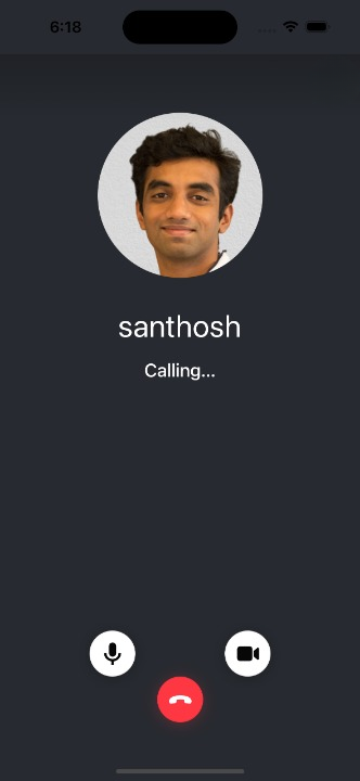
Implement incoming/outgoing screens with RingingCallContent:
- Incoming/Outgoing - Displays
IncomingCallorOutgoingCallbased on state - After accept - Shows
CallContent - Joining state - Shows
JoiningCallIndicator


const App = () => {
  return (
    <View style={styles.container}>
      <RingingCallContent />
    </View>
  );
};

const styles = StyleSheet.create({
  container: {
    flex: 1,
  },
});
UI Component Customization
Customize Stream SDK UI components by:
- Building from scratch - Use low-level components via UI Cookbook
- Using built-in components - Ready-to-use component library
- Mixing approaches - Combine custom and built-in components