 React
React iOS
iOS Android
 Flutter
 JavaScript
 Unity
Unity ESP32
ESP32 Platform
 Vision Agents
import {
  Call,
  CallContent,
  StreamCall,
} from "@stream-io/video-react-native-sdk";

const VideoCallUI = () => {
  let call: Call;
  // your logic to create a new call or get an existing call

  return (
    <StreamCall call={call}>
      <CallContent />
    </StreamCall>
  );
};CallContent
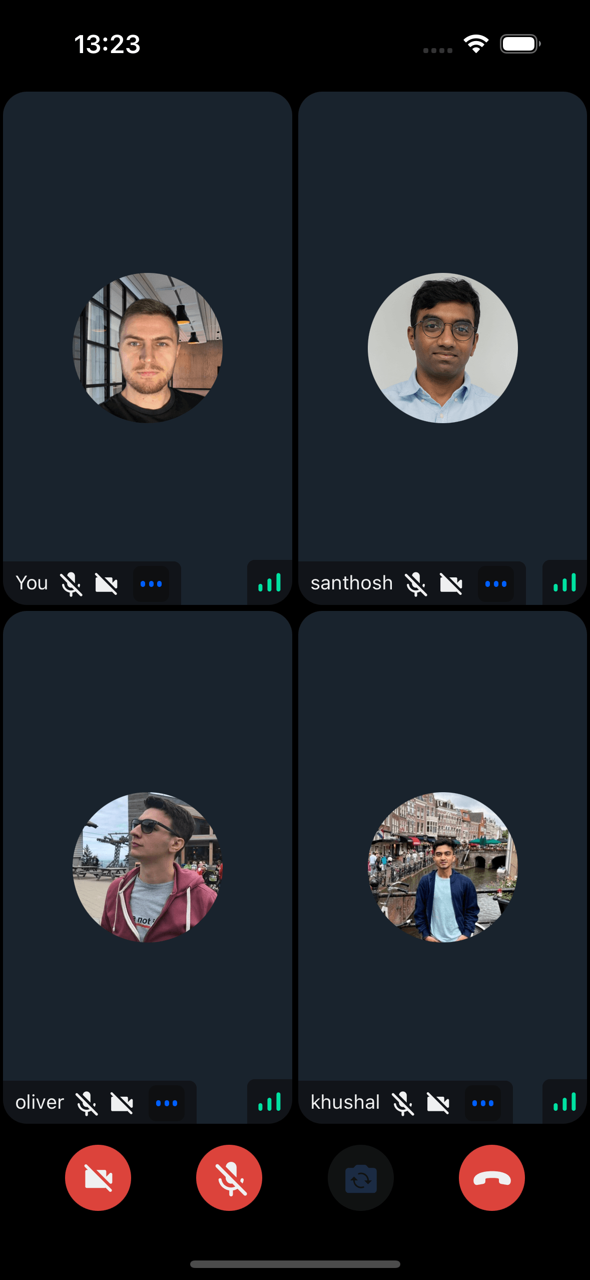
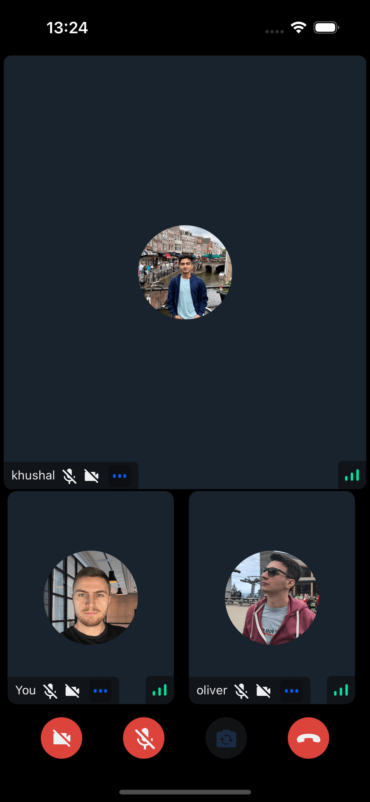
Highest-level UI component for building complete call screens with:
- Full call UI - Top view, participants grid, control buttons
- Media controls - Camera, microphone, speakerphone state management
- Screen sharing - Built-in rendering
- Participant info - Network quality, name, mute state, reactions
- Video rendering - Participant video streams
- Layout options - Grid or spotlight modes
Displays participant list/grid with avatars, names, video (if publishing), and connection quality.
General usage
Show CallContent UI:
Please ensure the CallContent component isn’t remounted during a call to avoid occasional audio loss.
We’re aware of this issue and working on a solution.
Props
layout
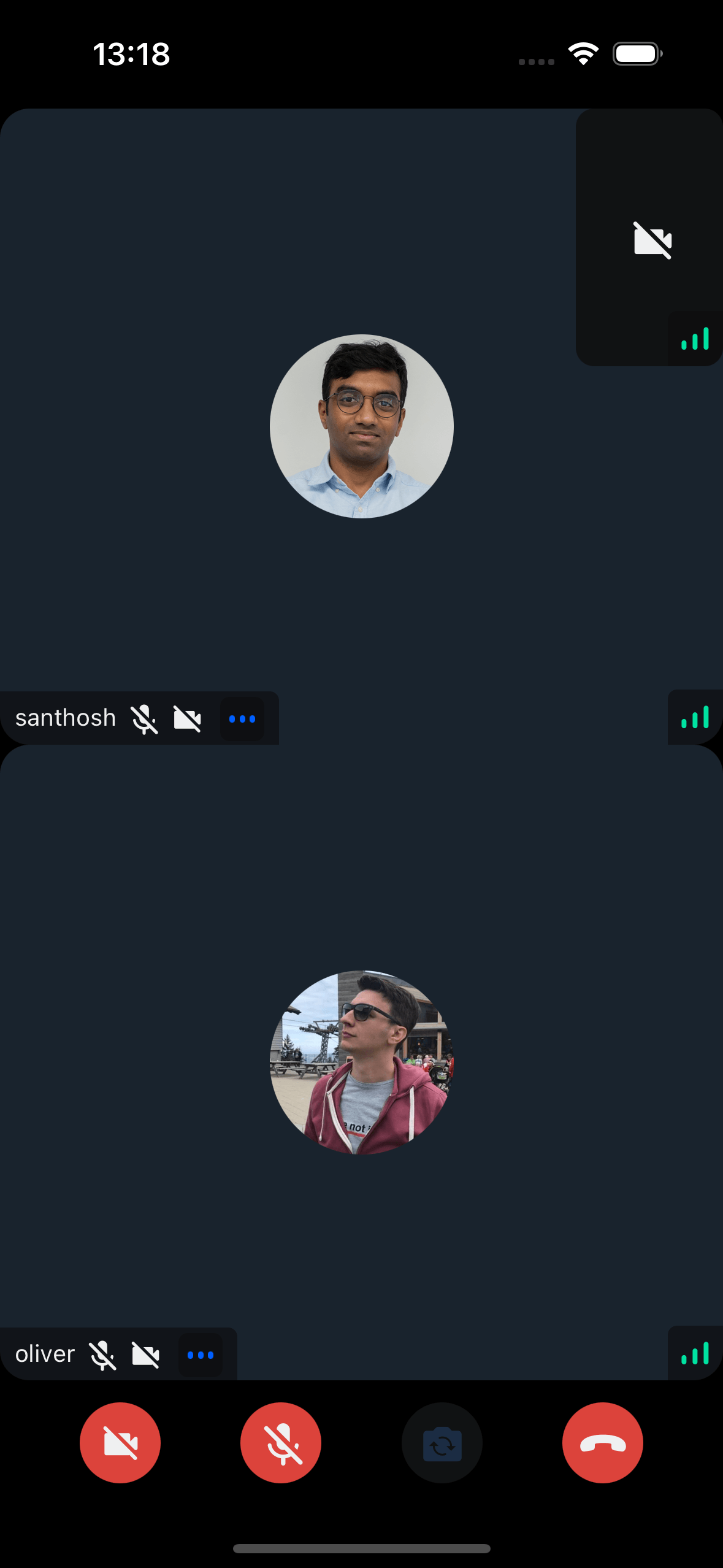
This switches the list between the grid and the spotlight mode.
See Call layouts for the layout components used by CallContent.
| Type | Default Value |
|---|---|
grid | spotlight | grid |
When a screen is shared, the layout automatically changes to spotlight mode.
landscape
Applies the landscape mode styles to the component, if true.
| Type |
|---|
boolean | undefined |
mirror
Forces participant's video to be mirrored or unmirrored. By default, video track from the local participant is mirrored, and all other videos are not mirrored.
This also applies to Picture-in-Picture rendering.
| Type |
|---|
boolean |
disablePictureInPicture
If true, disables Picture-in-Picture mode on both iOS and Android.
| Type |
|---|
boolean | undefined |
iOSPiPIncludeLocalParticipantVideo
If true, includes the local participant's video in the Picture-in-Picture view on iOS.
| Type |
|---|
boolean | undefined |
onHangupCallHandler
Callback invoked after leave attempt from the hangup call button in call controls. Receives an error on failure.
| Type |
|---|
(err?: Error) => void | undefined |
supportedReactions
Supported reactions for the call. Default reactions:
- 🤣 Rolling on the floor laughing
- 👍 like
- 🚀 rocket
- 👎 Dislike
- 🎉 fireworks
- 🙌 Raised hands
- ✋ Raised hand
| Type |
|---|
StreamReactionType[] |
CallControls
Prop to customize the CallControls component.
| Type | Default Value |
|---|---|
ComponentType| undefined | CallControls |
ParticipantLabel
Component to customize the Label of the participant.
| Type | Default Value |
|---|---|
ComponentType| undefined | ParticipantLabel |
ParticipantReaction
Component to customize the participant reaction display.
| Type | Default Value |
|---|---|
ComponentType| undefined | ParticipantReaction |
ParticipantVideoFallback
Component to customize the video fallback of the participant, when the video is disabled.
| Type | Default Value |
|---|---|
ComponentType| undefined | ParticipantVideoFallback |
ParticipantNetworkQualityIndicator
Component to customize the network quality indicator of the participant.
| Type | Default Value |
|---|---|
ComponentType| undefined | ParticipantNetworkQualityIndicator |
VideoRenderer
Component to customize the participant video. Also displays the ParticipantVideoFallback.
The VideoRenderer accepts a mirror?: boolean prop to force mirroring on or off. When provided, it takes precedence over the default mirroring logic.
| Type | Default Value |
|---|---|
ComponentType| undefined | VideoRenderer |
Props
| Prop | Type | Default Value | Description |
|---|---|---|---|
participant | StreamVideoParticipant | The participant whose video or screenshare should be rendered. | |
trackType | videoTrack | screenShareTrack | videoTrack | The track to render. |
isVisible | boolean | true | When false, the video stream is not shown even if it is available. |
objectFit | 'contain' | 'cover' | undefined | undefined | How the video fits within its container. When omitted, a default is computed from the track dimensions. |
videoZOrder | number | 0 | The z-order to apply to the underlying RTC view. |
mirror | boolean | undefined | undefined | Forces mirroring on or off. When omitted, the default mirroring logic is used. |
ParticipantVideoFallback | ComponentType | null | undefined | ParticipantVideoFallback | Component to render when video is unavailable. Use null to disable the fallback. |
ParticipantView
Prop to customize the ParticipantView component entirely.
| Type | Default Value |
|---|---|
ComponentType| undefined | ParticipantView |
FloatingParticipantView
Prop to customize the FloatingParticipantView component.
| Type | Default Value |
|---|---|
ComponentType| undefined | FloatingParticipantView |
Props
| Prop | Type | Default Value | Description |
|---|---|---|---|
participant | StreamVideoParticipant | undefined | The participant to render in the floating view. | |
alignment | top-left | top-right | bottom-left | bottom-right | top-right | Determines where the floating participant video will be placed initially. |
onPressHandler | () => void | undefined | Handler invoked when the floating participant view is pressed. | |
participantViewStyle | ViewStyle | Style override for the participant view container. | |
draggableContainerStyle | ViewStyle | Style override for the draggable container. | |
videoZOrder | number | 1 | The z-order for the video view. |
objectFit | 'contain' | 'cover' | undefined | undefined | How the video fits within its container. |
mirror | boolean | undefined | undefined | Forces mirroring on or off. When omitted, the default mirroring logic is used. |
supportedReactions | StreamReactionType[] | Reactions to enable for the floating participant view. | |
ParticipantView | ComponentType | undefined | ParticipantView | Custom participant view component. |
ParticipantLabel | ComponentType | undefined | ParticipantLabel | Custom label component. |
ParticipantReaction | ComponentType | undefined | ParticipantReaction | Custom reaction component. |
ParticipantVideoFallback | ComponentType | null | undefined | ParticipantVideoFallback | Fallback when video is unavailable. Use null to disable. |
ParticipantNetworkQualityIndicator | ComponentType | undefined | ParticipantNetworkQualityIndicator | Custom network quality indicator. |
VideoRenderer | ComponentType | undefined | VideoRenderer | Custom video renderer component. |
CallParticipantsList
Prop to customize the CallParticipantsList component.
| Type | Default Value |
|---|---|
ComponentType| undefined | CallParticipantsList |
ScreenShareOverlay
Component to customize the screen share overlay, when the screen is shared by a user.
| Type | Default Value |
|---|---|
ComponentType| undefined | ScreenShareOverlay |
initialInCallManagerAudioMode
This prop is deprecated and will be removed in a future version.
Please use callManager.start() with the appropriate audio configuration instead. See the Camera & Microphone guide for the recommended approach.
Property to set the audio mode for the react-native-incall-manager library. If media type is video, audio is routed by default to speaker, otherwise it is routed to earpiece. Changing the mode on the fly is not supported. Manually invoke InCallManager.start({ media }) to achieve this.
| Type | Default Value |
|---|---|
video| audio | video |
Customization
Customize via UI Cookbook recipes. See ParticipantView customization guide.
On this page:
- General usage
- Props
- layout
- landscape
- mirror
- disablePictureInPicture
- iOSPiPIncludeLocalParticipantVideo
- onHangupCallHandler
- supportedReactions
- CallControls
- ParticipantLabel
- ParticipantReaction
- ParticipantVideoFallback
- ParticipantNetworkQualityIndicator
- VideoRenderer
- ParticipantView
- FloatingParticipantView
- CallParticipantsList
- ScreenShareOverlay
- initialInCallManagerAudioMode
- Customization