@Composable
fun CustomMessageComposer(
    viewModel: MessageComposerViewModel,
    onDateSelected: (Long) -> Unit,
) {
    val activity = LocalContext.current as AppCompatActivity

    MessageComposer(
        modifier = Modifier
            .fillMaxWidth()
            .wrapContentHeight(),
        viewModel = viewModel,
        integrations = { // here
            IconButton(
                modifier = Modifier
                    .size(48.dp)
                    .padding(12.dp),
                content = {
                    Icon(
                        painter = painterResource(id = R.drawable.ic_calendar),
                        contentDescription = null,
                        tint = ChatTheme.colors.textLowEmphasis
                    )
                },
                onClick = {
                    MaterialDatePicker.Builder
                        .datePicker()
                        .build()
                        .apply {
                            show(activity.supportFragmentManager, null)
                            addOnPositiveButtonClickListener {
                                onDateSelected(it)
                            }
                        }
                }
            )
        }
    )
}Adding Custom Attachments
Introduction
By default Stream Chat supports several built-in attachment types like image, video, file and Giphy. Apart from that, you can also add your own types of attachments such as location, contact, audio, sticker, etc.
In this guide, we will demonstrate how to build a date sharing feature. Chat users will be able to pick a date from a calendar, preview their selection in the message composer and see the sent attachment within a message in the message list.
This involves doing the following steps:
- Implementing a custom message composer that is capable of sending a message with
dateattachments. - Adding support for
dateattachments by creating a custom AttachmentFactory.
In this guide, we'll show only the main points concerning custom attachments and their factories. Smaller parts will be omitted for the sake of being concise.
You can find the full code from this guide on GitHub. To check the final result, clone the repository, select the stream-chat-android-ui-guides module on your Android Studio like the image below, and run the module. 
Sending Date Attachments
To begin with, you'll need a custom message composer with a button to pick dates. Here's the code for this component:
For simplicity, the integration section to the left of the message input has only one button that is used to show the date picker dialog.
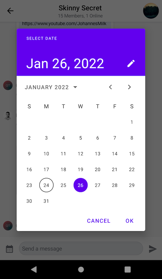
What's happening here is that within the integrations, you define a custom button to open the picker. Within its onClick, you build a new MaterialDatePicker and show it using activity.supportFragmentManager.
If the user selects a date and selects the positive button, you proceed to call onDateSelected() and update the state. But more on that later.
Next, you'll need to create a custom messages screen that makes use of the composer that you've created above:
@Composable
fun CustomMessagesScreen(
    channelId: String,
    onBackPressed: () -> Unit = {}
) {
    val factory = MessagesViewModelFactory(
        context = LocalContext.current,
        channelId = channelId,
    )

    val composerViewModel = viewModel(MessageComposerViewModel::class.java, factory = factory)

    // Other declarations

    Box(modifier = Modifier.fillMaxSize()) {
        Scaffold(
            modifier = Modifier.fillMaxSize(),
            topBar = {
                // Message list header
            },
            bottomBar = {
                // 1
                CustomMessageComposer(
                    viewModel = composerViewModel,
                    onDateSelected = {
                        // 2
                        val date = DateFormat
                            .getDateInstance(DateFormat.LONG)
                            .format(Date(it))
                        val attachment = Attachment(
                            type = "date",
                            extraData = mutableMapOf("payload" to date)
                        )
                        // 3
                        composerViewModel.addSelectedAttachments(listOf(attachment))
                    }
                )
            }
        ) {
            // Message list setup - available in the full code sample
        }
    }
}
The full source code of the CustomMessagesScreen component is available here.
In the snippet above, you:
- Make use of the newly created custom message composer in our messages screen, as the
bottomBar. - Create a custom attachment of type
datecarrying the selected date as a payload. - Submit the attachment with the selected date to the message composer.
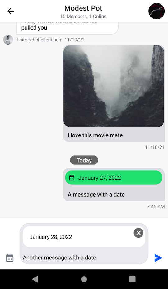
Now you can send a custom attachment of type date to the chat. The resulting UI will look like this:

Now that you've set up the DatePicker and the custom composer, you need to build a custom attachment factory to render the item both in the input and the list.
Rendering Date Attachments
Let's see how to create an AttachmentFactory that is capable of handling date attachments:
val dateAttachmentFactory: AttachmentFactory = AttachmentFactory(
    canHandle = { attachments -> attachments.any { it.type == "date" } },
    content = @Composable { modifier, attachmentState ->
      // Composable that represents the UI of "date" attachments in the message list
    },
    previewContent = { modifier, attachments, onAttachmentRemoved ->
      // Composable that represents the UI of "date" attachments in the message input
    },
    textFormatter = { attachment ->
      // String representation of the attachment in the channel list
    }
)
There are four important parts of each attachment factory:
canHandle: Describes the condition that tells our components if the factory can handle a given set of attachments.content: Represents the attachment UI within theMessageList.previewContent: Represents the attachment UI within theMessageComposer.textFormatter: Shows the attachment information formatted for ourChannelItems.
Let's start with creating a component for the message input:
@Composable
fun DateAttachmentPreviewContent(
    attachments: List<Attachment>,
    onAttachmentRemoved: (Attachment) -> Unit,
    modifier: Modifier = Modifier,
) {
    val attachment = attachments.first { it.type == "date" }
    val formattedDate = attachment.extraData["payload"].toString()

    Box(
        modifier = modifier
            .wrapContentHeight()
            .clip(RoundedCornerShape(16.dp))
            .background(color = ChatTheme.colors.barsBackground)
    ) {
        Text(
            modifier = Modifier
                .align(Alignment.CenterStart)
                .padding(16.dp)
                .fillMaxWidth(),
            text = formattedDate,
            style = ChatTheme.typography.body,
            maxLines = 1,
            color = ChatTheme.colors.textHighEmphasis
        )

        CancelIcon(
            modifier = Modifier
                .align(Alignment.TopEnd)
                .padding(4.dp),
            onClick = { onAttachmentRemoved(attachment) }
        )
    }
}
Then, create a component that will be rendered in the message list:
@Composable
fun DateAttachmentContent(
    attachmentState: AttachmentState,
    modifier: Modifier = Modifier,
) {
    val attachment = attachmentState.message.attachments.first { it.type == "date" }
    val formattedDate = attachment.extraData["payload"].toString()

    Column(
        modifier = modifier
            .fillMaxWidth()
            .padding(4.dp)
            .clip(ChatTheme.shapes.attachment)
            .background(ChatTheme.colors.infoAccent)
            .padding(8.dp)
    ) {
        Row(
            horizontalArrangement = Arrangement.spacedBy(8.dp),
            verticalAlignment = Alignment.CenterVertically
        ) {
            Icon(
                modifier = Modifier.size(16.dp),
                painter = painterResource(id = R.drawable.ic_calendar),
                contentDescription = null,
                tint = ChatTheme.colors.textHighEmphasis,
            )

            Text(
                text = formattedDate,
                style = ChatTheme.typography.body,
                maxLines = 1,
                color = ChatTheme.colors.textHighEmphasis
            )
        }
    }
}
What's important here is how you're able to fetch the custom attachment data, using attachment.extraData["payload"]. You can format the data in any way you want here, which makes our attachments very powerful.
Finally, you need to provide a string representation of the attachment for message preview:
textFormatter = { attachment ->
    attachment.extraData["payload"].toString()
}
Now your attachment factory is complete and looks like that:
val dateAttachmentFactory: AttachmentFactory = AttachmentFactory(
    canHandle = { attachments -> attachments.any { it.type == "date" } },
    content = @Composable { modifier, attachmentState ->
        DateAttachmentContent(
            modifier = modifier,
            attachmentState = attachmentState
        )
    },
    previewContent = { modifier, attachments, onAttachmentRemoved ->
        DateAttachmentPreviewContent(
            modifier = modifier,
            attachments = attachments,
            onAttachmentRemoved = onAttachmentRemoved
        )
    },
    textFormatter = { attachment ->
      attachment.extraData["payload"].toString()
    },
)
To complete the date sharing feature you just need to provide dateAttachmentFactory along with the default attachment factories via ChatTheme:
class MessagesActivity : AppCompatActivity() {

    override fun onCreate(savedInstanceState: Bundle?) {
        super.onCreate(savedInstanceState)
        val channelId = requireNotNull(intent.getStringExtra(KEY_CHANNEL_ID))

        val customFactories = listOf(dateAttachmentFactory)
        val defaultFactories = StreamAttachmentFactories.defaultFactories()

        setContent {
            // Pass in custom factories or combine them with the default ones
            ChatTheme(attachmentFactories = customFactories + defaultFactories) {
                CustomMessagesScreen(
                    channelId = channelId,
                    onBackPressed = { finish() }
                )
            }
        }
    }

    companion object {
        private const val KEY_CHANNEL_ID = "channelId"

        fun getIntent(context: Context, channelId: String): Intent {
            return Intent(context, MessagesActivity::class.java).apply {
                putExtra(KEY_CHANNEL_ID, channelId)
            }
        }
    }
}
Date attachments should be now correctly rendered in the message composer and in the message list like on the screenshot below:

With just a few lines of code, you're able to render any custom UI within the MessageComposer and MessageList components of our SDK. This gives the ability to build powerful features without having to change our default components, you just need a custom AttachmentFactory.
Quoted Messages
Stream SDK supports quoting or replying to messages, even if they contain attachments. These quoted messages are shown inside the message bubble above the text you wrote when quoting, which is a common pattern in various chat services.

Since the quoted content is nested inside a regular message, it has less space available and requires a different layout. For this reason, the Compose SDK provides separate attachment factories just for the quoted content. This allows you to provide a different UI for attachments that are displayed as a part of the quoted content.
Attachment factories used for displaying quoted content extend the same class as regular attachment factories. As such, they are interchangeable. If you don't provide a quotedAttachmentFactory that can render your custom type of attachments, we will use your custom attachmentFactory by default in our UI, instead.
Let's see how to build a custom quoted attachment factory.
Rendering Quoted Date Attachments
We will be using the same AttachmentFactory type for quoted messages.
Let's start with creating a component that will be used to render the quoted message inside the regular message content:
@Composable
fun QuotedDateAttachmentContent(
    attachmentState: AttachmentState,
    modifier: Modifier = Modifier,
) {
    val attachment = attachmentState.message.attachments.first { it.type == "date" }
    val date = attachment.extraData["payload"].toString()
    val formattedDate = StringBuilder().apply {
        val dateTime = SimpleDateFormat("MMMMM dd, yyyy", Locale.getDefault()).parse(date) ?: return@apply
        val year = Calendar.getInstance().apply {
            timeInMillis = dateTime.time
        }.get(Calendar.YEAR)
        if (Calendar.getInstance().get(Calendar.YEAR) != year) {
            append(year).append("\n")
        }
        append(date.replace(", $year", ""))
    }.toString()

    Column(
        modifier = modifier
            .padding(4.dp)
            .clip(ChatTheme.shapes.attachment)
            .background(ChatTheme.colors.infoAccent)
            .padding(8.dp)
    ) {
        Column(
            horizontalAlignment = Alignment.CenterHorizontally
        ) {
            Icon(
                modifier = Modifier.size(16.dp),
                painter = painterResource(id = R.drawable.ic_calendar),
                contentDescription = null,
                tint = ChatTheme.colors.textHighEmphasis,
            )

            Text(
                text = formattedDate,
                style = ChatTheme.typography.body,
                color = ChatTheme.colors.textHighEmphasis,
                textAlign = TextAlign.Center
            )
        }
    }
}
As before, we are fetching the custom attachment data using attachment.extraData["payload"]. We also hide the year if it's the same as the current one and we add a new line before the date for a more compact preview.
This time we don't need the textFormatter or previewContent. The textFormatter is used to show the description of the attachment in the ChannelList and that will be handled by the parent message. The previewContent is used in the MessageComposer and it only shows the parent message before it's sent.
Now your attachment factory should be complete and look like this:
val quotedDateAttachmentFactory: AttachmentFactory = AttachmentFactory(
    canHandle = { attachments -> attachments.any { it.type == "date" } },
    content = @Composable { modifier, attachmentState ->
        QuotedDateAttachmentContent(
            modifier = modifier,
            attachmentState = attachmentState
        )
    }
)
To complete the quoted date sharing feature you just need to provide quotedDateAttachmentFactory along with the default quoted attachment factories via ChatTheme:
class MessagesActivity : AppCompatActivity() {

    override fun onCreate(savedInstanceState: Bundle?) {
        super.onCreate(savedInstanceState)
        val channelId = requireNotNull(intent.getStringExtra(KEY_CHANNEL_ID))

        val customFactories = listOf(dateAttachmentFactory)
        val defaultFactories = StreamAttachmentFactories.defaultFactories()

        val customQuotedFactories = listOf(quotedDateAttachmentFactory)
        val defaultQuotedFactories = StreamAttachmentFactories.defaultQuotedFactories()

        setContent {
            // pass in custom factories or combine them with the default ones
            ChatTheme(attachmentFactories = customFactories + defaultFactories, quotedAttachmentFactories = customQuotedFactories + defaultQuotedFactories) {
                CustomMessagesScreen(
                    channelId = channelId,
                    onBackPressed = { finish() }
                )
            }
        }
    }

    companion object {
        private const val KEY_CHANNEL_ID = "channelId"

        fun getIntent(context: Context, channelId: String): Intent {
            return Intent(context, MessagesActivity::class.java).apply {
                putExtra(KEY_CHANNEL_ID, channelId)
            }
        }
    }
}
To show the MessageOptions, you need to add the component to the CustomMessagesScreen. We'll skip this part for the sake of the guide.
You can find the full source code of the CustomMessagesScreen component here, where everything is set up.
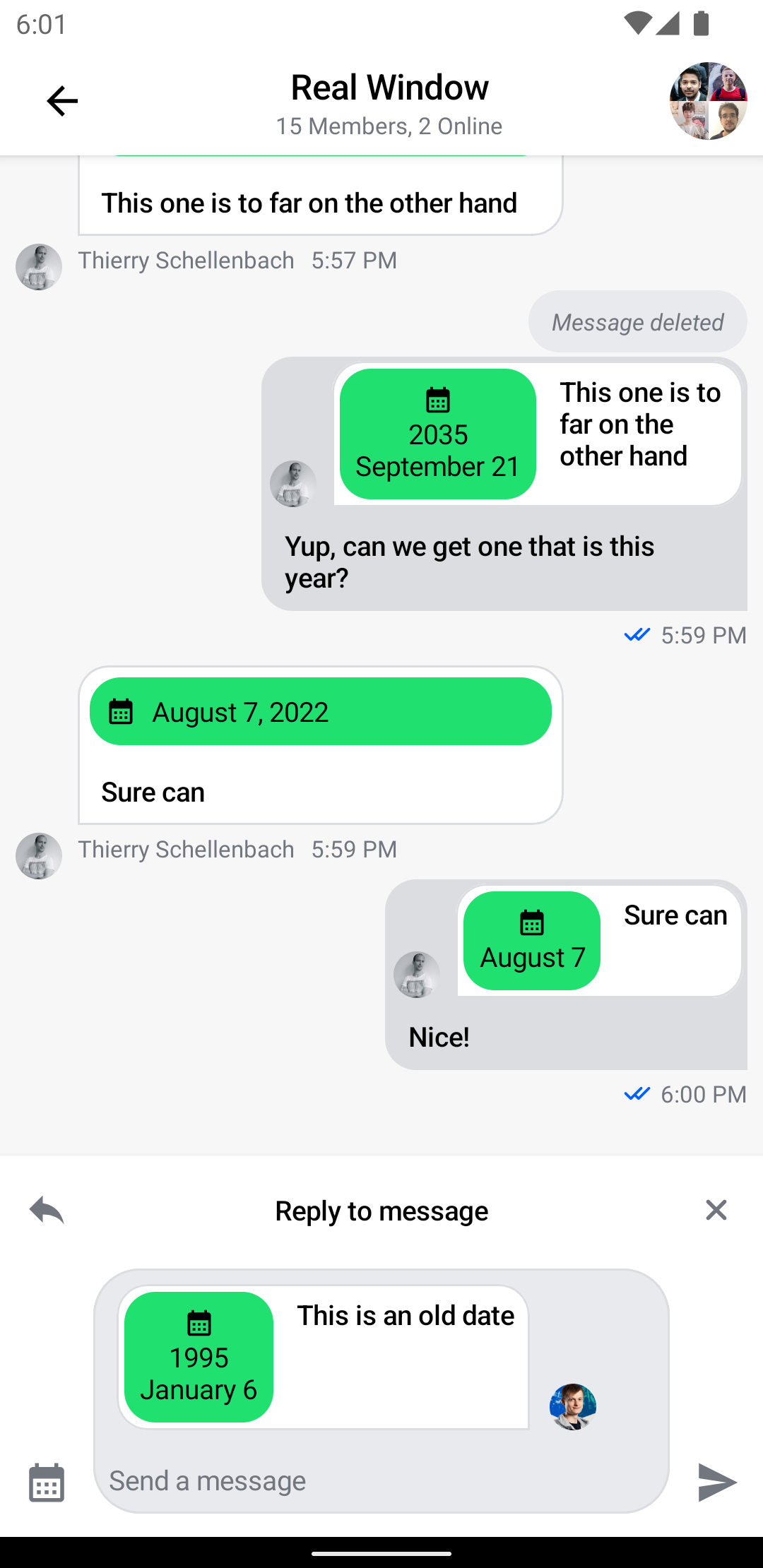
Quoted date attachments should now be correctly rendered in messages where they're quoted, like in the screenshot below:

With even fewer lines of code than the previous custom attachment factory we have adjusted the date preview to fit a smaller layout retaining all the relevant data. This gives you even more fine grained customization to build powerful and responsive UI with the same reusable components.